


We created a fun and unique name for the poke bowl restaurant Kuri Poke, along with an abstract and colorful identity, inspired by the ingredients of the traditional poke bowl.
STRATEGY
Branding
Brand name creation
Logo and identity design
Logo and identity design
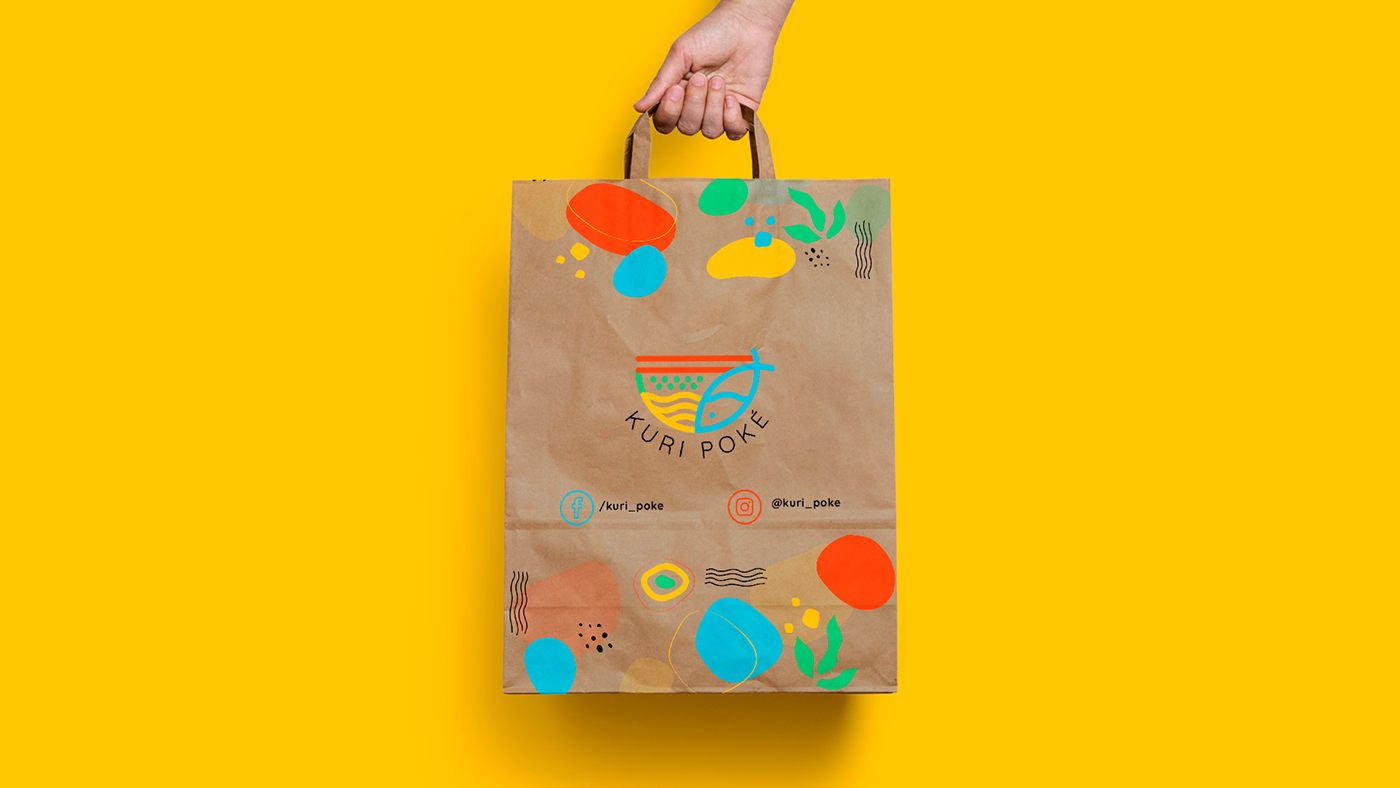
Brand assets
Brand Identity
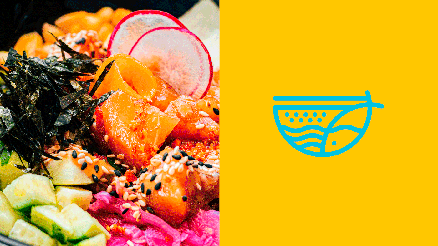
Taking as inspiration the main ingredients of the traditional poke bowl, an icon with abstract shapes was designed to represent each element and specific colors were designated for its identification; orange (chopsticks), blue (seafood), yellow (base) and green (toppings). In contrast to black, this harmony of colors gave us the opportunity to be creative and play with them in the brand’s applications, achieving a youthful, unique and cool identity.


PROJECT CREDITS
Art Direction
Elizabeth Contreras
Brand Identity & Assets
Mariana Ortega
MORE
Done by kiwis 🐥 with ⚡️
Thank you for your appreciation ❤️


