


Momento Coffee Roastery
Welcome to a short story about how we created a simple coffee roastery brand in a week. Yes, one week.
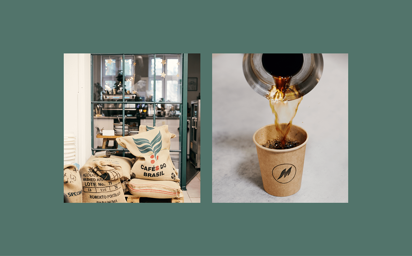
Momento is a small coffee roastery based in Rzeszow, Poland run by a super nice couple — Kamil & Roma. They have several years of experience in bean cooking which they gained in London. Tired of rain and tea o’clock, they moved back to Poland. Apart from tons of baggage they also brought a particular type of wisdom: high-quality specialty coffee producing skills.
The budget was kinda low but we try to be open to everyone with good ideas. More important, we are coffee addicts so how could we drop a topic like this. We came up with a pretty experimental (at least for us) process which assumed one week for creating a strategic idea and brand creation. It was run in two all-day-long workshops with a client and creation or designing in between. What was unexpected, it turned out to work pretty well.
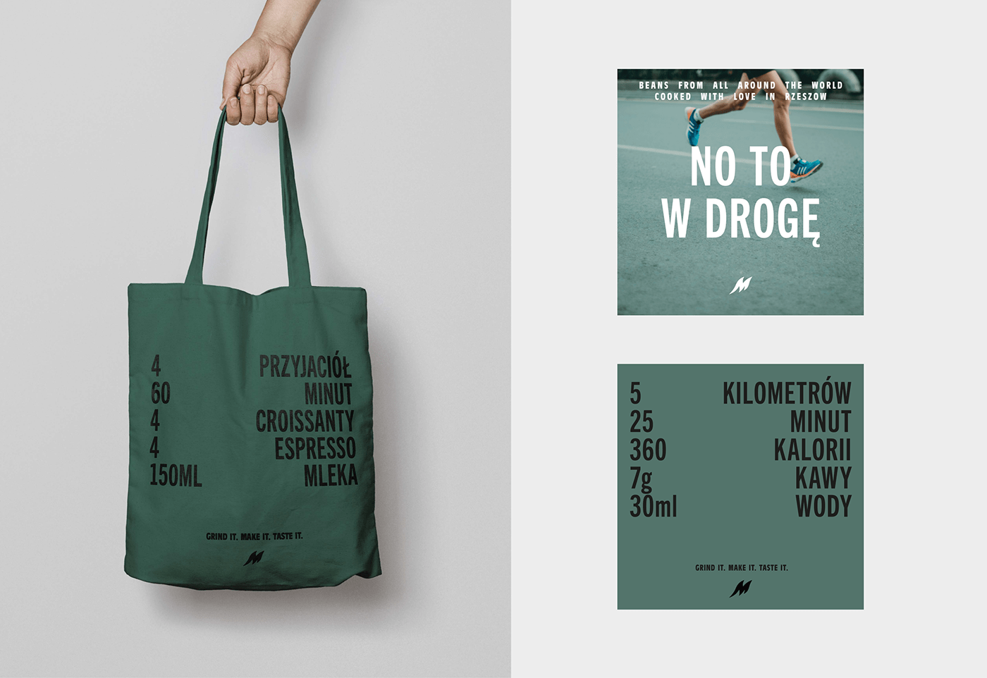
After a fun yet intensive work, we have worked out conclusions on which the whole brand would be set. The brand idea was supposed to be all about celebrating the moment of drinking coffee – not only the beans themselves. Wherever you are, whatever you do, and whoever with, it all builds the experience of tasting the coffee. So go cycling with the crew, sit on a bench with your bae, go to the office, go hiking, relax, run, take your time, hurry but always with the right cup of coffee.
Welcome to a short story about how we created a simple coffee roastery brand in a week. Yes, one week.
Momento is a small coffee roastery based in Rzeszow, Poland run by a super nice couple — Kamil & Roma. They have several years of experience in bean cooking which they gained in London. Tired of rain and tea o’clock, they moved back to Poland. Apart from tons of baggage they also brought a particular type of wisdom: high-quality specialty coffee producing skills.
The budget was kinda low but we try to be open to everyone with good ideas. More important, we are coffee addicts so how could we drop a topic like this. We came up with a pretty experimental (at least for us) process which assumed one week for creating a strategic idea and brand creation. It was run in two all-day-long workshops with a client and creation or designing in between. What was unexpected, it turned out to work pretty well.
After a fun yet intensive work, we have worked out conclusions on which the whole brand would be set. The brand idea was supposed to be all about celebrating the moment of drinking coffee – not only the beans themselves. Wherever you are, whatever you do, and whoever with, it all builds the experience of tasting the coffee. So go cycling with the crew, sit on a bench with your bae, go to the office, go hiking, relax, run, take your time, hurry but always with the right cup of coffee.
Naming
It is simple, we know that. It should be, it is a coffee roastery, not an IT solution implementation service company. We had many various ideas. But stuck to the one which at the same time: goes with the brand idea; is short & easy to remember; sounds Italian; and literally means in Italian: “Give me some space you, I am occupied with something I love doing right now, you ba$tard.”
Logo
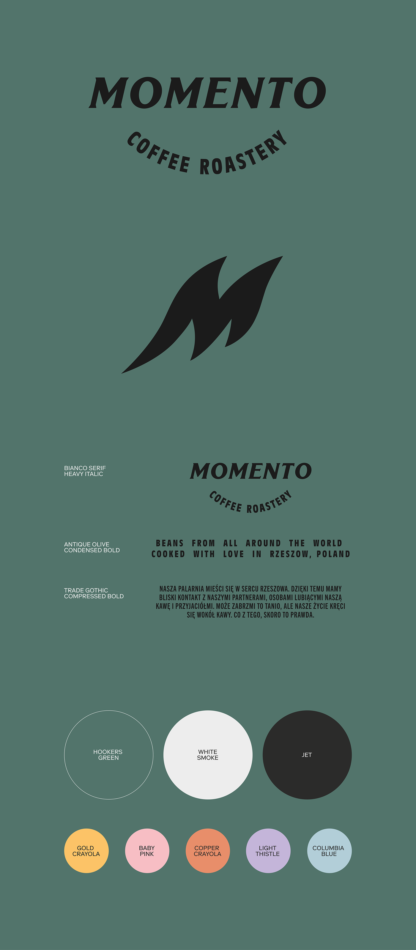
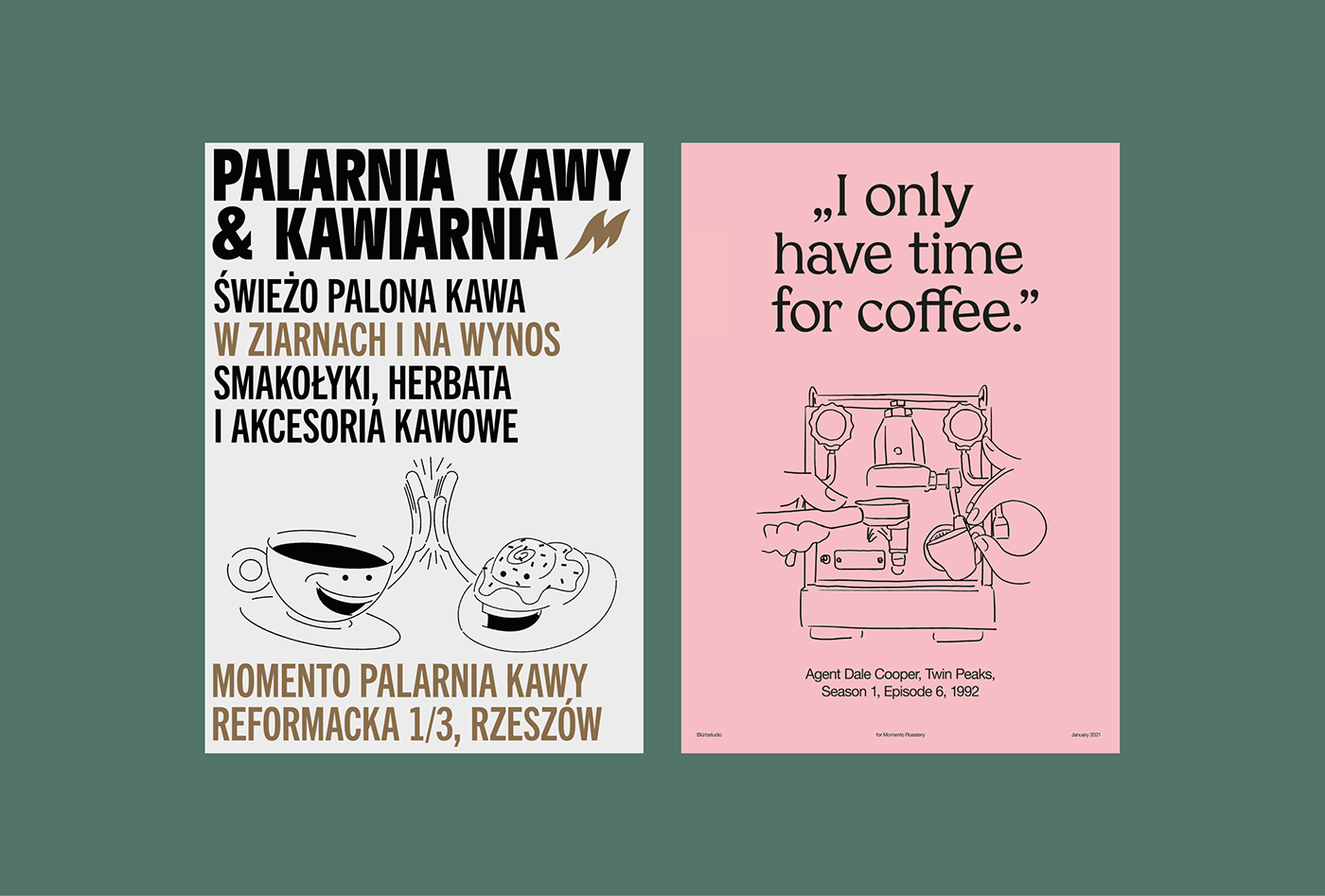
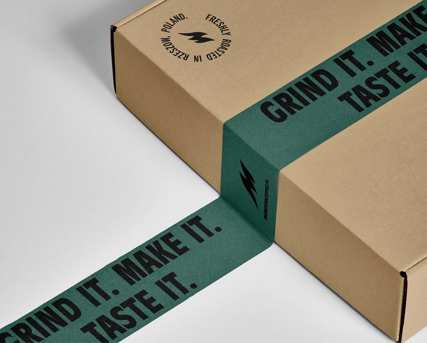
The logotype consists of two elements — the brand name and the descriptor. For the first element we used Bianco Serif, italic makes it more dynamic, almost running. The other was set in Antique Olive Condensed.
Sign
Coffee bean is just weird, colorful and useless fruit without one thing — fire. On the other hand, freshly brewed coffee steams in a very sexy way. Those two resemblances brought us to this smoking hot letter M.
It is simple, we know that. It should be, it is a coffee roastery, not an IT solution implementation service company. We had many various ideas. But stuck to the one which at the same time: goes with the brand idea; is short & easy to remember; sounds Italian; and literally means in Italian: “Give me some space you, I am occupied with something I love doing right now, you ba$tard.”
Logo
The logotype consists of two elements — the brand name and the descriptor. For the first element we used Bianco Serif, italic makes it more dynamic, almost running. The other was set in Antique Olive Condensed.
Sign
Coffee bean is just weird, colorful and useless fruit without one thing — fire. On the other hand, freshly brewed coffee steams in a very sexy way. Those two resemblances brought us to this smoking hot letter M.
Naming system & information architecture
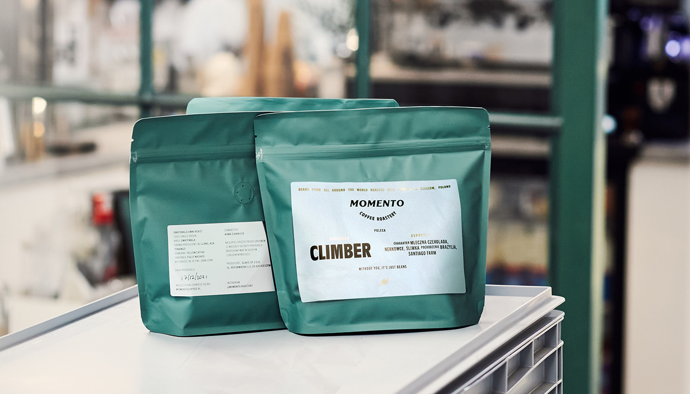
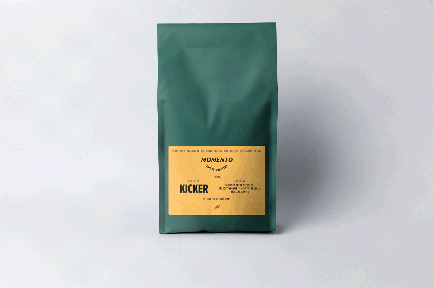
The two main product lines needed two separate visual languages as a proper naming system. So basic, more colorful sets of espresso blends have vigorous names based on their character and flavor complexity. The name is set with the name of a farm and taste profile to be more distinctive.
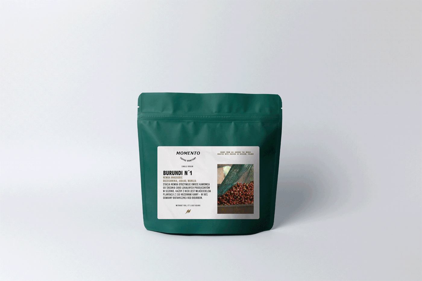
For a more dynamic and diverse group of single-origin beans, we needed something way more practical. The more important stuff for coffee heads around the world are details — not taste — so we stuck to the coffee origins.
The two main product lines needed two separate visual languages as a proper naming system. So basic, more colorful sets of espresso blends have vigorous names based on their character and flavor complexity. The name is set with the name of a farm and taste profile to be more distinctive.
For a more dynamic and diverse group of single-origin beans, we needed something way more practical. The more important stuff for coffee heads around the world are details — not taste — so we stuck to the coffee origins.

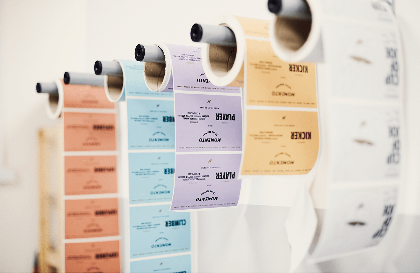
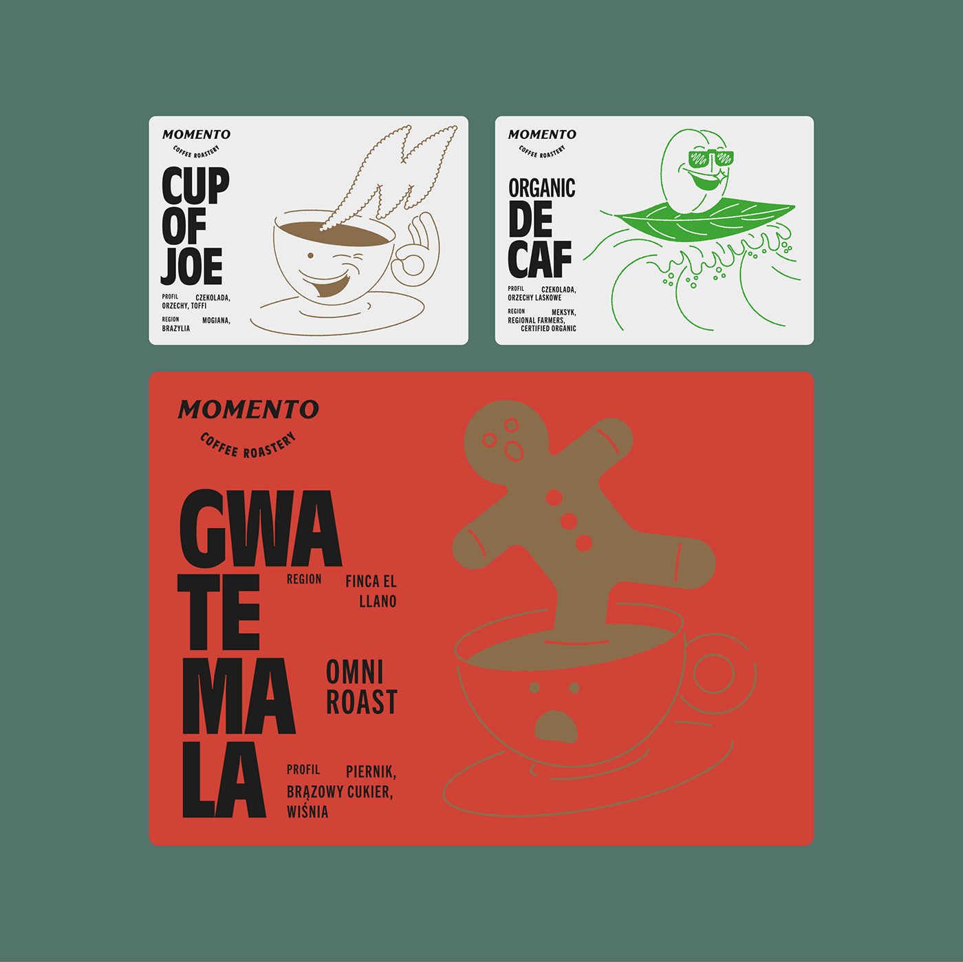
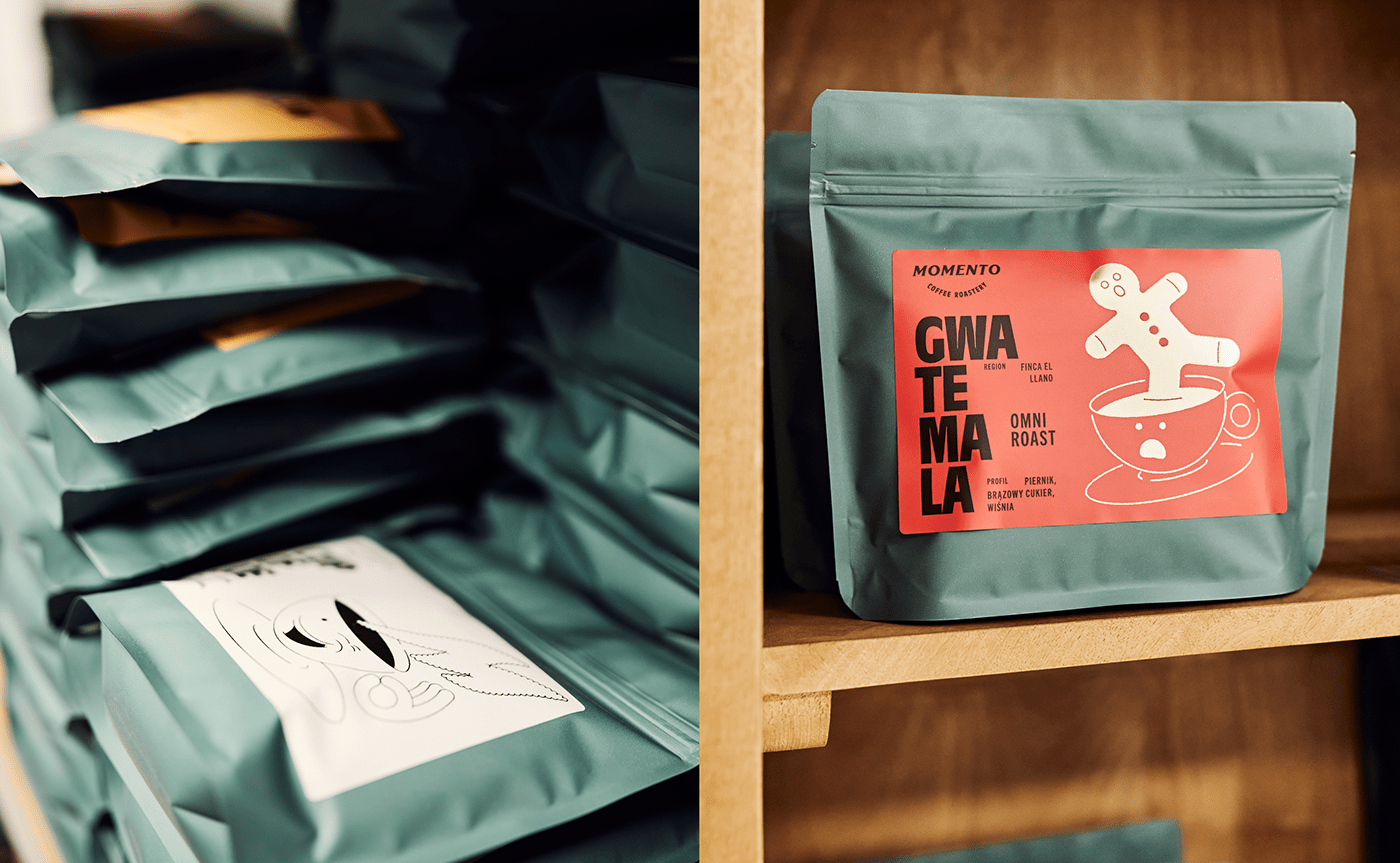
Special editions
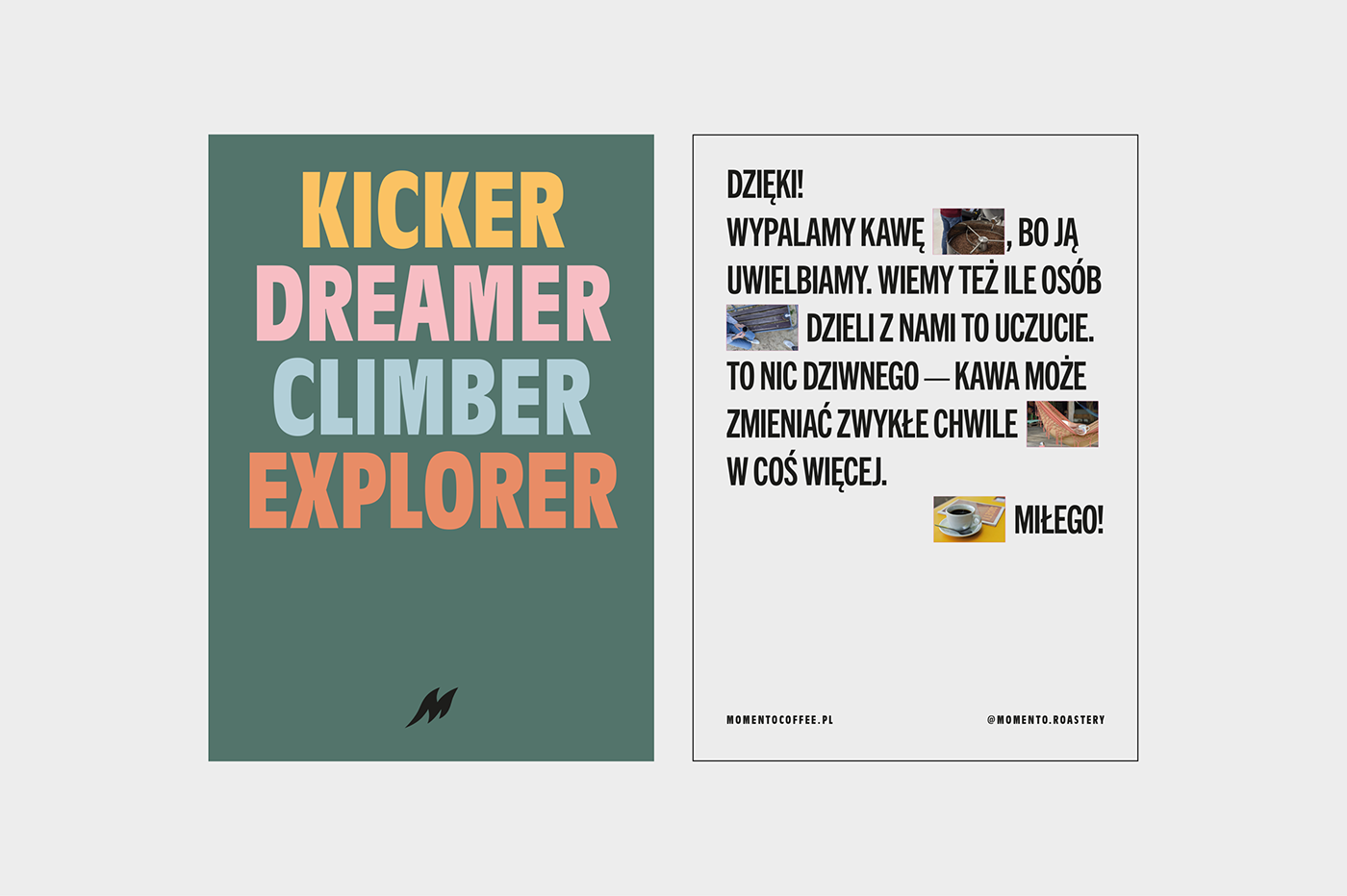
As the owners' creativity in roasting has no end, we also had to work out some special edition types of labels to make it slightly different from others. We figured they also should use their creative minds to come up with names. So they did. We just created a simple illustrating style to make it even more creative. Woo-hoooo! Hell yea, we drink too much coffee.
Design by:
Blürbstudio
Job's Scope:
Brand strategy
Naming
Creative Direction
Visual Concept
Illustrations
DTP
Designers:
Artur Mierzwa
Alina Ziemiańska
Follow Us:
Facebook
Instagram
Blürbstudio
Job's Scope:
Brand strategy
Naming
Creative Direction
Visual Concept
Illustrations
DTP
Designers:
Artur Mierzwa
Alina Ziemiańska
Follow Us:


