
/// Three vector illustration projects
and their iteration journey
/// Project 1: EAM-X Illustration
Iteration 1:
The main idea has been sent to me via Slack message. It involved connecting the SCOM logo to the various plugins that SquaredUp's EAM-X product can interact with.
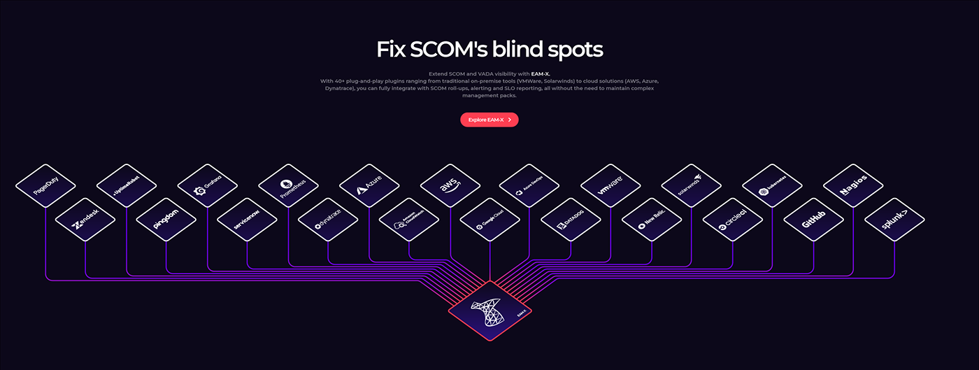
Iteration 2:
The number of plugins was brought down to 10 in order to achieve a more focused result and to prevent the illustration to overflow the viewport. Additional connections were added to increase the complexity of the illustration and to bring more edge to it.

Iteration 3:
Following an idea by a member of the team, I experimented with losing the isometric distortion on the logos.

Iteration 4:
The connections in the upper part of the design were deleted in order to achieve a cleaner look.

Iteration 5:
Following a team meeting, the logos were reverted to an isometric view.
Iteration 6:
Complexity was further increased to make the illustration look more intriguing and modern.
This also regained the original idea's "cable ribbons", while also putting an accent on the isometric nature of the illustration's context, which now looks a bit like a motherboard/chip.
This also regained the original idea's "cable ribbons", while also putting an accent on the isometric nature of the illustration's context, which now looks a bit like a motherboard/chip.

Iteration 7:
A white glow has been added next to the plugin cards, to make it look like they're pushing their own energy out into SCOM.

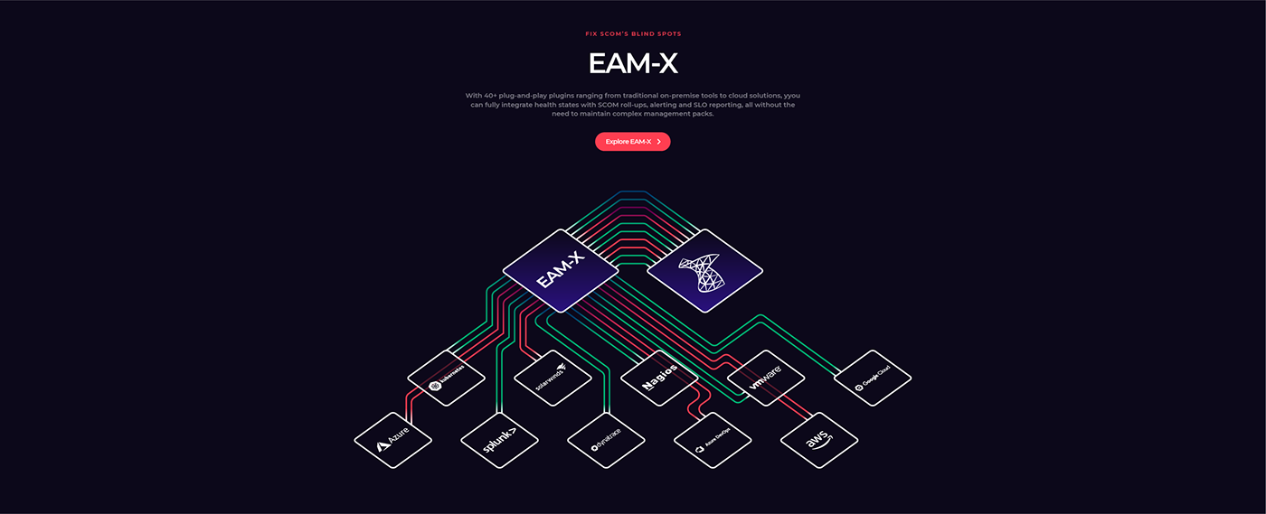
Iteration 8:
The stakeholders requested the purple colour to be changed to red and green in order to nod to healthy and unhealthy application status.

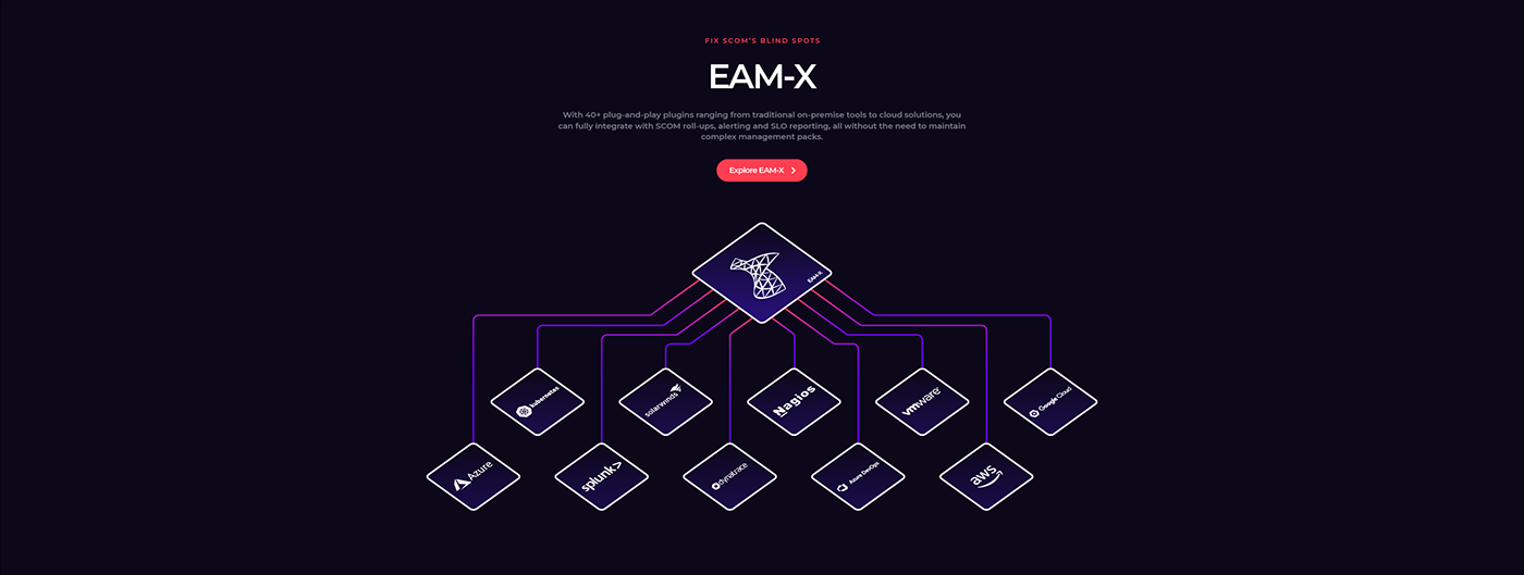
Iteration 9:
An alternative layout was requested in order to introduce the "EAM-X" tile and reduce the vertical viewport at the same time.
Iteration 10:
Back to a vertical layout, which looks more symmetrical and streamlined.

Iteration 11:
The final result, animated by the in-house web developer.

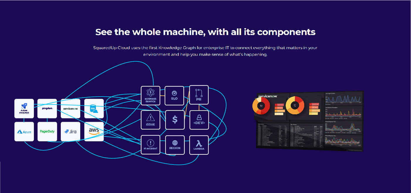
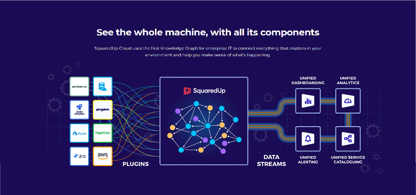
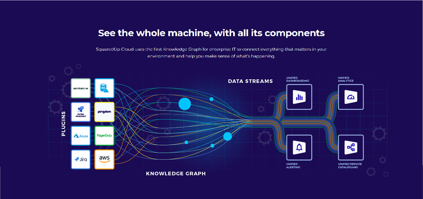
/// Project 2: Cloud Marchitecture Illustration
Iteration 1:
The main idea has been sent to me via brief and a first sketch followed shortly after.

Iteration 2:
The stakeholder requested a very specific set of connections between the icons. Here is a screenshot of the process.
Iteration 3:
A new idea was brought by the stakeholder, now requesting the various plugins/integrations to be illustrated as if they were cogwheels in a more complex machine.

Iteration 4:
The cogwheel idea was soon discarded and we went back to the job of connecting icons with lines of different colours.

Iteration 5:
The idea gets more refined. A new, updated dashboard is added to the mix.

Iteration 6:
The stakeholder takes some time to think over the latest iteration, and then proceeds to request some new changes, as shown below. Arrows are preferred for a more impactful, clear look.

Iteration 7:
The simple design of the arrows gets replaced by the old idea of connecting icons via lines. Anyway, this time around, the concept gets hybridated with the other ideas that emerged in the meantime.
Iteration 8:
The stakeholder requests to simplify the middle section of the illustration and to edit the "cable ribbons" on the right in order to alter the icon hierarchy.
Iteration 9:
The icon on the left hand side of the composition are switched to an inverted look in order to better suit the rest of the illustration.

Iteration 10:
After a few days, many new ideas are brought to the table by multiple stakeholders, resulting in the iteration displayed below.

The project was then abandoned by the stakeholders and never made further progress.
/// Project 3: Dashboard-themed hero animation
Iteration 0:
Moodboarding, storyboarding, gathering of assets.


Iteration 1:
A mix of two ideas: flipping cards and the company logo as a prism.


Iteration 2:
The flipping cards have been retained, but the second part of the animation has been revised by introducing a structure that will be similar to the final one.


Iteration 3:
High-fidelity stills, which have been approved and then turned into an animated asset.


/// Feel free to leave a like and/or a comment. :)


