Packaging Design concept for Catskill Distilling Company in New York— A whiskey distillery inside the Bethel, NY mountains. A region well-known for it's vast natural resources and wildlife.
For years, the Catskills, a compound of mountains in the New York State, have become a synonym for travel, venture and leisure. Since the opening of the Northern train rails, the destination became a preferred getaway from the business of the city, as well as a place to live closer to nature. It remains that way today.
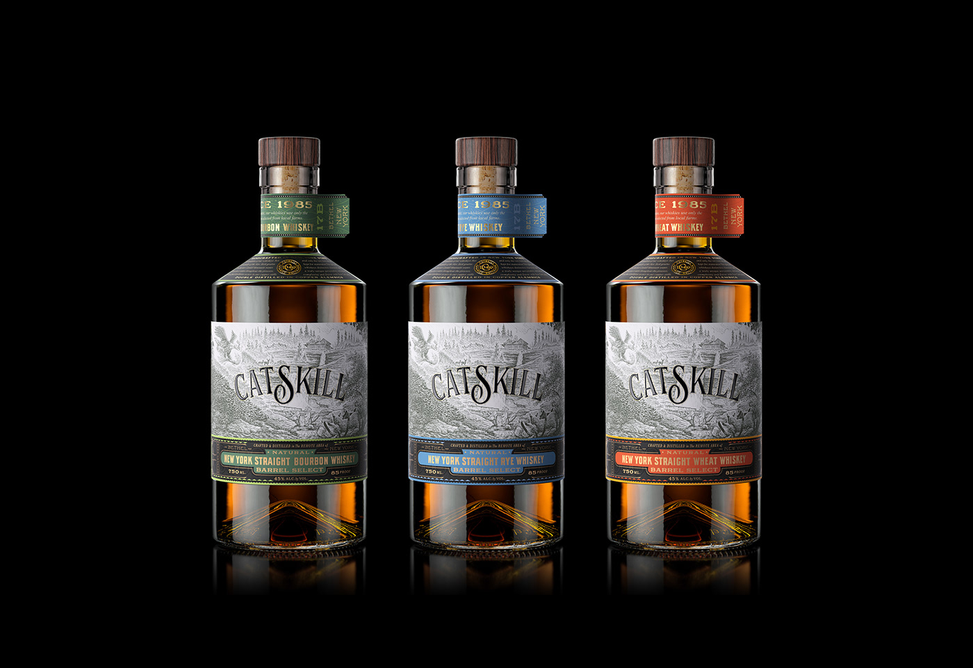
Paying homage to those originating traveling, the design uses the bottle as a train brochure; departure charts, destination and origin devices, as well as—of course—an inviting window with detailed illustration carefully crafted to illustrate the lush nature of the Catskills.

Illustrated by artist Nathan Yoder, the hero image transports you to a place and time to relax and indulge. Featuring a family of deers, a bobcat coming out from an abandoned whiskey barrel, a white-head eagle flying with a banner, a cabin with a bricked chimney and a waterfall center piece—water is the ingredient the Catskill Distilling Company is the proudest of.
Sourced from melted ice water from the mountains, the water in this spirit is the freshest and cleanest in the area, allowing the Whiskey to have a distinguishable flavor of unparalleled quality. The same quality found in other ingredients, like the grains, turn this product into a hyper-local whiskey, telling us a story without falling into the cliches of local products.

The typographic set is a rich concoction of custom-made typography and ready-to-use fonts—including Motor City by Carmel Type, Abolition by Mattlox Shuler, SuperClarendon and Worker by Natanael Gama. The mix-and-match of fonts is an attention-grabbing chaos with an inviting order, allowing drinkers to read more about this product.
On the sides, a custom-made font reads "Made With fresh Mountain Water" intertwined as a braid and also a resemblance of water. This same detail is used as a texture on the neck and shoulders' labels reinforcing the design language of the brand.

The shoulders' label continues the story of this product educating further on process, an important element for Whiskey connoisseurs. This secondary label is inspired by the structural design of the bottle, which is one of the most identifiable elements in the design, allowing the piece to feel cohesive and tailor-made, even with the use of a stock bottle.

Nathan Yoder - Main Illustration
Pablo Gil - 3D Visuals
Bottle: Saverglass
Stopper: Tapi Group
Abraham Lule - Packaging Design and Art Direction


