
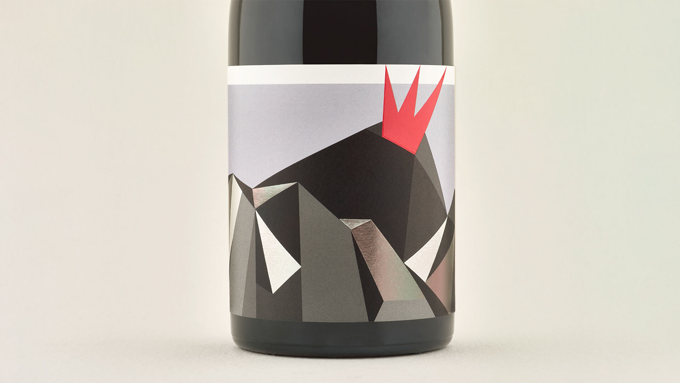
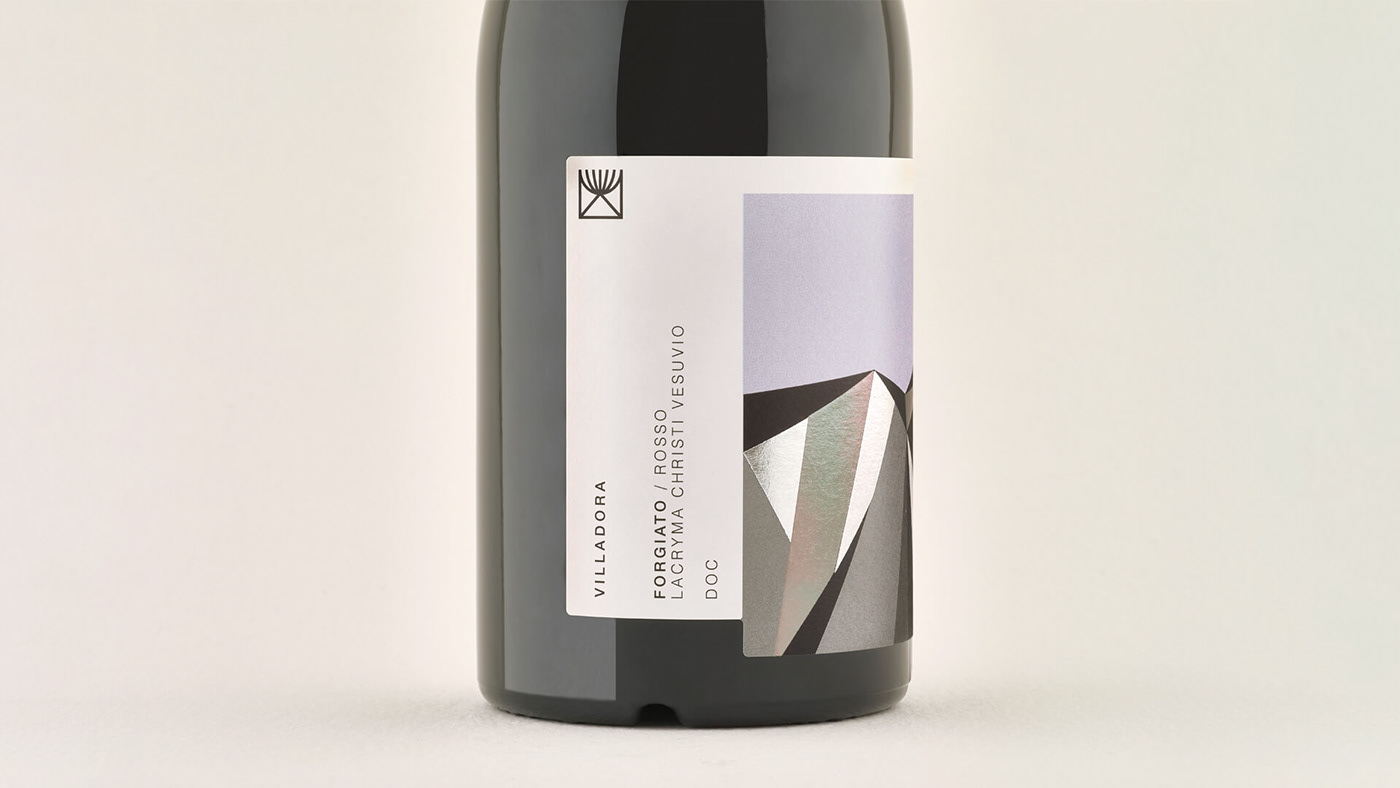
The Villa Dora brand and packing project is futuristic, essential, locally rooted, and full of joy. The value of the client, a wine producer located at the foot of the Vesuvius, turns all around the territory's peculiarity and history. The concept of the labels is to take the most popular and iconic images of Naples - the landscape of Vesuvius - rethink it unconventionally and redesign it so personally to seem previously unknown. The labels had to look essential, and upfront while expressing and revealing the fullness and complexity that Vesuvius assumes for the local communities.
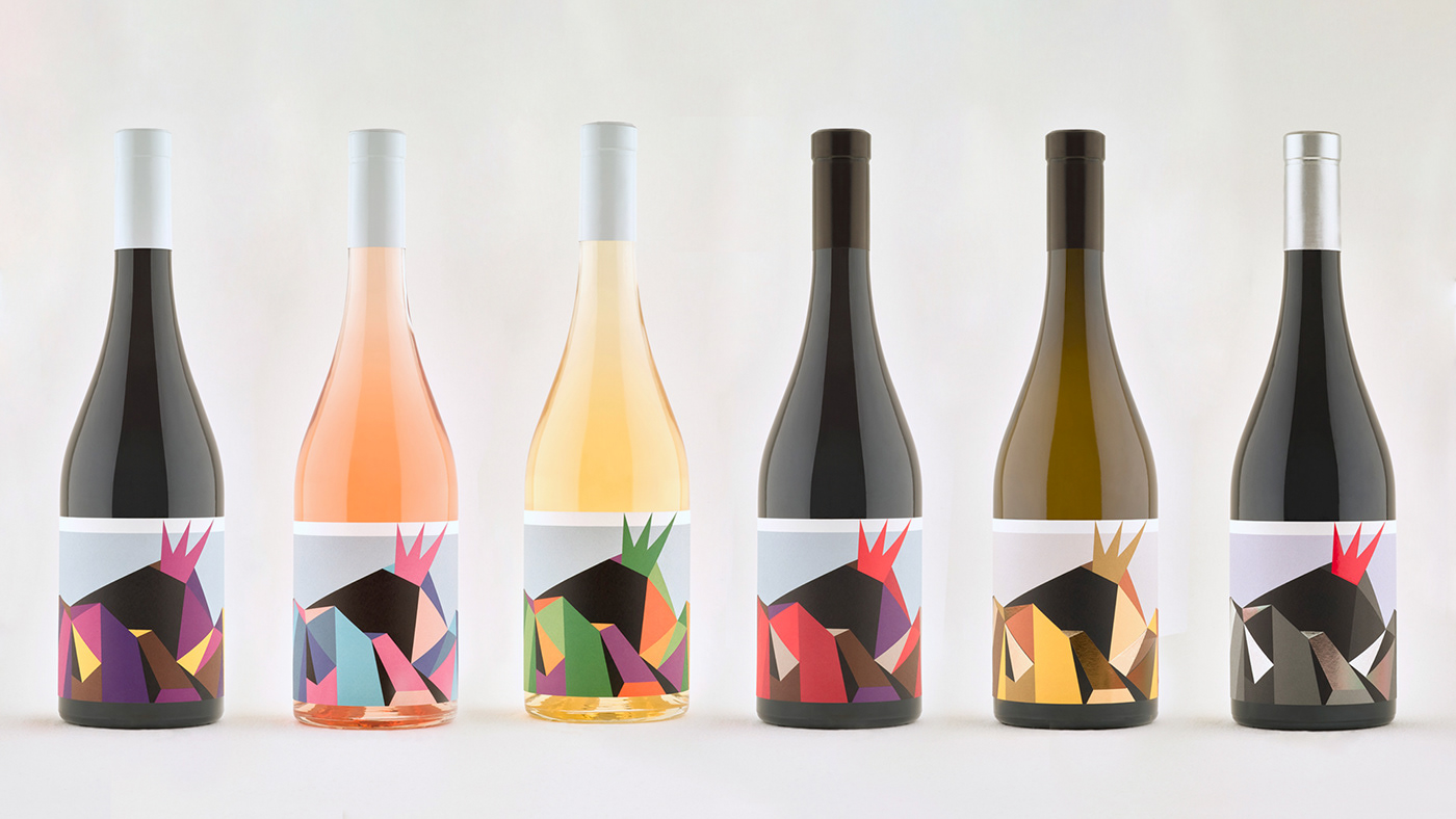


The client's request was to stand out among competitors on the market from the same geographic area while keeping a tight reference to it. Villa Dora needed to highlight their vanguard vinification process of historic denominations of local wines. The tale of the label had to be their innovation-oriented business model to sustainably take advantage of the characteristic of the Vesuvian land.
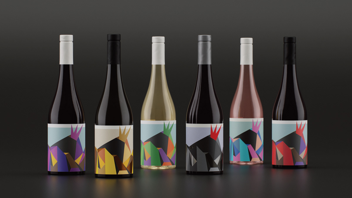

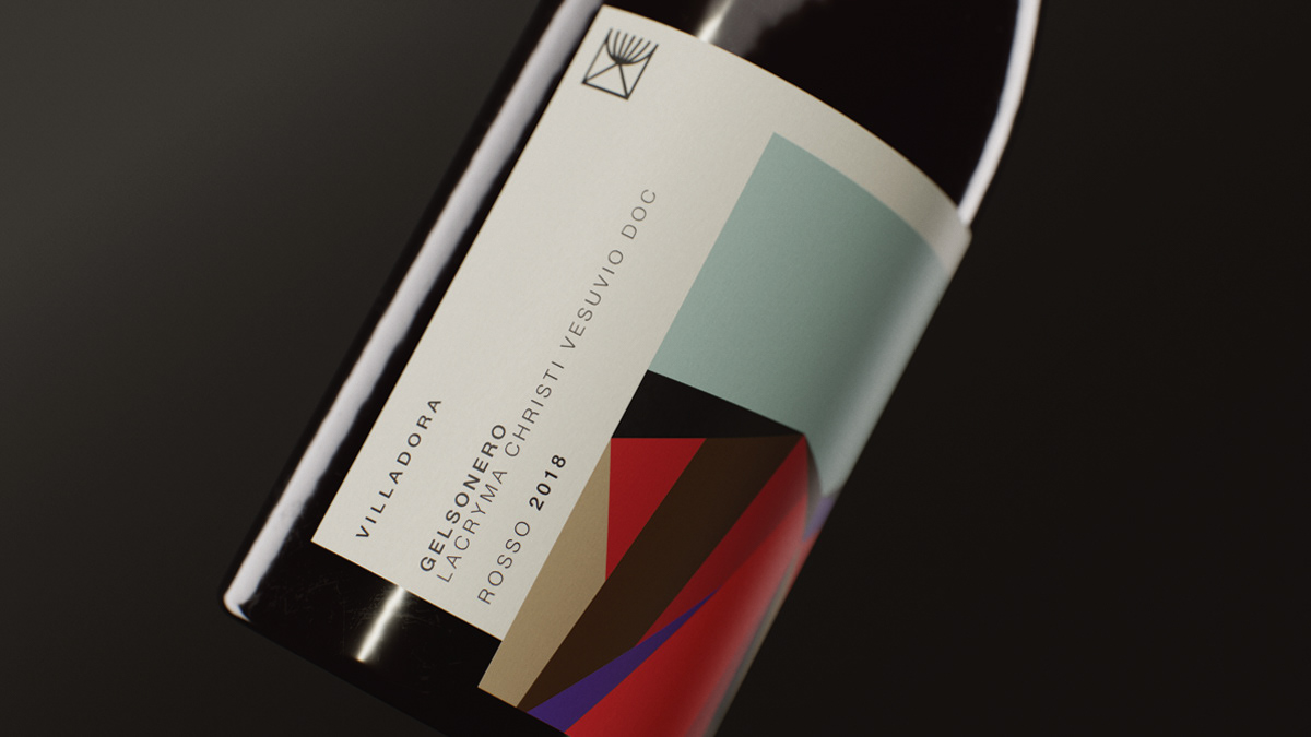

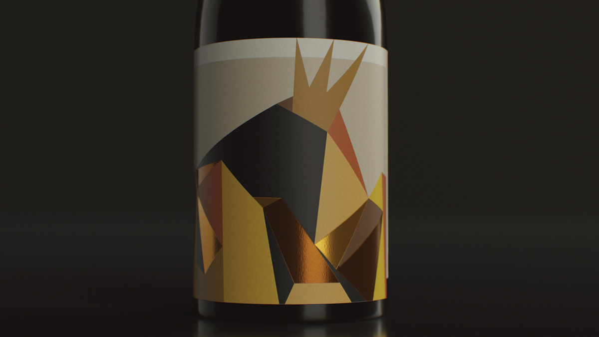
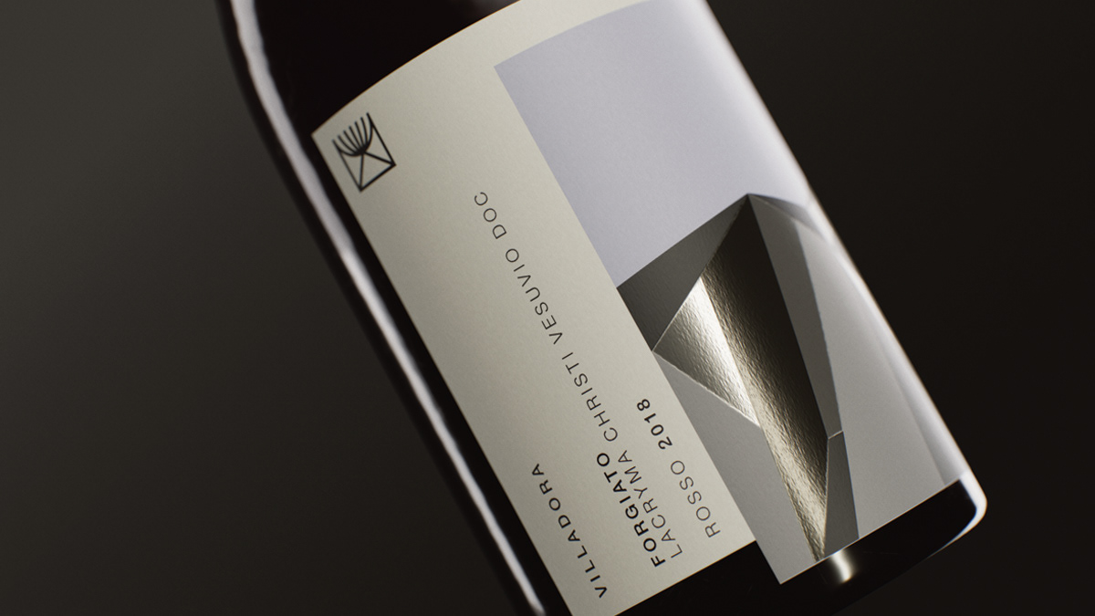

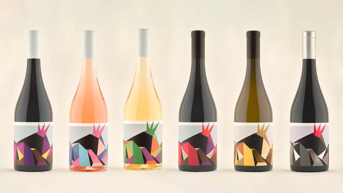
The project's reference to Futurism and the overall design are thought to visually communicate Avant guard, history, and sense of place. We staked on courageous colouring - using a different colour palette for each product, and printing techniques to render the material experience of the rocks. Hot gold or silver foil inserts play with the geometric figures and recall surfaces of the stones.
Printing techniques and paper: Self-adhesive paper Arconvert-Ritrama Picasso X-dry Fsc (95 g) Hot-foil stamping.
We hope that you like it, thank you!
www.njucomunicazione.com
www.njucomunicazione.com


