branding . graphic design . animation . broadcast
RTP Newscast Ident
Teaser
—
RTP [Rádio e Televisão de Portugal is the public service broadcasting organisation of Portugal and it operates four national television channels and three national radio stations, as well as several satellite and cable offerings] challenged us to develop a visual identity for every newscast program. A new identity to mirror the company's new strategy; forward-looking, dynamic, and youthful. It had to make the operators' daily routine easier and in line with the channel's visual identity.
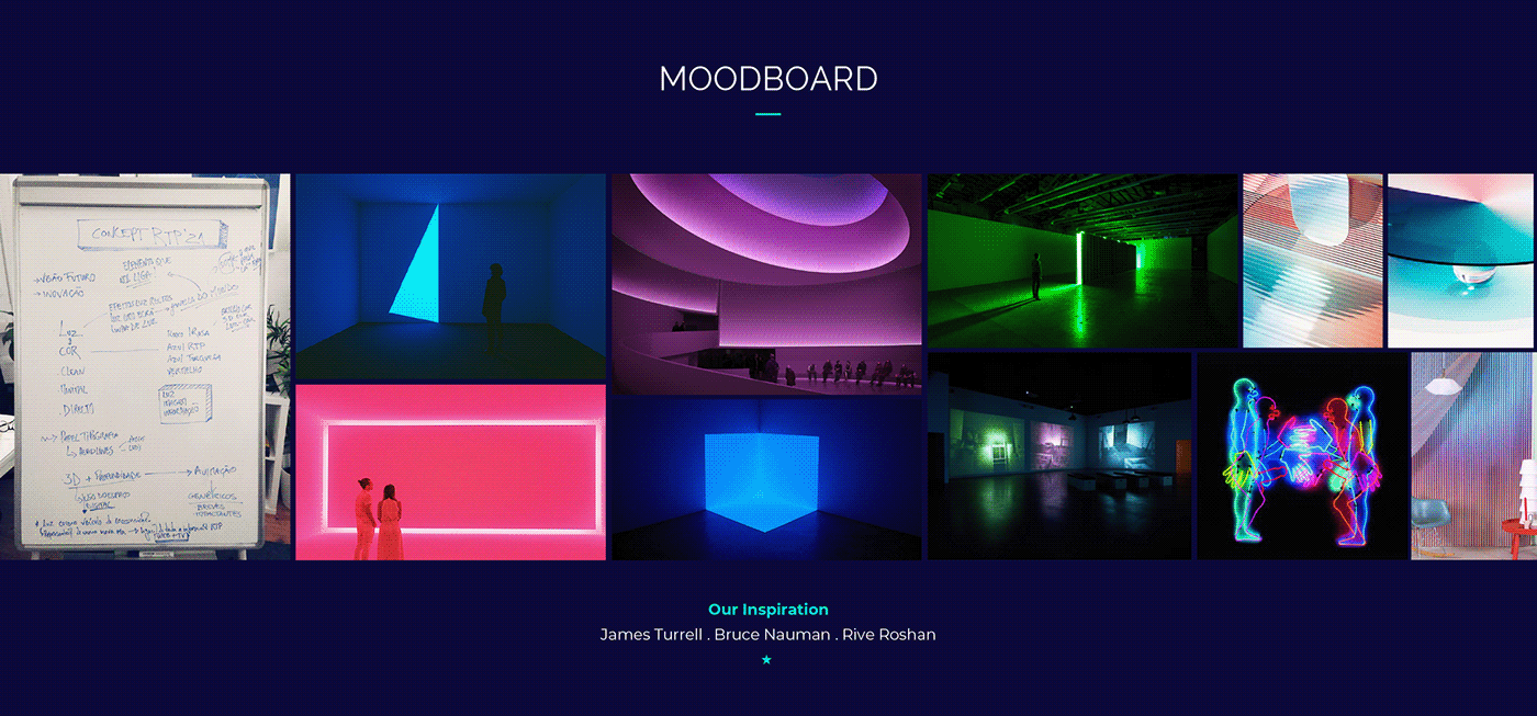
Light . Image . Information
These are the main pillars of our graphic identity. Light became a metaphor for a window to the world. A window in which the screen appears as an information vehicle. Which unfolds on the various digital platforms.
We chose to be daring along with strong and vibrant colours. An elegant, multifaceted sans serif typography. Adapted to all types of screens. Simple and straightforward layout infographics. Favouring adaptability to various formats. Sophisticated 3D work for the intros where light plays a leading role. The animations are fluid, organic, and captivating. They guide the viewer's attention along with the news narrative.
—
Directed by: Itsanashow Studio
RTP's Art Direction: Nicolau Tudela
Creative Direction: Ana F. Borges
Animation Direction: Ruben de Sousa
Project Manager: André Torres
Graphic Design: Ana F. Borges & Gonçalo Quinaz
2D Animation: Ruben de Sousa & Rudá Virginio
3D Artist & 3D Animation: Ruben de Sousa
RTP's Art Direction: Nicolau Tudela
Creative Direction: Ana F. Borges
Animation Direction: Ruben de Sousa
Project Manager: André Torres
Graphic Design: Ana F. Borges & Gonçalo Quinaz
2D Animation: Ruben de Sousa & Rudá Virginio
3D Artist & 3D Animation: Ruben de Sousa


