


If you still think that a serif font is a typeface with a strong historical character that difficult to apply in modern realities, meet the new typeface from TypeType!
TT Livret is an elegant, modern and functional serif font featuring a calm text and an expressive display subfamily.
TT Livret is an elegant, modern and functional serif font featuring a calm text and an expressive display subfamily.
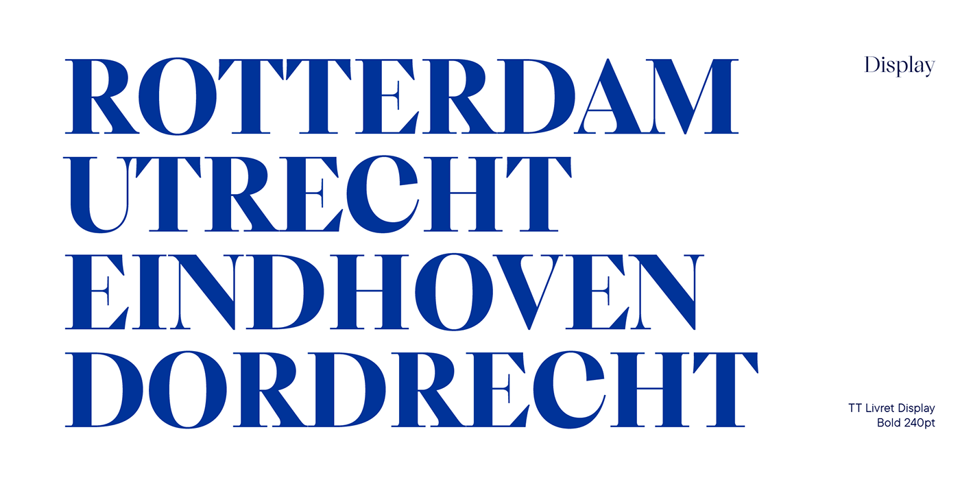
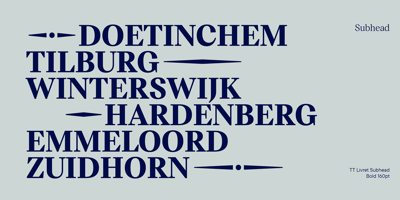
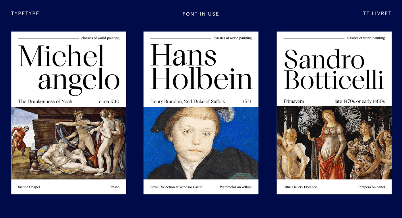
This font looks harmonious in books and other periodicals, on posters or on magazine covers. The scope is not limited to the printing industry, because TT Livret looks aesthetically pleasing wherever text is used.
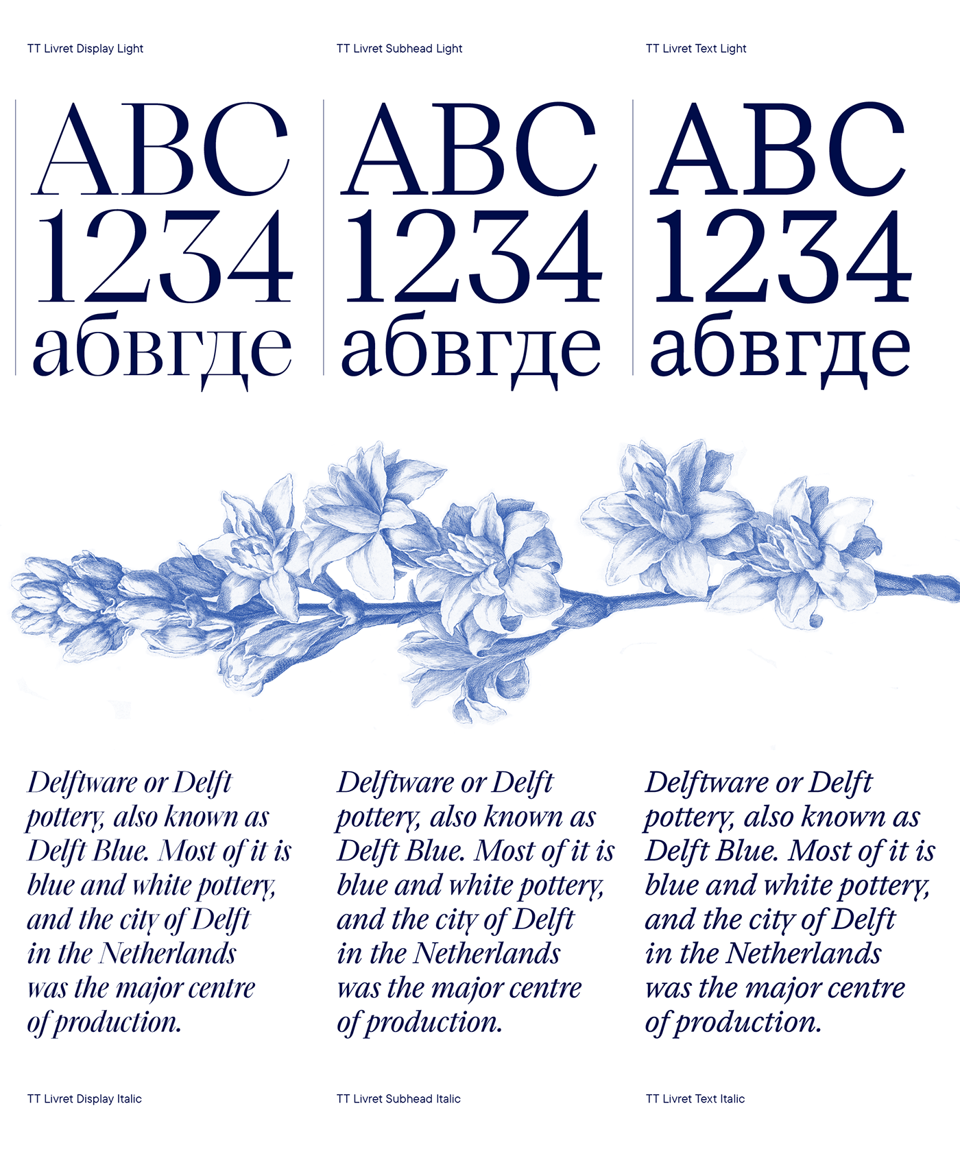
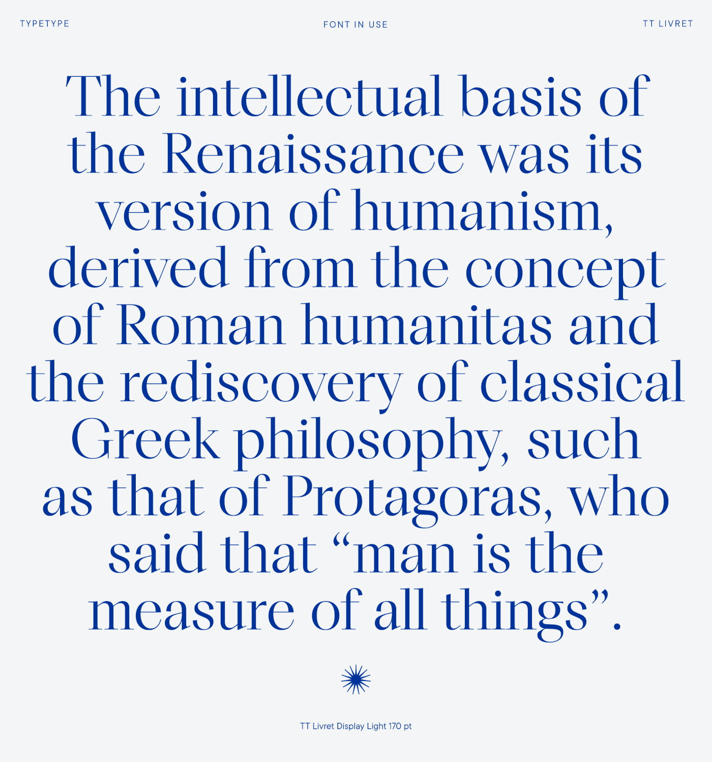
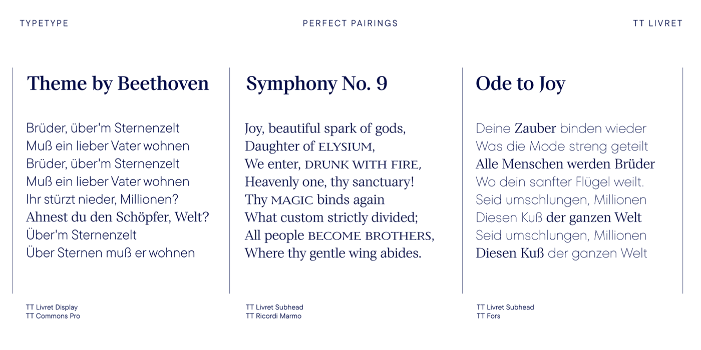
The text subfamily has uniwidth proportions and a calm spirit, oval round characters, free spacing and more open apertures. The glossy display subfamily is proportional and has round signs that are as close to a circle as possible, the apertures are closed, and the spacing is dense. The font has an intermediate subfamily - Subhead, which can look more relaxed when used as text font, or be contrasting and used as a display font.
In TT Livret, we have embodied the idea of a serif font that will be comfortable to use in modern realities. This is a functional font, where the text face does not distract from reading, and the display face, on the contrary, attracts attention.
The TT Livret font family consists of 32 faces: 15 upright, 15 oblique, and 2 variable fonts.
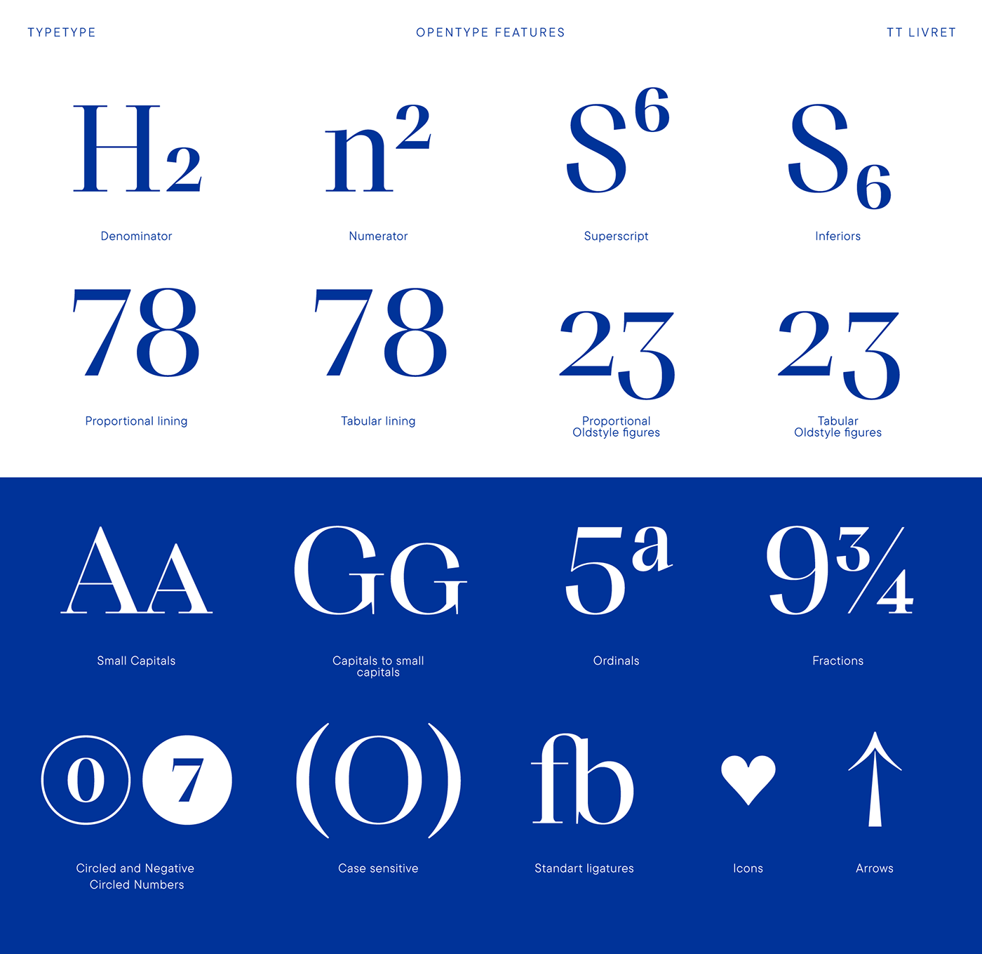
Each face has 1031 glyphs. The font contains 26 OpenType features, as well as a large number of ligatures. There are many alternative characters in italics, which are especially diverse in Cyrillic.

