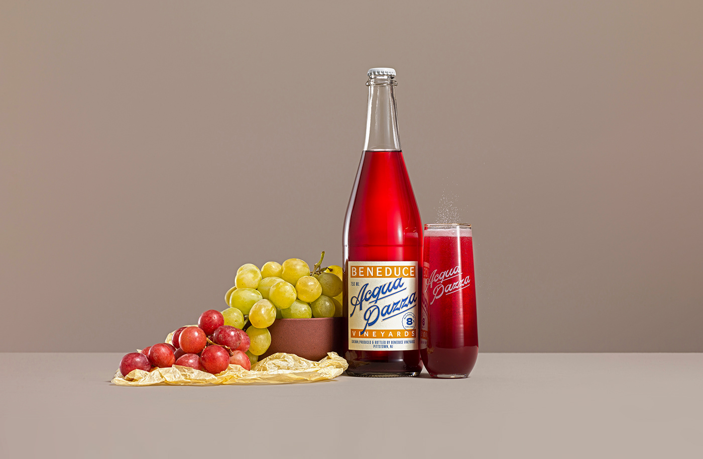
A term mostly used in Italian Cuisine; Acqua Pazza, translates to the English into "Crazy Water" — a small batch naturally fizzy wine made from rehydrated grape skins and wildflower honey from Pittstown, New Jersey. This project, sequels the Beneduce re-branding and re-packaging I did a few years ago and it was an opportunity to continue expanding their wine portfolio through the exploration of their Italian heritage.


This wine was first described to me as a Low-ABV Italian soda, tapping into the world of better-for-you drinks, and spiked seltzers. Aside from this category, I focused the design language on the heritage, with so many Italian components in the brief, I was certain the design should be influenced by the world of classic aperitivos and vintage Italian labels, so I did. Fruit wrappers, juice labels, soda bottles, among others, were in the mix of references, a world to express a drink that is meant to transport you to a fresh-air lake-side indulgent picnic.


Going through the pages of Louise Fili's Script Book, I found this label (1)— from which I extracted the typographic composition and the mix and match of fonts—a similarity I noticed in most products of this kind.
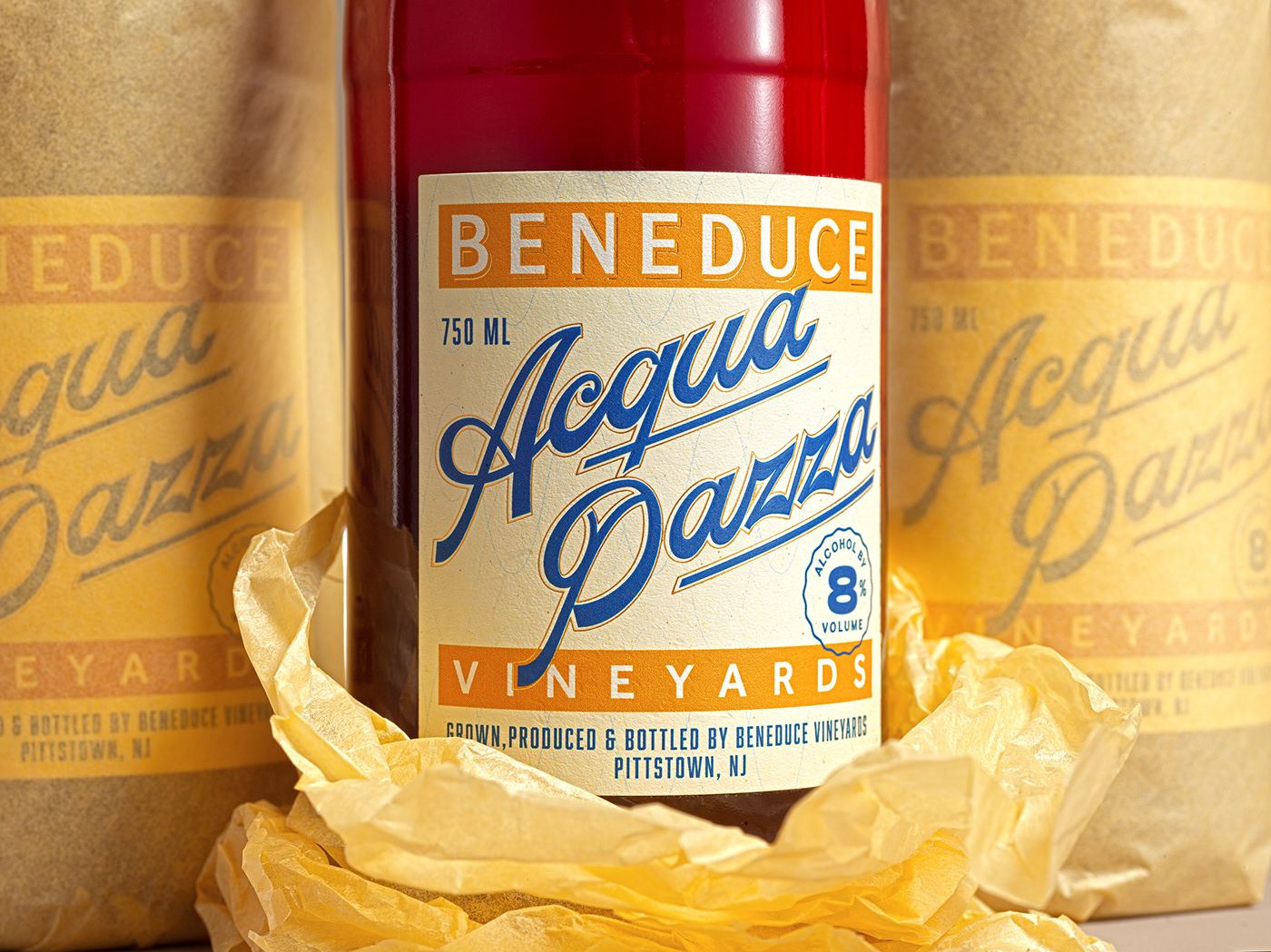
The re-hydrated grape skins as part of the recipes is something outstanding in the production and flavor profile of this wine, and I wanted this fact to inspire the paper choice. I found Fasson Citrus Touch (2) an uncoated, wood-free printing paper made from 15% by-product from juice production—a substrate to elegantly communicate the freshness and rusticity of the drink. Unfortunately, chilling would've distress the label, and we had to opt for another paper. The material inspired my design process through-out, and that's the reason I decided to include it here.
Early rough sketches and some notes (3), in which the only certain thing was the use of a script and the shape of the bottle. And lastly, an element of craft; a parchment wrapping paper as secondary packaging (4), a detail to exaggerate the freshness of the product as if it was a fruit on the market.

Rounded shapes in the scripted logotype are reminiscent of graphic water depictions, through an Italian-american style, which can be seen in the heavier bottom of the letters and the use of straight swooshes—elements that I also thought would add modernity to the classic-looking script.
The color palette of warm-yellows represents the wildflower honey touch from the recipe, refreshed through the use of blue in the wordmark, with some minor touches of gold in the shadows of the logo and the outline of the script—a combination that balances the vibrant color of the liquid.
The logo-positioning in the Beneduce classic and crafted series is an element that brought cohesiveness to the portfolio. Although, I ended-up breaking the rule and sacrificing that aspect since I considered more valuable the presence and the authenticity of this line; and the fact that this product could be treated as a stand-alone beverage.


