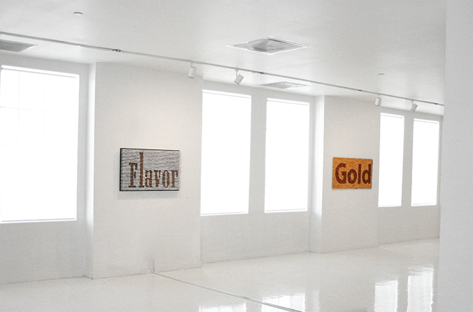
Gold is part of an installation series created to expose audiences to a particular idea through
the power of typography and demonstrate how it could communicate and represent outside of
the usual screen and print based forms.
the power of typography and demonstrate how it could communicate and represent outside of
the usual screen and print based forms.

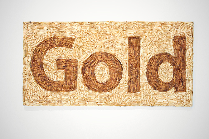
The word chosen gold has different meanings, it portrays the main color of the logo of this company, the color of the popular fries and it also portrays the associations made between the brand and society, especially the marketing campaigns which depicts this food as something very desirable, especially for kids, creating a society with really bad eating habits that have lead to an obesity problem.
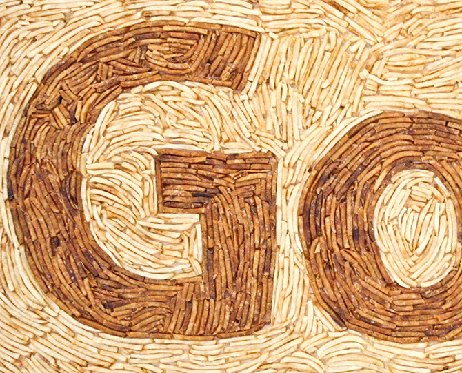
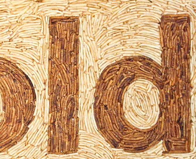
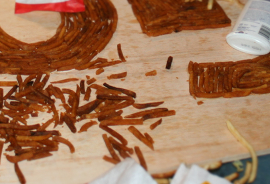
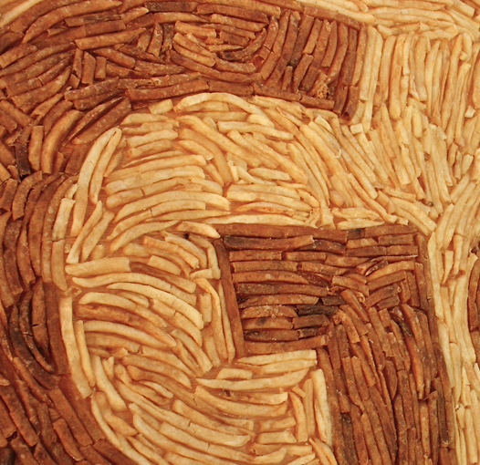
Gold is a piece that criticizes a very popular fast food company and its contribution to the obesity problem facing our society today. The piece was created by using the popular golden French fries.