WM Hotel
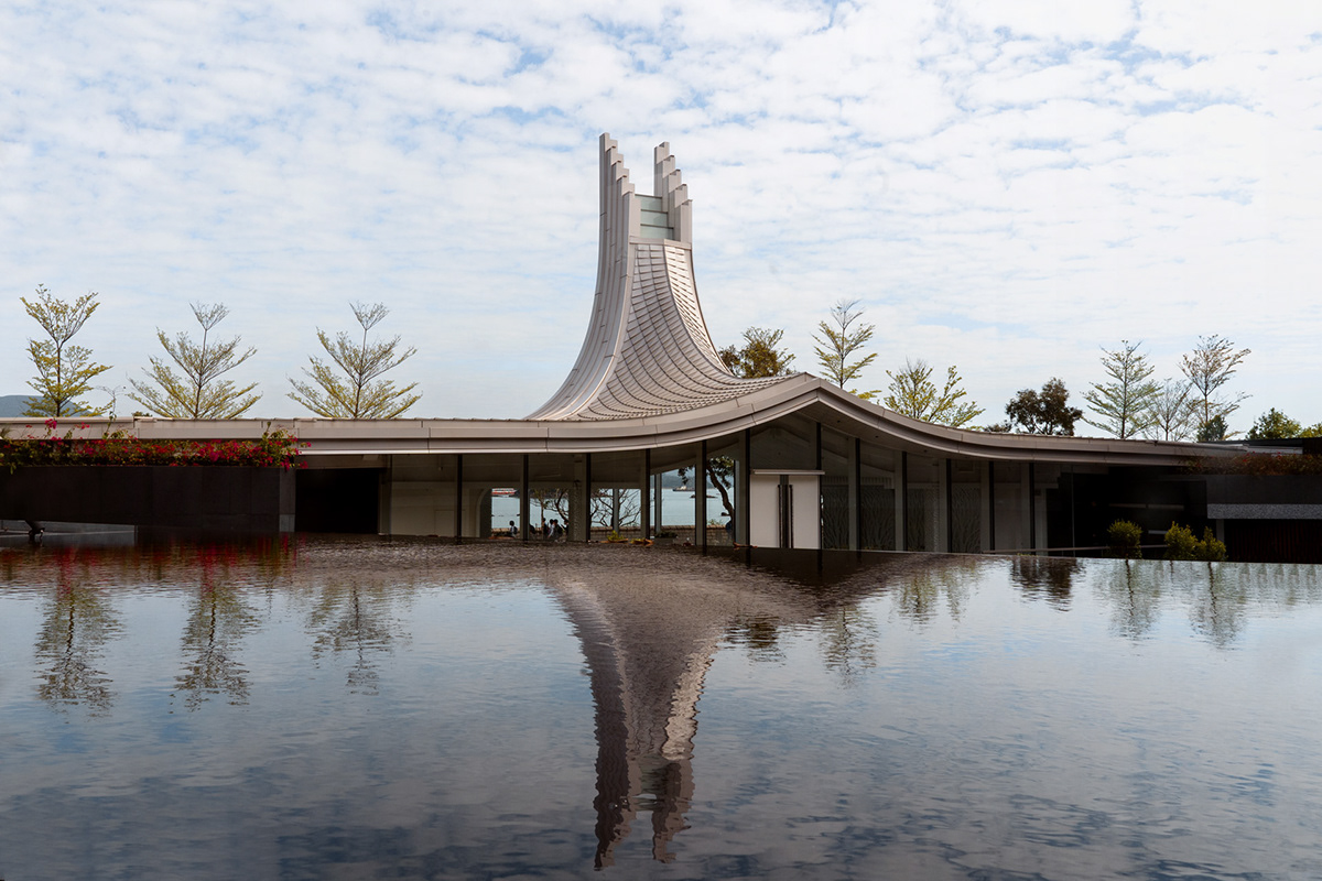
Located in the quaint sanctuary of Sai Kung, WM Hotel sits amongst the expansive seascapes and rolling mountainous ranges treasured against the usual bustle of Hong Kong. Endowed with the lush abundance of nature, WM Hotel offers the promise of serenity and relaxation defined by its fine hospitality.
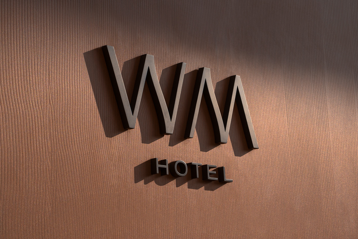
The naming was formulated by us to illuminate the notability of location, an acronym of Wai Man Road where the hotel is situated alludes back to both its distinct architectural form and neighbouring waves of the seaside. The acronym name is also expanded into an interchangeable tagline system that can be adapted to the contents and needs of the hotel.
The naming was formulated by us to illuminate the notability of location, an acronym of Wai Man Road where the hotel is situated alludes back to both its distinct architectural form and neighbouring waves of the seaside. The acronym name is also expanded into an interchangeable tagline system that can be adapted to the contents and needs of the hotel.
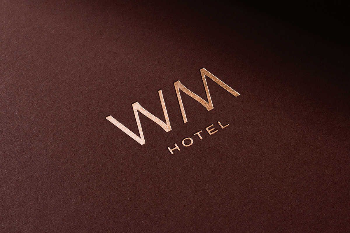
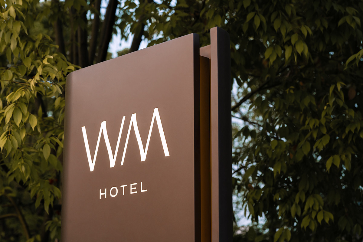
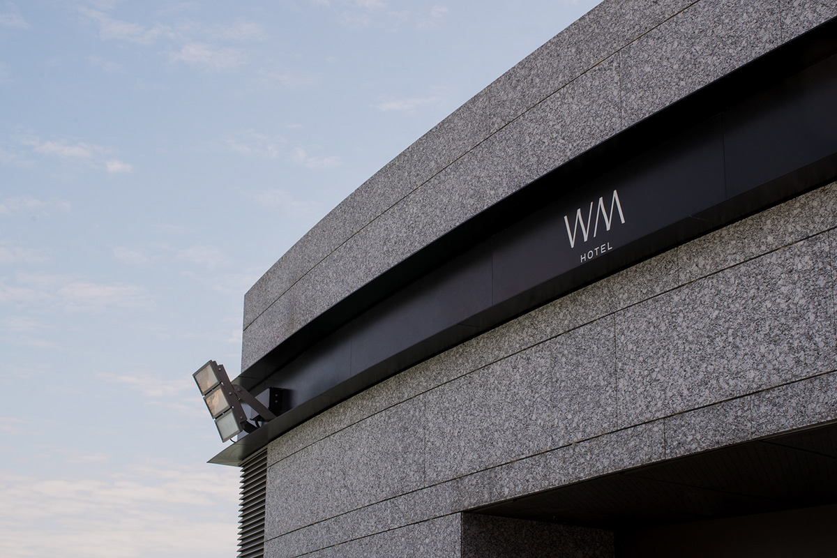
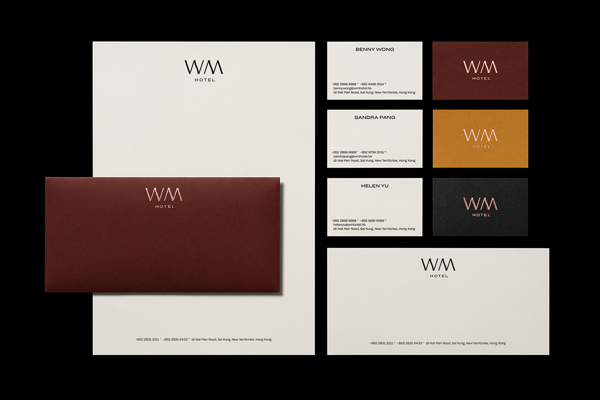
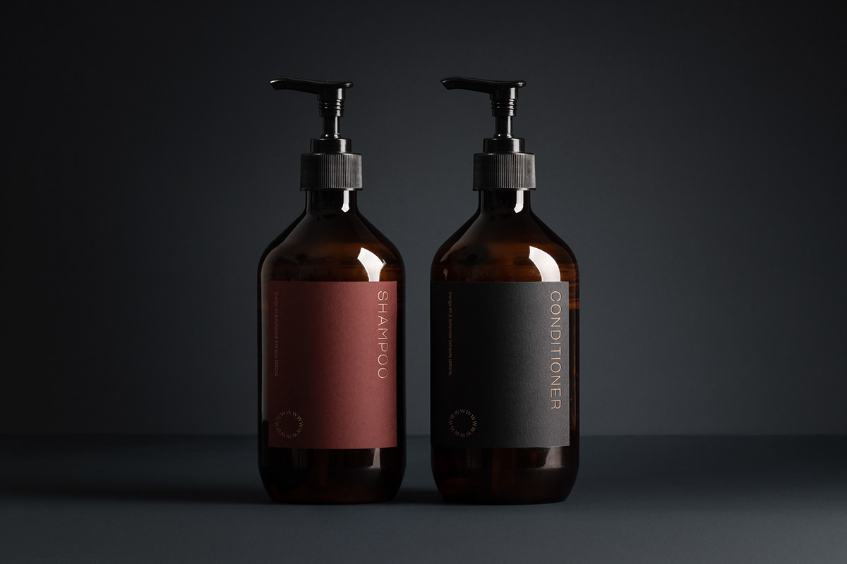
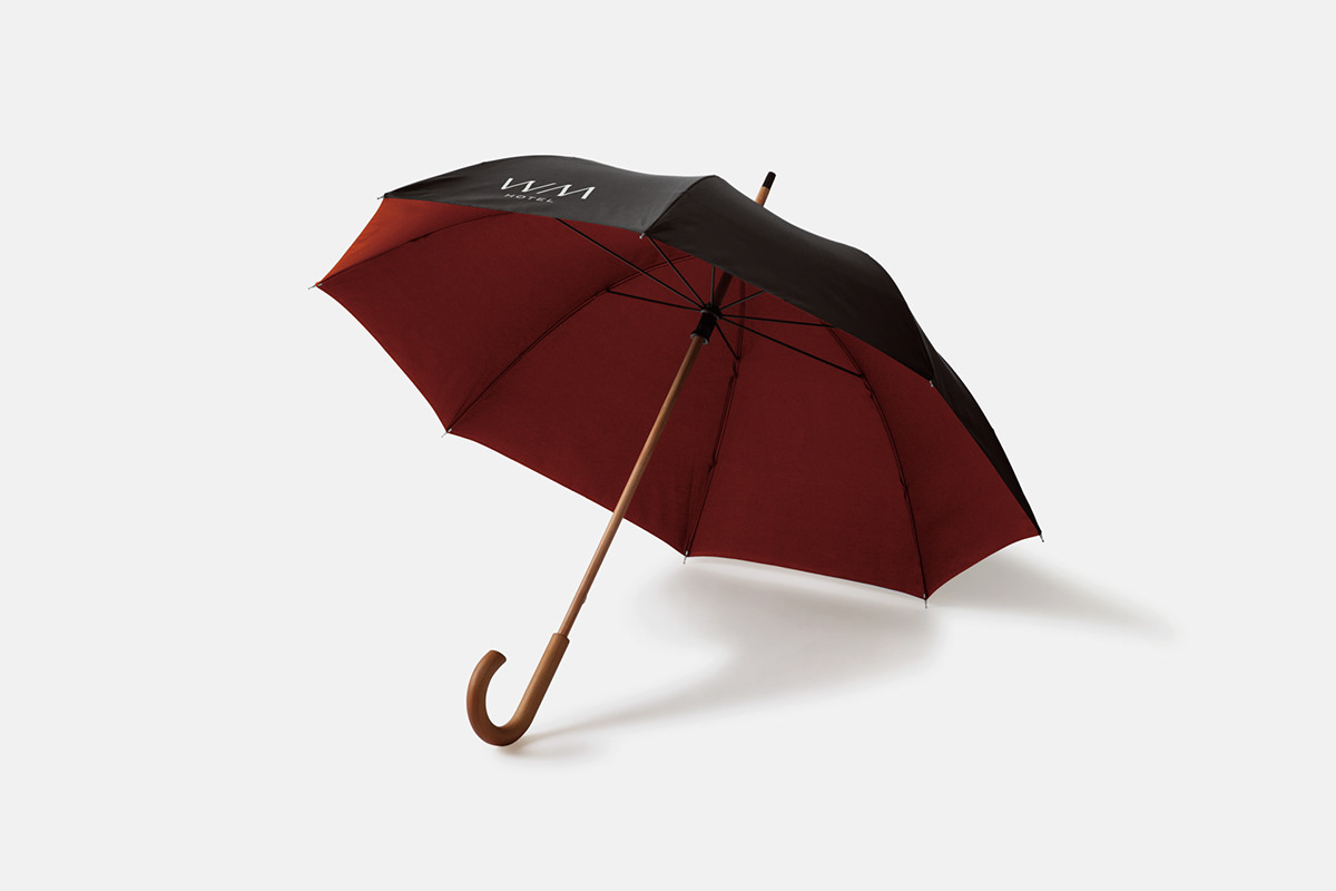
An exercise in subtlety, the identity is defined by a logo of distinct letterforms accented by soft wave details, truly embracing the essence of the name. Brand colours reflect the hotel architecture and gentle natural surroundings for a complete immersive experience. Together, the brand identity works across print, packaging, digital and signage to create an intimate and restful atmosphere that transports visitors away into a paradise of nature.


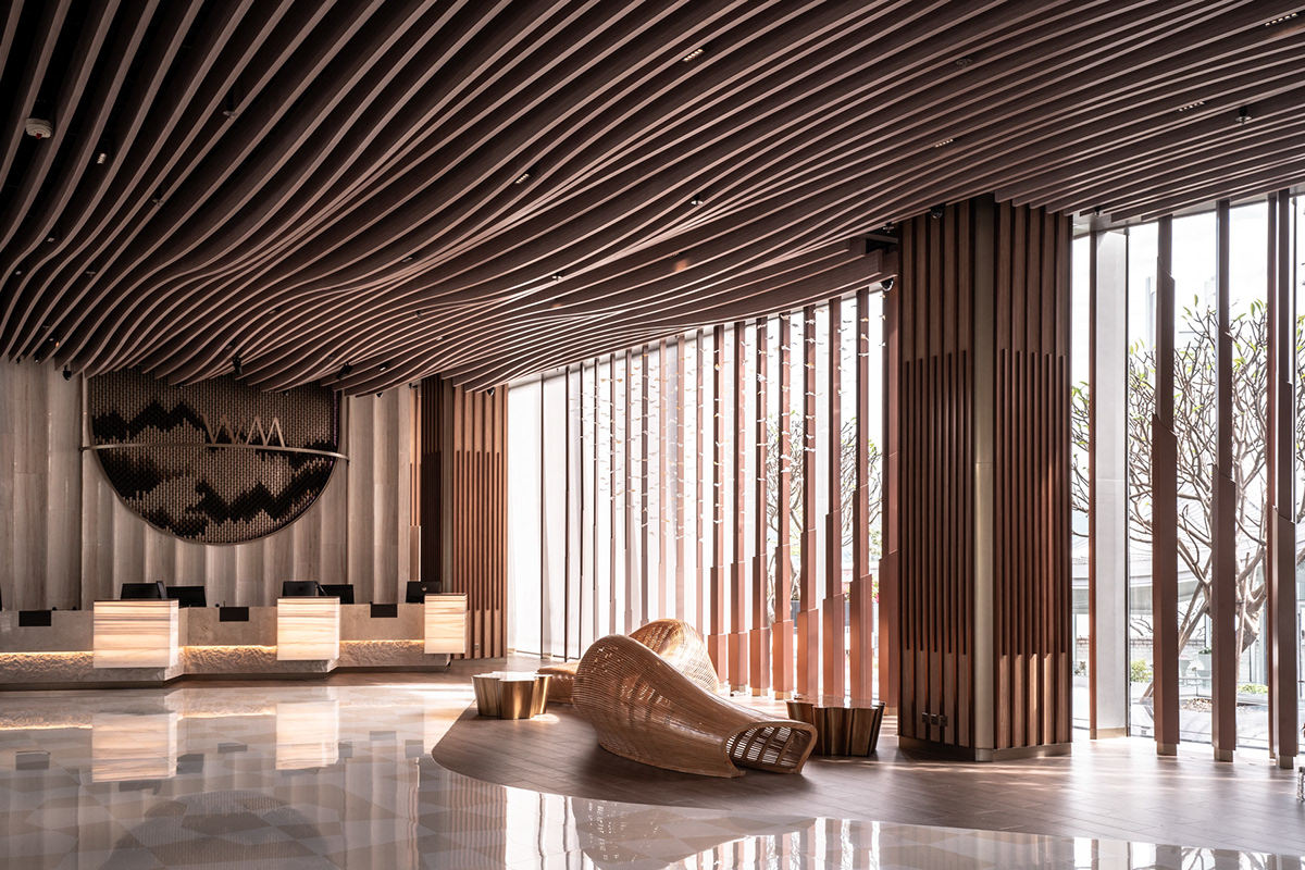


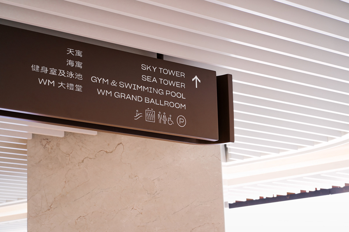
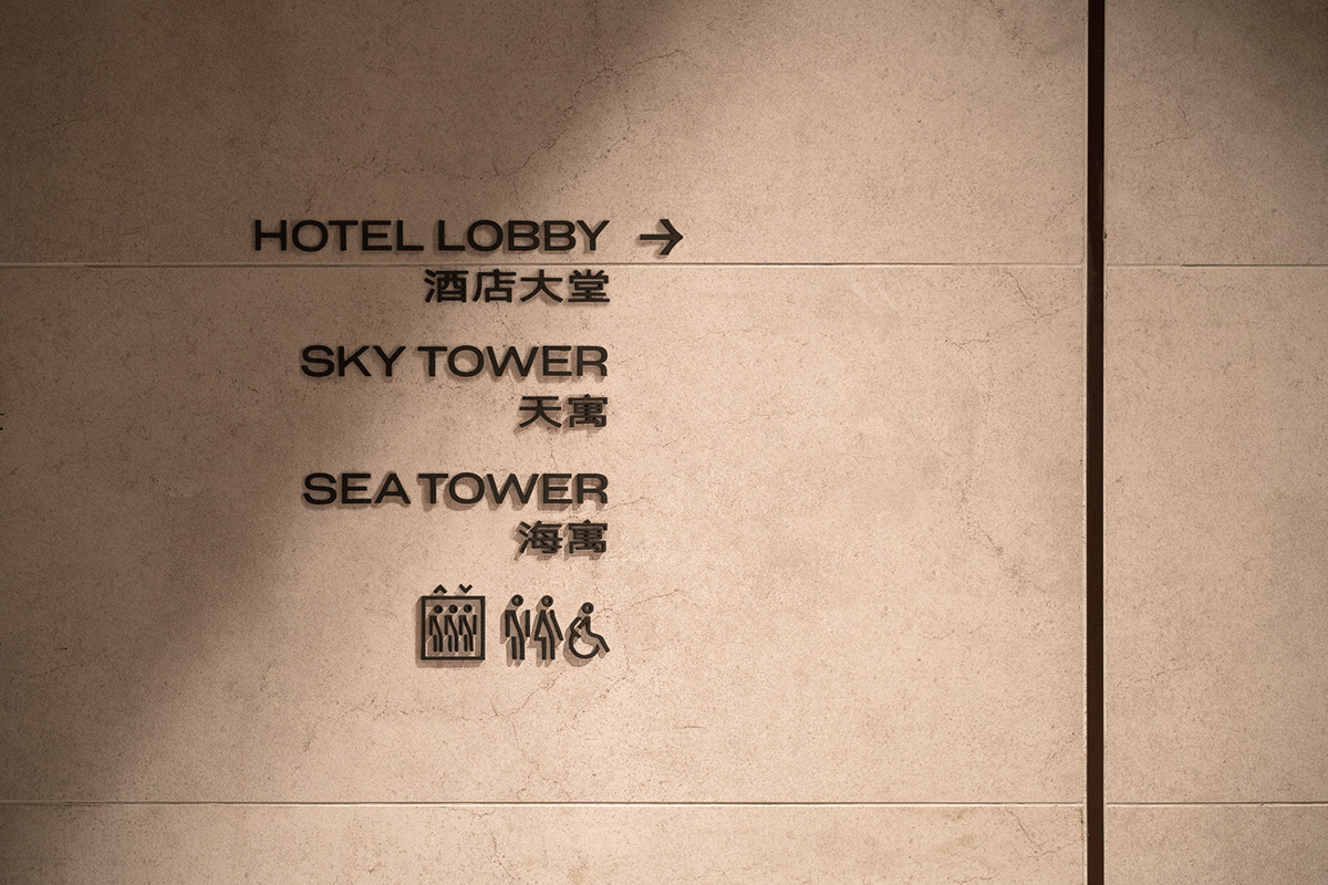
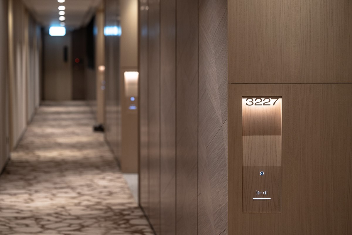
The signage system is devised with refined details that draw from motions of the waves to harmonise with the landscape whilst providing ease of navigation. An additional set of icons are designed to fit the needs of the hotel, also influenced from the wave elements of the logo.