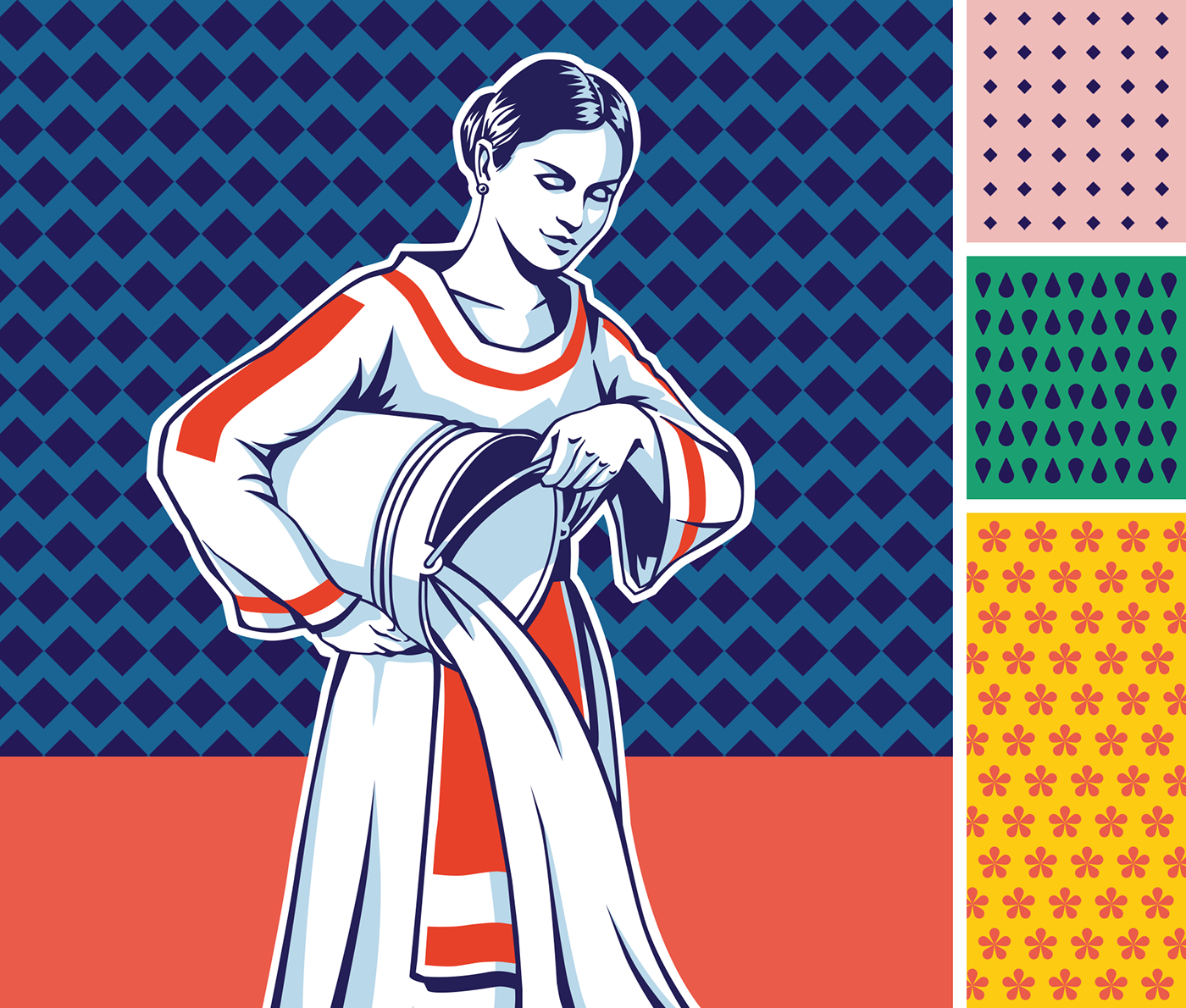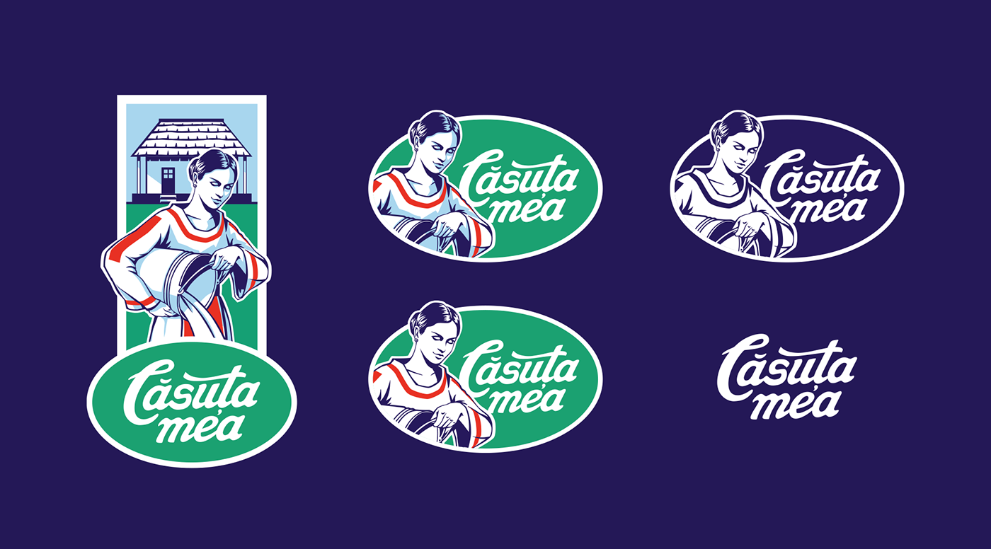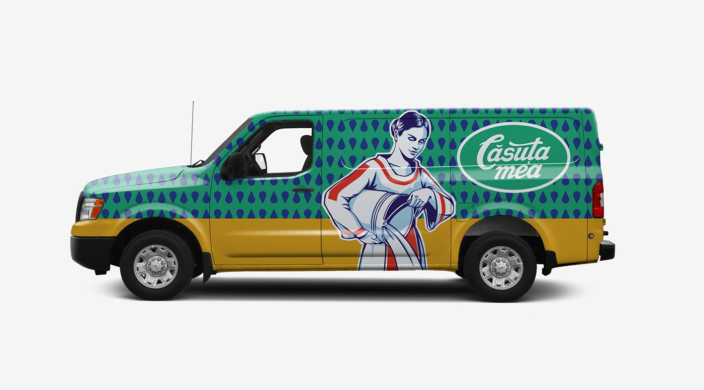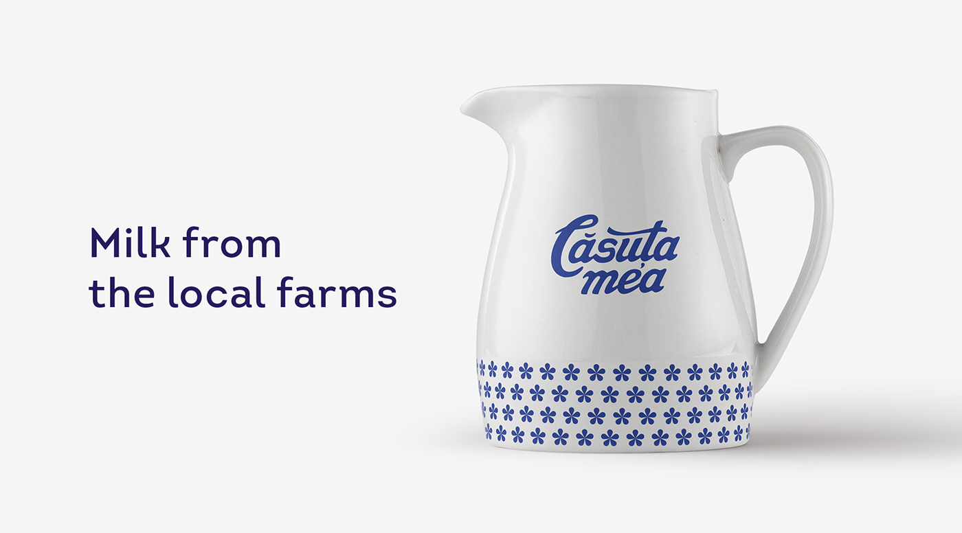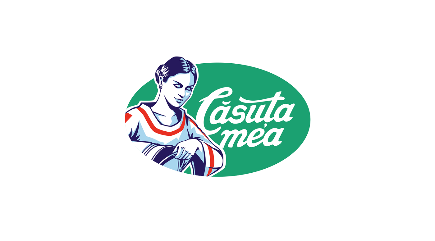
"Casuta mea" is a well known local dairy brand. They needed to jumpstart their visual presence on the shelves. Our first move, after getting deep into the problem, was to rethink the graphic elements following the brand strategy. The logo was the most visible thing thing to be changed. Keeping the general idea, we developed a new illustration, the lettering, the colour charts. We proposed even a pattern system that would accompany the logo.
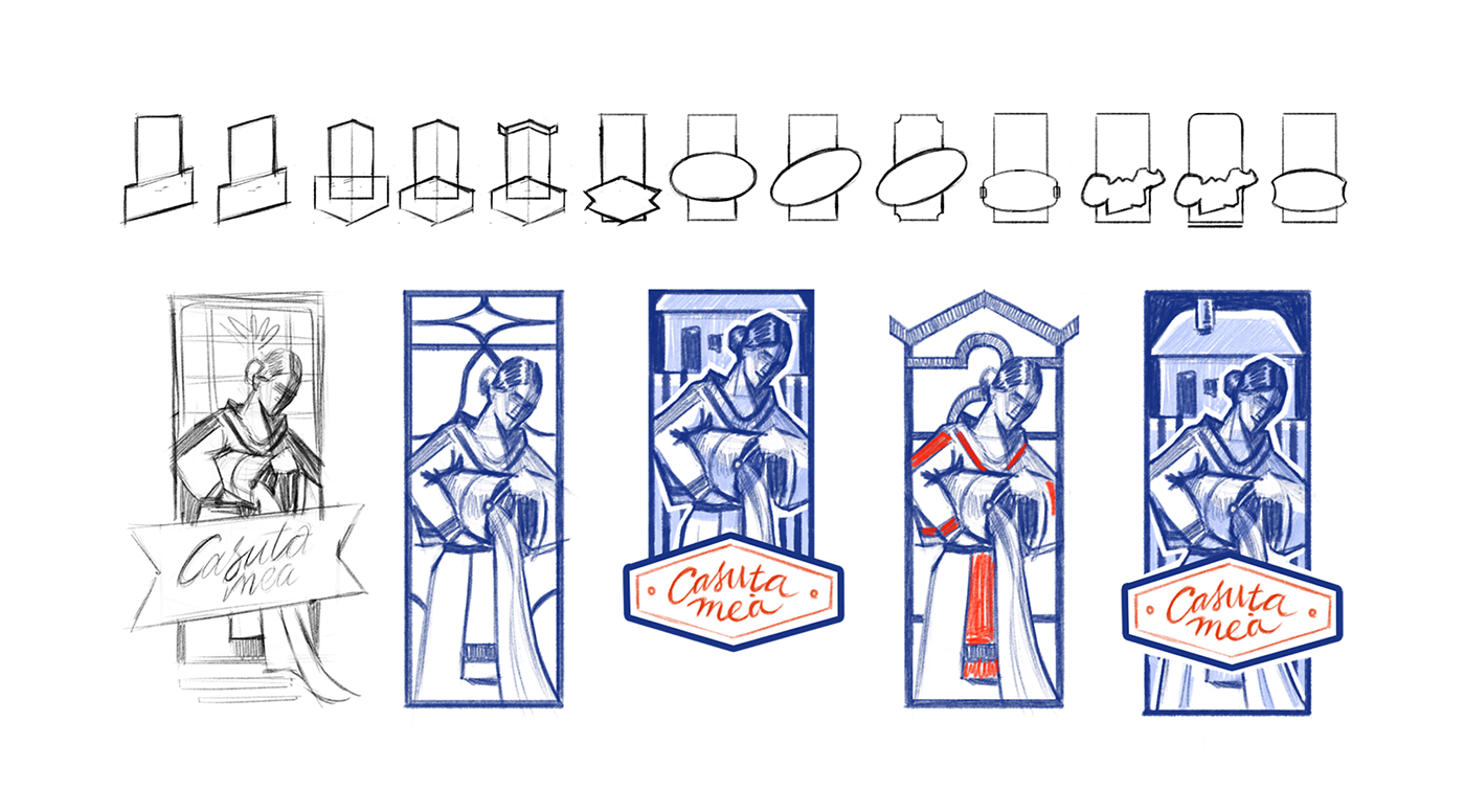
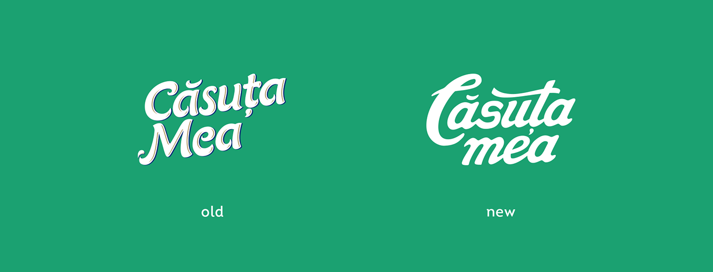
The illustration was made in the style of the 70s cutout graphics that we find appropriate for a local East-European brand that has tradition as one of its core values. The new lettering has its rounded milk-panted lines. Also, we developed a system of patterns, that would work well in communication.