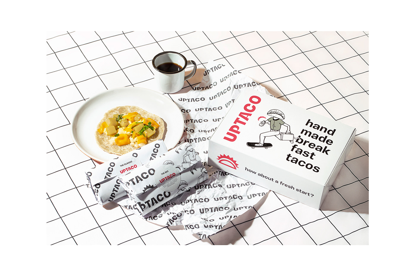
Uptaco NYC
strategy, verbal, illustration & brand
New York, USA
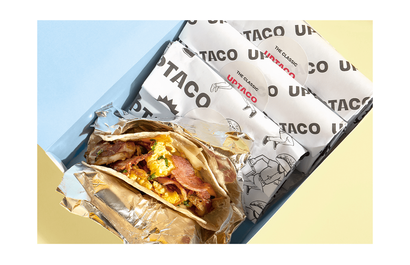
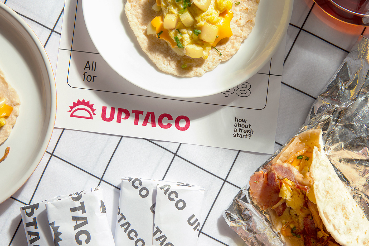
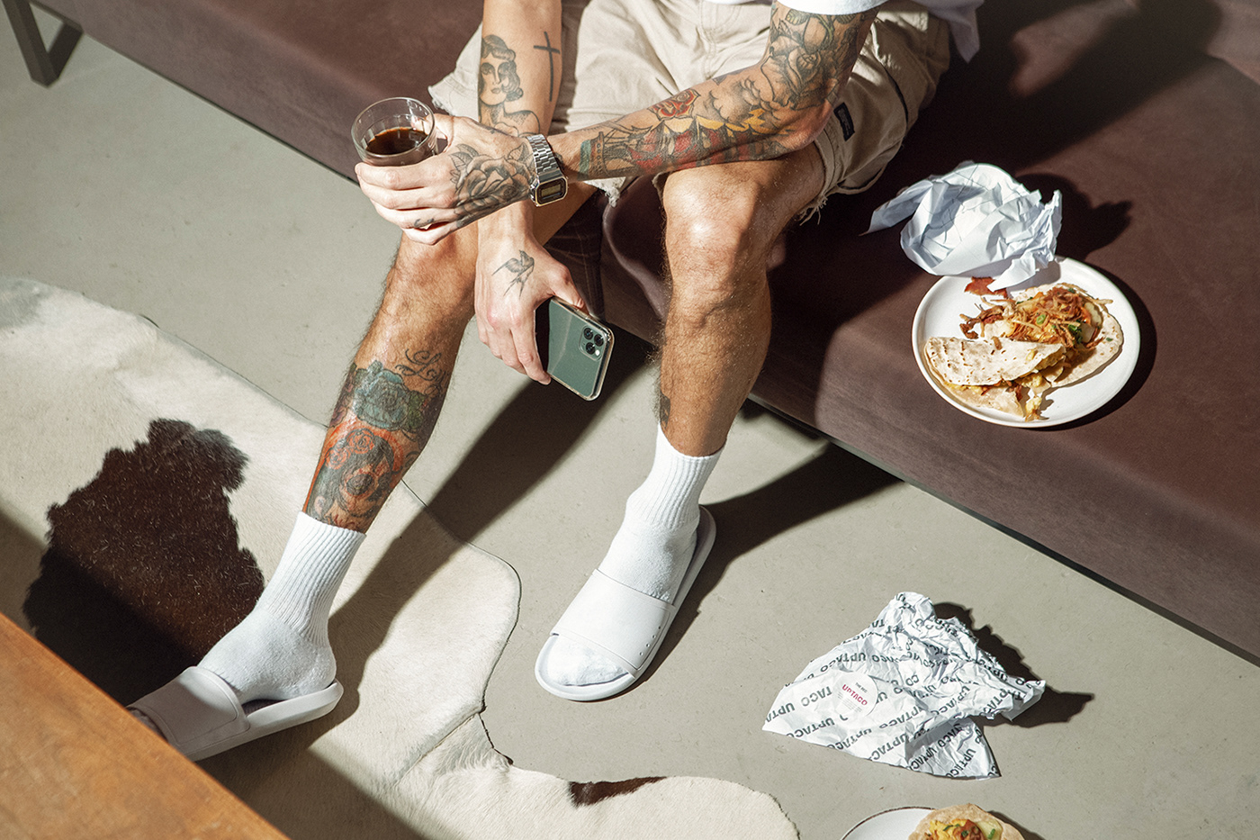
Uptaco is a handmade breakfast tacos brand located in New York City. Created by Dan & Derek, two childhood friends, the company spotted in the New York market the opportunity to bring something different, fresh, and tasty to the breakfast of the city. The inspiration comes from the recipes of Texan tacos, a little different from the well-known Mexican tacos and reinvented by Chef Derek, with different ingredients.
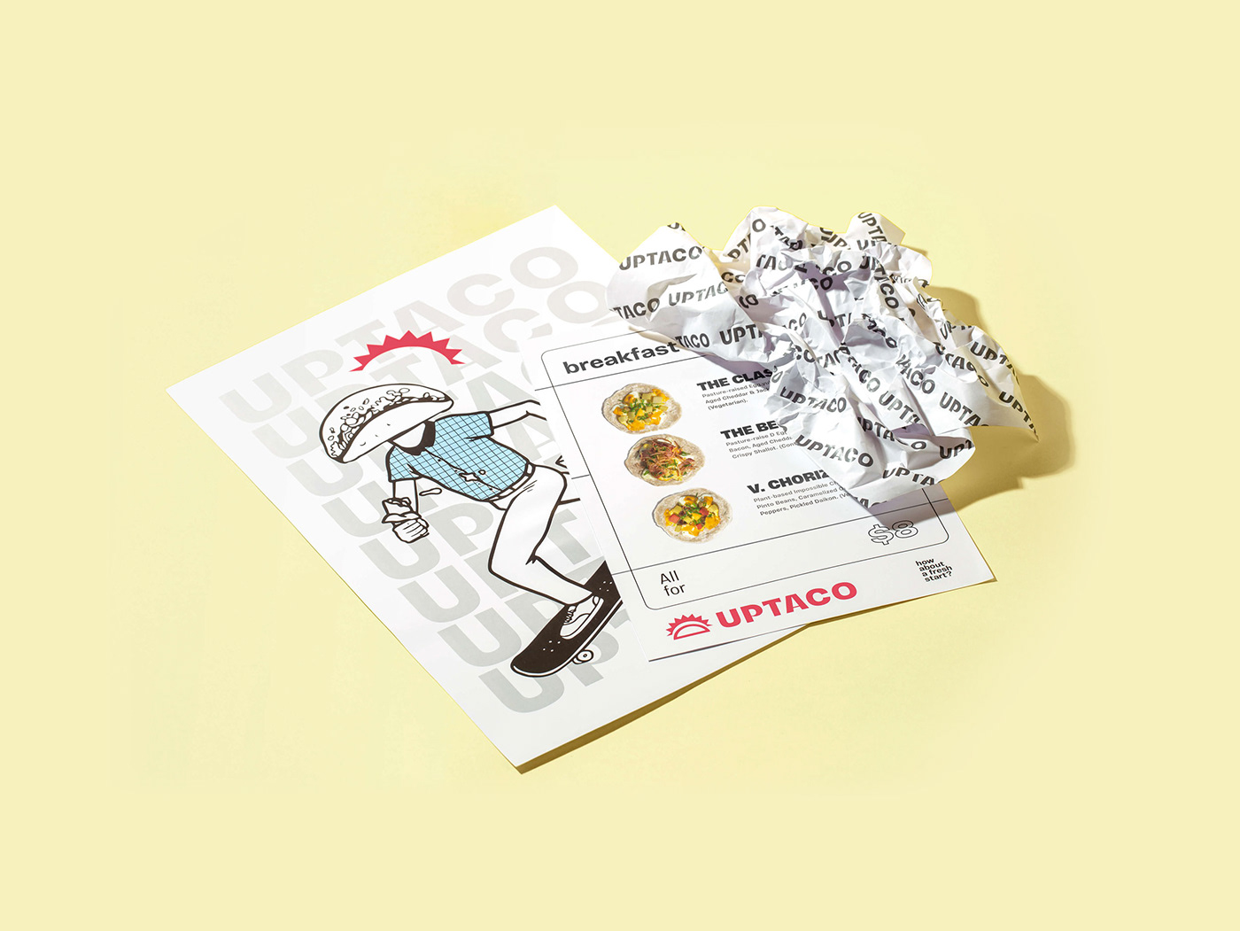
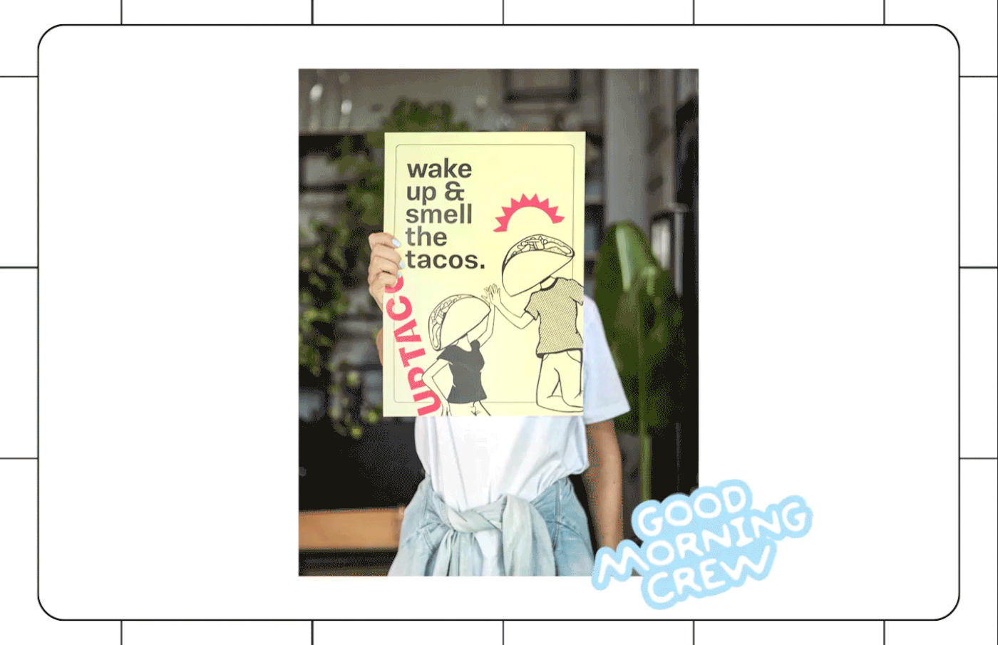
The briefing asked for a provocative yet simple and direct attitude that would work in coffee shops and restaurants but that could also be taken to groceries stores in the future. Considering a young and diverse audience, the creative process inspired by the tagline “How about a fresh start?” brings a series of connected elements to communicate the brand’s personality.
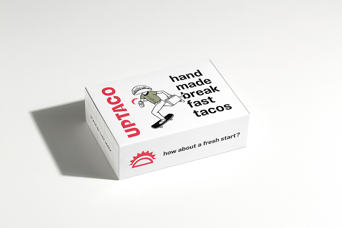
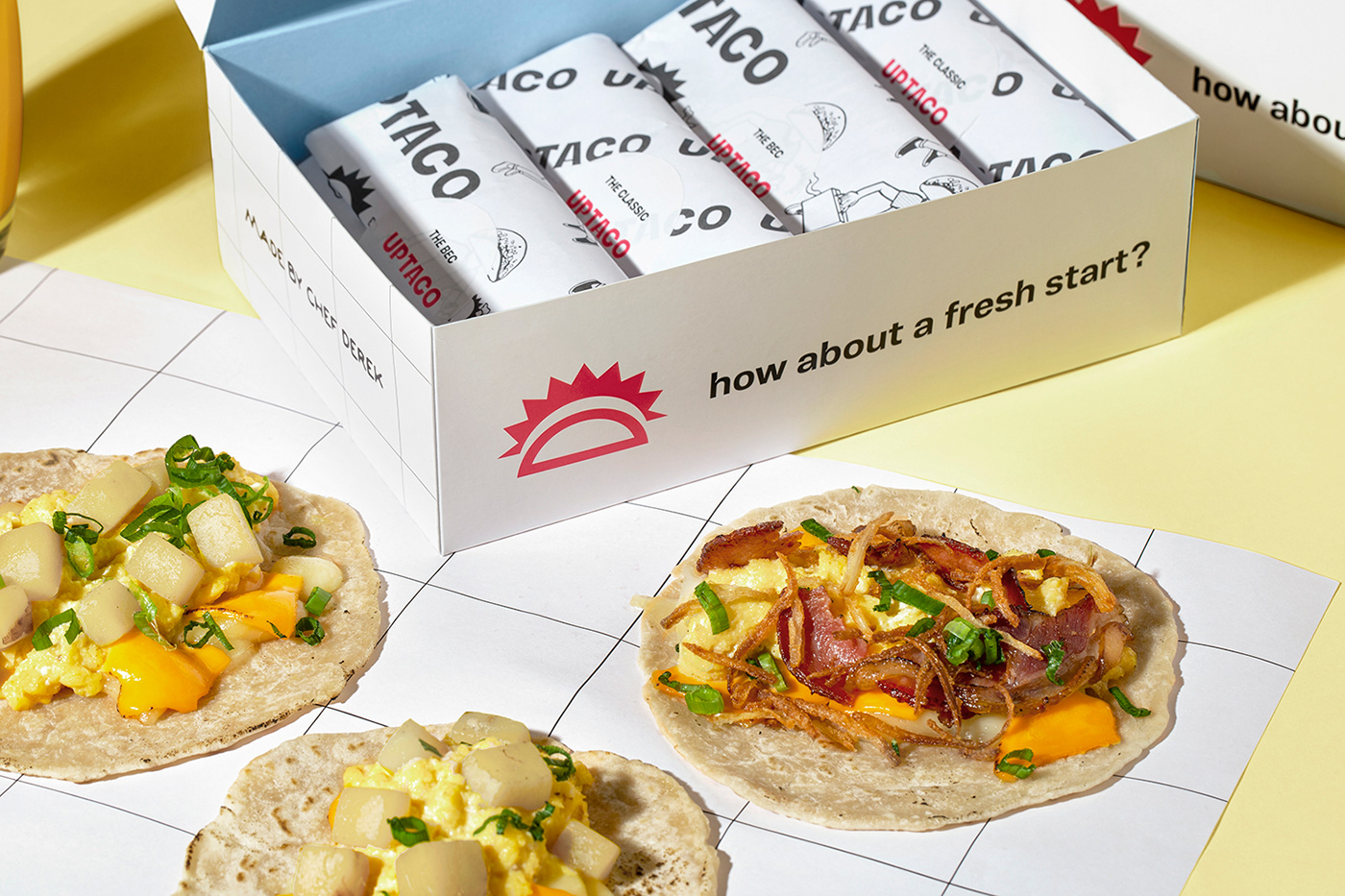
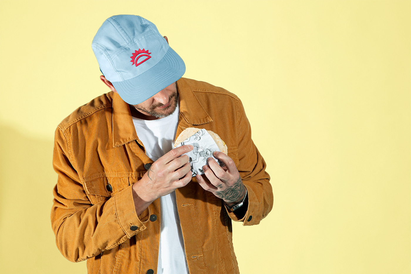
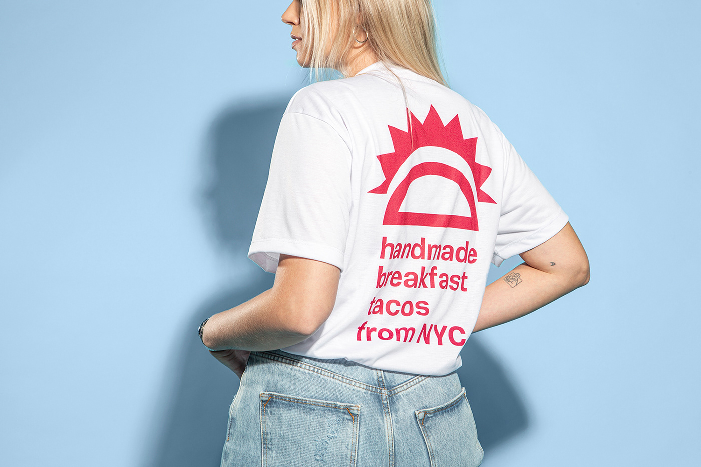
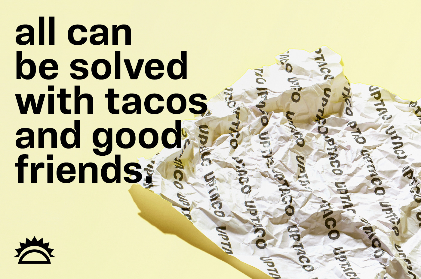
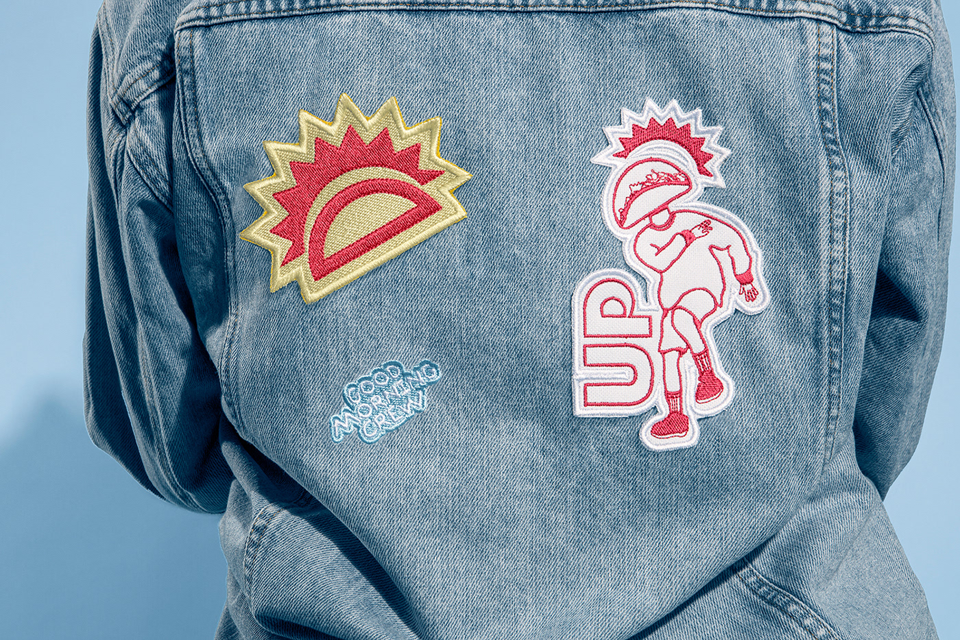
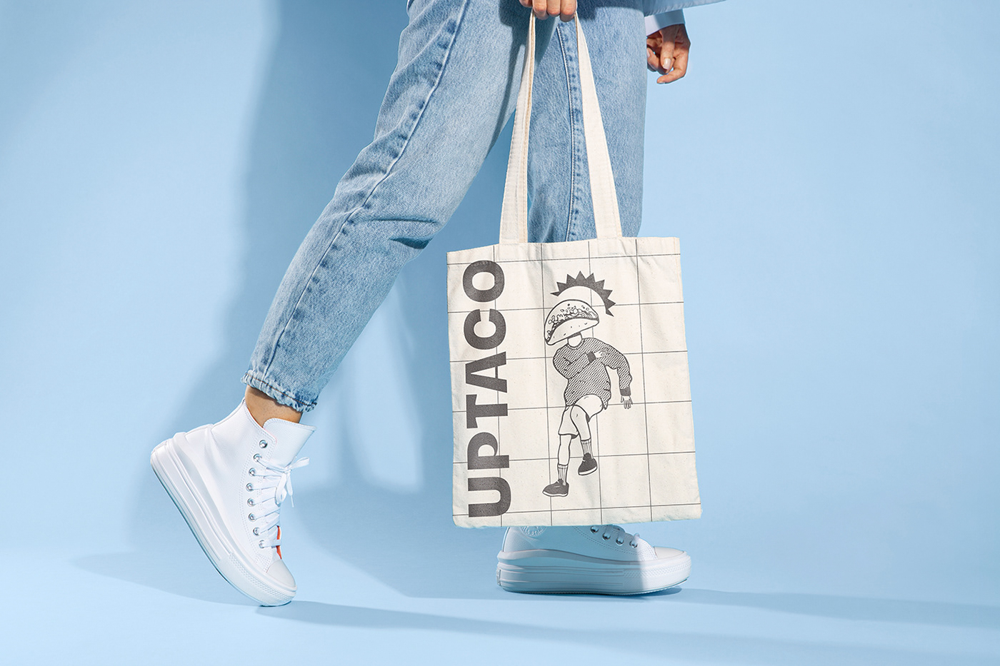
First, the breakfast-inspired colors. The blue refers to the sky and the freshness of the food. The light yellow refers to the morning sun and classic ingredients like cheese and eggs. The green brings natural ingredients to mind, and the red is the legacy of the old brand. The types used were modified from the manual movements made to make the Taco tortillas. The symbol comes from the Taco shape, mixed with a rising and vibrant sun. The brand platform leaves the common place of Tacos universe, using white color and a modern and direct typography. The illustrations have a hint of fun that states that having tacos for breakfast is a different way to start the day, uplifting the public’s state of mind.


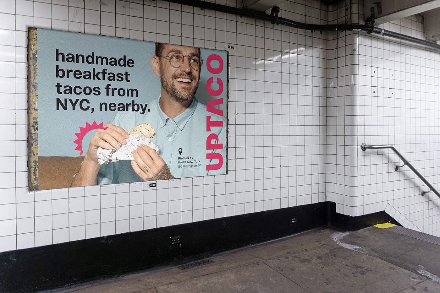
The context explores clean and objective communication, as demanded by a city with abundance of information. The result is a simple yet unusual platform that provokes the perception of: How about a different breakfast?