


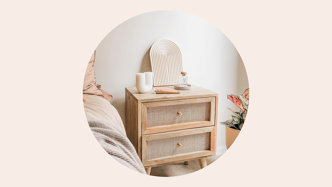
Handcrafted pieces, inspired by home
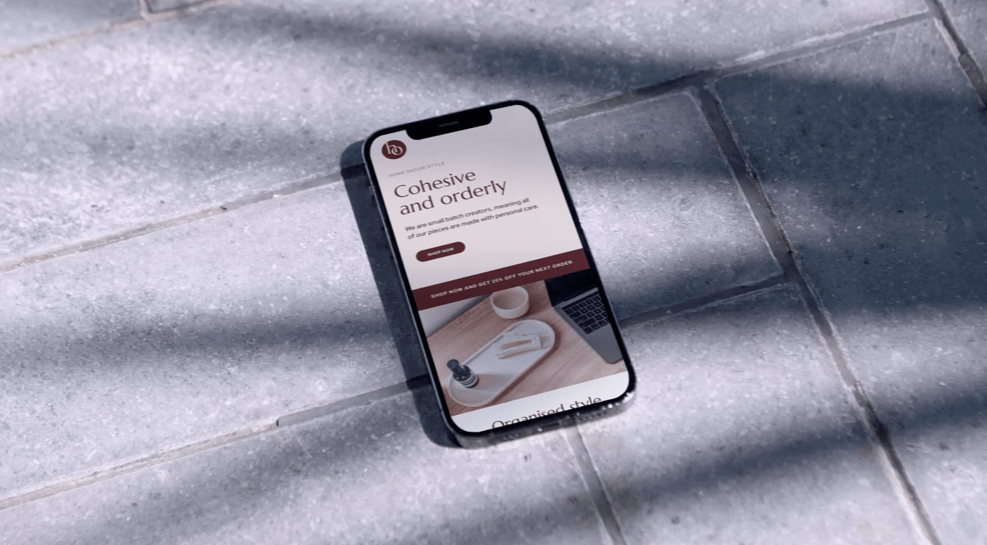
Home Orderly seeks to create harmony and balance by creating simplistic homewares designed to hold life's bits and pieces. Sustainably made, these eco-friendly trays are the perfect accompaniment for any item and are designed to seamlessly fit into any home. An important factor of the brand was to encapsulate the warm and cozy feeling that only being at home can give us. By using a colour palette that was complementary and subtle, the idea is to create a sense of peace and harmony, not just with the brand but all the elements that will interact with it – both from the internal and external environments.


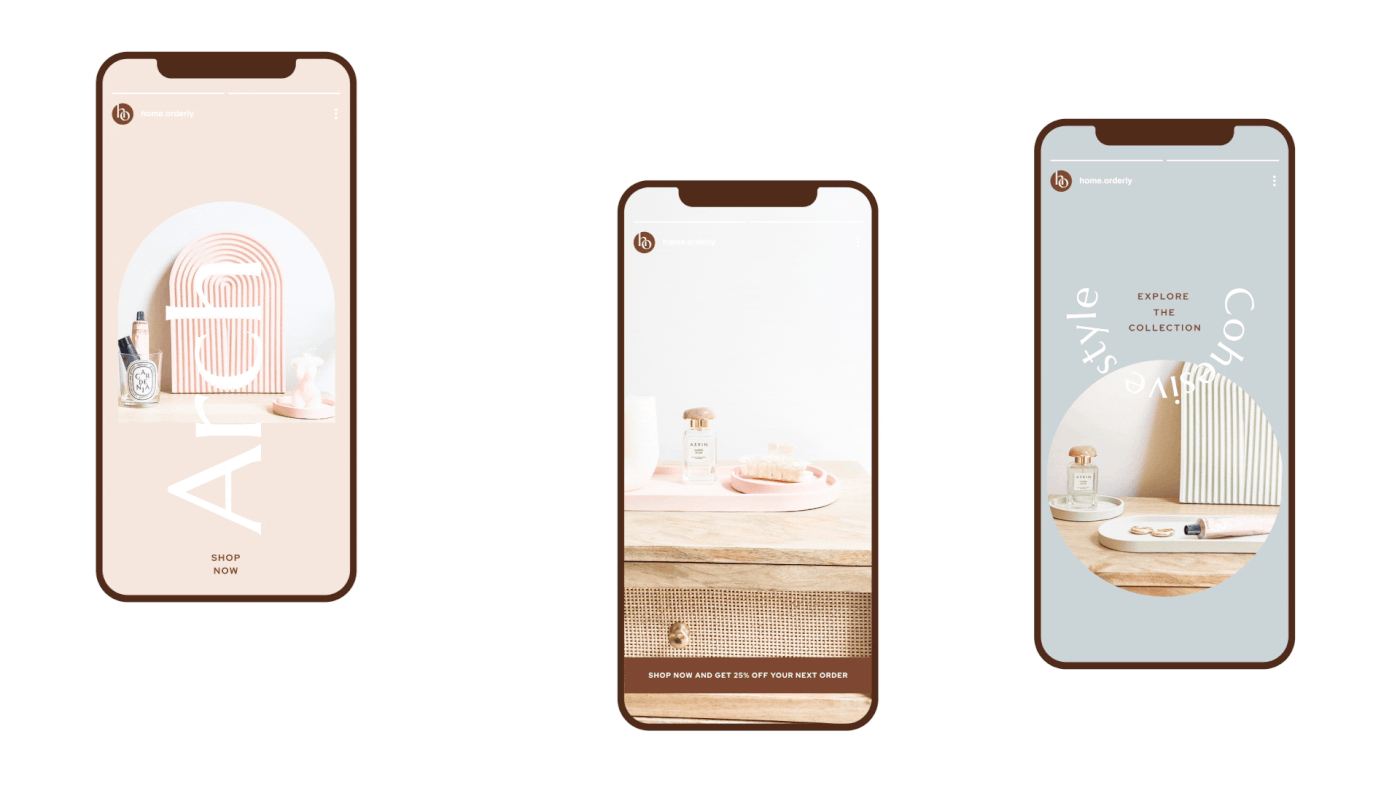
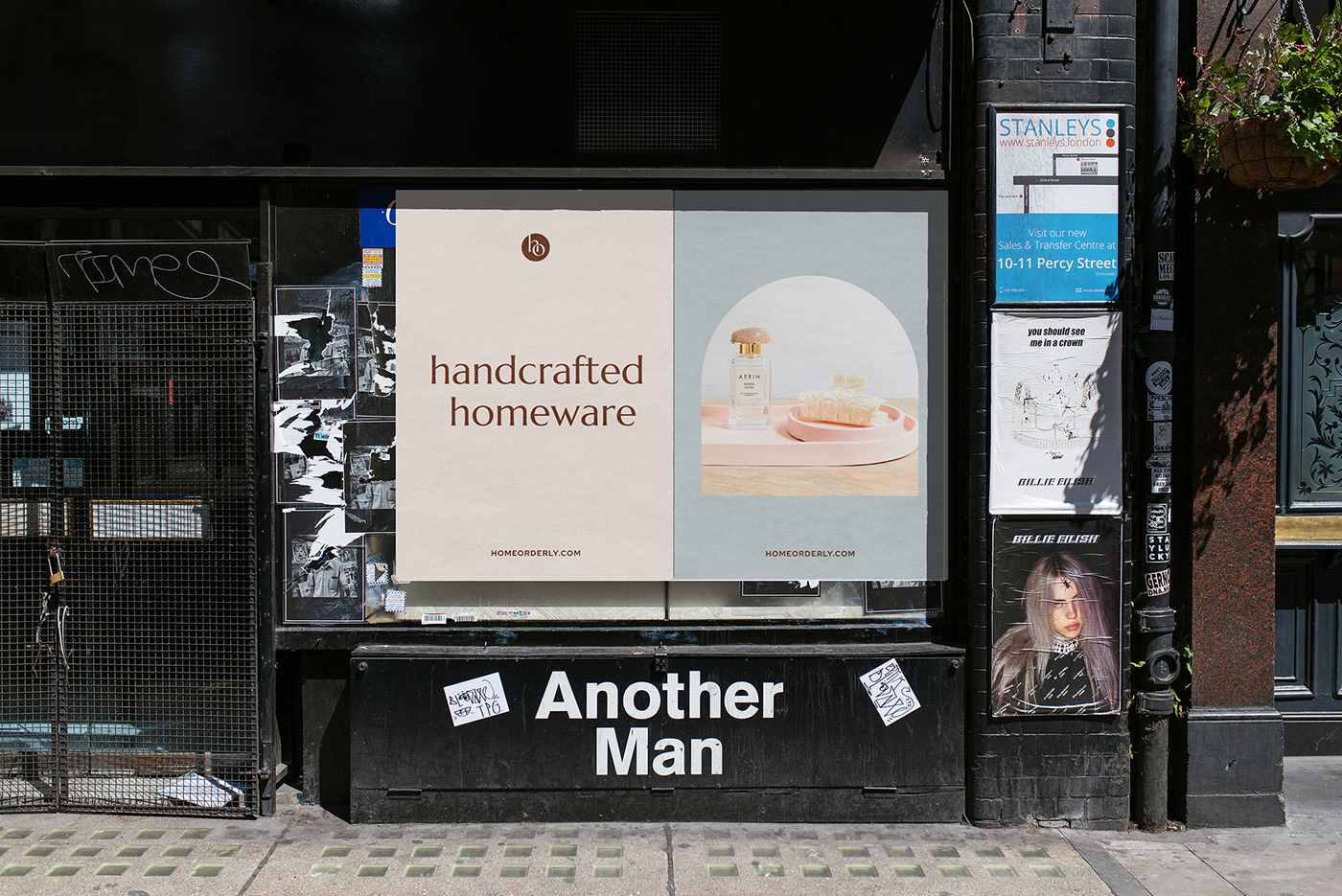
The Home Orderly brand draws its inspiration retrospectively by pairing the primary font with a classic geometric visual – a node to Swiss graphical design of the 70s, while also keeping the theme contemporary. It was an important consideration to make sure the personality of the brand translated not only from screen to print, but all with the the actual products themselves, to continue the brand story to the consumer. The shapes as a graphic device create a juxtaposition between orderly and disorderly. This is designed to help create a vibrant and playful brand personality while also keeping the visual tension within the brand.


Credits
Type: Marcellus/Red Hat Display
Design and direction: Jan-Alfred Barclay
____________________________
More information
Follow me on Instagram | hello@janalfredbarclay.com | janalfredbarclay.com
© Jan-Alfred Barclay 2022


