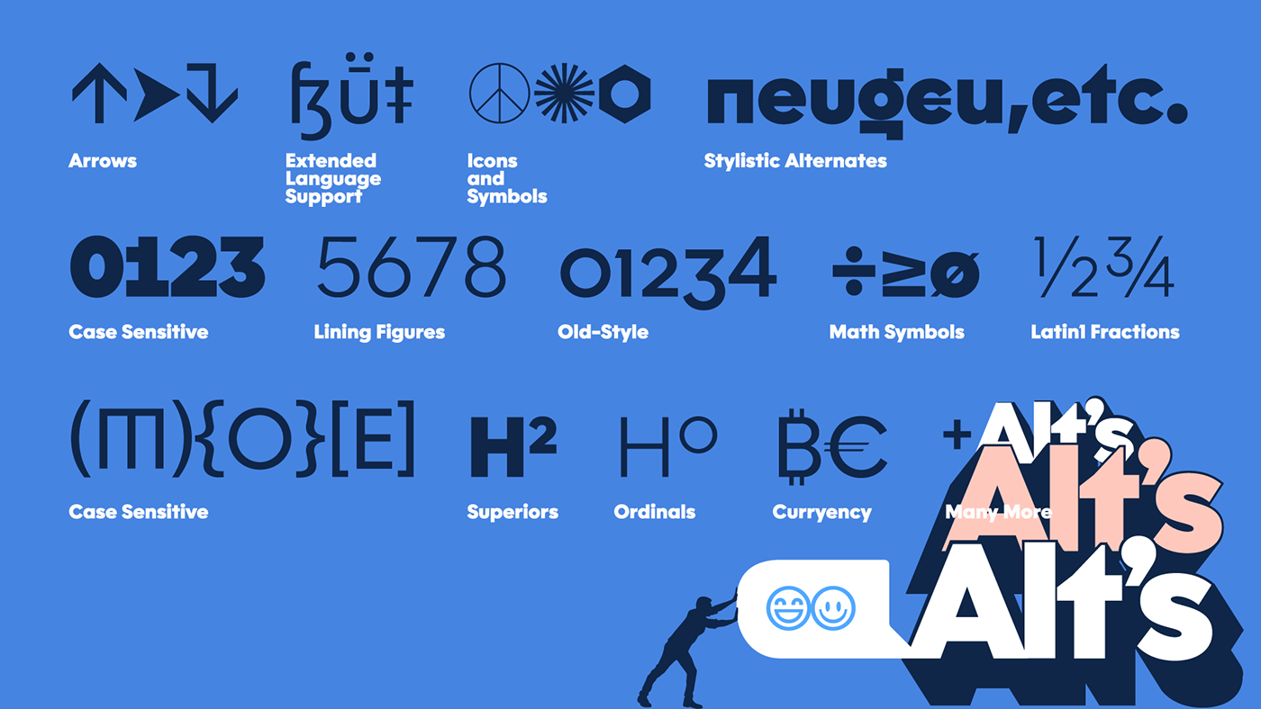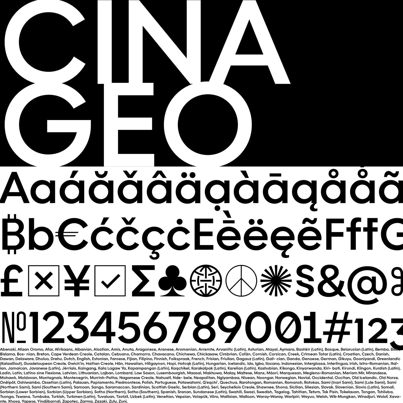


Through the years I have had a long affair with the “geosans” typeface genre and this font is a result of countlessly drawing those letterforms. For this font, I wanted to build a strong infrastructure; something that looked great however you used it. I wanted to balance invisibility with finesse. I started by drawing the thin in 2014, using “ideal” ratios and then modifying that structure to my taste. The black was drawn later to maximize space and character. During the pandemic I picked this font back up, realizing that by drawing the characters to my own standards, the typeface would be a major asset to my workflow. Thank you for your support, I hope you enjoy using this typeface.
> Cina GEO (Purchase and Trial)


