


Snaps is a boutique agency specializing in advertising, KOL & influencer marketing management services and many areas of communication.
Background
In 2021, Snaps made great strikes a few years after its birth. At that time, they need a new identity to further strengthen their position and brand recognition in the marketplace. GudLag Creative decided to tap into the distinct characteristic that set Snaps apart from other full-service agencies.
Challenge
The challenge was to change people with mindset that boutique agencies do not have high quality outcome and do not complete a big project. But, a big agency has too many departments what make project slow down.
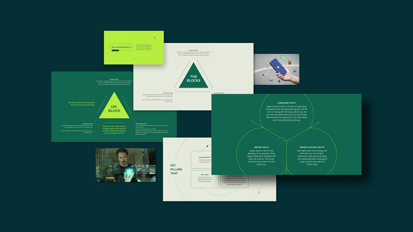
Approach & concept
Snaps provides much more customized services and focuses on the client’s niche. Because Snaps is a boutique agency, they can make meaningful decisions on the fly and offer client dynamic solutions without having to go through too many departments. Everything goes as quick as a snap, Snaps handles everything that client need. That’s how a new brand concept for Snaps was born: All in Snaps, Snaps for all.
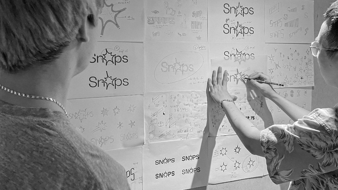


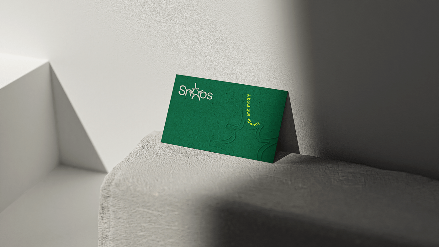
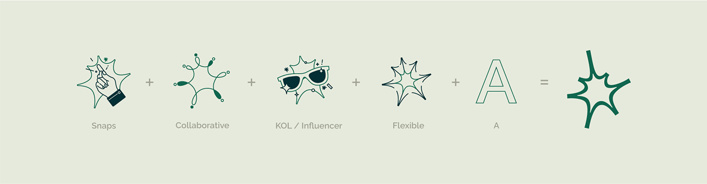
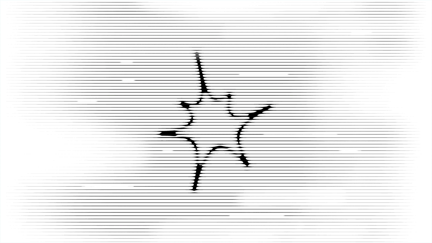
Logo concept
The letter mark “A”, which was created from the letter “A” in brand name, was used as the special emphasis of the logo. The letter mark “A”, which is called by Buzz Symbol, symbolizes the sound of a snap of the fingers, the quick and flexible working process, and a new buzz in the advertising field comes from Snaps.

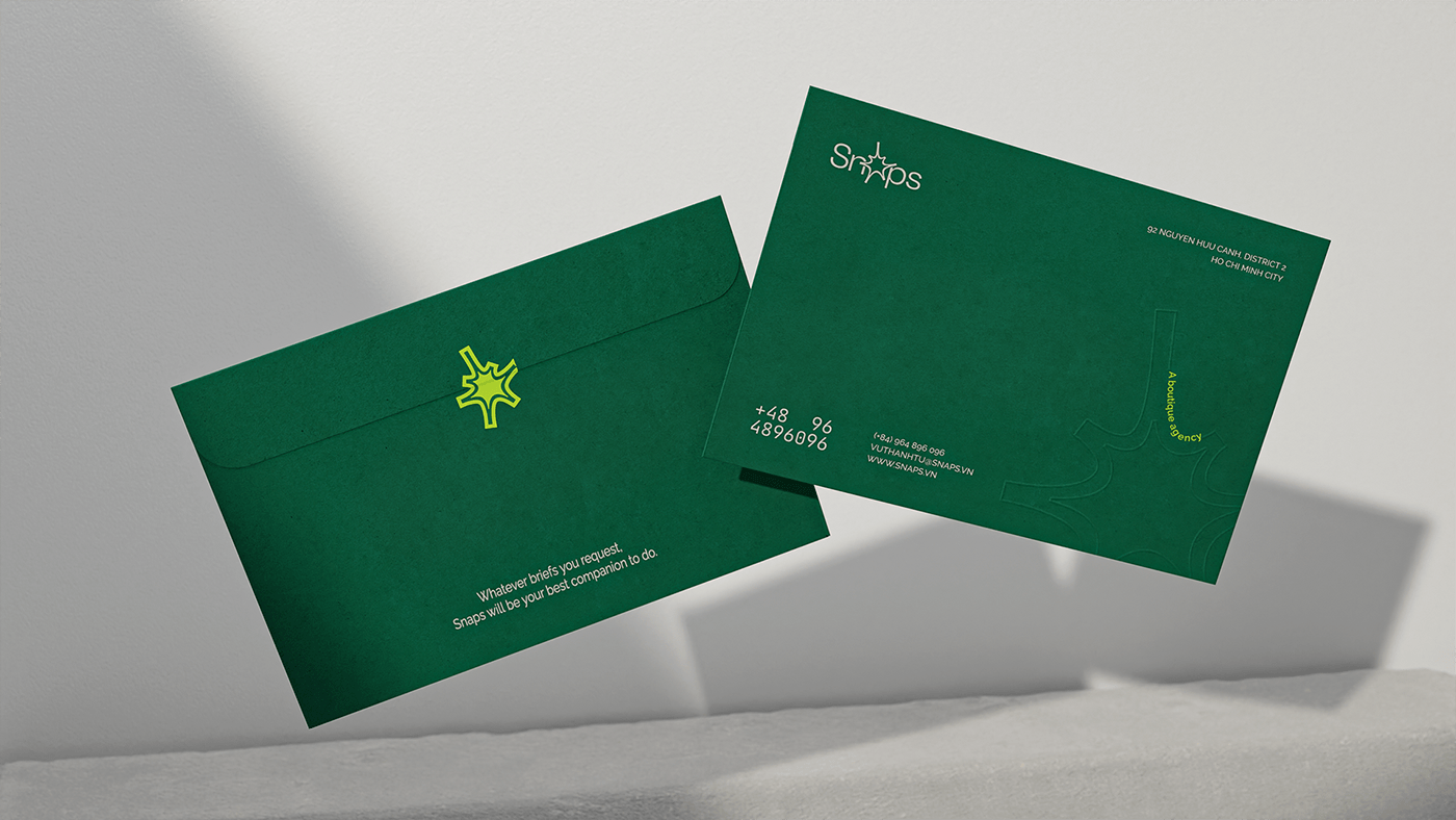
Identity
From there we created a design system that used the buzz symbol as a key image with unity-in-diversity versions for various purposes. The check-line system also is a distinct hallmark of buzz symbol.

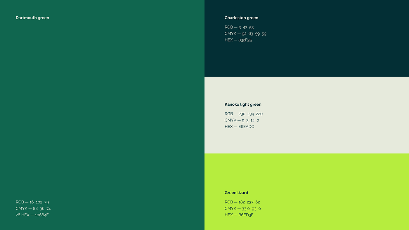
Color Palette
In the Vietnamese advertising industry, red is the key color of most agencies, studios because that color is really relevant with creative thinking. But it was used too much that made it look too bold, too strong and stressful. We think the green tones used to relax the eyes, the mind and spirit. That is why we choose green tones to make the contrast in that universe.


This project has been finished after more than 3 months and the client was very satisfied with our work. Hope this new orientation is an important stepping stone to lead Snaps to a fruitful future ahead. Thank you!
Featured on World Brand Design Society - April 2022:


