


●
Branding of the organizational development and
personnel management department of Evex Clinics.
Evex is the largest network of clinics and policlinics. It includes 35 clinics and more than 3,500 employees. Evex is the first medical institution to have a training center for its doctors. The association conducts free vocational training and advanced training courses for employees.
Evex constantly cares for each employee and their family members. Social responsibility projects are being actively implemented.
The specified department was created to take care of employees. Focused on their work and their professional development. Initiates and organizes various CSR projects both within the company and outside it
At this stage, the company has created a fund that takes care of and helps employees.
As part of company branding, an internal corporate identity for a multifunctional department is created that will be easy for employees to understand. It will have a unique style within which various activities, projects, activities or campaigns will be implemented.
After analyzing all these details, a logo was created, developed a main and additional color palette, and selected a font and shapes that reflected the main direction and value of the company.
●
●
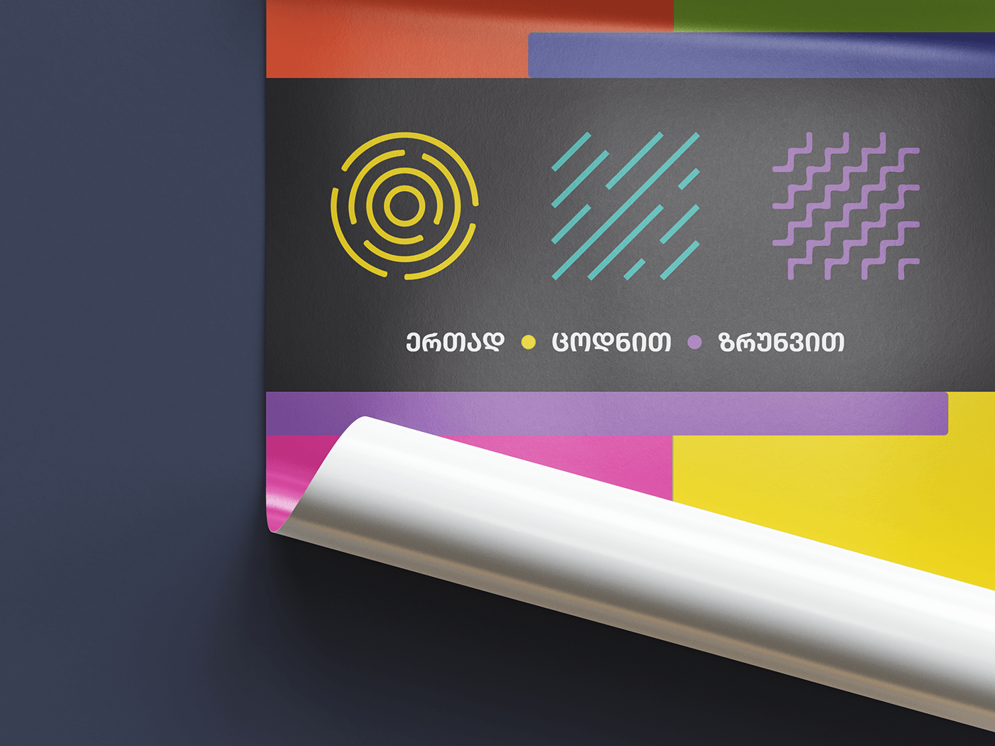
A logo is a synthesis of color and shape, making it easier to create and plan a visual identity for internal or external campaigns.
Three primary colors have been chosen: yellow-orange (this is an intermediate color and conveys the character of both), turquoise and violet are the colors of our Evex clinics.
Each color corresponds to the main idea that the main message tells us: “Together, with knowledge and care.” “Open” shapes are also compatible with colors: circle, line and zigzag.
Colors:
Yellow – Orange – positivity, optimism, youth, reliability, creativity, energy, uniqueness and transformation.
Evex - Turquoise - Hope, Health, Harmony, Loyalty, Trust, Honesty, Communication, Sympathy, Knowledge.
Purple – refined, outstanding, sublime, luxurious.
Shapes:
Circle - unity, cohesion, although they are always ready to accept more people into their ranks.
The line - the general shape is inclined to the height, which indicates that there is gradually an exchange and increase in knowledge, for our field this is a very important part. Constant learning and striving for the top.
●


