


Sloaf : We bake slow and steady.
Sloaf is a bakery that specializes in bread for meals. Its key value is to attend to the repetitive process of making bread everyday with an unwavering sincerity of the first day. Hence, the focus of this work was the following two points.
1. Rather than showing how the bread looks, reveal the fundamental value of bread and the mindset of its makers.
2. Visualize the repetitive process of making bread to express the brand’s core value of consistency and sustainability.
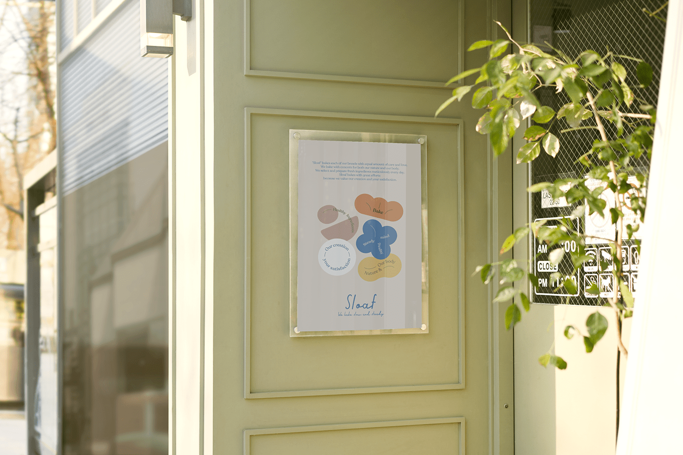
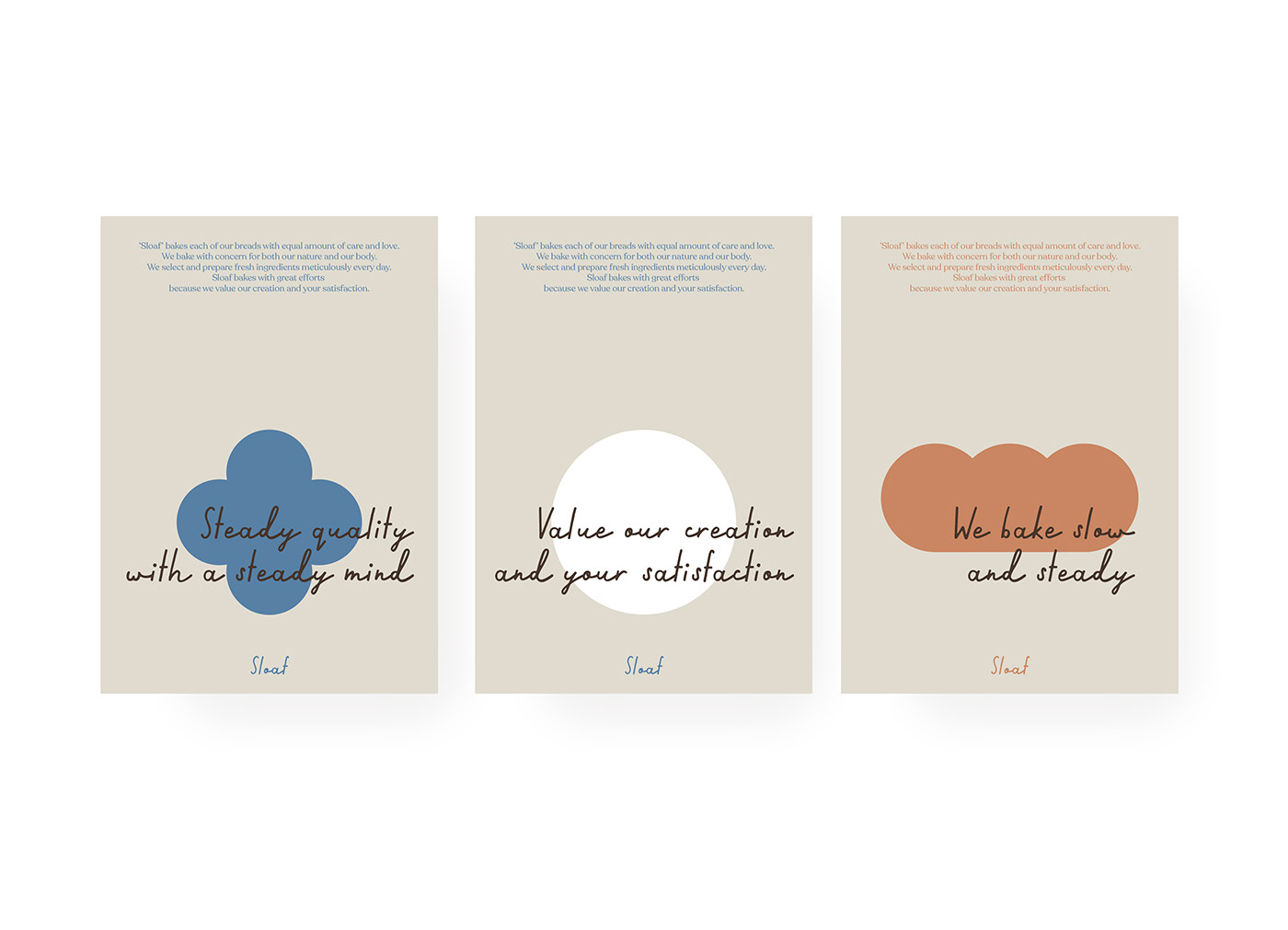
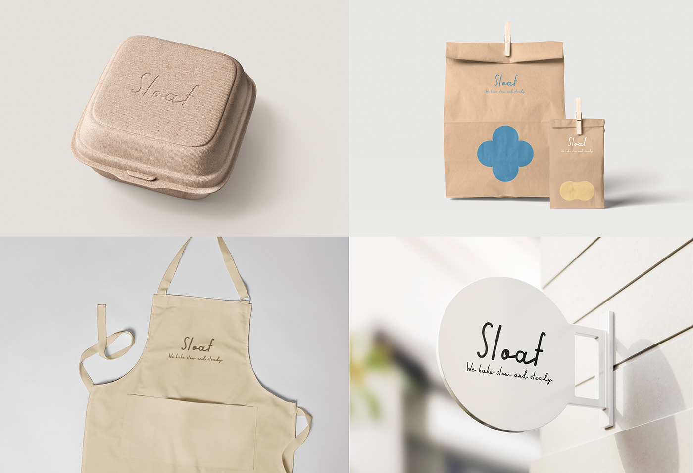
The five steps (mixing, kneading, fermenting, forming, and baking) that are repeated when making bread were graphically represented through a looping circle. A calligraphic font was used to convey Sloaf’s attitude towards breadmaking to its customers in a more approachable way.
Sloaf는 식사빵 전문 베이커리로 반복되는 제빵 과정을 매일 처음처럼 꾸준히 진심을 다해서 빵을 만드는 자세를 가장 중요한 가치로 삼는다. 따라서 2가지 포인트에 집중하여 작업을 진행하였다.
1. 빵의 비주얼보다 빵의 본질적 가치와 만드는 사람의 자세를 전할 수 있는 브랜딩
2. 반복되는 제빵과정을 시각화하여 브랜드의 핵심가치인 꾸준함과 지속가능성을 표현
빵을 만들때 반복되는 5가지 과정(섞기, 반죽, 발효, 성형, 굽기)을 순환하는 원의 형태를 통해 그래픽화 하였다. 또한 캘리그라피 폰트를 함께 사용하여 빵을 대하는 Sloaf의 생각을 고객들에게 조금 더 가깝게 전달하고자 했다.

With a shift in people’s diet and the increase of one-person households, the demand for bread has grown rapidly.
As people begin to view bread as a meal rather than a snack, high-quality bread has become sought-after.
Alongside this, a need for healthy and eco-friendly ingredients that people can rely on has also risen.
Approaching baking with an unchanging mindset to produce bread of consistent taste and quality, Sloaf aims to introduce wholesome bread for more people to consume healthily.
식생활의 변화와 1인가구의 증가로 빵에 대한 수요가 급격히 증가했다. 빵을 간식이 아닌 식사로 인지하기 시작하면서 높은 퀄리티의 식사빵을 찾기 시작하였고 동시에 믿을 수 있는 건강하고도 친환경적인 재료에 대한 니즈가 생겨났다. Sloaf는 한결같은 자세로 꾸준한 맛과 품질의 빵을 만드는 것을 기본으로 더 많은 사람들이 건강하게 소비할 수 있는 빵을 선보이고자 한다.


Concept
The five steps (mixing, kneading, fermenting, forming, and baking) that are repeated when making bread were graphically represented through a looping circle. Create a visualization of Sloaf’s steadfast and earnest mindset towards breadmaking and expand it to create various points of contact in customers’ brand experience.
빵을 만들때 반복되는 5가지 과정(섞기, 반죽, 발효, 성형, 굽기)을 순환하는 원의 형태를 통해 그래픽화 하였다.
Sloaf가 꾸준하고 성실하게 빵을 만드는 자세를 시각화하여 다양한 브랜드경험 접점으로 확장하여 사용한다.


Thank you for watching :)
Copyright 2022. Sujin Choi all rights reserved.


