

This powerful Design System for Figma and Adobe Xd is based on the most popular dashboard CoreUI library. Download FREE Demo or purchase a full product on the Official CoreUI Design System website:
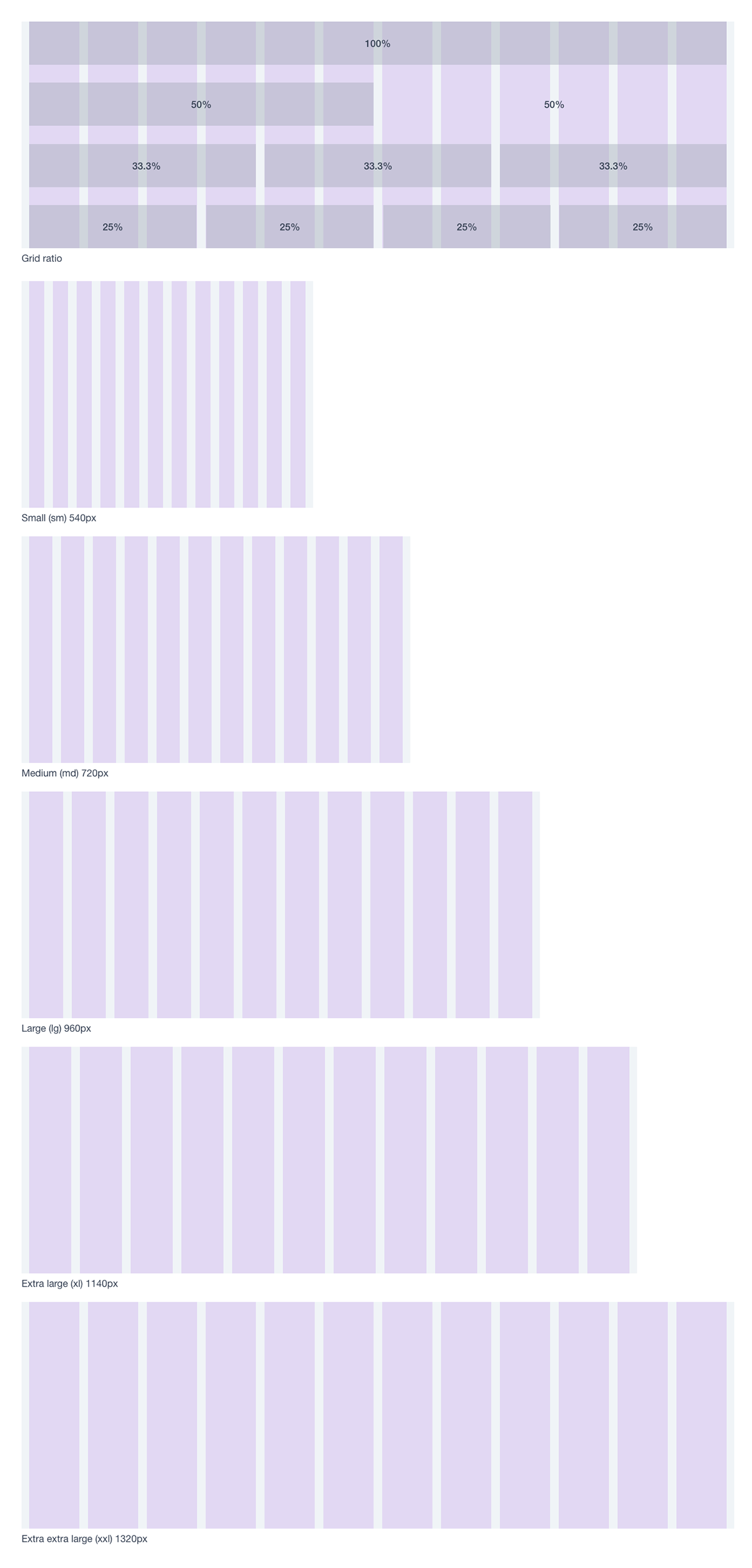
Grid
Use powerful mobile-first flexbox grid to build layouts of all shapes and sizes thanks with a twelve column system. Grid system can adapt across all default breakpoints, and any breakpoints you customise. Here’s how the grid changes across these breakpoints
Spacing
Base spacing of 8px is used for all types of screens (mobile, tablet and desktop). Spacing methods use baselines, key lines, padding, and incremental spacing to adjust aspect ratio and containers. Start by working from 4px grid. This means every spacing element is divisible by 4. It provides foundation for harmoniously and constantly positioning elements onscreen, creating an order to your designs.

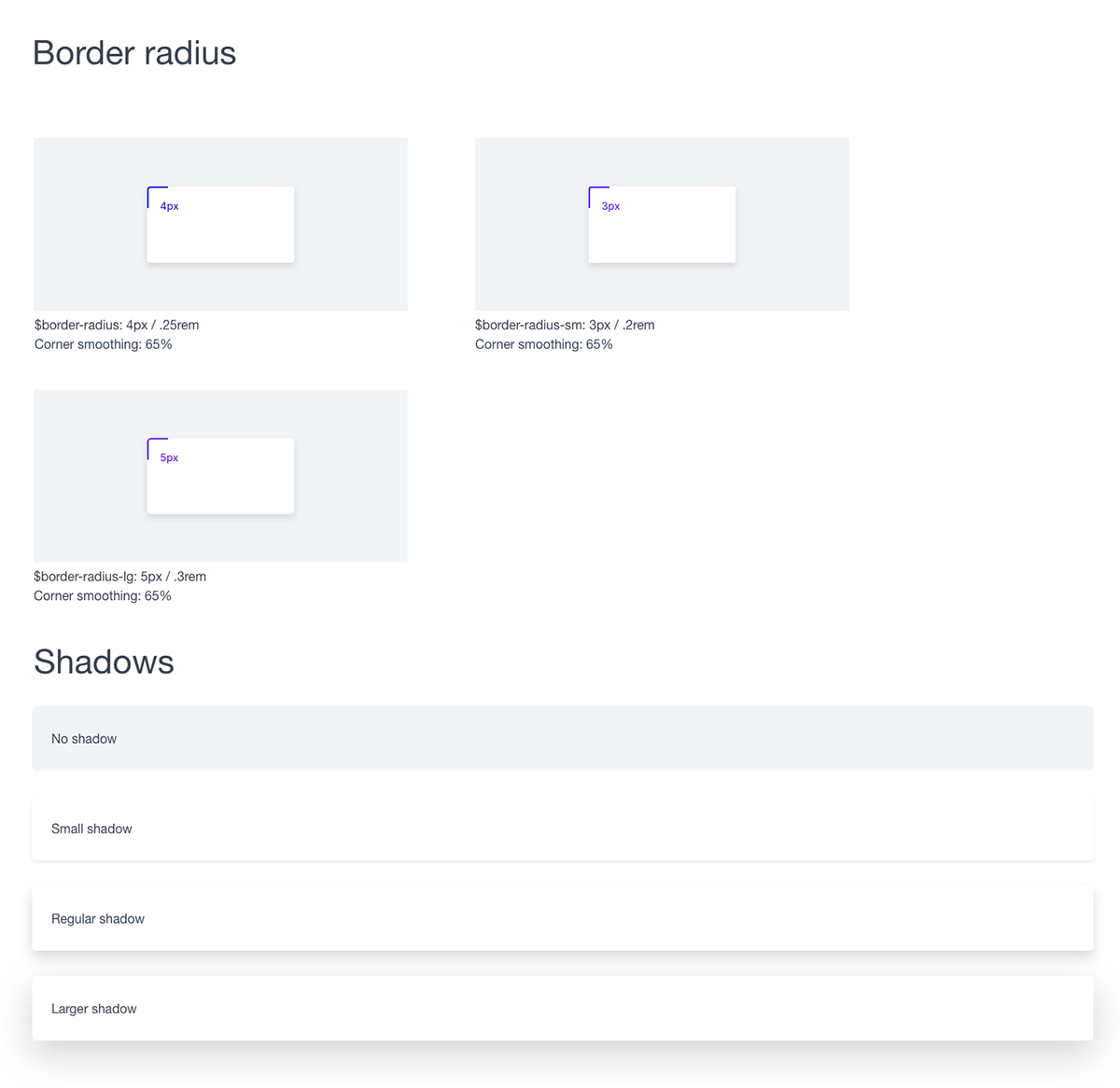
Border & Shadows
Colors
CoreUI is supported by an extensive color system that themes our styles and components. This enables more comprehensive customisation and extension for any project.

Typography
Use a native font stack that selects the best font-family for each OS and device. Font weight: Light, Regular, Medium, Bold
For a more inclusive and accessible type scale, we use the browser’s default root font-size (typically 16px) so visitors can customise their browser defaults as needed.
For a more inclusive and accessible type scale, we use the browser’s default root font-size (typically 16px) so visitors can customise their browser defaults as needed.

Tables

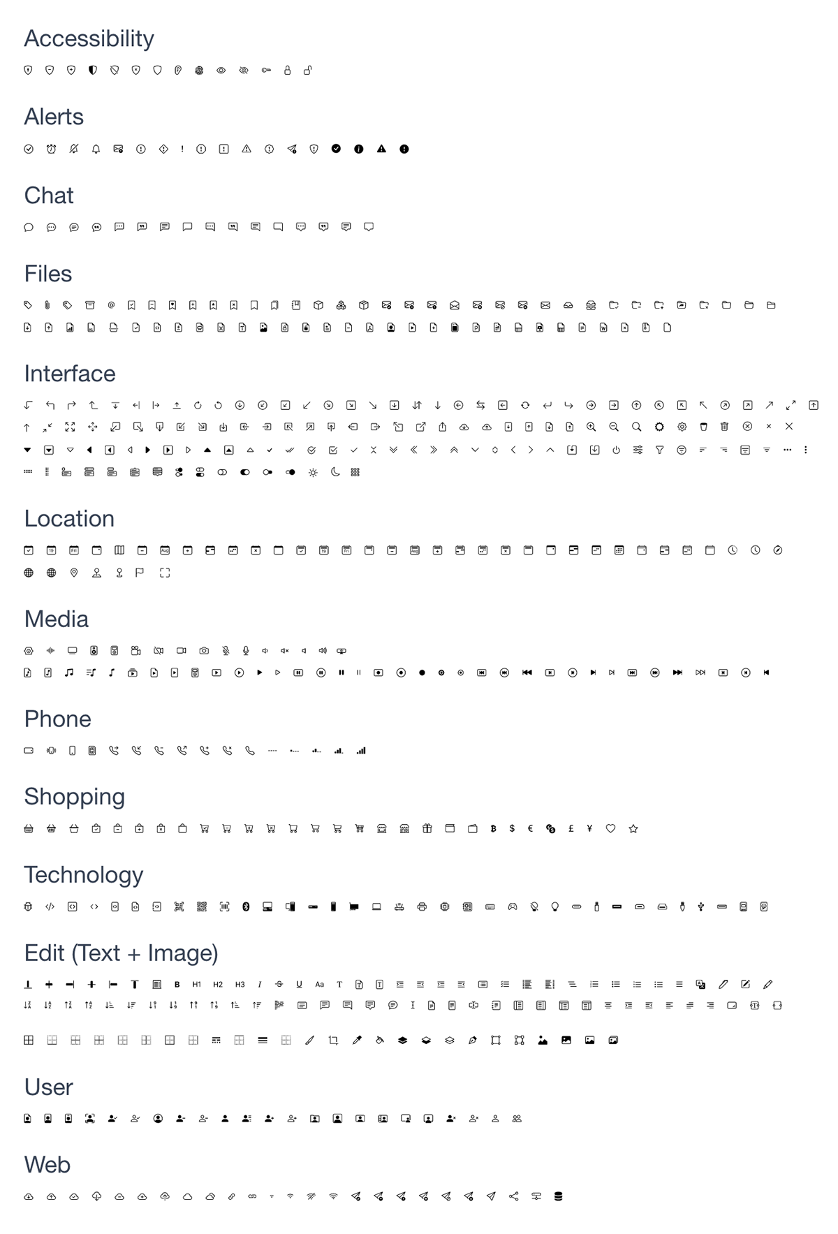
Icons
CoreUI Icons has beautifully crafted symbols for common actions and items. You can found them here.
However, in this Design Kit are essential Bootstrap (linear) icons.
However, in this Design Kit are essential Bootstrap (linear) icons.
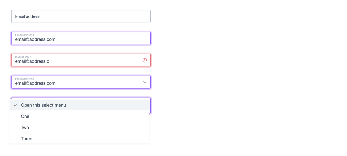
Forms
Give textual form controls like inputs and textareas an upgrade with custom styles, sizing, focus states, and more.

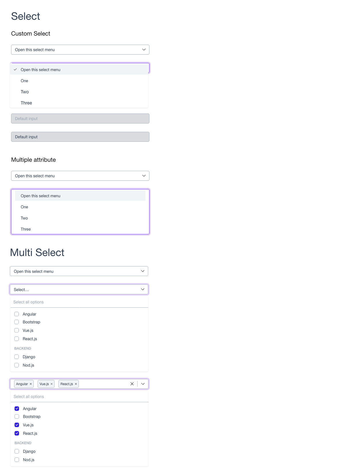
Select & Multi-Select
Checks, Radios & Range

Floating Labels
Beautifully simple form labels that float over the input fields.
Input Group
Easily extend form controls by adding text, buttons, or button groups on either side of textual inputs, custom selects, and custom file inputs.

Accordion

Alerts
Alerts give contextual feedback information for common user operations. The alert component is delivered with a bunch of usable and adjustable alert messages.

Avatars
Avatar component can be used to display circular user profile pictures. Avatar can be used to portray people or objects. It supports images, icons, or letters.

Badge
Badge is small count and labeling components.

Buttons
Button component for actions in tables, forms, cards, and more. This Kit provides various styles, states, and size. Ready to use and easy to customise.

Button Group

Card
Card component provides a flexible and extensible container for displaying content. Card component is delivered with a bunch of variants and options.

Dropdown
Dropdown component allows you to toggle contextual overlays for displaying lists, links, and more html elements.

List Group
List Groups allows displaying are a series of content. Examples on how to use list group to build complex list structure.

Modals
Modals are lightweight and multi-purpose popups. Modals are split into three primary sections: header, body, and footer. Each has its role and so should be used accordingly.

Navs & Tabs

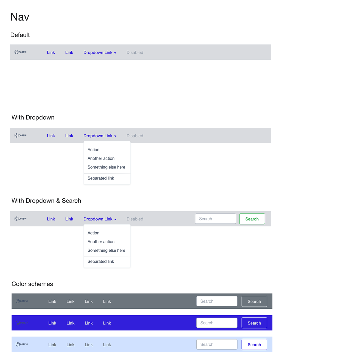
Navbar
Responsive navigation header, the navbar. Includes support for branding, navigation, and more.
Offcanvas

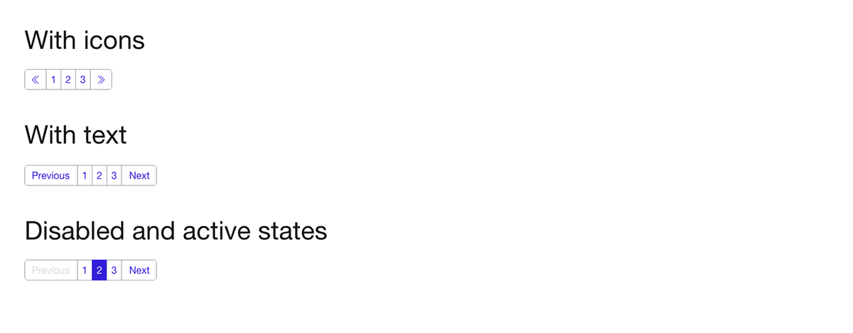
Pagination
Progress

Sidebar
Sidebar is a powerful and customisable responsive navigation component for any type of vertical navigation.

Toasts

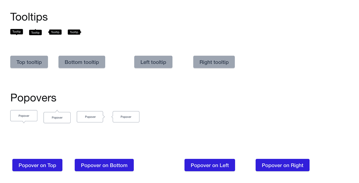
Tooltips & Popovers
Give a transient view that shows on a content screen when a user clicks on a control button or within a defined area.
______________________________________________________________
FREE Demo Xd Prototype
Download FREE Demo or purchase a full product on the Official CoreUI Design System website:


