Project丨KoshyBlue品牌视觉设计
Time丨2021
Service丨品牌命名 / 品牌梳理 / 标志设计 / VIS识别
Design丨zoey
KoshyBlue 意为“纯粹的蓝”,代表着没有杂质的全心全意的专注。他们专注于家具照明,厌倦了当下市场千篇一律的北欧式的寡淡,希望用更未来更科技更纯粹的方式切入新一代消费者的生活。
我们与KoshyBlue合作开发了一套整体的品牌体验,包括他们的品牌名称和视觉识别,每个品牌接触点都需要传递KoshyBlue的理念:Catch Light Of Future。
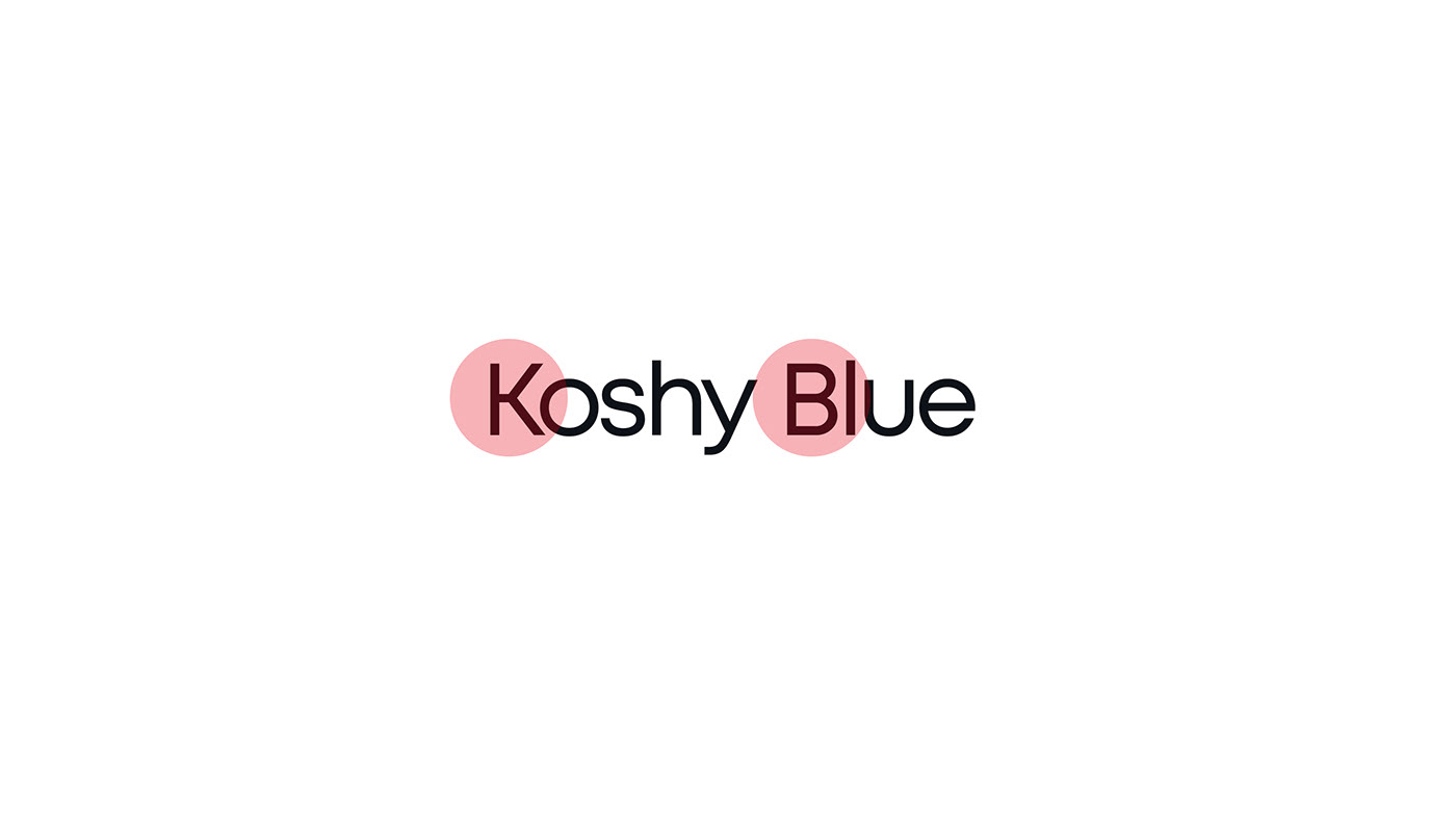
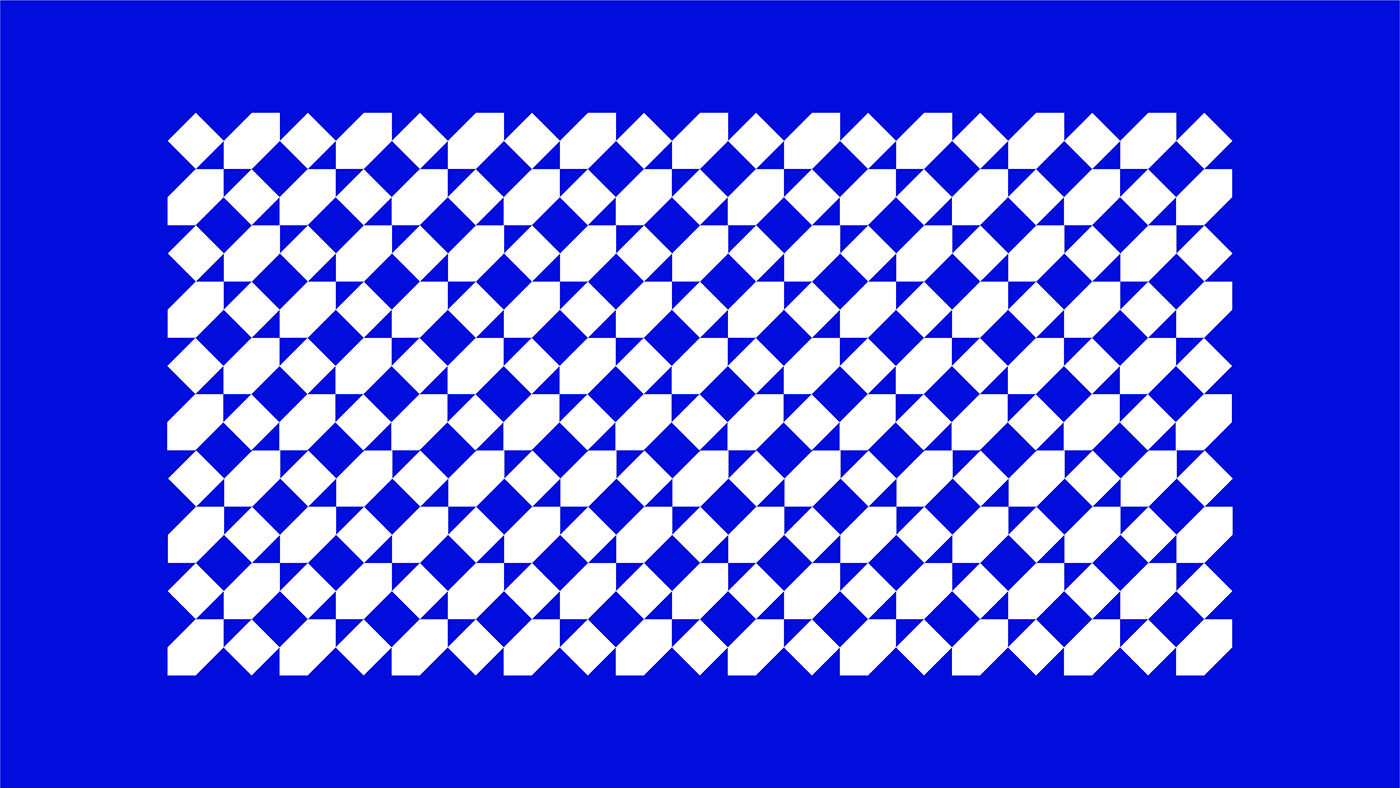
在整体品牌设计中,严谨与秩序是我们一以贯之的准则,基于此我们为KoshyBlue设定了精准严密的网格系统,以供后续物料可以充分延展。几何式的分割将灯具光线化、光线平面化,最终使用明暗分割的方式来表现logo。而这种视觉规则也延续到字体的设计以及后续的文本编排、图色分割等等,作为整个KoshyBlue的设计准则。分割错位与严谨秩序有机结合,构成了KoshyBlue的品牌美学。
KoshyBlue means "pure blue" and represents whole-hearted focus without impurities. They focus on furniture lighting, tired of the same Nordic style in the current market, and hope to use a more future, more technological and purer way to cut into the life of a new generation of consumers.
We worked with KoshyBlue to develop a holistic brand experience, including their brand name and visual identity, and every brand touchpoint needed to convey KoshyBlue's philosophy: Catch Light Of Future.
In the overall brand design, rigor and order are our consistent guidelines. Based on this, we have set a precise and strict grid system for KoshyBlue so that the subsequent materials can be fully extended. The geometrical division makes the lamps and lanterns light and flat, and finally uses the method of light and dark division to express the logo. And this visual rule also continues to the design of fonts and subsequent text arrangement, color segmentation, etc., as the design principles of the entire KoshyBlue. The organic combination of segmentation dislocation and strict order constitutes the brand aesthetics of KoshyBlue.
