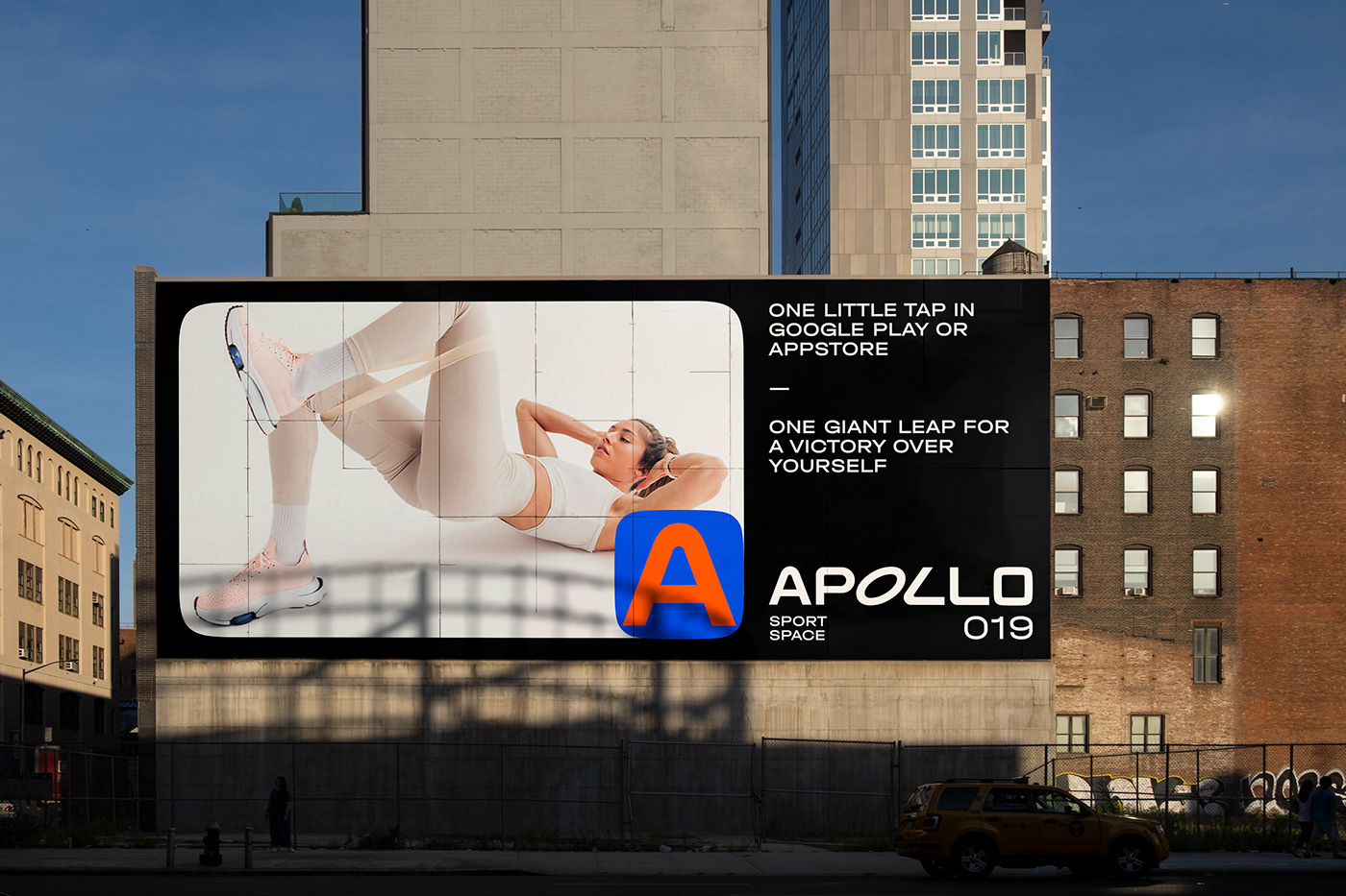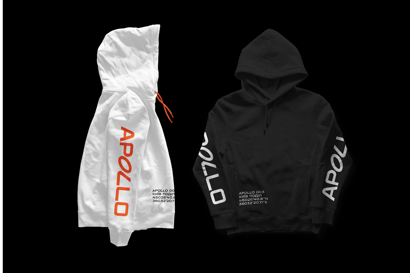
Apollo by Silpo is a sport space for different people. Unification and diversity is the main thing about this place. Apollo is supposed to be the territory of sport freedom for
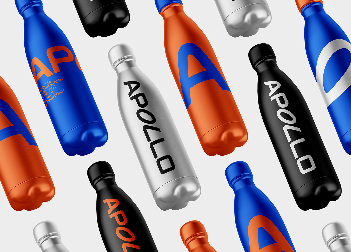
everybody: moms, professional sportsmen, amateurs, busy IT workers, students, fitness lovers, yoga fans, try guys etc. Like for everyone who needs some physical activity in their lives. That's why letters in typographical logo are different. Some of them are dynamic and ready to burn. Other are static and pretty tired after a nice workload.
everybody: moms, professional sportsmen, amateurs, busy IT workers, students, fitness lovers, yoga fans, try guys etc. Like for everyone who needs some physical activity in their lives. That's why letters in typographical logo are different. Some of them are dynamic and ready to burn. Other are static and pretty tired after a nice workload.
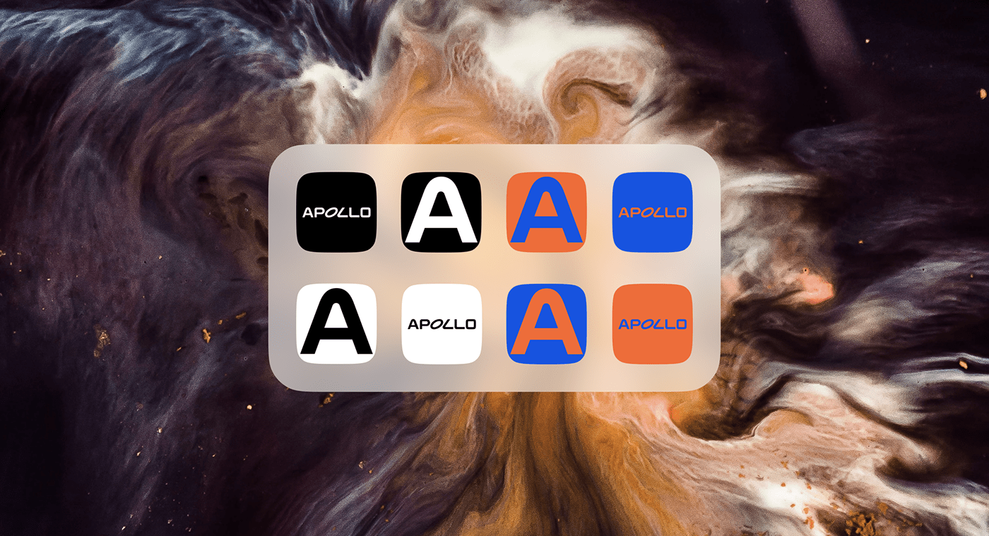
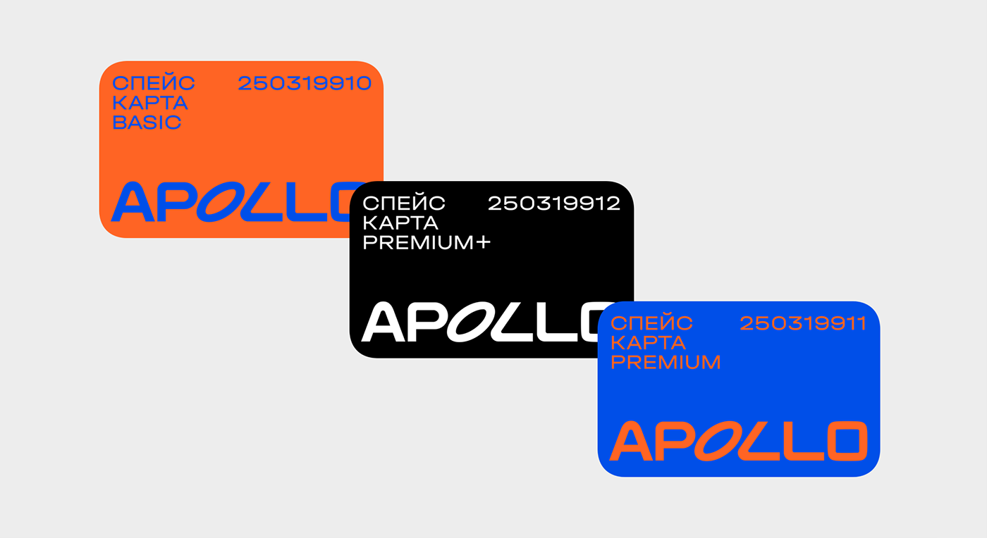
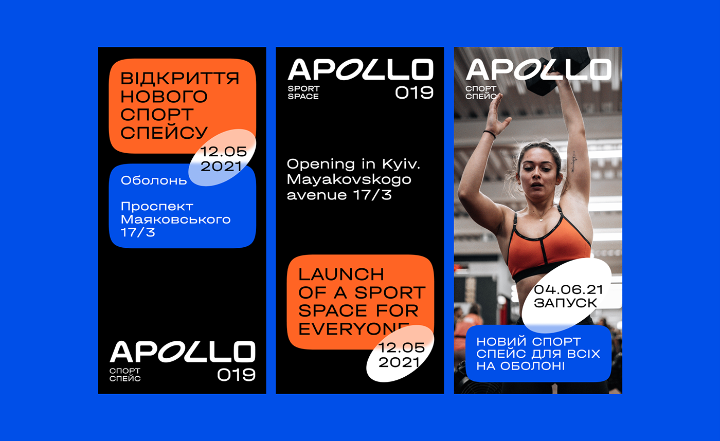
Another thing about Apollo is, obviously, a space theme. Our clients from Silpo, Ukraine, are fans of this aesthetics, that's why the naming and the whole brand identity is full of cosmic easter eggs. Orange and electric blue are the colours from Kubrick's 2001: A Space Odyssey, typography resembles NASA fonts, and text composition is an allusion on cosmic digital interfaces from Sci-fi movies.