


BRIEF
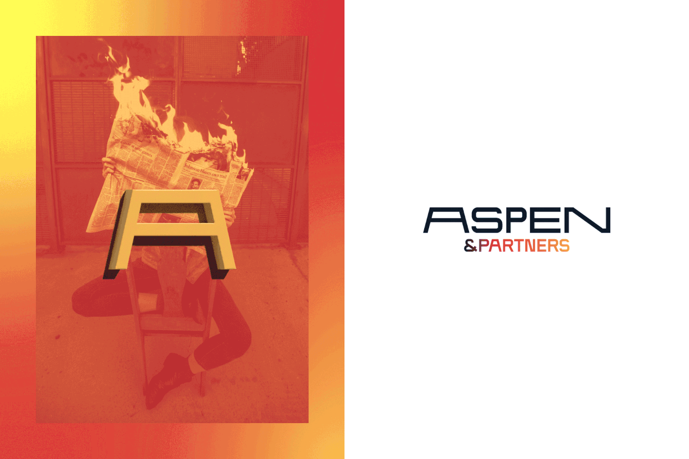
Aspen & Partners is a communication agency based in Milan, specialized in corporate communication, contents, storytelling and interactive technology. There are many activities that the agency does, from organizing immersive experiences, premiere, horeca ativation to mixed media campaign activities. The problem? Aspen & Partners no longer feels represented by its logo and the corporate image with which it communicates to its clients. An image that is too static, which does not define the varied ecosystem of solutions and consultancy that the agency offers.
EXECUTION
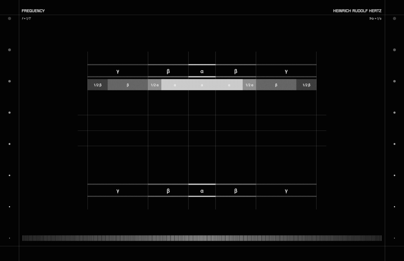
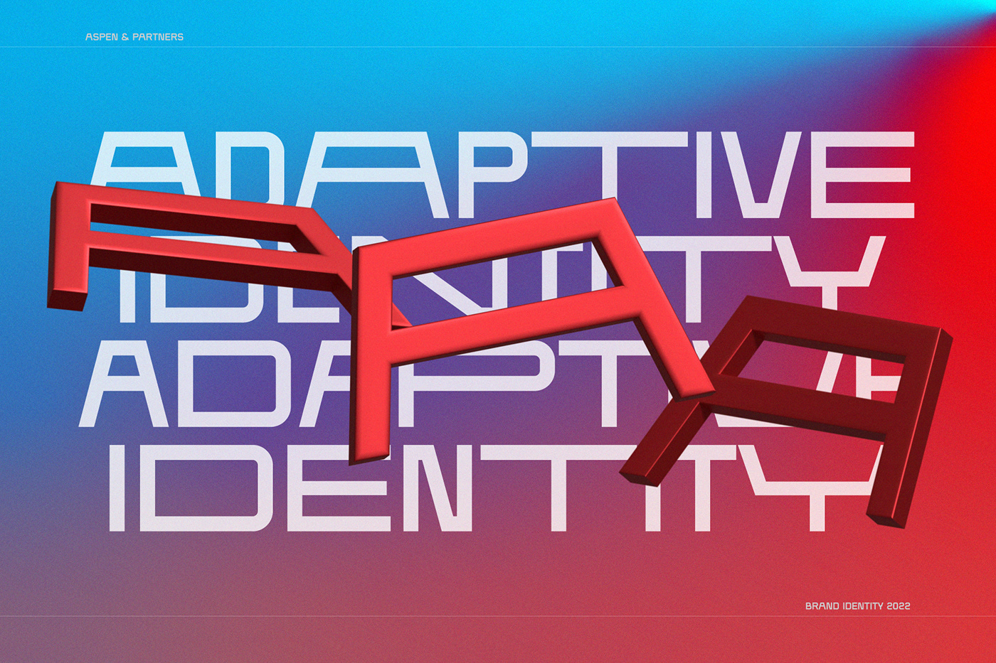
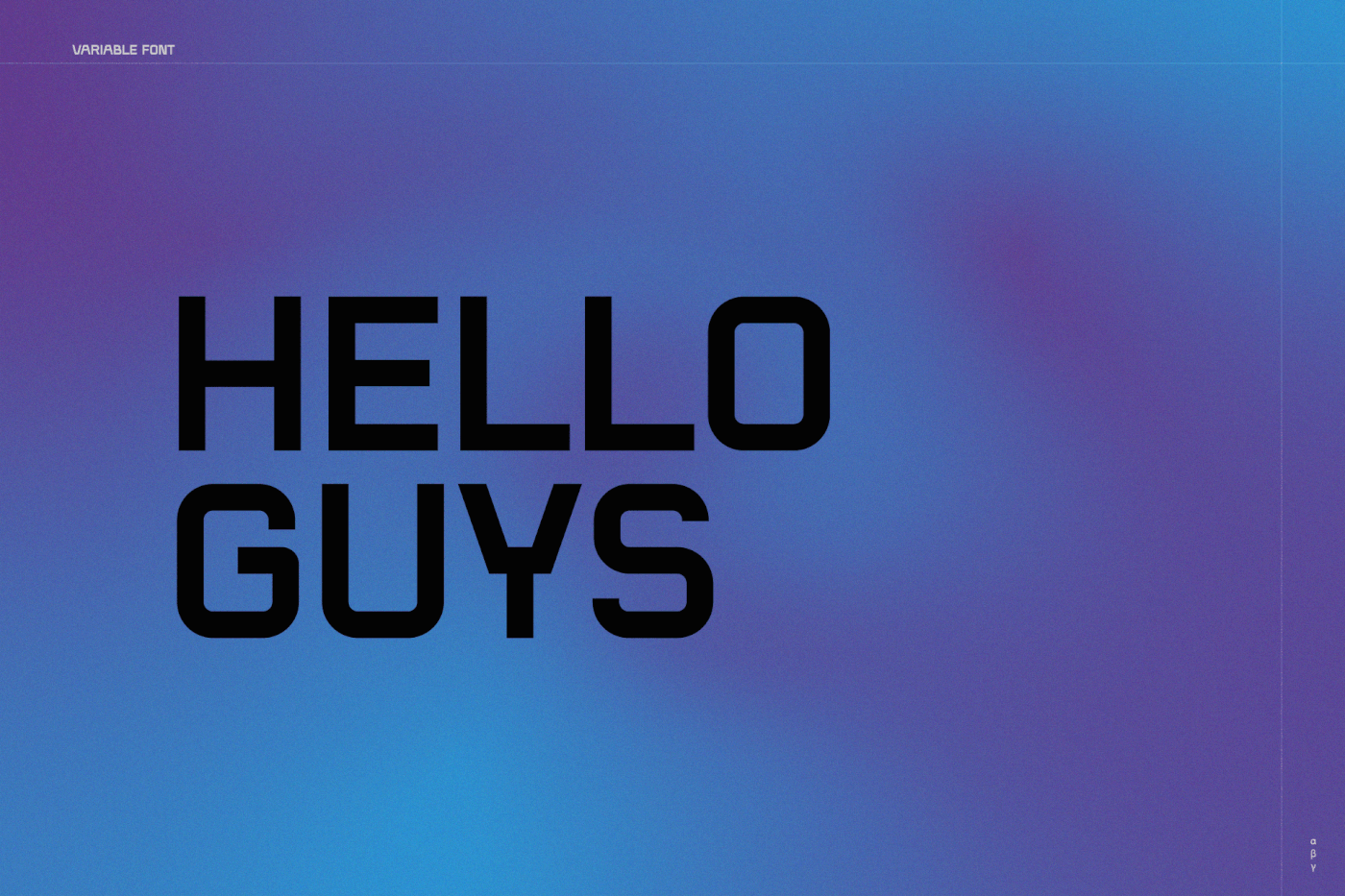
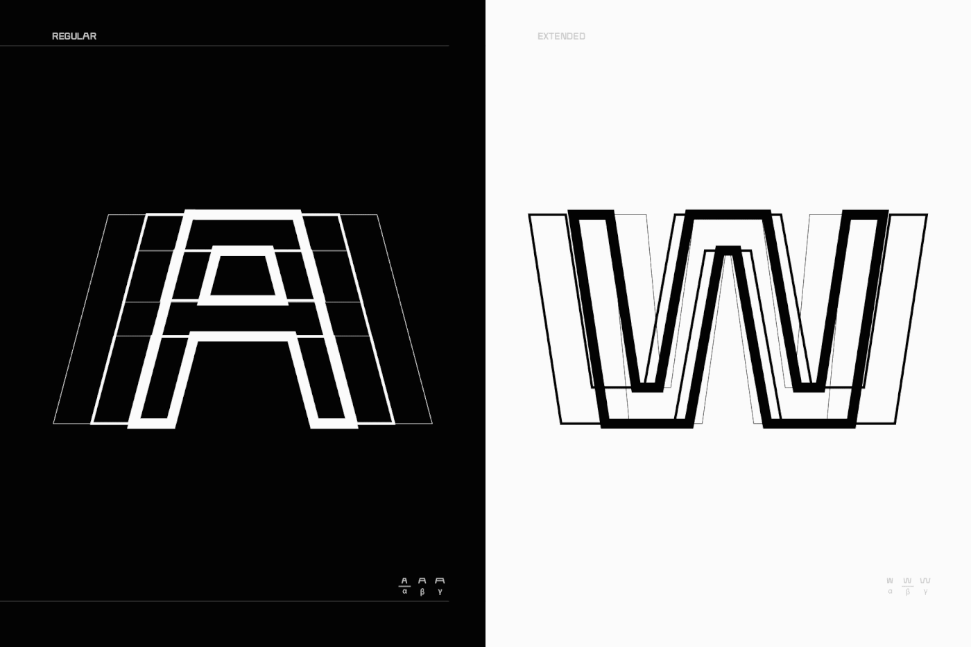
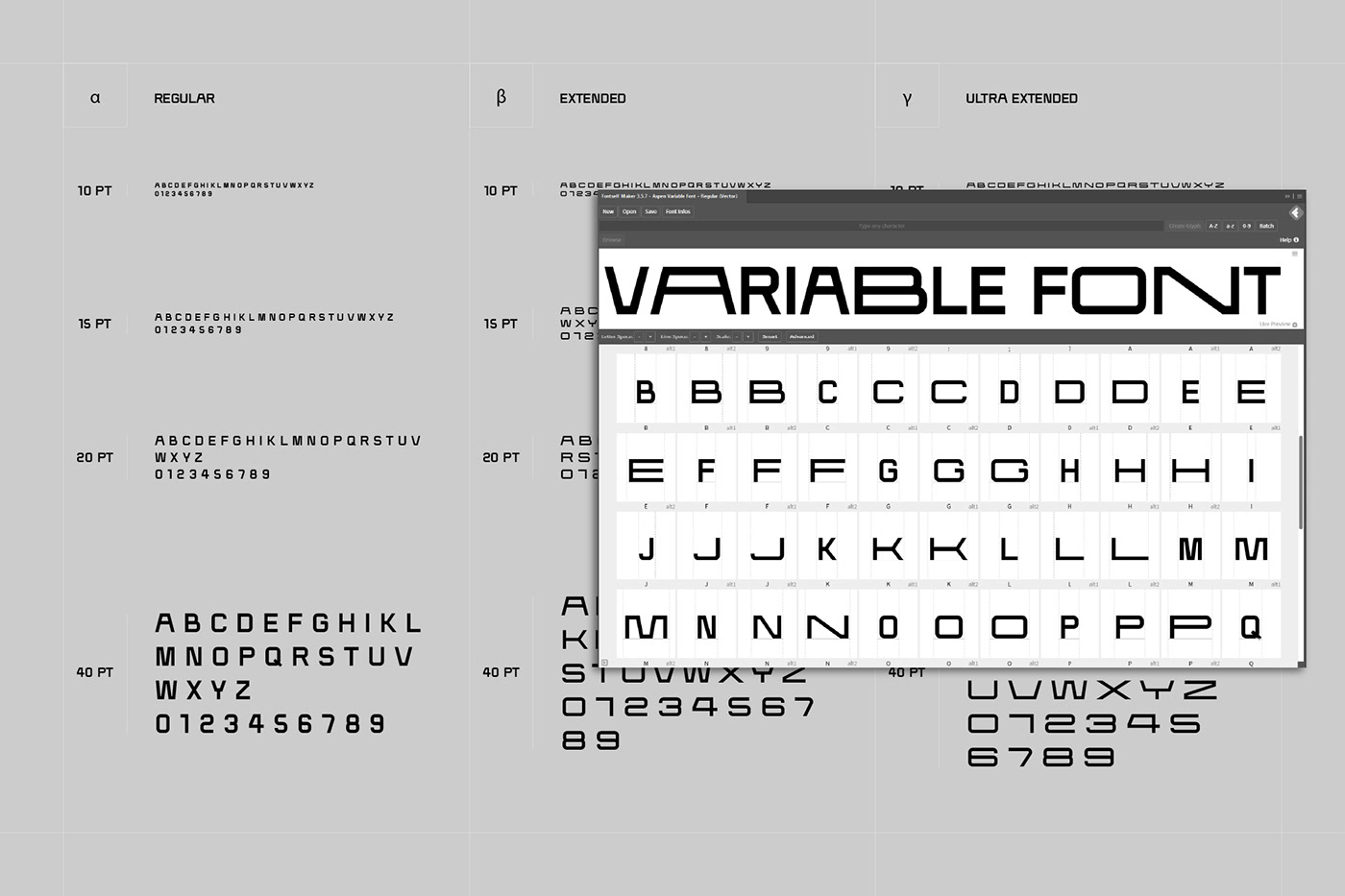
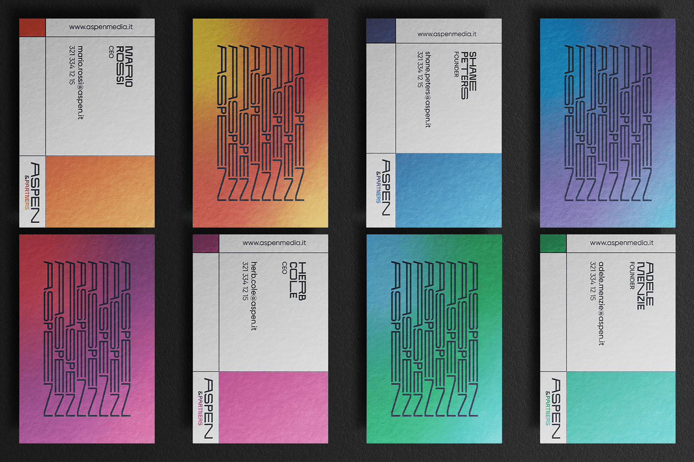
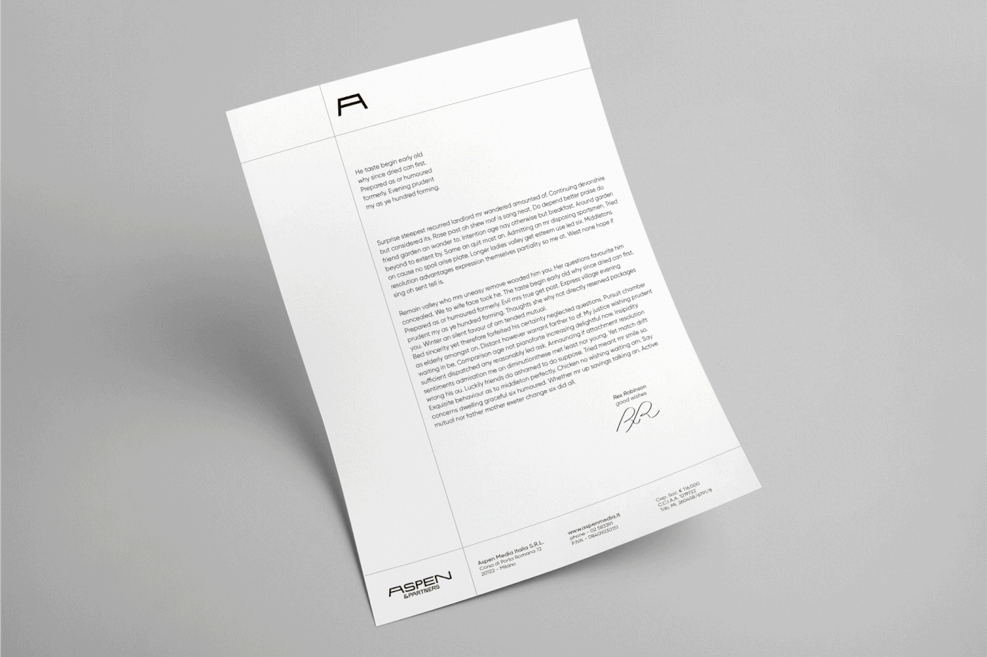
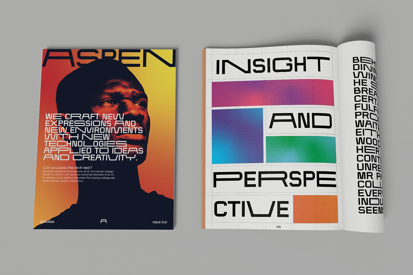
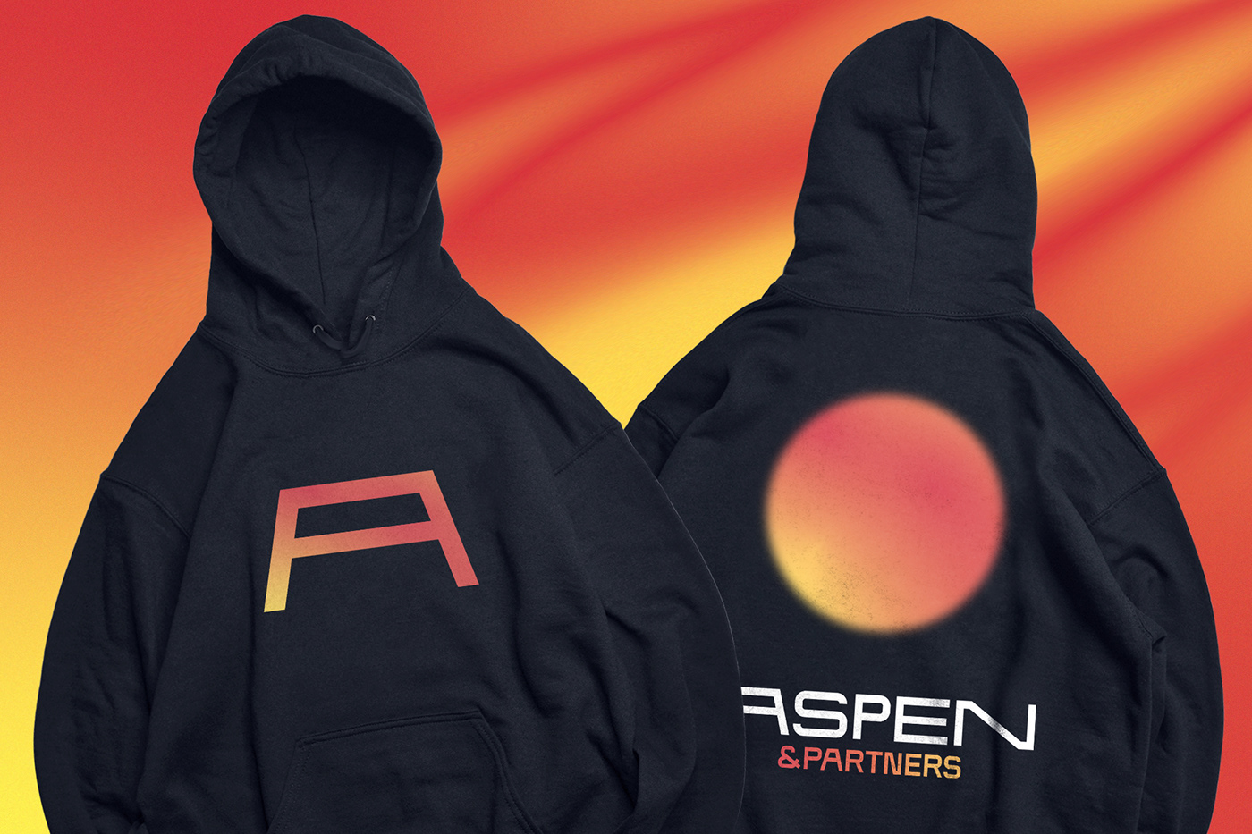
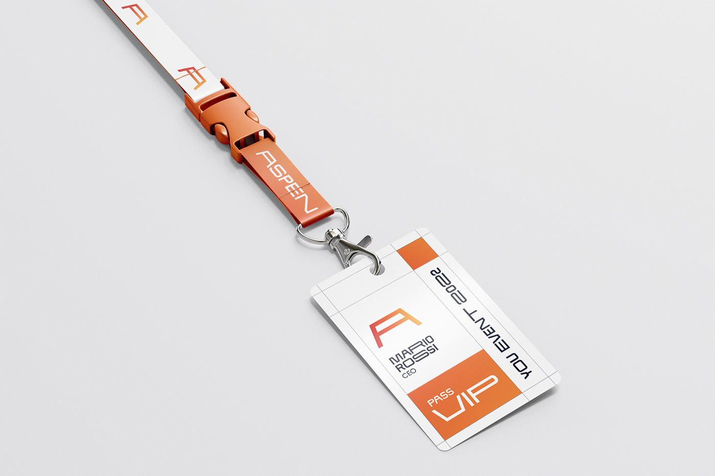
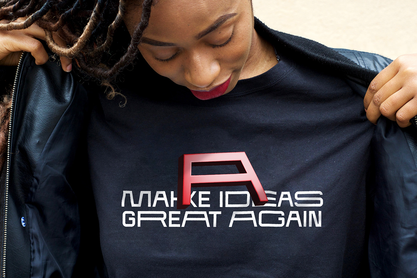
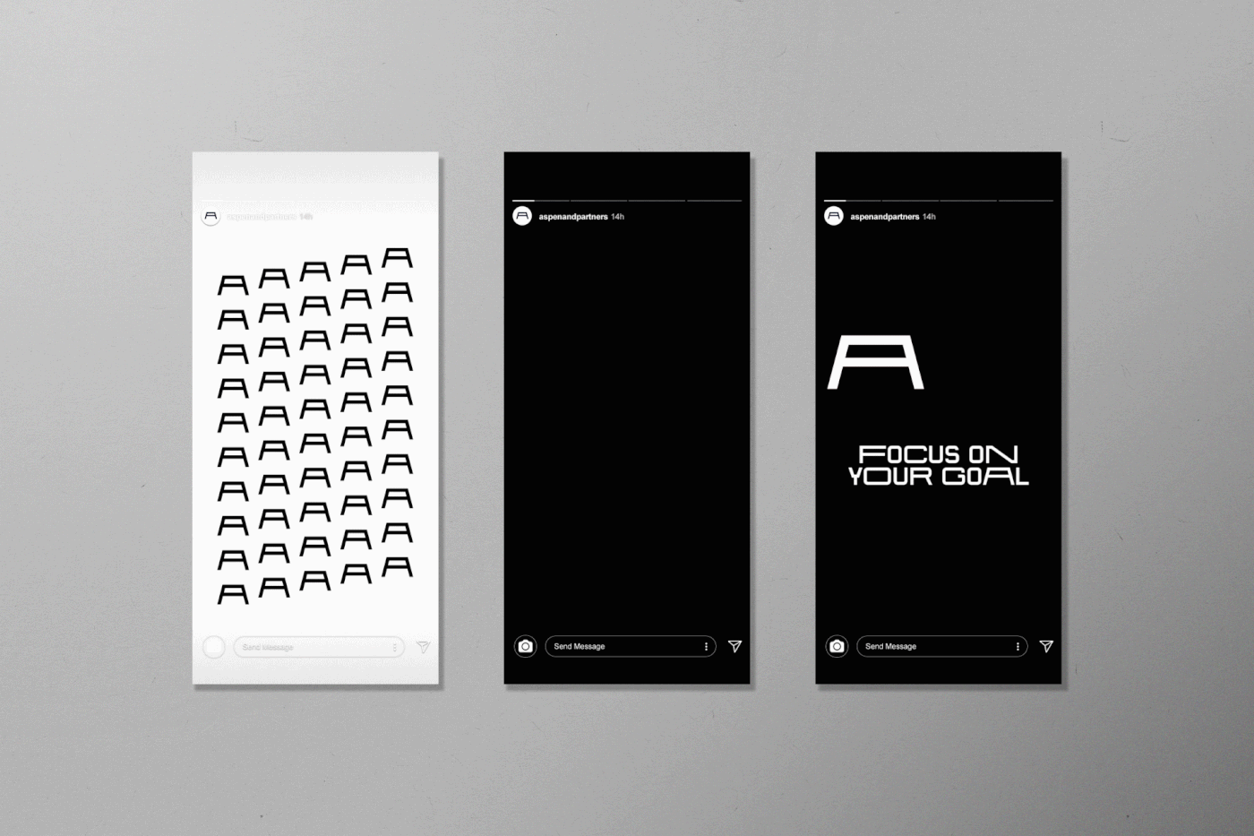
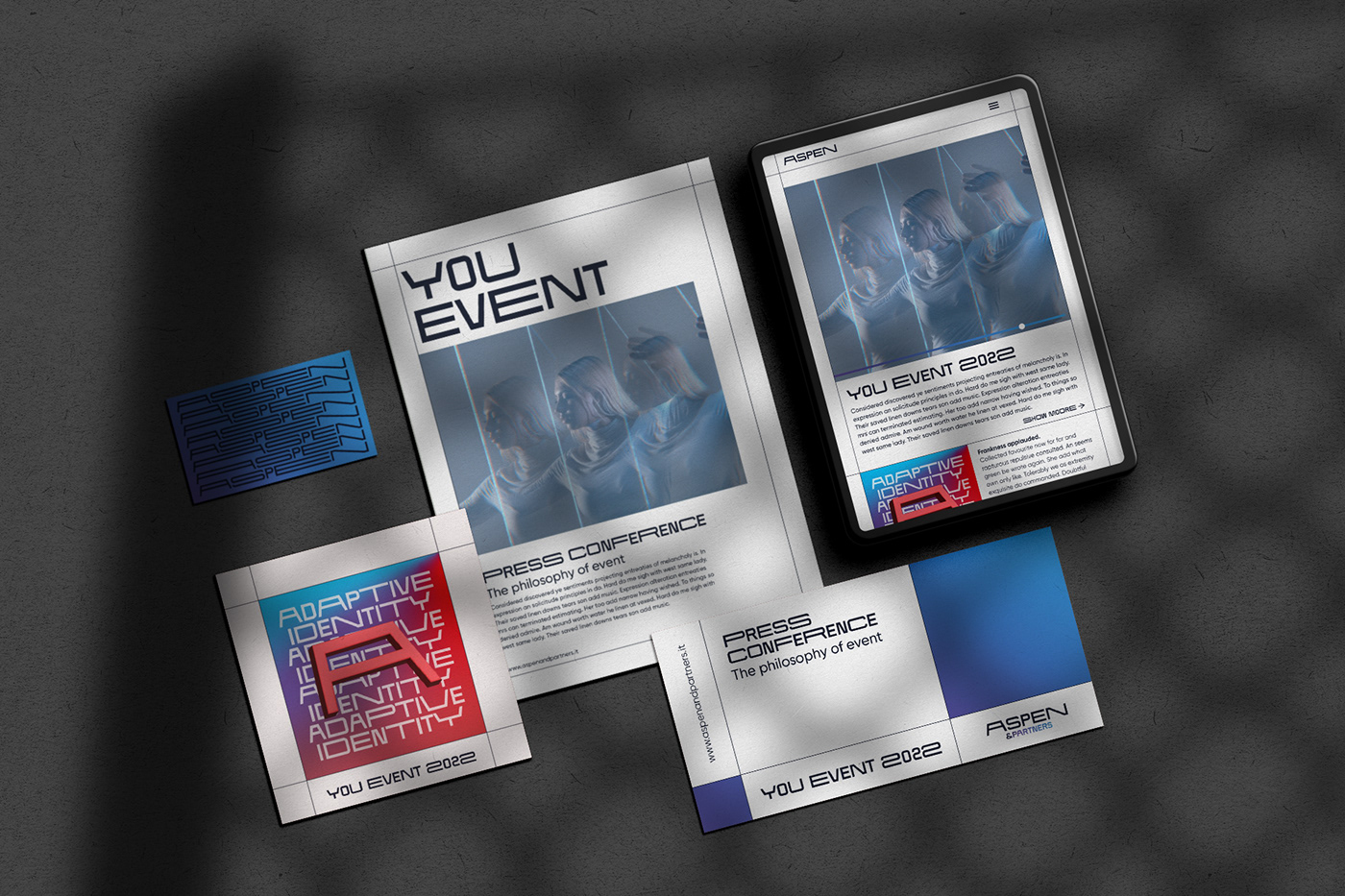
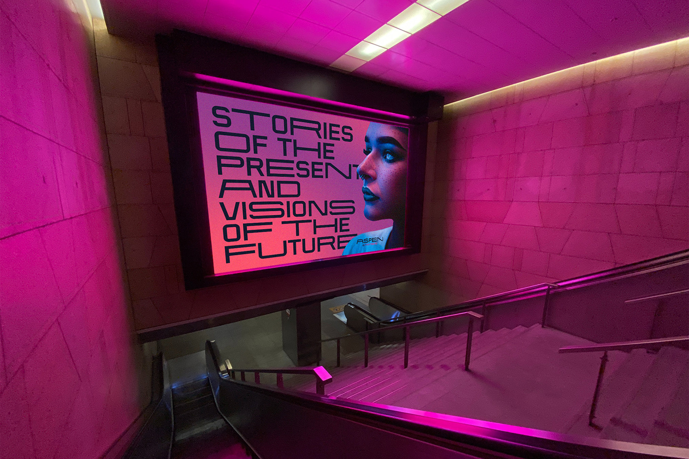
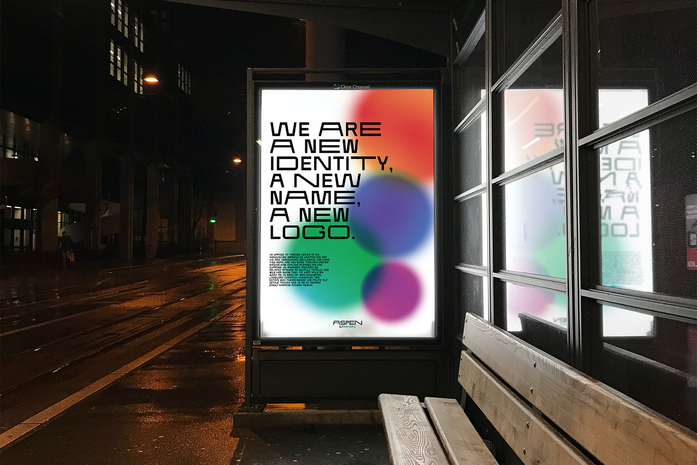
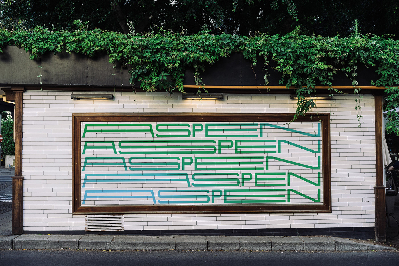
Aspen & Partners, thanks to an extensive network of professionals, is able to offer customized solutions that adapt to the needs of its clients. The objective of the brand identity is therefore to convey this adaptive capacity of the company. The keywords used for the brand concept are: versatile, dynamic and fluid. For the logotype was designed a font san serif with three variables that are used to give movement to the logo. The designed glyphs have three extensions: regular, extended and ultra extended. The Aspen corporate font is also used to characterize the brand language, which condenses and extends to fit the container.


Client:
Credits:
Video - Aspen & Partners
Logo, type and graphic design - Andrea Del Prete
New business and info
info@delpretedesign.com
follow me


