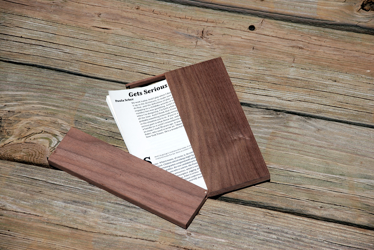
For this project, I was tasked with representing two contrasting articles or talks typographically. The Crystal Goblet by Beatrice Ward was chosen for us. I chose the TED Talk Paula Scher Gets Serious by Paula Scher as my reaction to The Crystal Goblet.
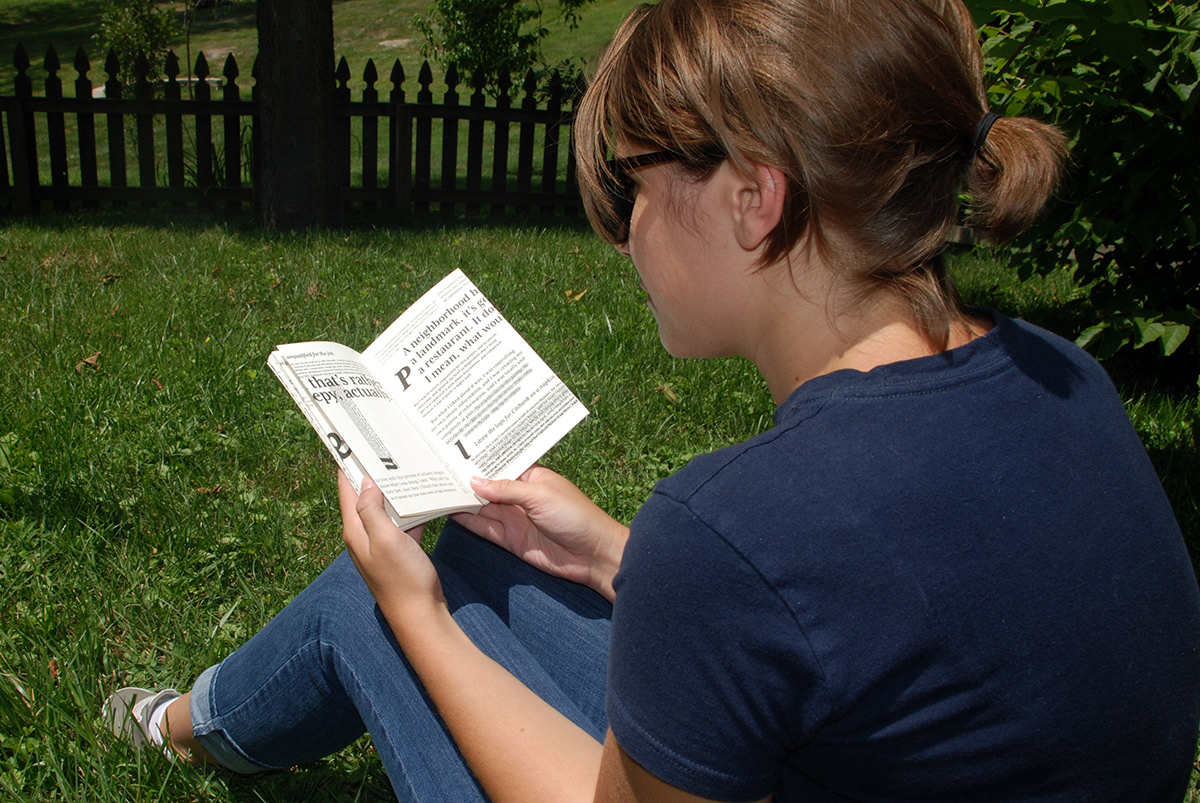
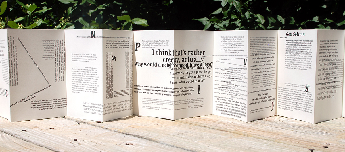
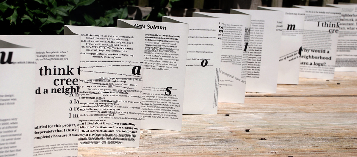
I chose to represent these two pieces in an accordion book. Each side represents one of the two articles. Each article starts at the opposite end. This allows the reader to flow from one to the other. The sides appear upside-down to each other, signifying that they are different.
The experience of the piece is that of elegance and boldness, both typographically and in the interaction. When turning through the pages by hand, the book is very intimate. However, when the accordion is spread out across a table, the sheer length becomes daunting.
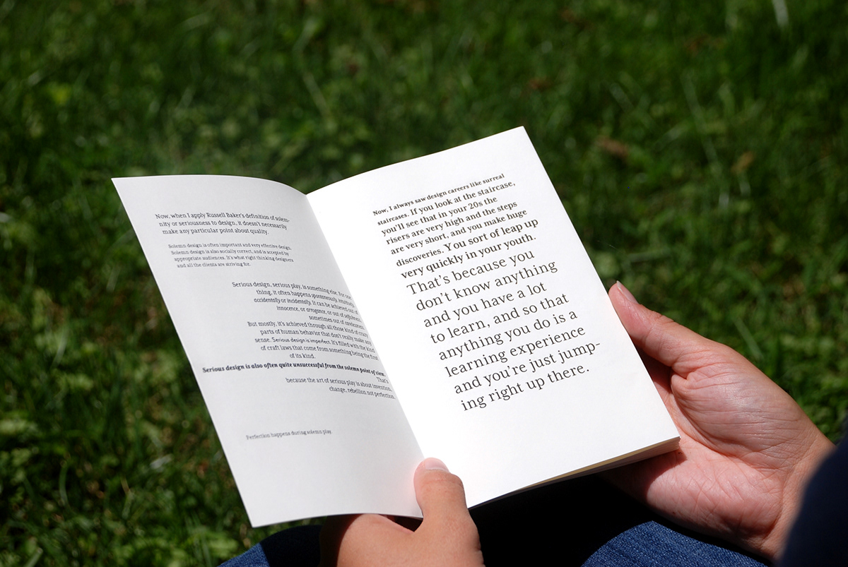
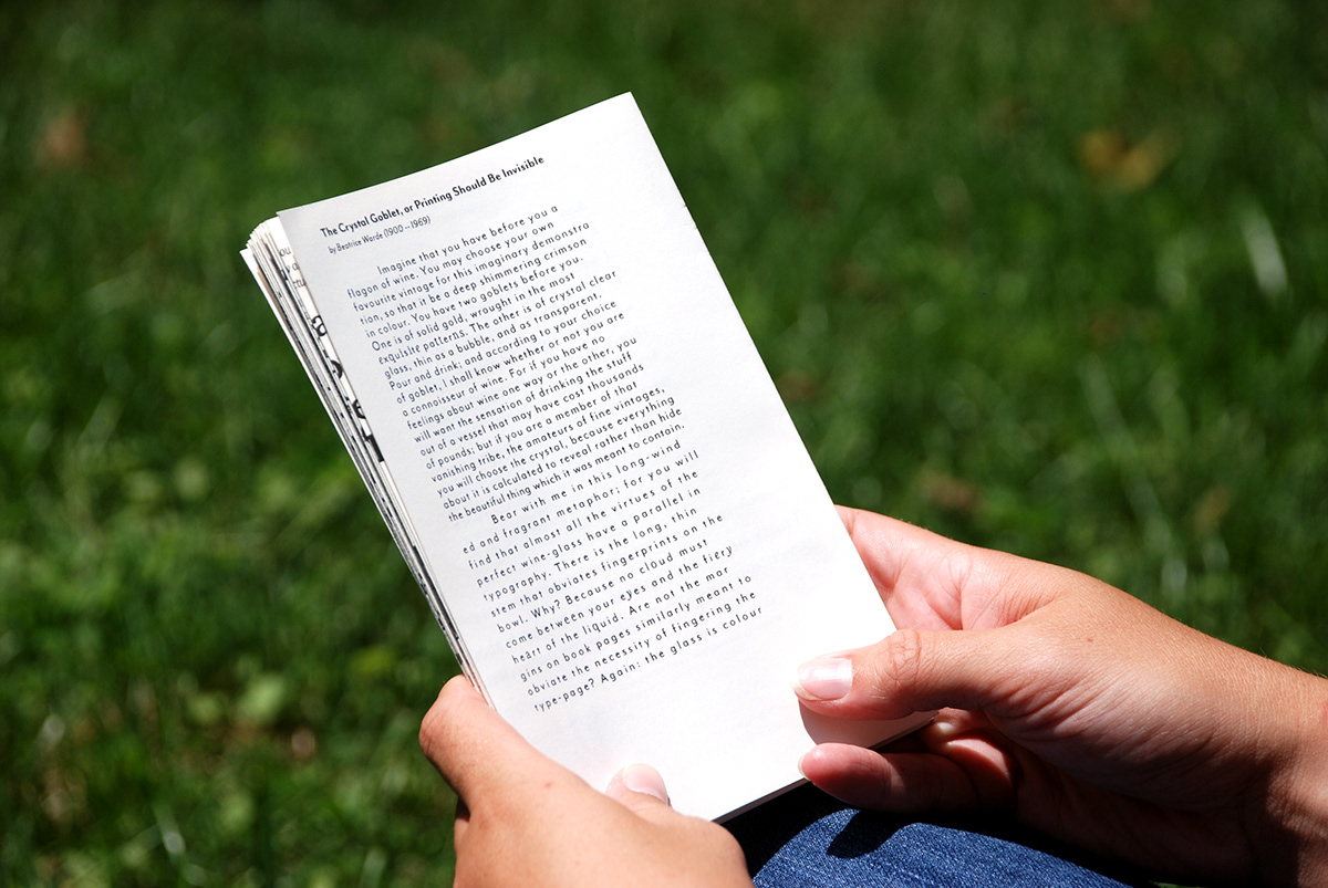
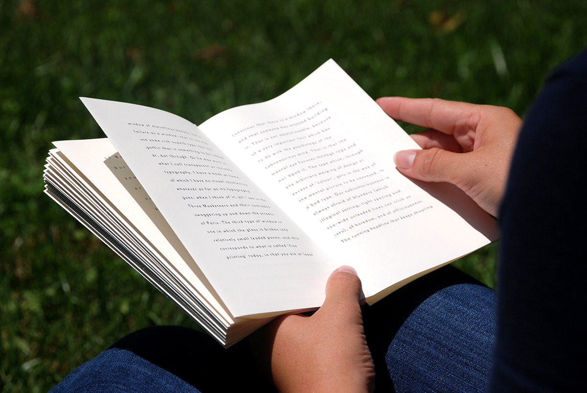
In the Crystal Goblet (shown 2nd), Ward puts forth her belief that typography should be invisible to the reader as text. The text conveys the idea and meaning seamlessly. She does not mention a specific typeface or style that must be used, but that the use of decoration and any printing techniques should in no way detract the reader from reading and understanding the text.
Ward’s article is representing one time over the entire length of the accordion book. The pace is drawn out dramatically to show how a reader can become lost or dazed when going by The Crystal Goblet. There are a few design inconsistencies with the typography that relate to the contradictions in Wards article.
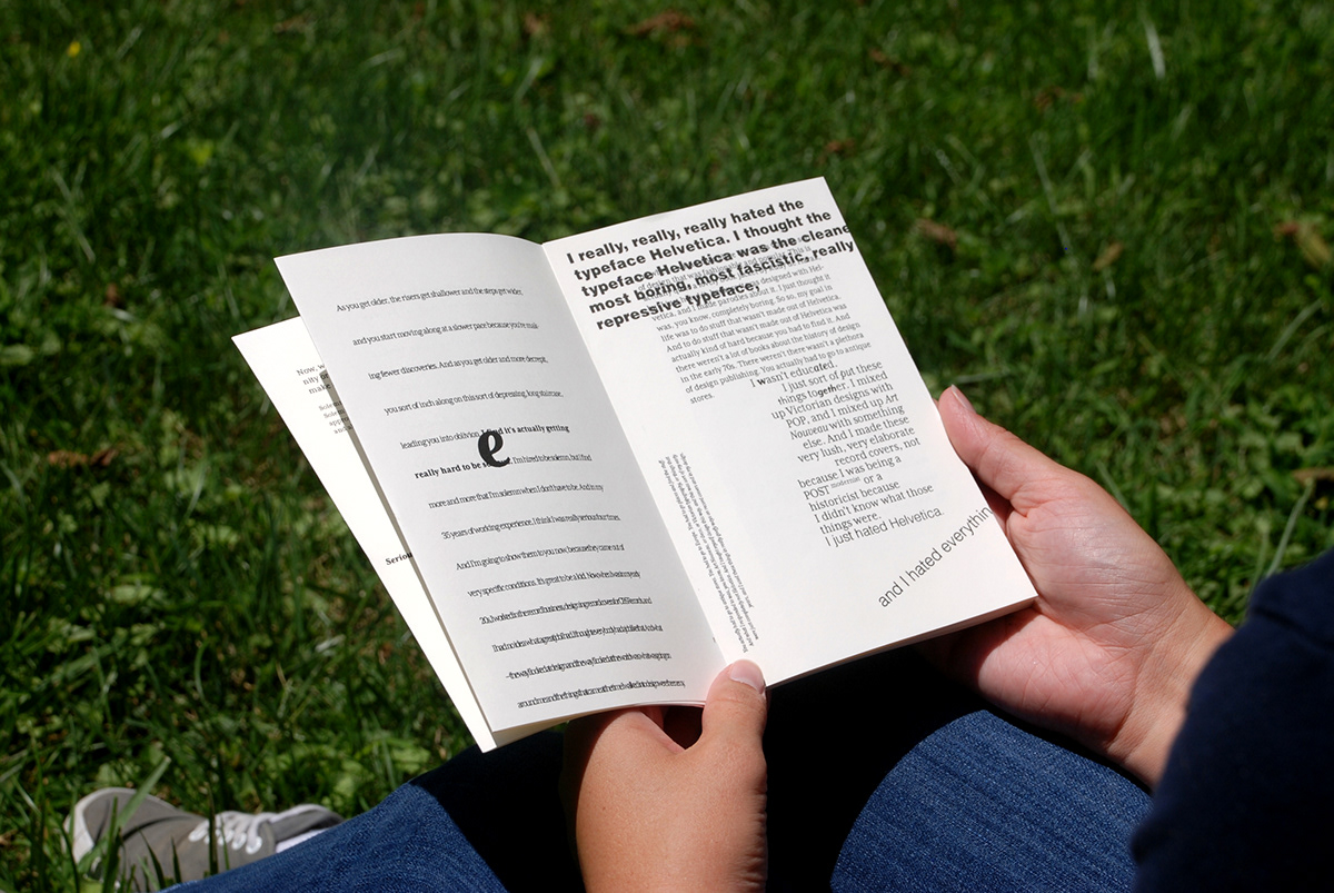
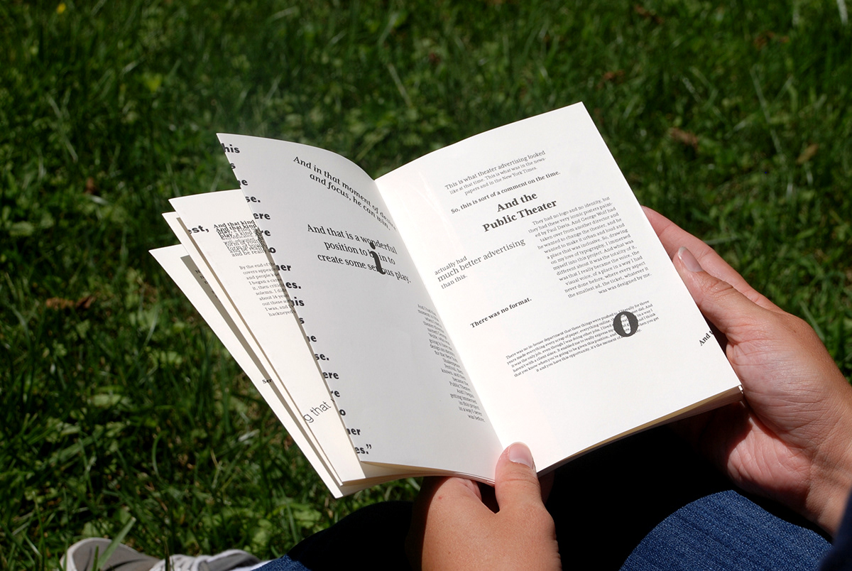
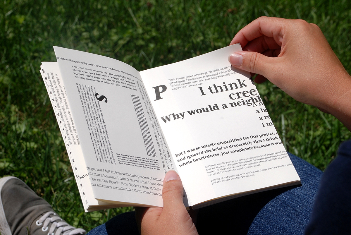
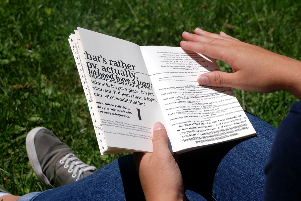
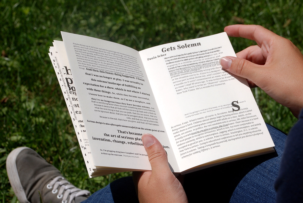
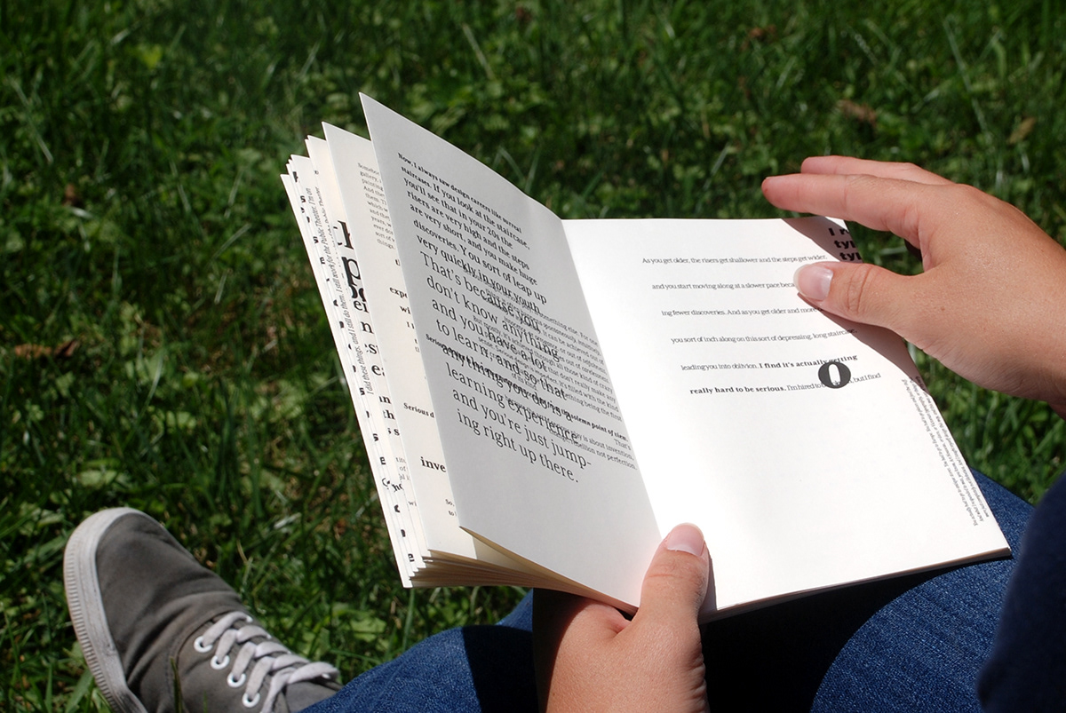
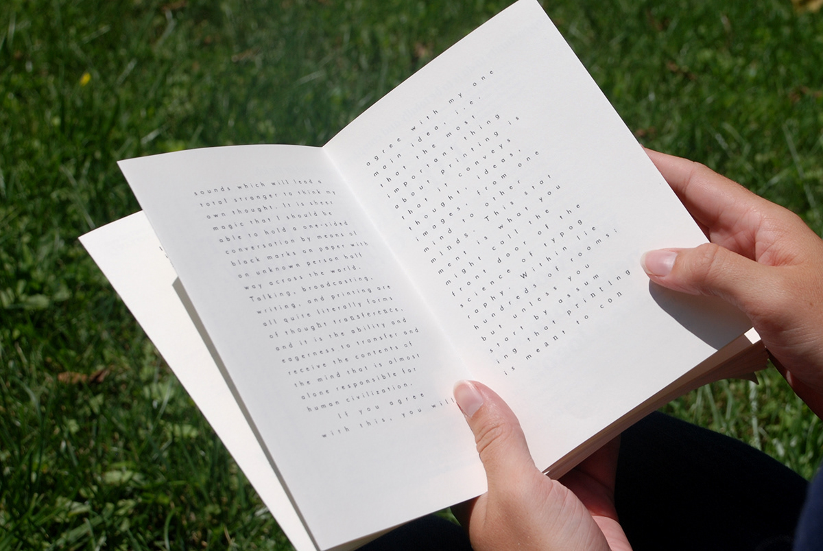
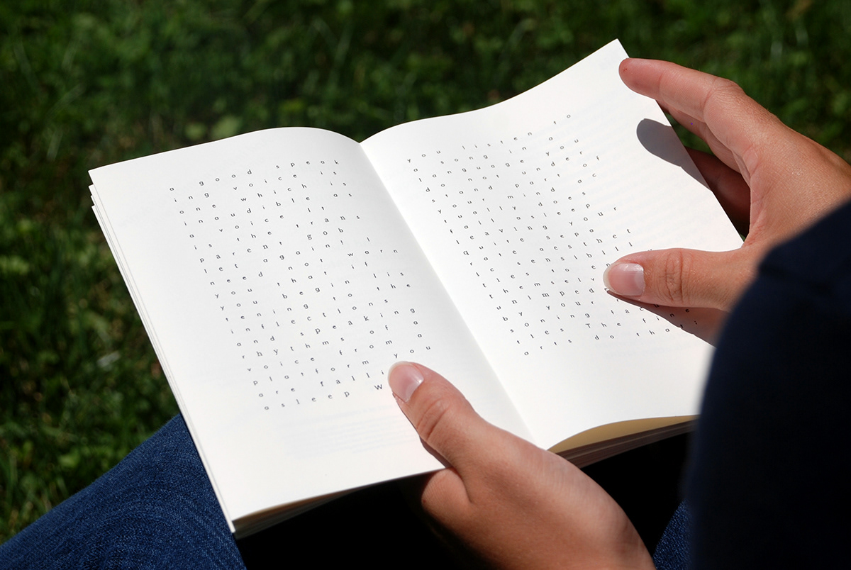
In the TED Talk by Paula Scher (shown 1st), she discusses two types of design, solemn and serious. The choice of this text is my response to what Ward discusses in her text. Solemn design is essentially what The Crystal Goblet is intending, by all typography having the same general voice. Serious design is not at all about perfection. It holds the ability to become solemn over time and repetition. Most design will eventually become solemn once it is repeated enough. Serious design is where typography is allowed to evolve, change, and inspire a difference in creative voice.
The entire transcription of the talk is represented twice. Once showing serious design and play. The repetition is a new design, but very familiar to the first. This shows how serious design can become solemn through repetition without the room for creative play.
Conclusion
By choosing the talk by Paula Scher, I am not going completely against the ideas expressed in The Crystal Goblet, but I am showing the need for both ideas to live together within the design community. There is a time and a place for the typographical voice to take a backseat to deliver the information seamlessly. That’s not to say the voice will go away, but just glide under the radar of readers. There is also a time for the voice to stand bold and even possibly outrageous, using the designer’s creativity to contribute to the design outcome and the discipline as a whole.
* Digital layouts at the bottom. Each section is four pages or two spreads.