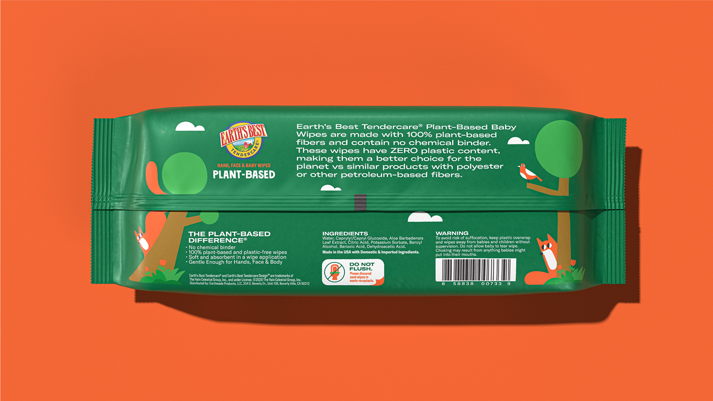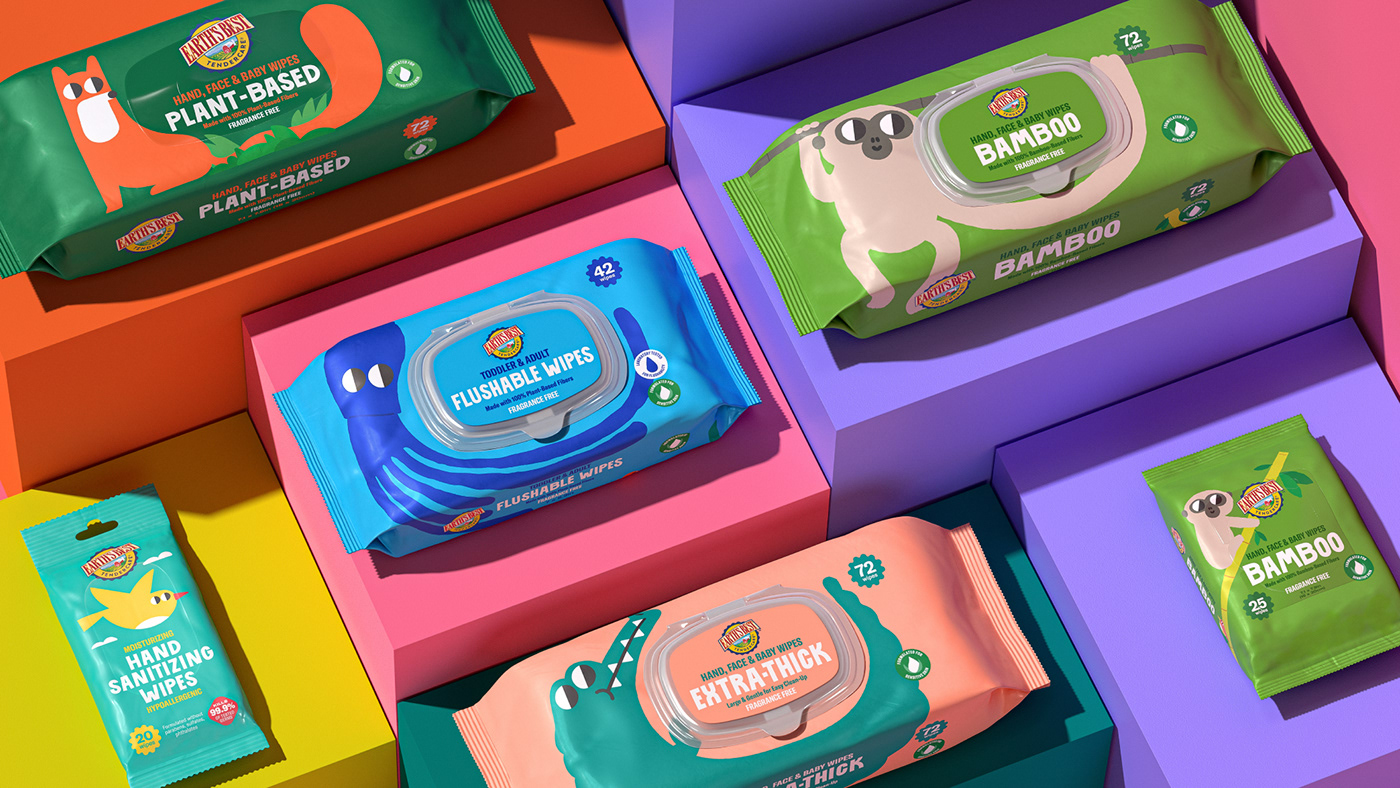

In a rather competitive landscape with many start-up brands popping up and new products constantly being introduced in the market, Earth's Best decides to launch a new line of baby wipes without chemicals, emphasizing natural materials.
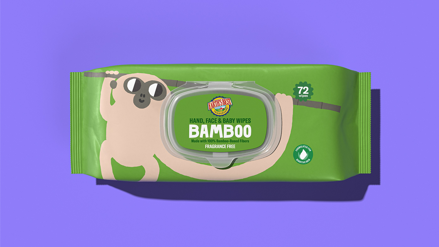
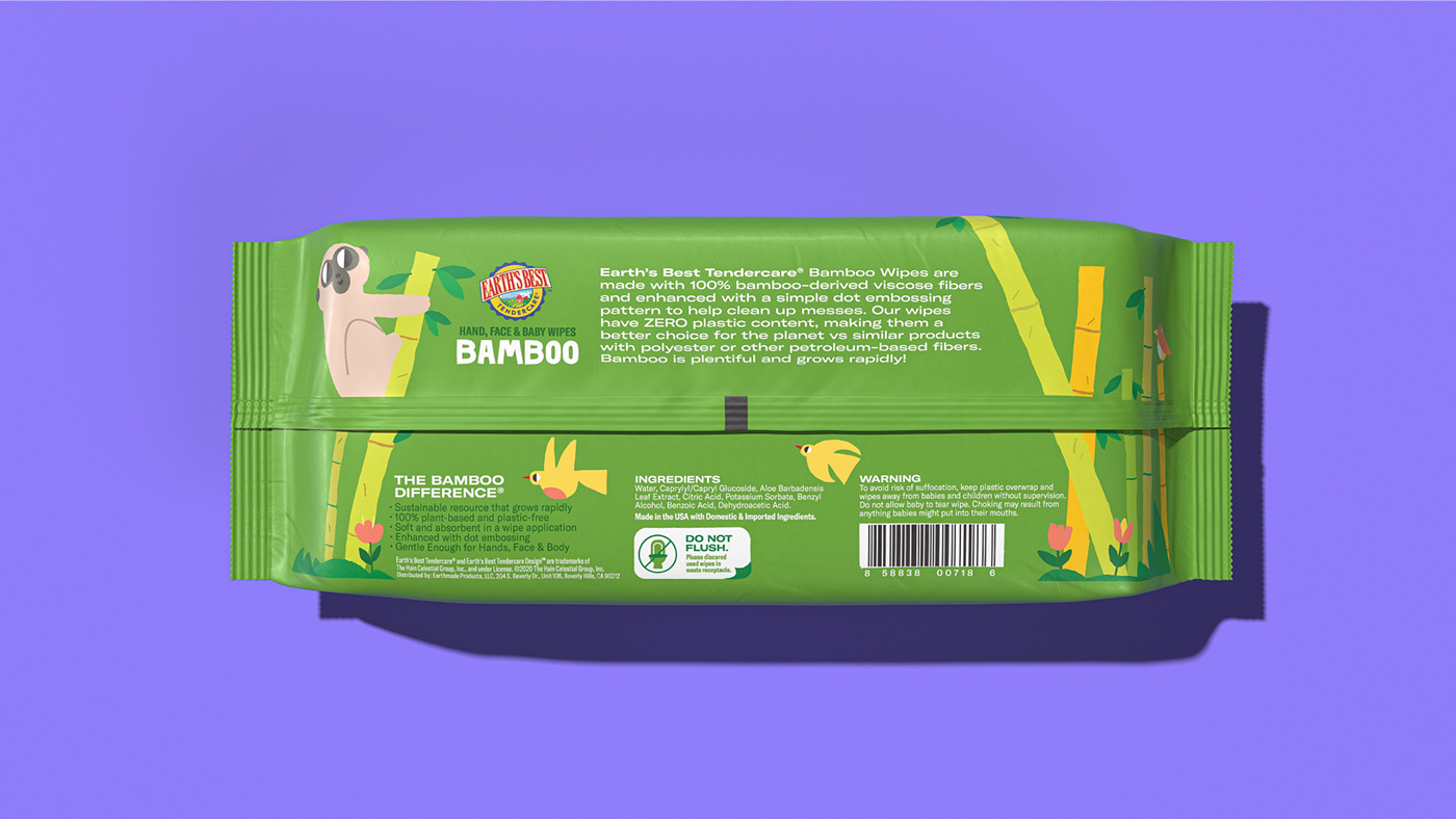
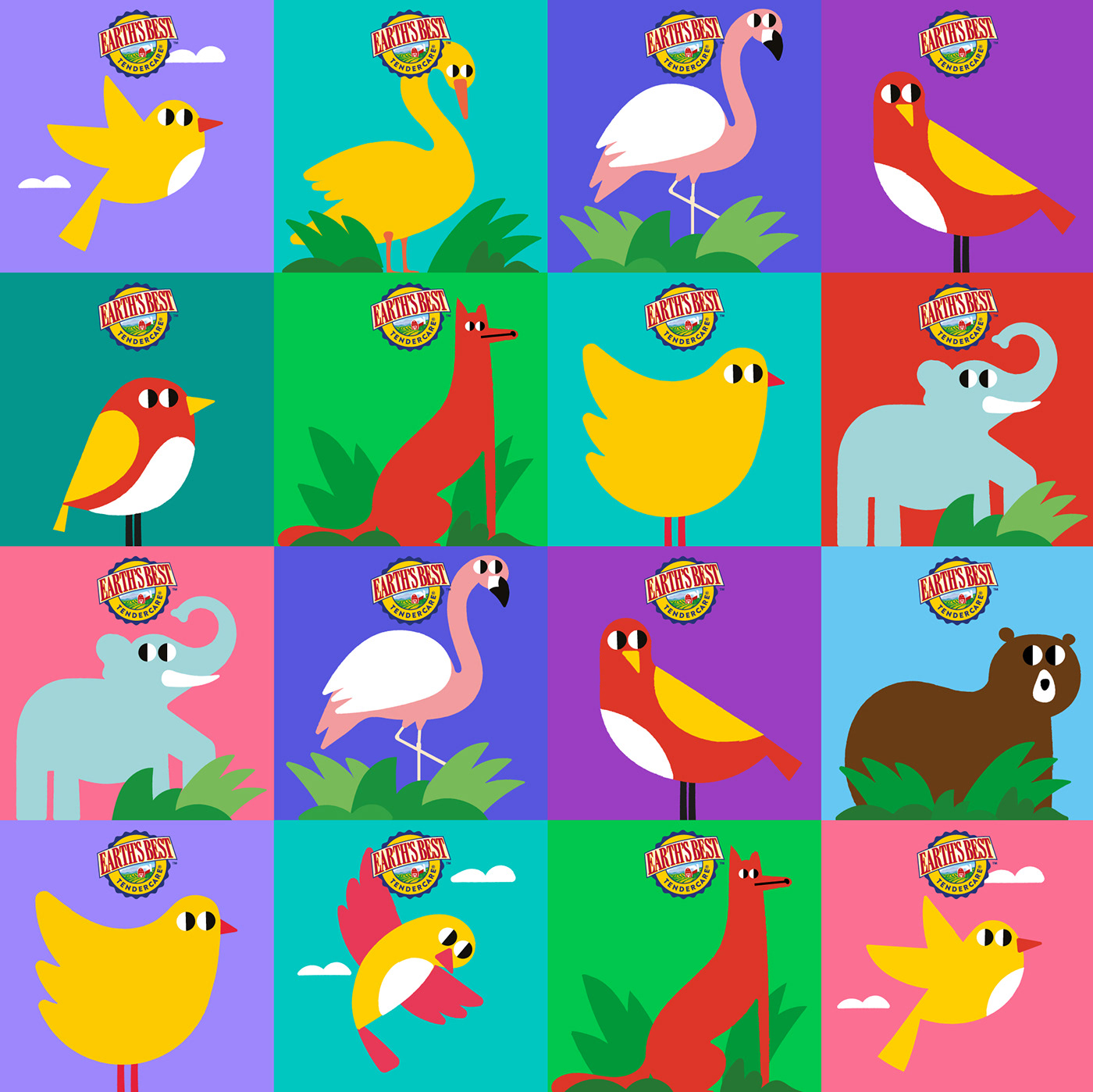
The design heroes of this product range are five super-cute animal mascots in their natural habitat. Inspired by the "natural" product and brand name "Earths' Best," we designed each reflecting the primary product benefit of each SKU.the monkey hanging on a bamboo rod visualizes the Bamboo-fiber wipes,
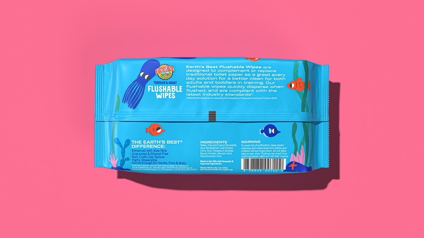
the octopus in the sea shows the water-soluble (Flushable) wipes,
the crocodile sunbathing on the edge of the lake defines the Extra Thick,
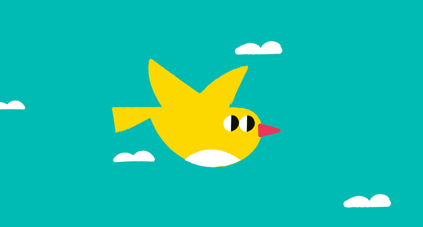
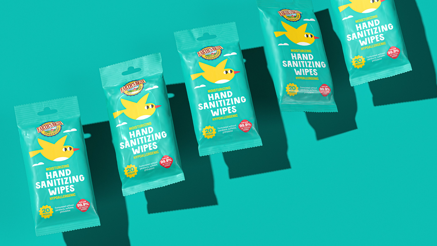
the bird refers to light on-the-go Hand wipes,
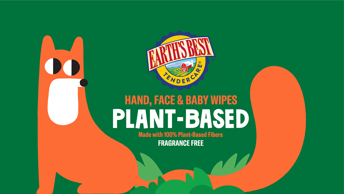
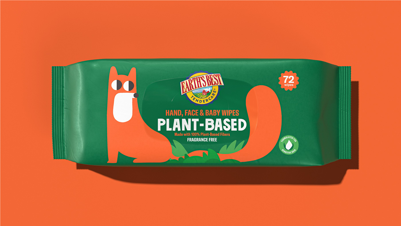
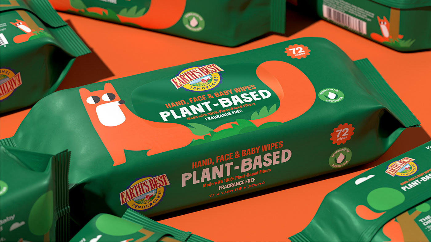
and finally, the fox in the forest
implies the smart solution for Hand / Face natural wipes with a witty touch.

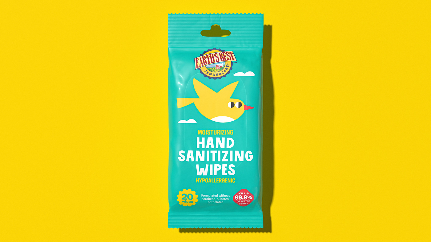
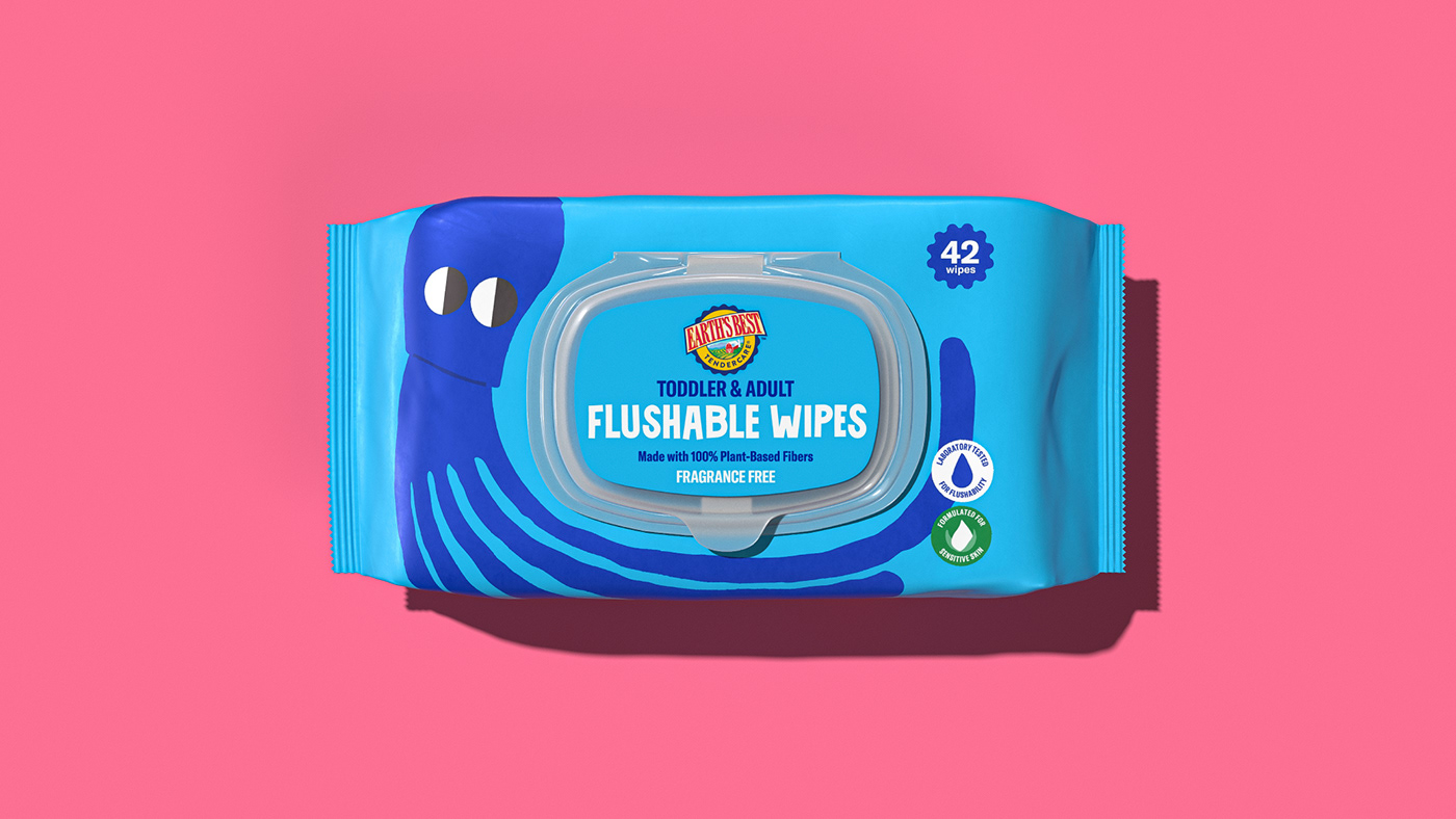


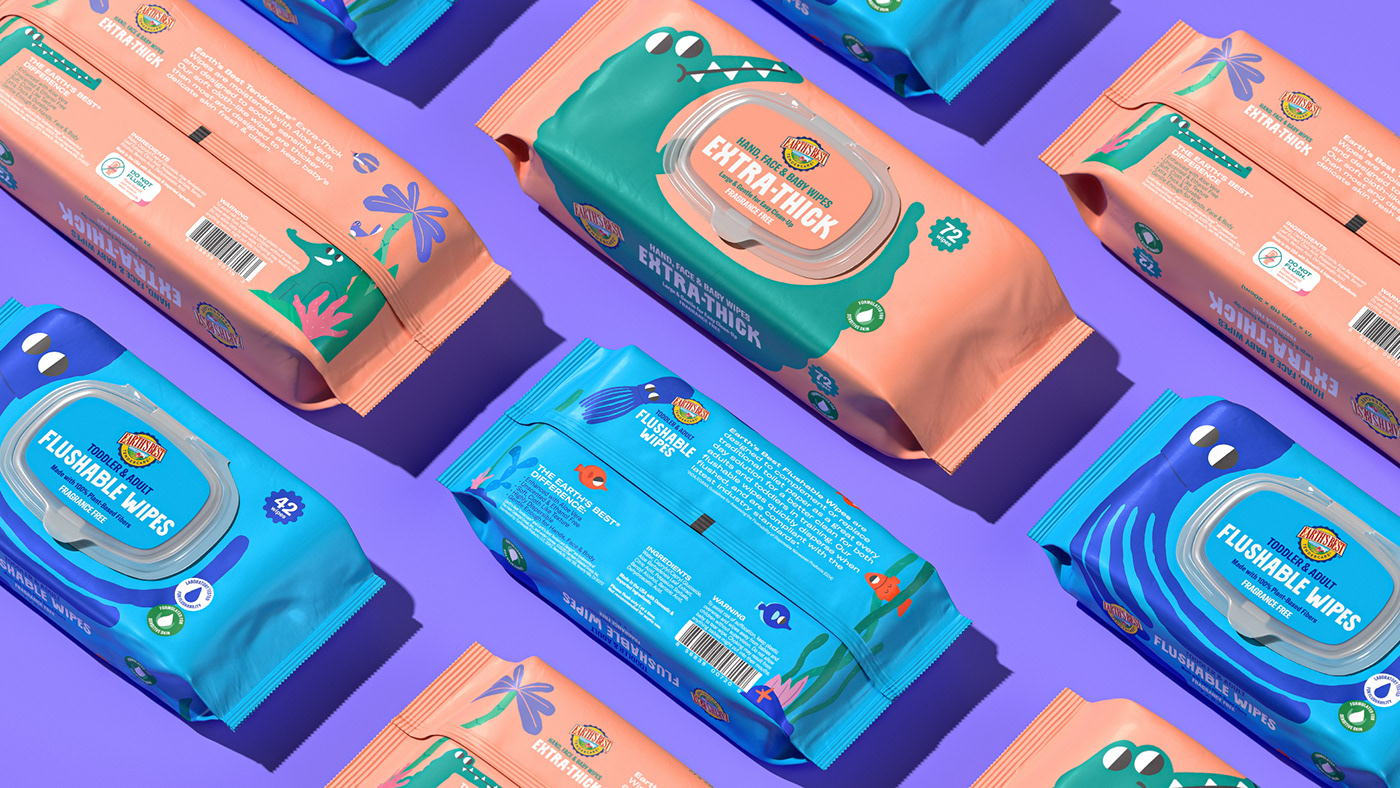
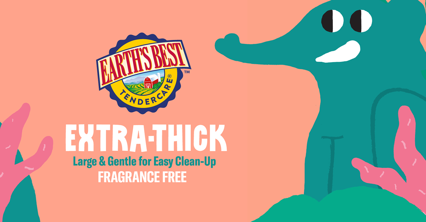
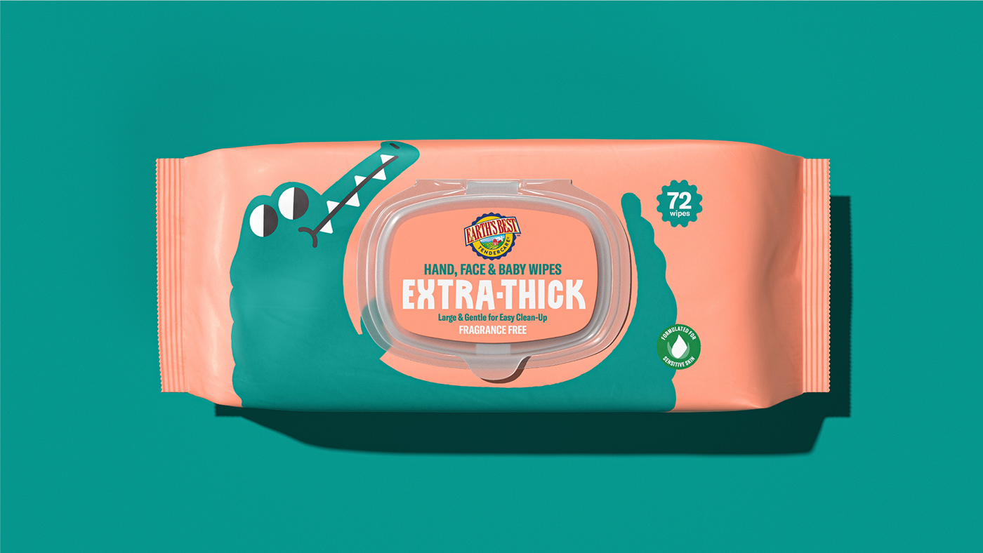
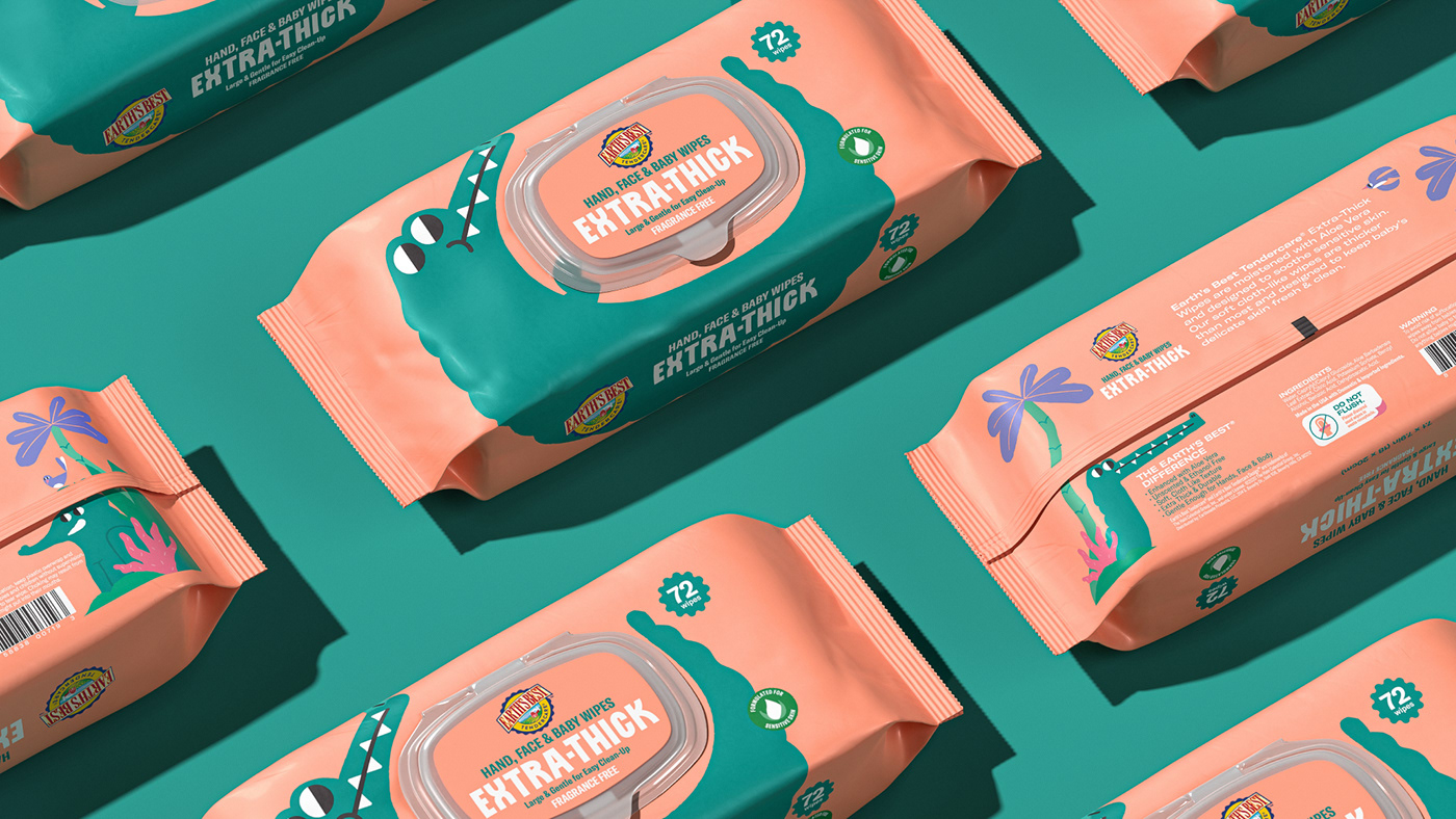
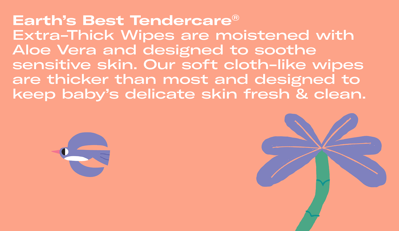
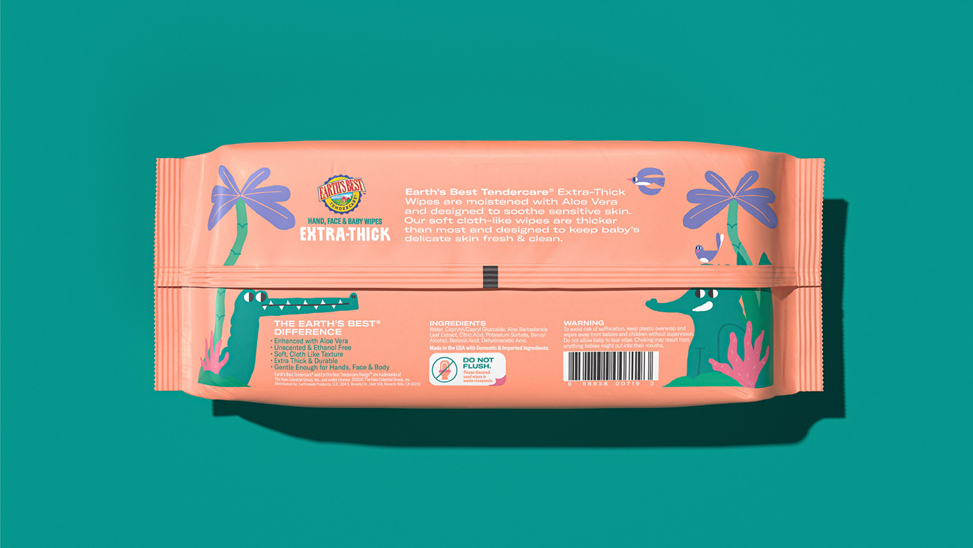

Since their use is mainly for baby care, the design aims directly at new parents. So we created an illustration series with a naive style, without realism and spikes, consisting of smooth shapes and eye-catching colors inspired by the modern cartoon and children's book ecosystems.
Front sides display the characters in a way they interact with the lid and embrace the opening of the packaging to reflect tenderness and care even more.
Front sides display the characters in a way they interact with the lid and embrace the opening of the packaging to reflect tenderness and care even more.