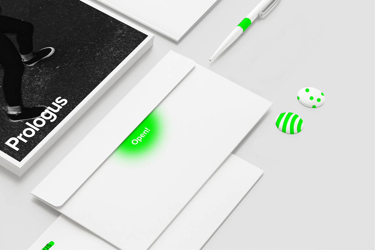
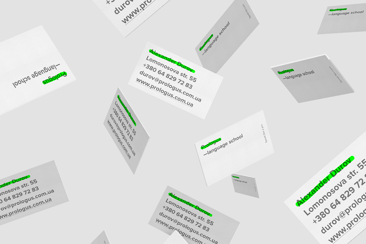
Prologus is the Kyiv based language school with an innovative approach to teaching. The training emphasis is not on the complexity of the in-depth study, but the speed and ease with which a student can learn to speak a foreign language.
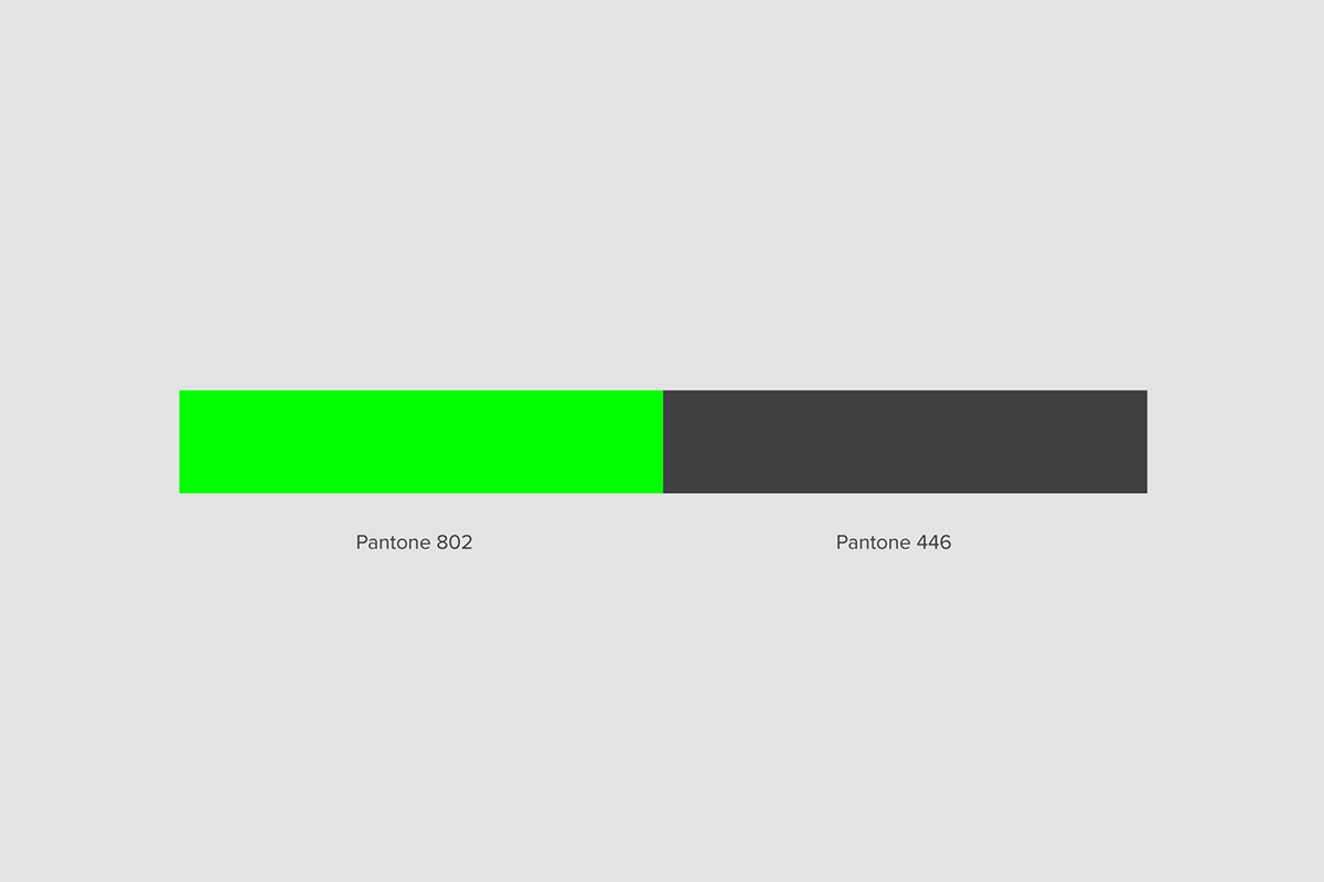
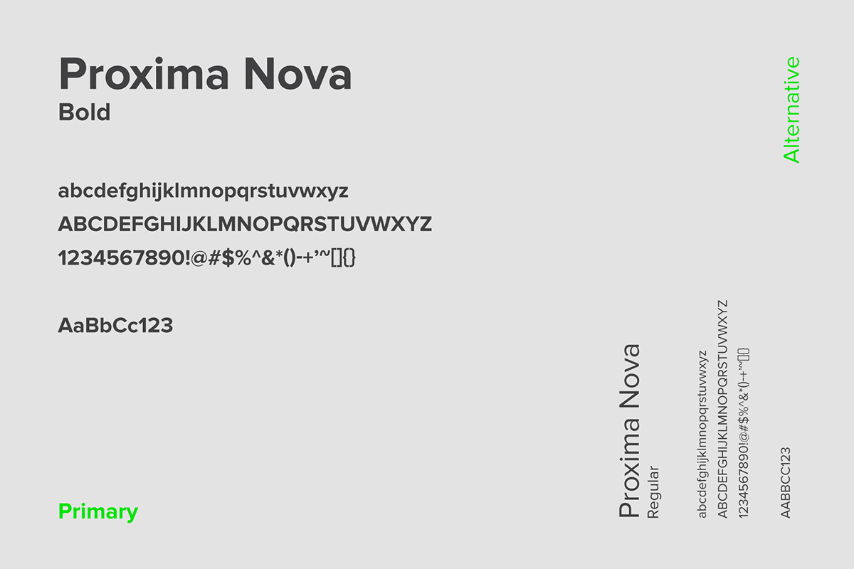
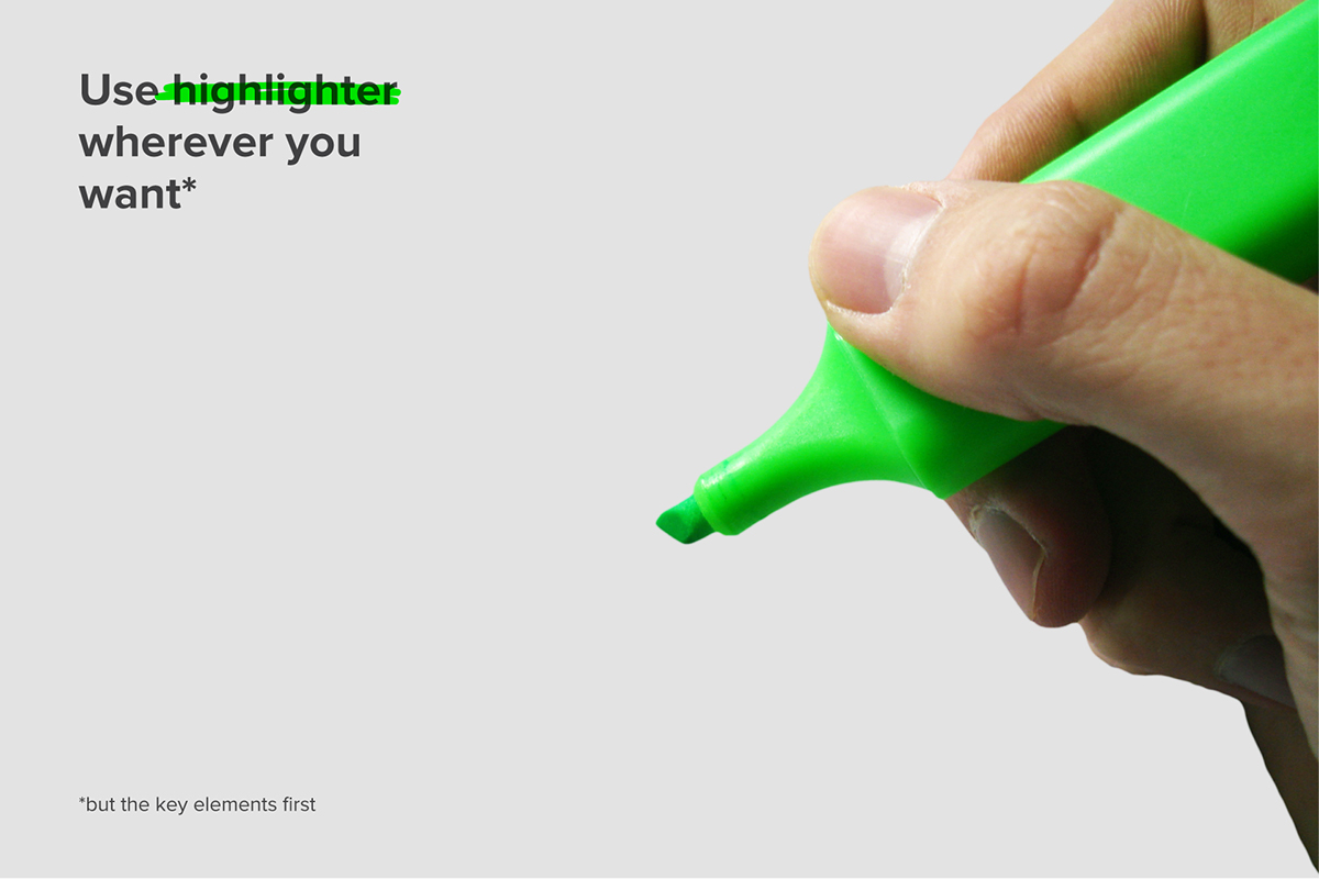
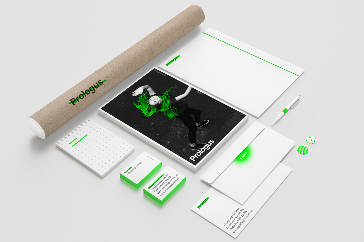
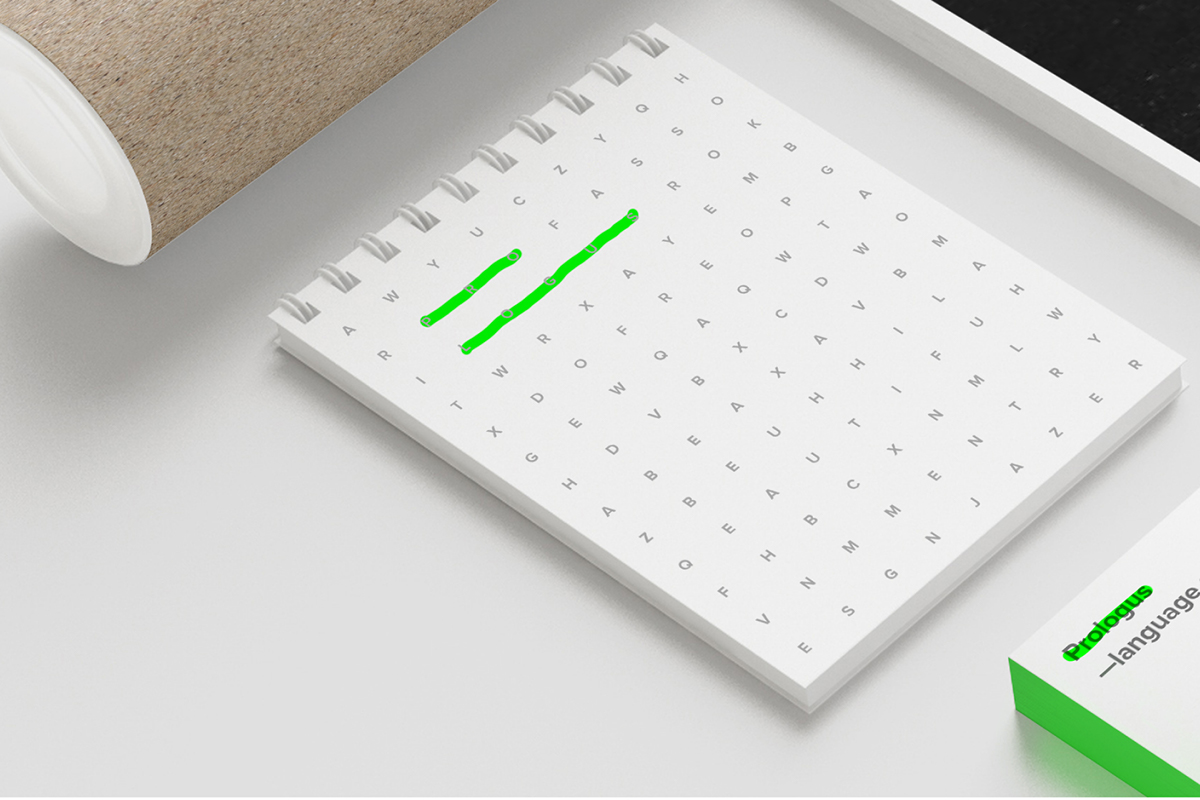
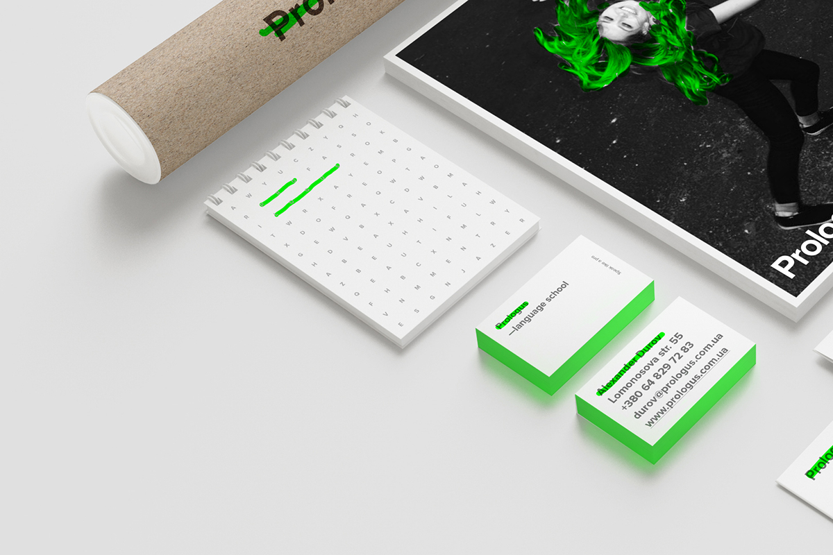
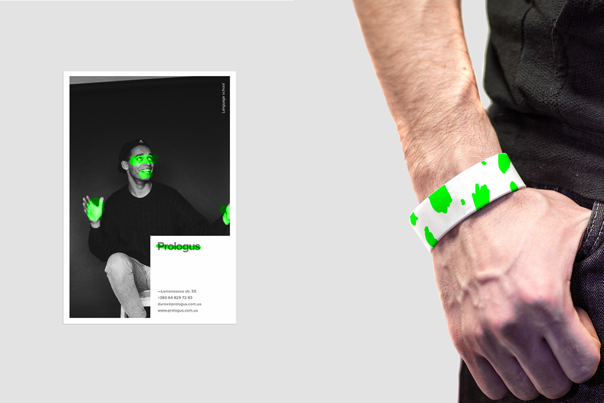
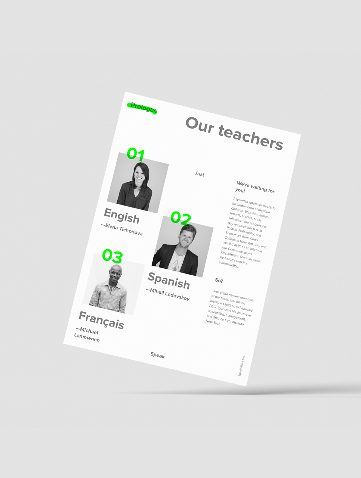
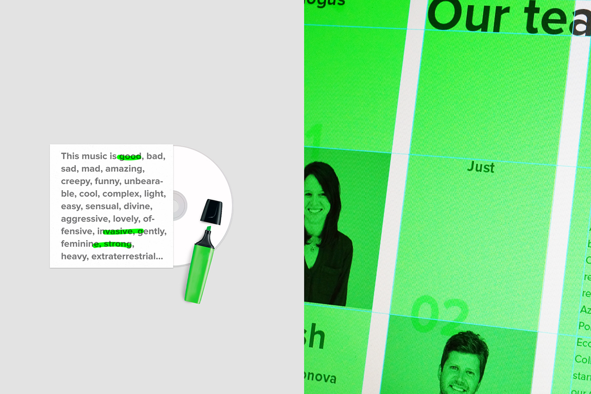
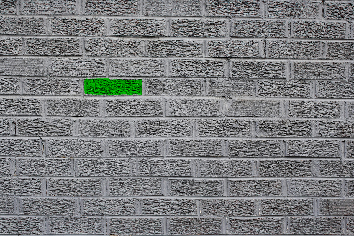
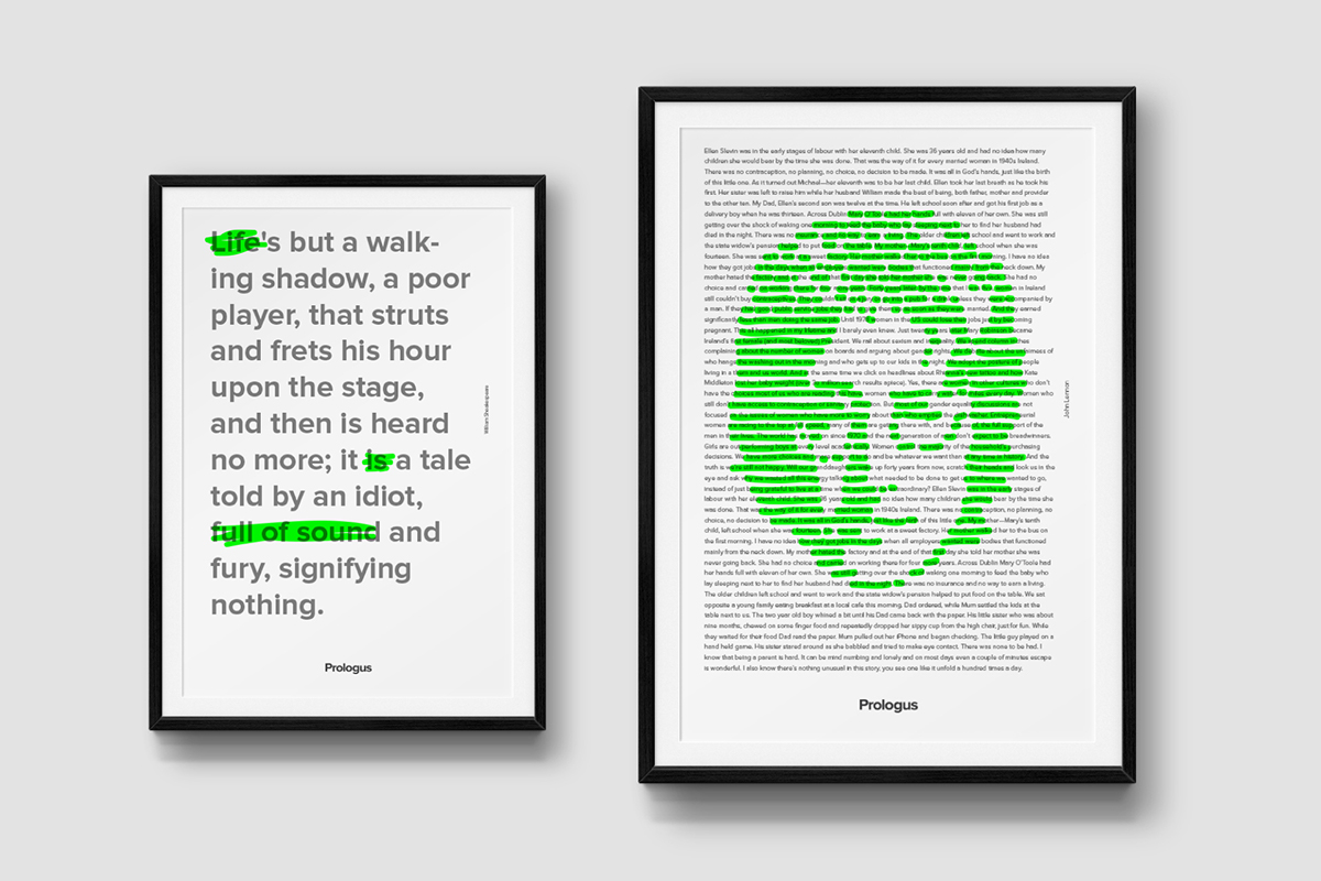
It was decided to use fresh and bright colors to attract young people. There is no corporate identity logo. Instead, the name of the brand typed by corporate font and always crossed out with a highlighter. As a key action was chosen strikethrough of important elements by highlighter to accent attention to them. Also crossing the highlighter can be used in any media for fun.
All rights to photos belong to their owners and are used only for demonstration. Example of the photos by Jessica Haye and Clark Hsiao


Thanks for attention.

