Ferris and Sylvester are a folk/blues duo from the UK that I have worked with since 2016. Over the years, I've created multiple EP and single artwork for them, including their EP 'Sickness', which featured a graphical fox. This fox morphed into a symbol of Ferris & Sylvester and was used throughout tours and across social media for years to come. It developed into part of their identity. So when it was time for Ferris & Sylvester to set up their own record label, we knew where to start.

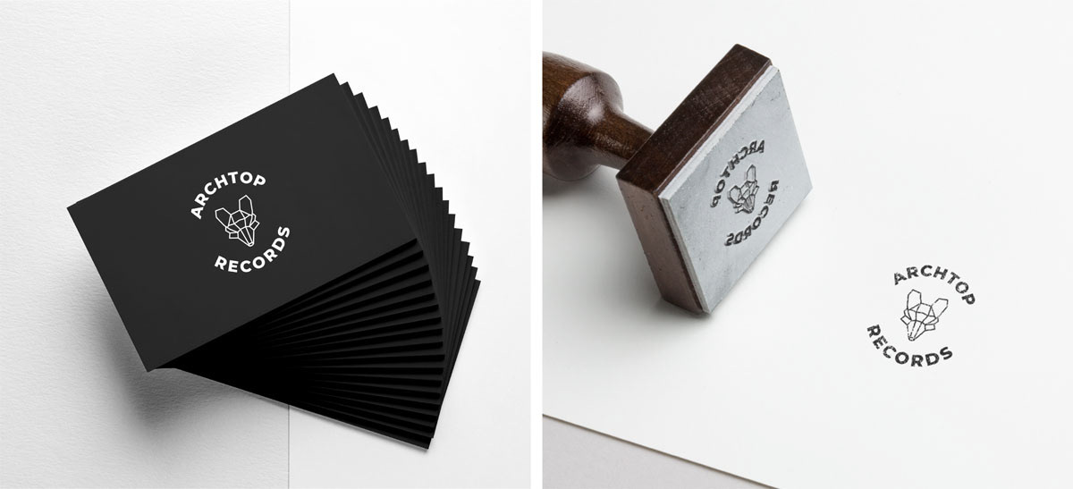
So the fox could work as a logo, it needed to be adapted to be scalable. This logo would appear on CD and Vinyl spines, as well as large scale prints. So I reduced the number of lines featured in the original fox graphic, added some line weight and positioned the type to encase the fox, pulling your focus to the centre. We used the same colour palette for Archtop Records as the 'Sickness' artwork.
As a nod to the impact of the fox graphic, I've used the 'Sickness' artwork colour palette in other artwork over the years. Scroll to the bottom of this page to see the additional artwork.
I provided the mockups below to the client to show how their chosen logo would look at various scales. As the label evolves, we will continue to develop the brands' visuals and collateral.