FRICON is a pioneer company in the Portuguese market in the domestic and commercial refrigeration segment, specialized in the conception, development, production and marketing of freezing and chilling equipment for supermarkets, ice cream freezers and beverage coolers.
studium developed FRICON's stand for Euroshop 2020, with the intent of starting a new era for the brand's communication. Along with it, a new catalogue was designed, following the new proposed art direction.
FRICON's statement (Cooling Life) was the inspiration for a new graphic approach, inspired by the aurora borealis.

Photo by Lightscape on Unsplash
IBM Plex typeface family was chosen in two variants ( Sans and Sans Condensed ).
The choice is based on three main reasons:
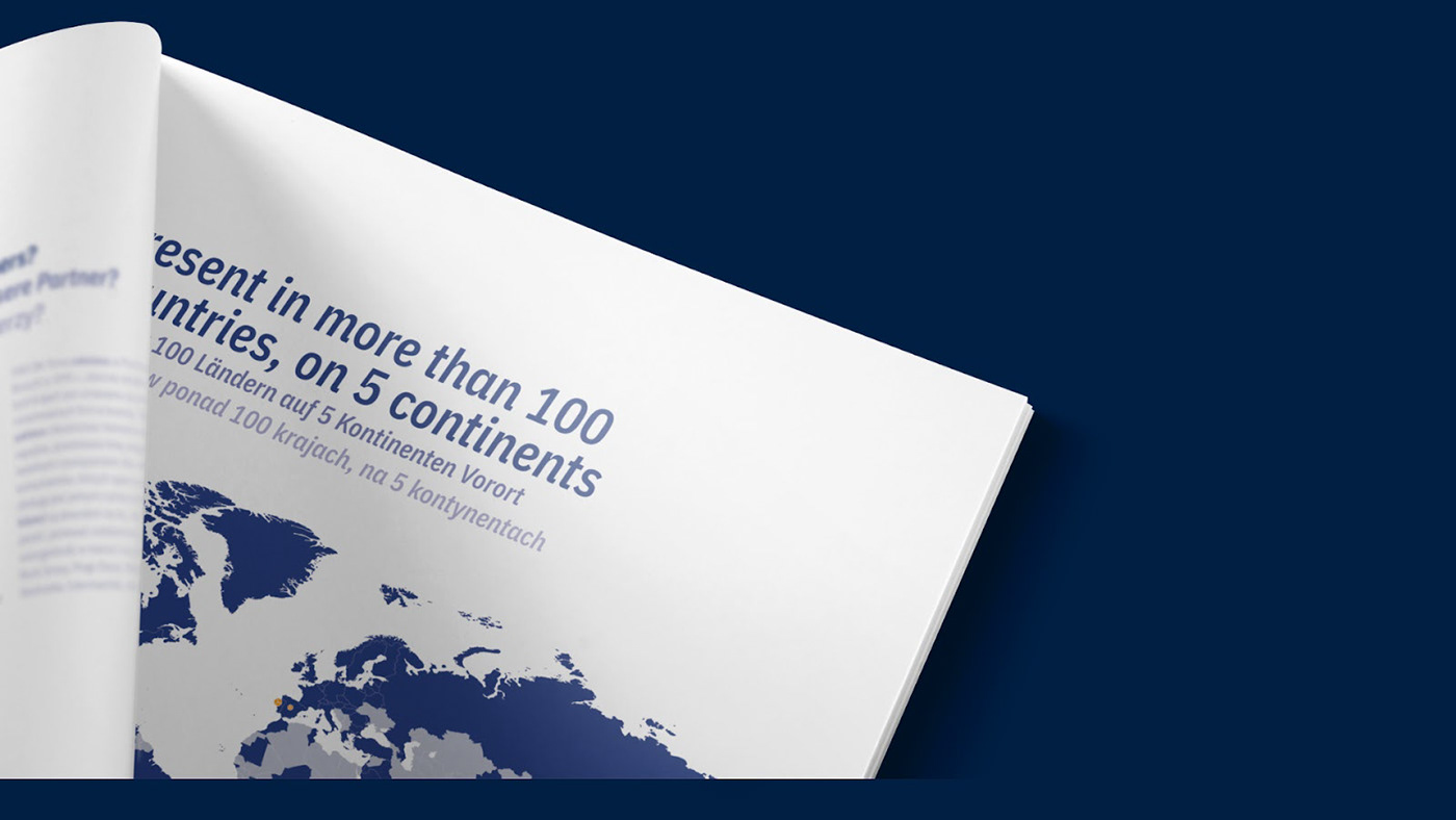
— the number of languages supported, since the catalogue would be published in 06 different languages;
— space optimization by using the condensed variant;
— the ability to act both as a highly legible typography or as an element of visual prominence;

Iconography also plays an important role in the catalogue, being the main differentiation feature of the sections and the respective types of products.
A unique set of icons was designed to be uniform in terms of expression, scale and legibility.