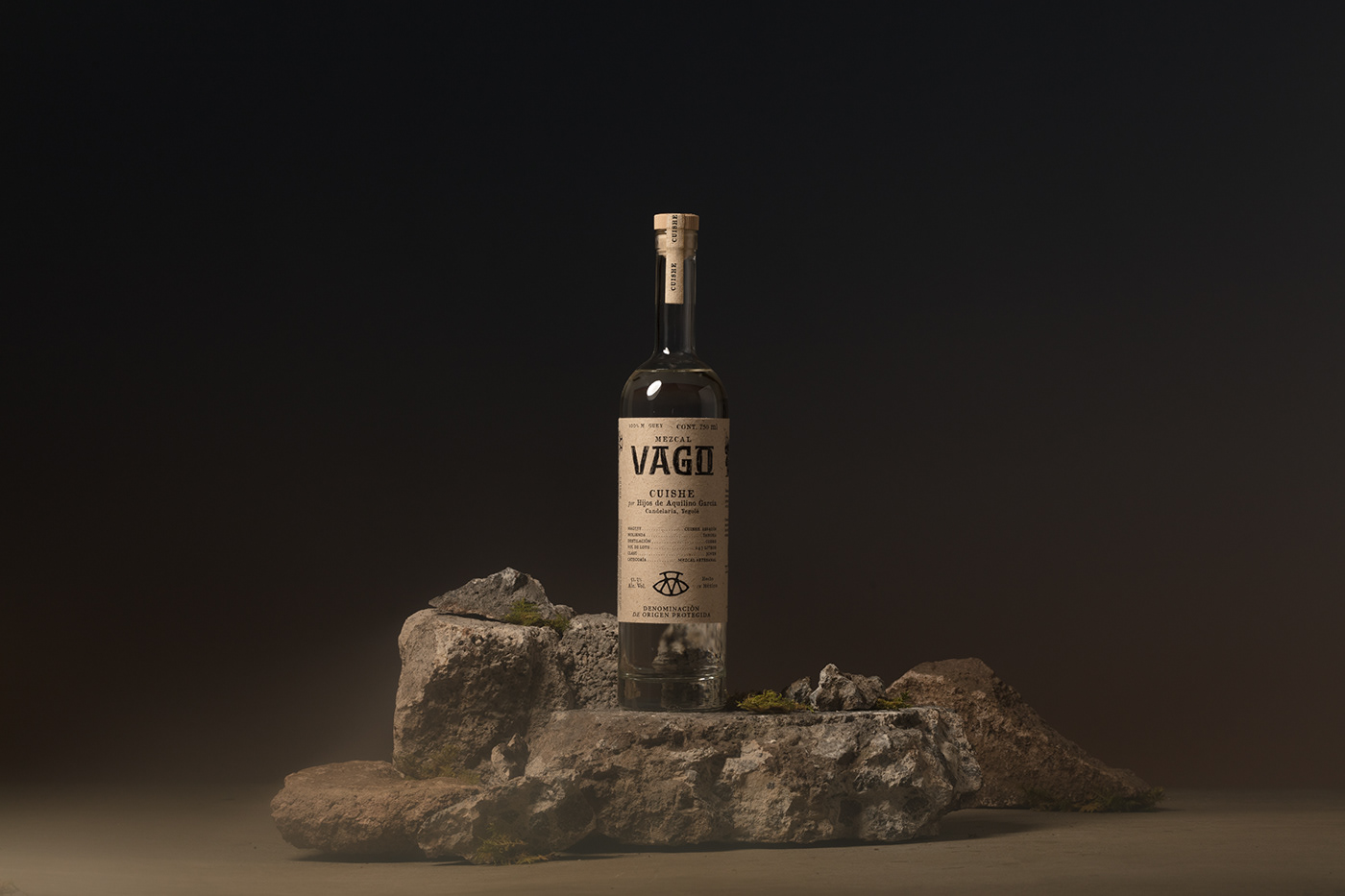
Unlike any other spirit, to drink mezcal is to taste the intuition of a mezcalero—its master and maker—and the raw combustion of place. We set out to capture both in our packaging brand and design for Mezcal Vago.
Playing the 'vago' ourselves, we traveled from village to village to take in these intangible “ingredients,” and celebrate the story of every bottling in our designs.

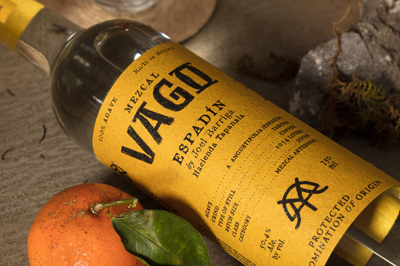
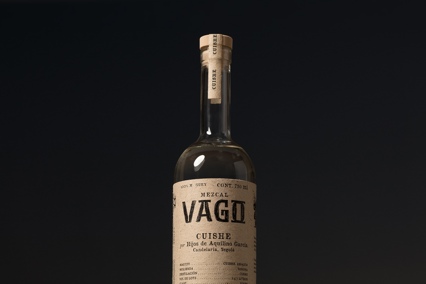
We started with the logotype. Vago is a bit of local slang, something like a vagabond or dilettante. A roamer who is gloriously content with doing absolutely nothing.
By bringing the name Vago front and center in the logotype, we remind drinkers that every bottle is an invitation to explore—to be transported to the dusty streets and agave-studded mountains of Southern Oaxaca and experience the pure, concentrated labor of love that is mezcal.
The imperfect feel of the hand-drawn letters is intentional. We wanted to replicate the rustic, ancestral mezcal-making process in our own design process. Working directly from sketches, we kept the imperfect lines as we moved to digital: a true Vago wouldn’t show up too polished.
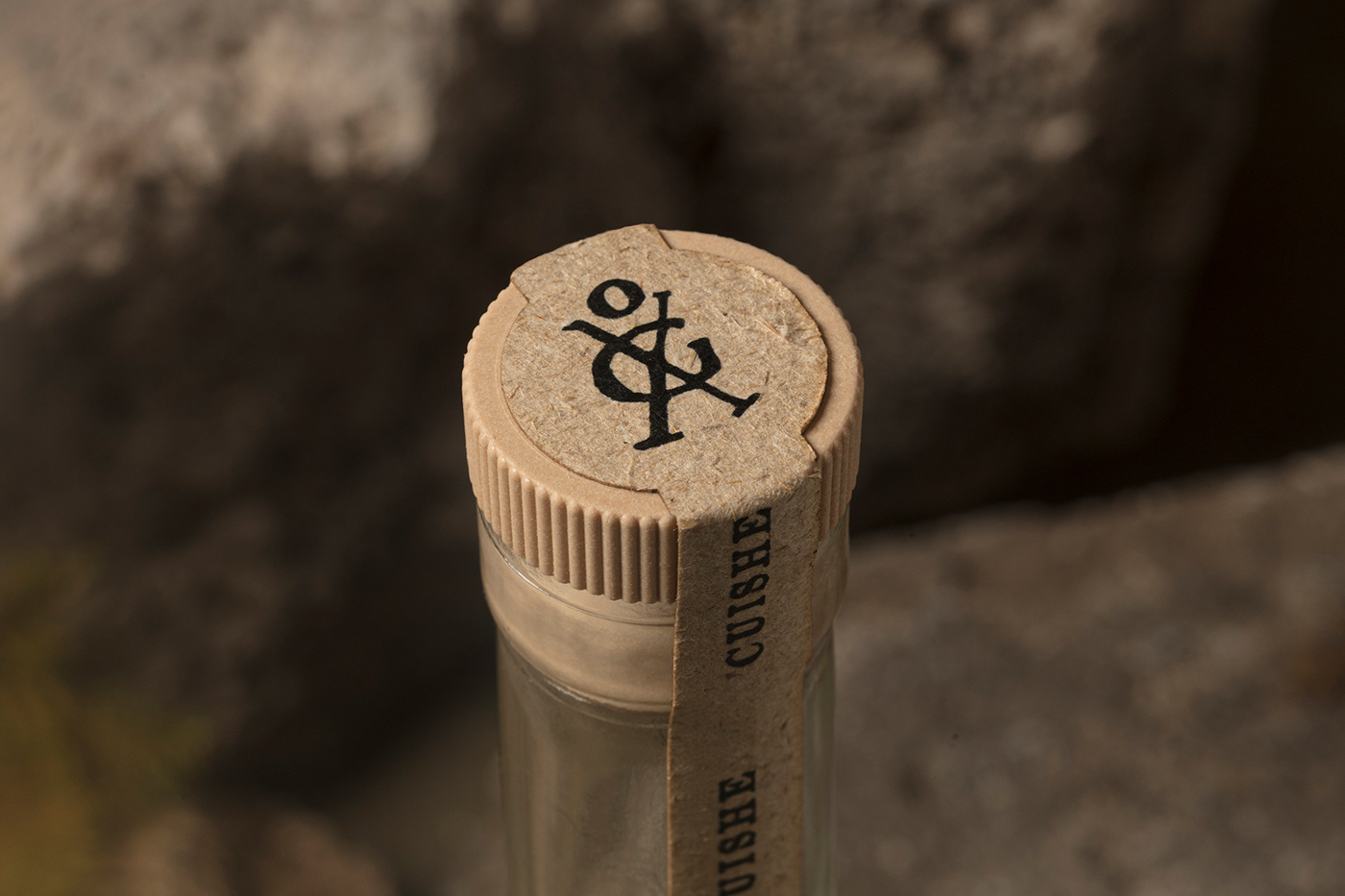
The Vago also takes on another form—born from the letters V, A, G, O, but given its own life as the drinker’s spiritual guide. Guarding the top and back of every bottle, our ‘Dancing Man’ whispers and welcomes them to, “Dust off a bottle and drink it in.”
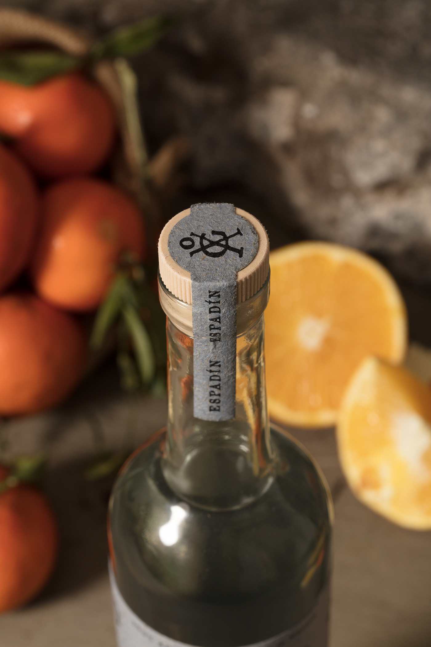

The Vago doesn’t work alone. Each of the maestro mezcaleros have their own medallion built from the M and V of Mezcal Vago but expressive of their perfected, time-worn style. One medallion nods to the ridgeline of the Sierra Madre del Sur (Tío Rey) and another a mezcalero’s oxen (Emigdio Jarquin); both call to mind the carvings found in nearby Nahuatl ruins that inspired these designs.
1.- Initial exploration of emblems featuring intertwined Mezcal Vago's intials
2.- Monogram explorations with each of the Maestro Mezcaleros' initials
3.- Final emblems


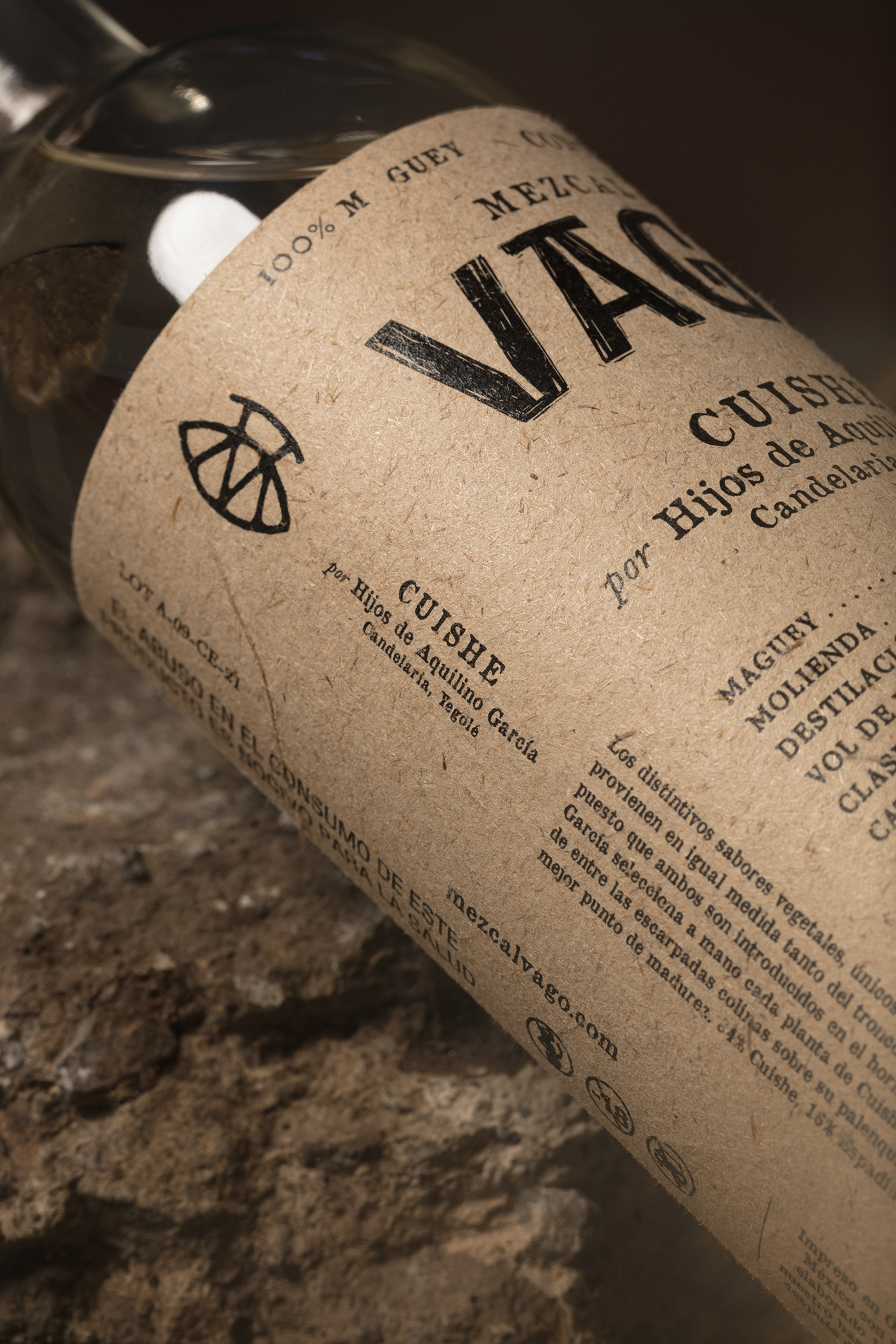


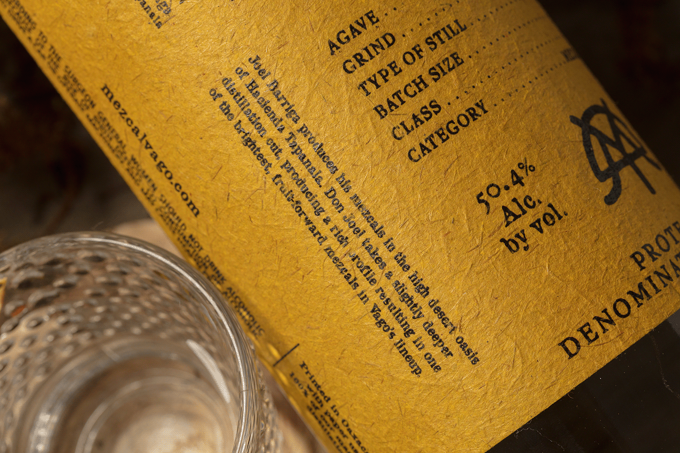
Unlike any other packaging, the mezcaleros also get their own signature color—an amarillo, dusty blue, natural or clay red derived from natural pigments like cochinilla, cempasuchil flowers, and earthen minerals found in the high-hills of the state of Oaxaca.
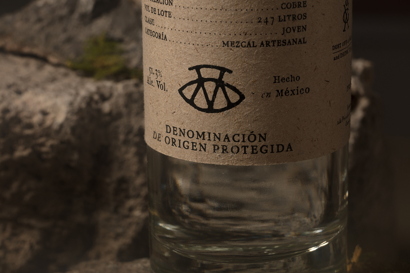
In our packaging design choices, we wanted to carry through our brand’s authenticity, as well as its other values of transparency and sustainability. Where it might be tempting to romanticize or embellish with finishes, we restrained—never sacrificing the story’s texture.
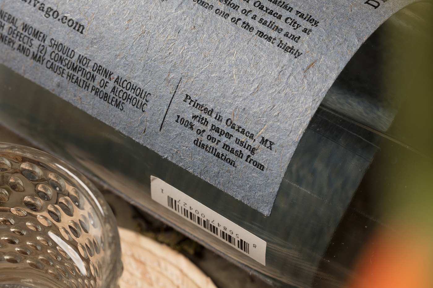
Quite literally. For our paper, we found inspiration in the leftover pulp of agave (bagaso) used during fermentation. Warm and fragrant, steeping in piles outside of the small palenques, it forms the raw material for the label. This bagaso is selected and sent to a local artisan’s workshop to be cleaned, milled, pressed, and dyed with the natural pigments representative of the mezcalero behind the bottle. Through this local circular design, we resurrect the precious agave plant and remind our drinker—through the rare effect of touch—where their mezcal comes from.
01.- The front door of Eric's workshop; the artisan behind the paper making
02.- Other natural fibers Eric, the paper artisan, experiments with to add consistency to the paper. Cotton, cacao nibs, corn husk, dried branches, grass, straw, chaff, among others
03.- Additionally, Vago's palenques, like 'Hijos de Aquilino,' uses the bagazo from Mezcal distillation to fabricate the bricks for construction
04.- Clay pot Mezcal distillation, and another example of how bagazo is used through the mezcal production.


We added our paper story on the label as another symbol of transparency and authentic craft. Below, a capture of Eric's hands; introducing us to his process, and explaining how he, and his team collect, dissect and integrate different ingredients from the region to the paper.


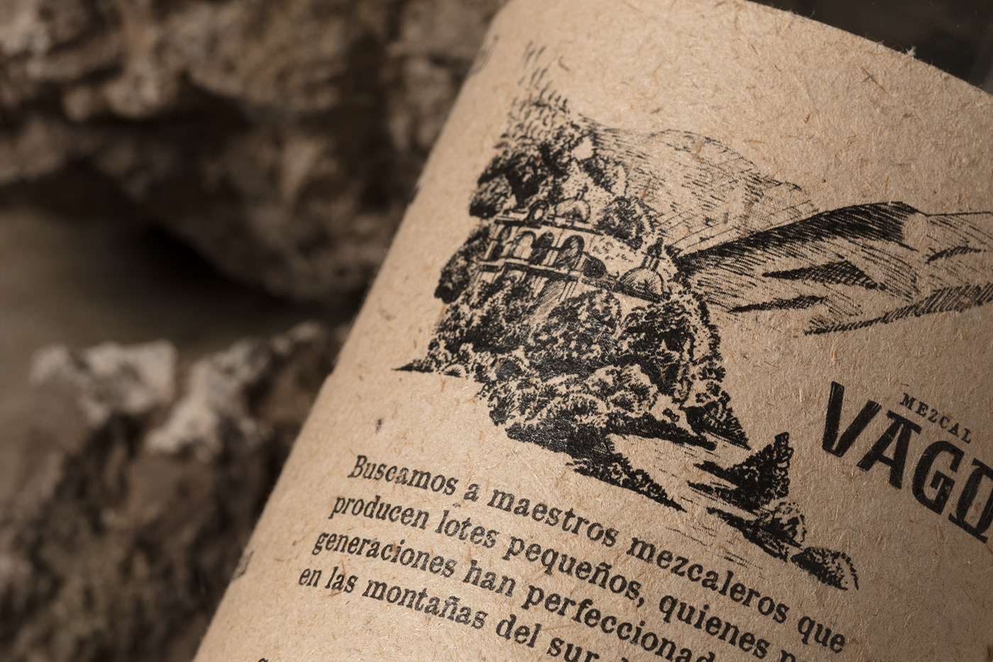
Our texture, of course, also weaves into the back of the bottle. Here, we have a chance to unfold and enrich the story with wood-engraving-style illustrations, showing drinkers vignettes from our travels: a particularly charming palenque or a hidden hacienda oasis in the mesa. The rustic elegance of these vignettes are composed in pairs; featuring provenance and process together.
2.- A vista of Tío Rey' home and Palenque on a hillside in Sola de Vega
3.- Joel Barriga - Hacienda Tapanala is an oasis amongst the arid mesa
4.- Hijos de Aquilino García - a view of Yegolé, Oaxaca, the river winding by the small, arid and mountside village
5.- Emigdio Jarquín - still with refrescador
6.- Tío Rey' clay pots (ollas de barro) with mazos
7.- Joel Barriga - still over wooden fire
8.- Hijos de Aquilino García - Cántaro and Copper Still


The wandering composition of the text varies from bottle to bottle, and mixes typefaces like OldNewspaperTypes, P22 Franklin Caslon Italic, and LTC Pabst Oldstyle Regular. Alongside the illustrations, it creates a collected effect: like a typewritten note.
Made by hand from the souls of the agave—mezcal is pure spirit, in every sense of the word. Our packaging brand and design showcases the magical combination of ancestral tradition, undiscoverable place, and the real & felt expression of heart and hand that go into making mezcal. And like the Vago, every bottle is here to tell a story about the people and place that make this spirit so pure.