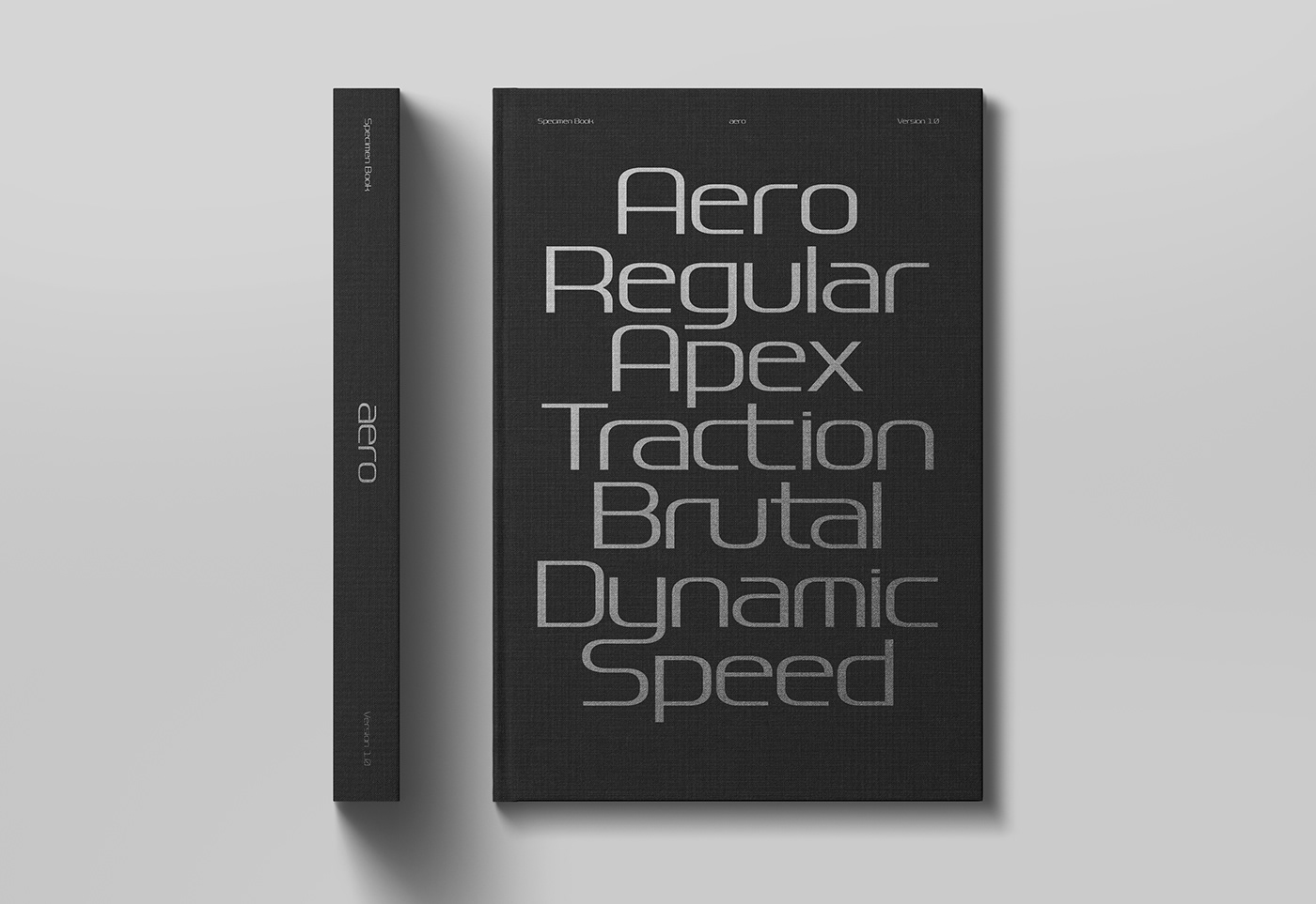
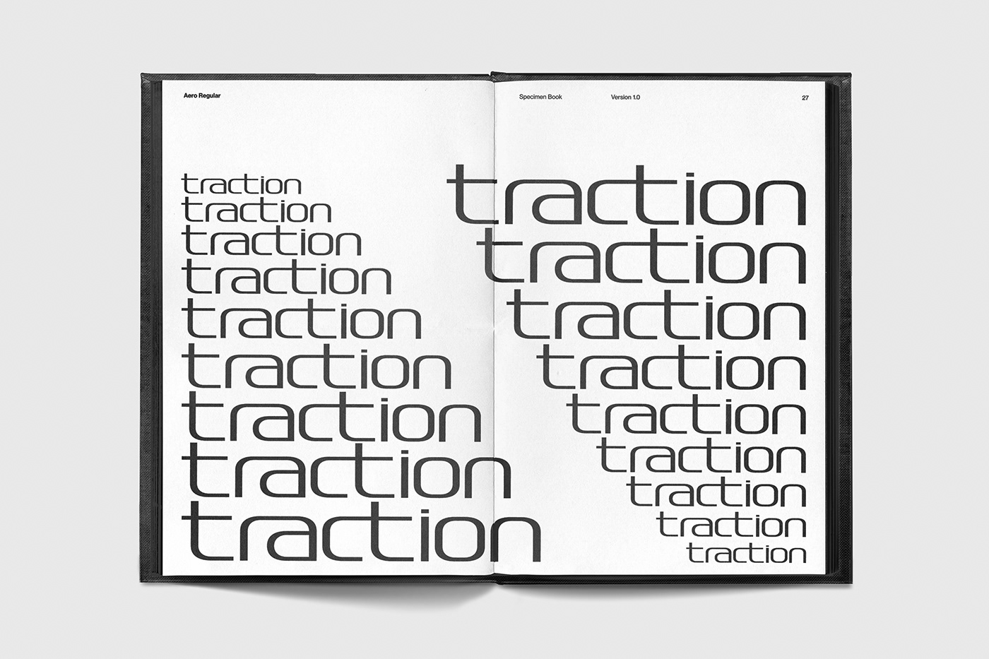
Aero is a typeface inspired by aerodynamics. The letters maintain a geometrically precise and rigorous constructive grid, while following three fundamental paradigms: adherence, acceleration, and reduction, all of which align with the concept of speed. The first parameter results in a rectangular form where horizontality is emphasised by a strong contrast between the vertical and horizontal lines. This visual contrast lends to dynamism and adds a sense of acceleration to the letter. Minimal strokes have been reduced to only fundamental markings, so that each character can be formed using the most direct route or "road". Although Aero is governed by strict structural rules, its many ligatures allow to considerably reduce the gap between the letters, favouring a fluid and continuous stroke. This makes aero versatile and effective, especially in large sizes.