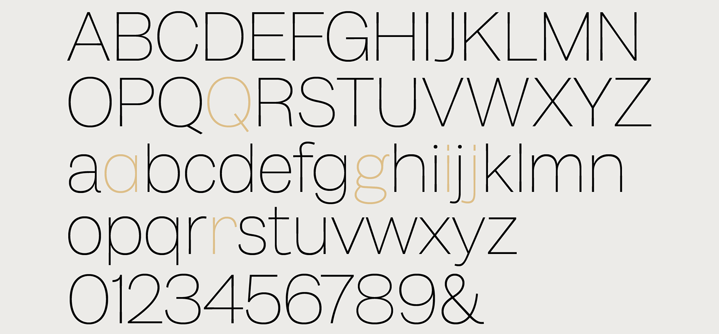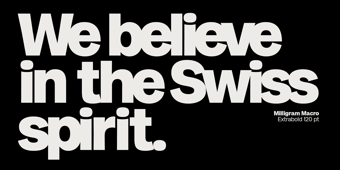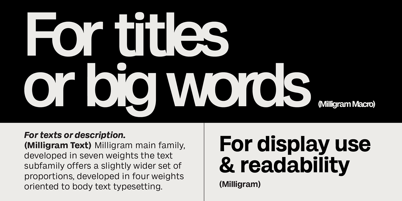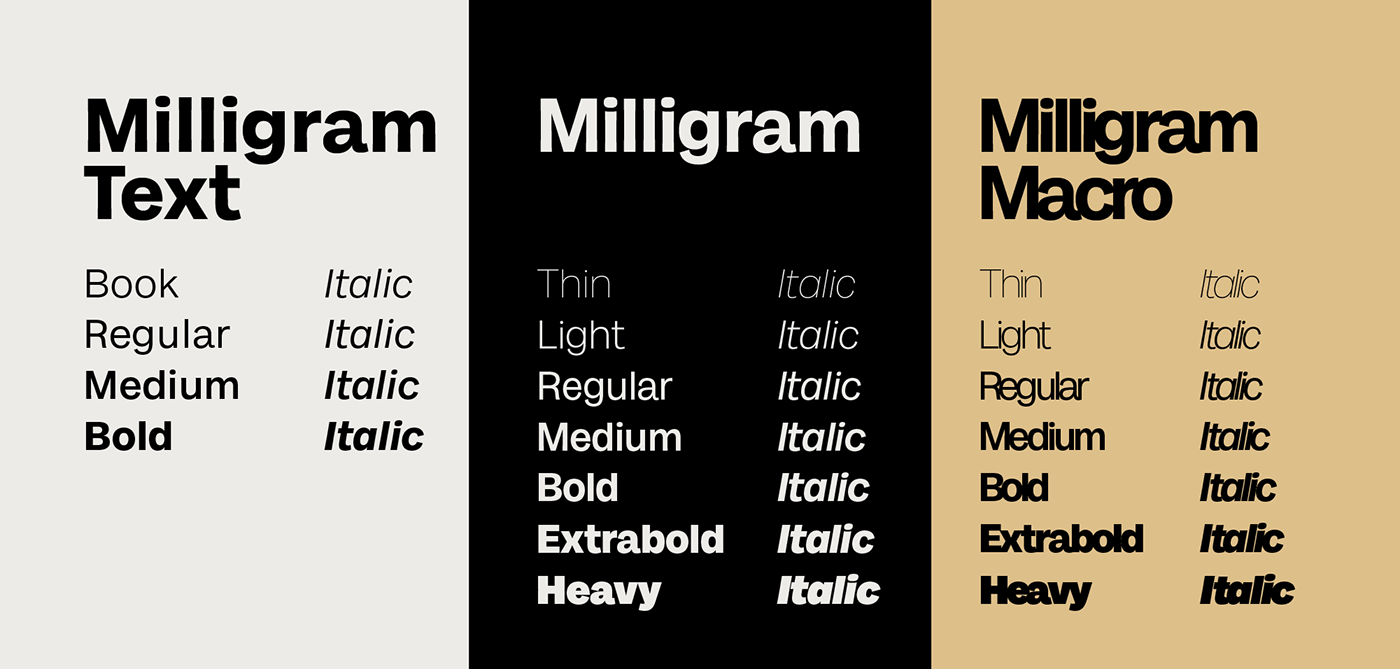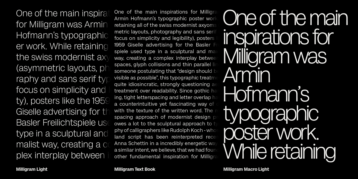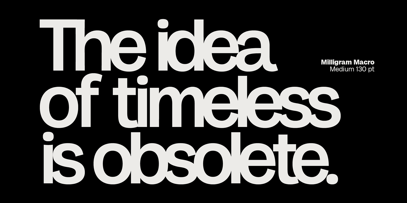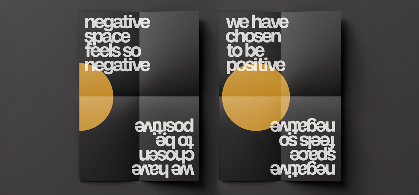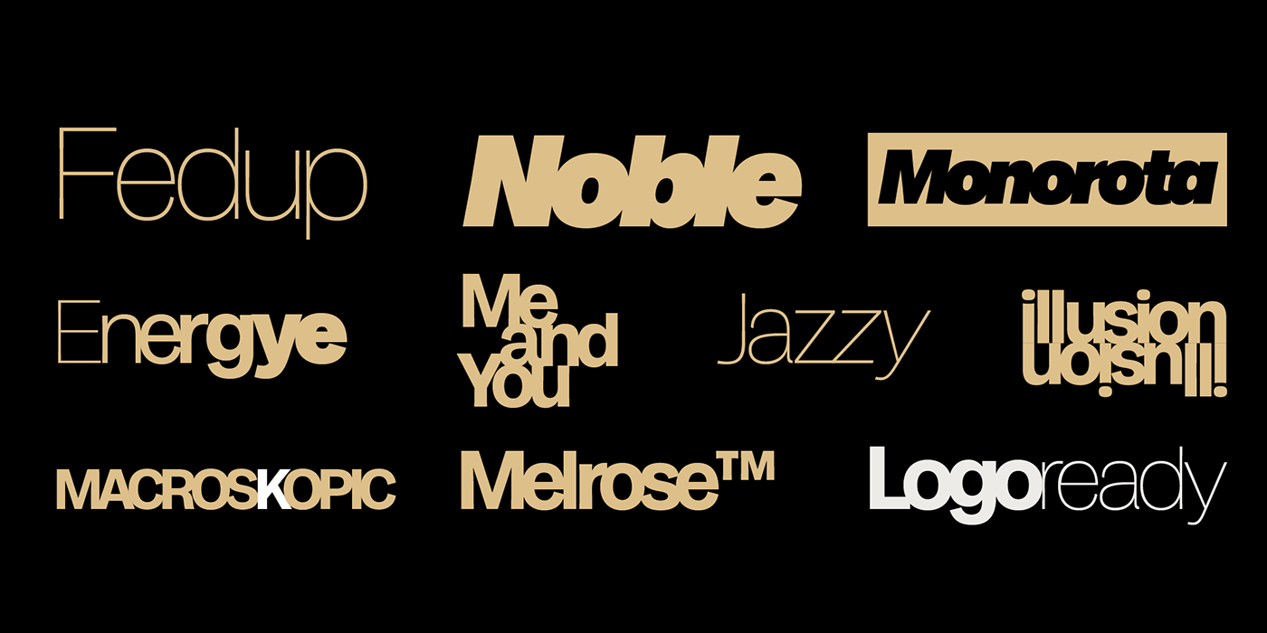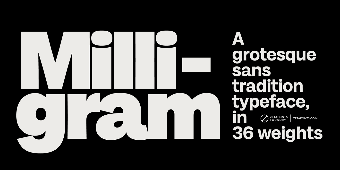
Grotesque sans typefaces: you know you won’t ever get tired of those. And any moment you decide that Vignelli was right and one Swiss font is enough, here comes a new specimen from the past inviting you to try new takes on the modernist letterforms. It's a tight and crowded design space, so design decisions are subtle and almost unnoticeable. Whoever you decide to be in the details - either God or the Devil - you surely need a taste for the infinitesimal to work with these shapes. Time design borders sandstoning shapes, in a delicate equilibrium between modernist precise ideals and the fascinating energy of old lead grotesques. The resulting typeface develops around an idiosyncratic relationship with negative space, inspired by the tight metrics modernist designers imposed on their layouts. Leaving a text optimised spacing to the text subfamily, Milligram plays with a feeling of attraction behind shapes, something brought to the extremes in the logo-oriented Milligram Macro Variant. Designed by Cosimo Lorenzo Pancini with Andrea Tartarelli, Milligram is a fine but bold homage to the Akzidenz Grotesk that never was.