


[PT]
BÁRBARA VALVERDE | Identidade Visual
-
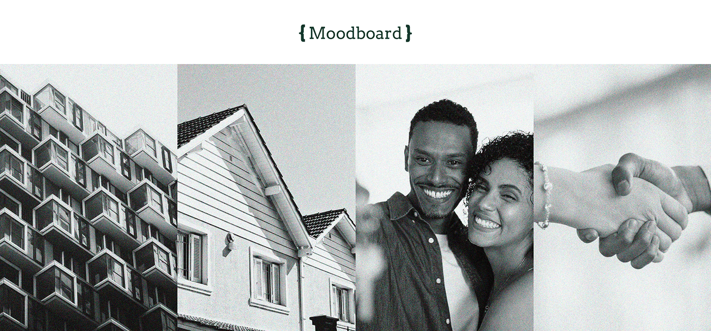
Bárbara Valverde é uma profissional que atua no ramo de Consultoria Imobiliária em Palmas [TO], buscando oferecer um atendimento exclusivo, personalizado e de alto padrão, que preza por relações humanas e empáticas para responder às necessidades reais de seus clientes.
Entendendo que os corretores "padrão" hoje representam um pilar negativo no mercado imobiliário em função de venderem "o que tem" e não "o que os clientes precisam", a construção da marca se pautou, principalmente, na diferenciação por meio de uma conceituação e representação visual de personalização, humanização e elegância.
Cliente: Bárbara Valverde Consultora Imobiliária
[EN]
-
Bárbara Valverde is a professional who works in the field of Real Estate Consulting in Palmas [TO], seeking to offer an exclusive, personalized, high-standard service that values human and empathic relationships to respond to the real needs of her clients.
Understanding that "standard" estate brokers today represent a negative pillar in the real estate market as they sell "what they have" and not "what customers need", the construction of the brand was based mainly on differentiation through a conceptualization and visual representation of personalization, humanization and elegance.
Client: Bárbara Valverde Real Estate Consultant

[PT]
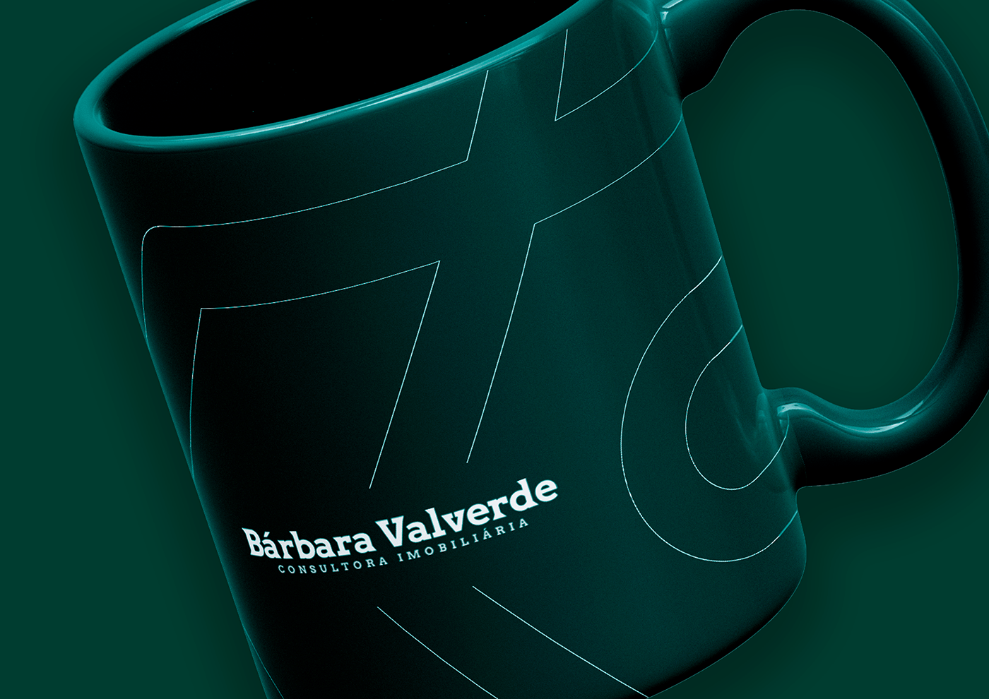
O símbolo
-
A construção do símbolo consistiu na representação visual do conforto embutido em um processo empático e humano de consultoria imobiliária, utilizando de um imóvel. Ao mesmo tempo, foi representada a letra inicial 'B', visando agregar exclusividade e personalização ao resultado final.
[EN]
-
The construction of the symbol consisted of the visual representation of the comfort embedded in an empathic and human process of real estate consulting, using a property. At the same time, the initial letter 'B' was represented, aiming to add exclusivity and personalization to the final result.


[PT]
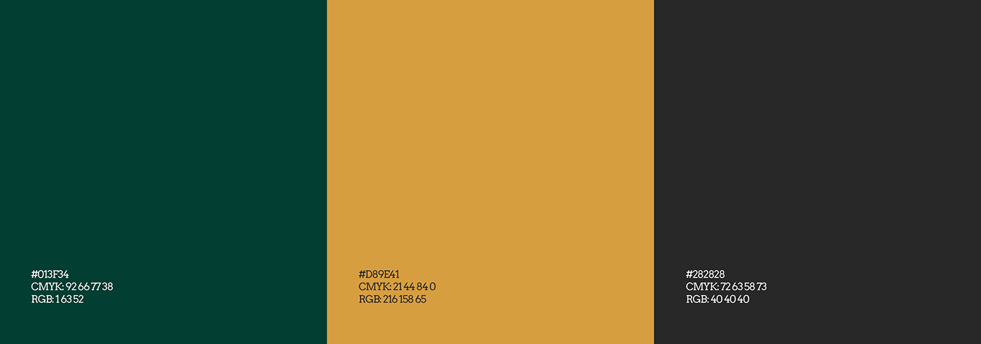
As cores
-
Atendendo à solicitações da cliente, levando em consideração o público almejado, e embasando o processo com estudos relacionados à Psicologia das Cores [Eva Heller], foram definidas cores capazes de transmitir a sofisticação, alto padrão e humanização por trás dos serviços prestados pela marca.
[EN]
-
In response to client requests, taking into account the target audience, and basing the process with studies related to Color Psychology [Eva Heller], colors capable of conveying the sophistication, high standard and humanization behind the services provided by the brand were defined.
[PT]
As versões da marca
-
Pensando na melhor maneira de conservar a integridade de aplicação do símbolo e logotipo, foram pensadas três versões de uso para a marca, sendo: uma horizontal, uma vertical e uma ícone.
[EN]
-
Thinking about the best way to preserve the integrity of the application of the symbol and logo, three versions of use for the brand were thought, namely: one horizontal, one vertical and one icon.


Agradecemos pela atenção!
-
Thank you for your attention!
Feito por: Spire Branding
Direção de Arte: João Moita
-
Made by: Spire Branding
Art Direction: João Moita


