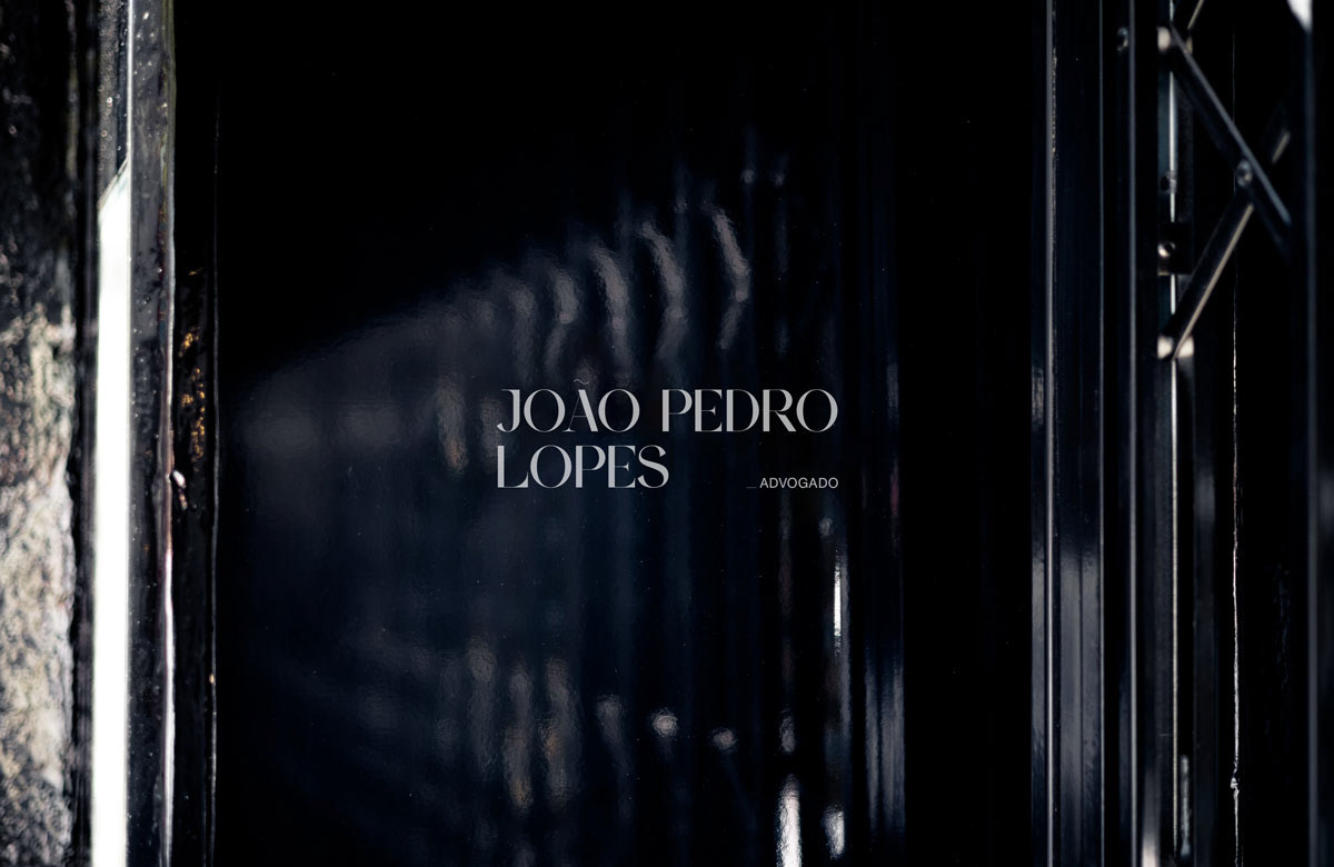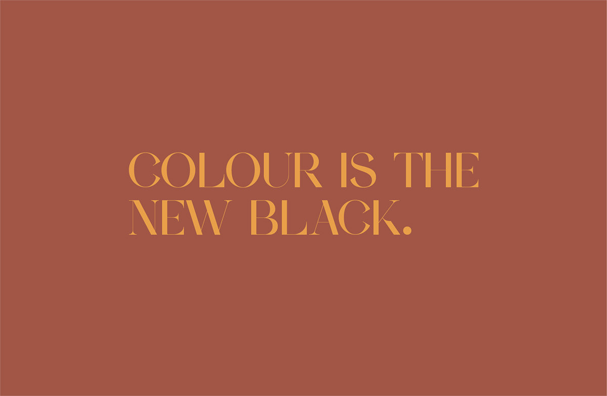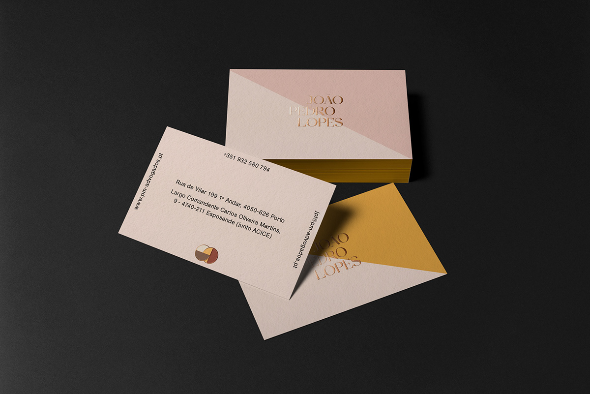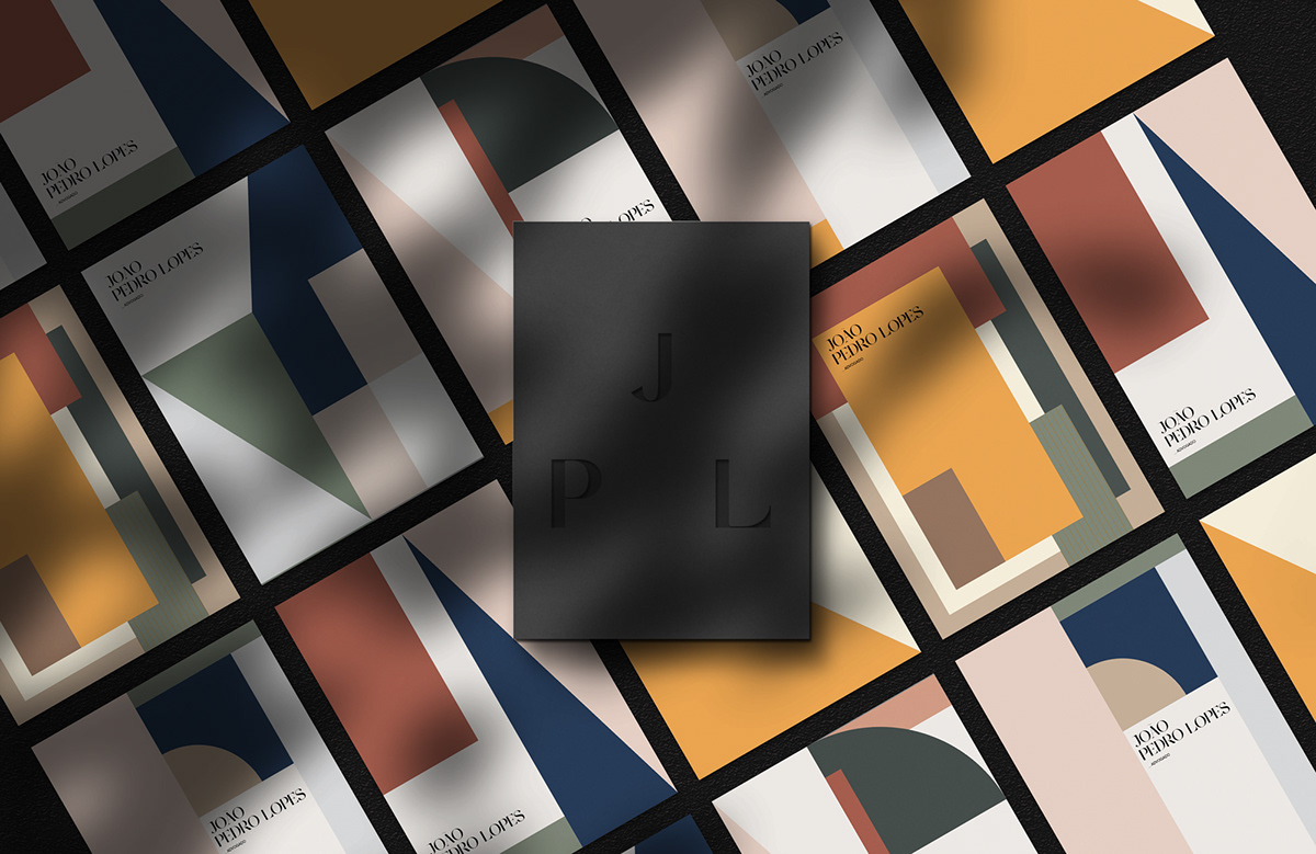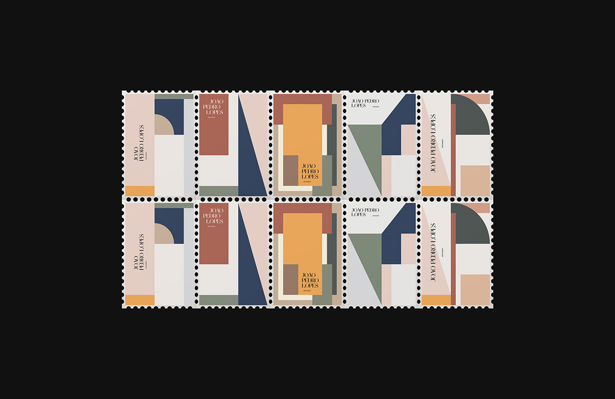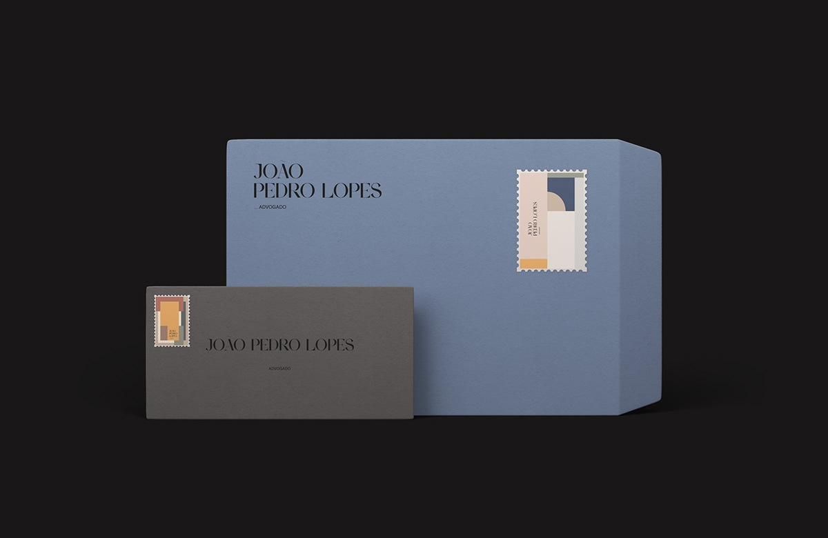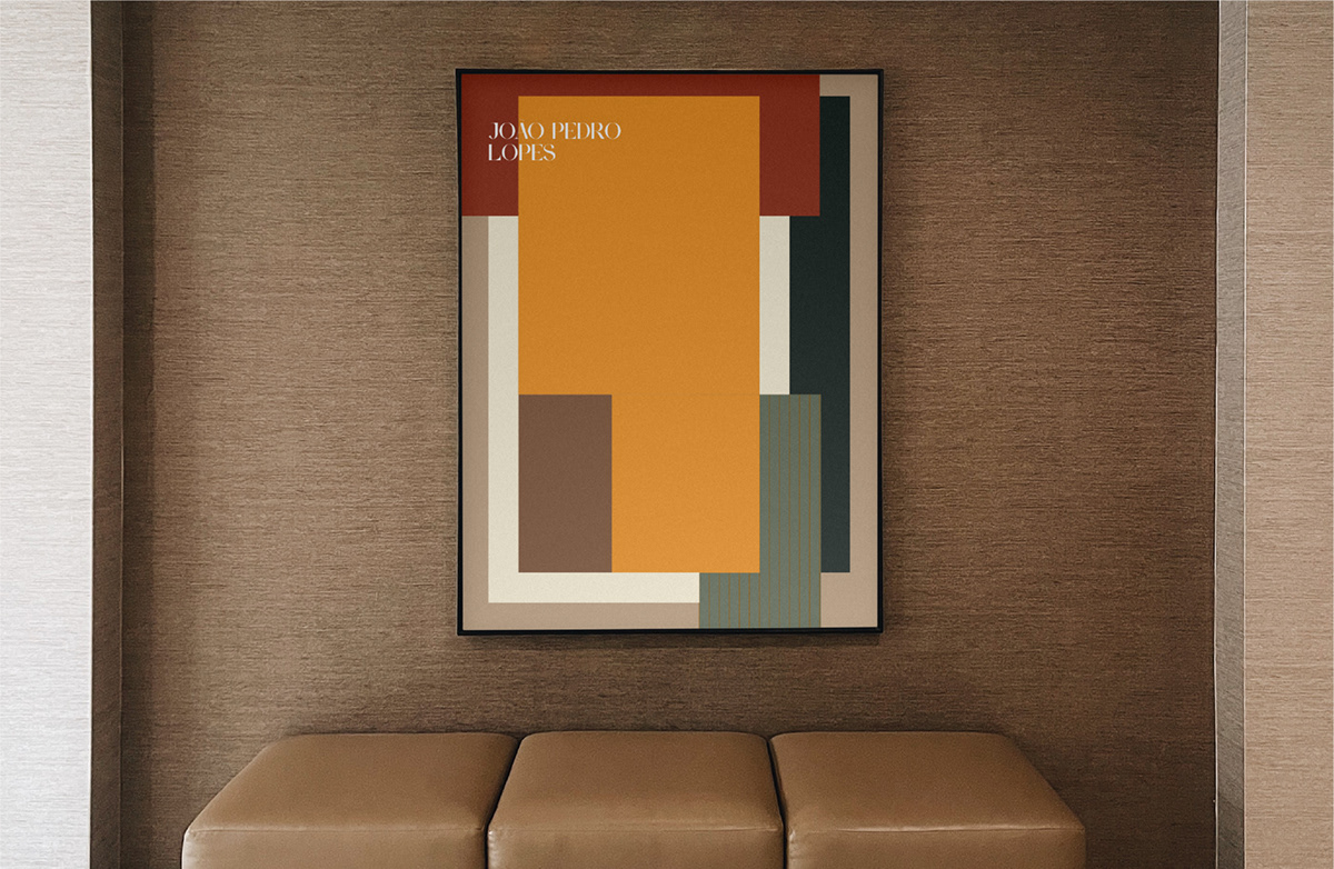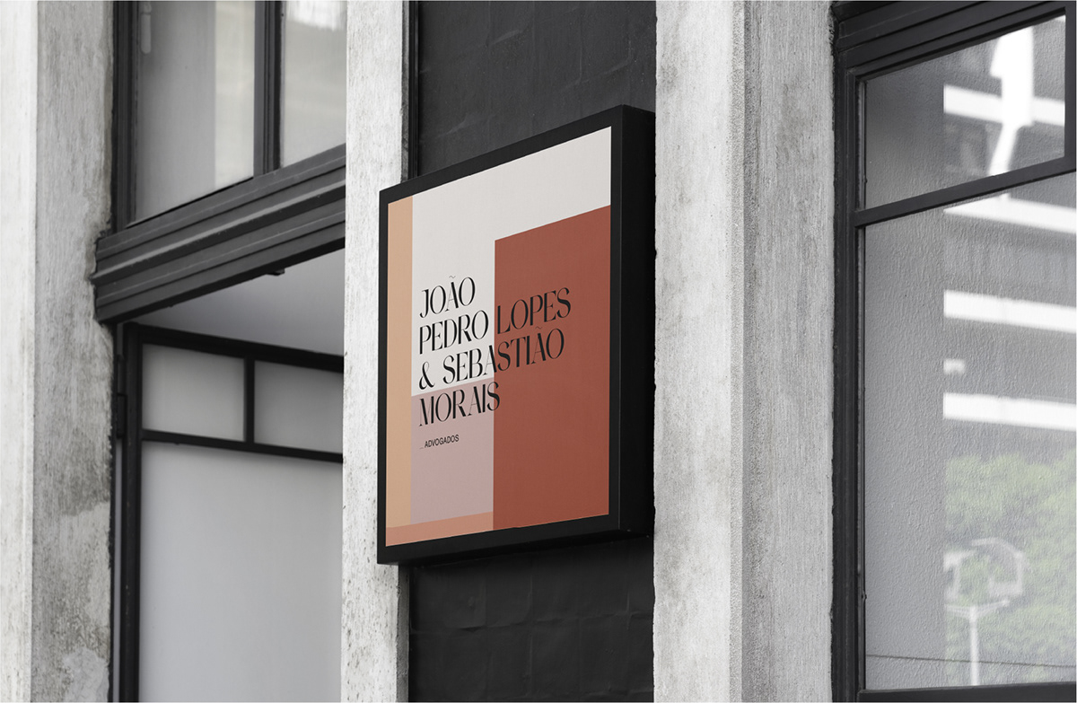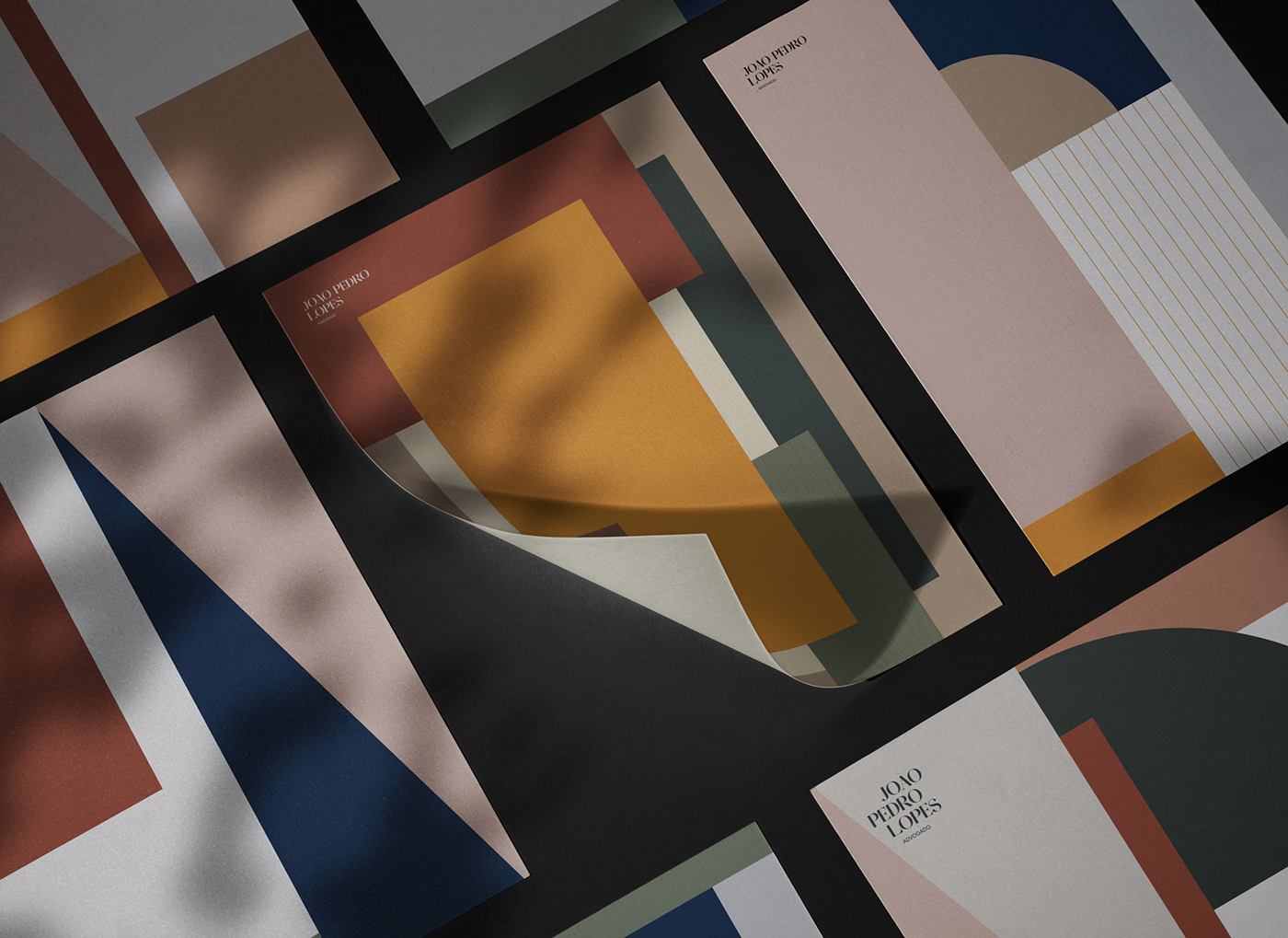
João Pedro Lopes is a member of a law firm based in Esposende. Without denying its heritage, the identity stripped itself of the traditional environment that surrounds the law. The dark tones were followed by color. Lots of color. The choice of typography is intended to be a balance between the past and the future. Classic and formal in the environment, modernist and bold in the details. The triangle and diagonal lines have a disruptive character, very much inspired by João's personality and character. The scales, one of the symbols of advocacy, were replaced by half circles, in allusion to its plates. The toga, symbol of equality, is represented by the horizontal lines. Finally, the vertical lines represent honesty, seriousness and quality.