


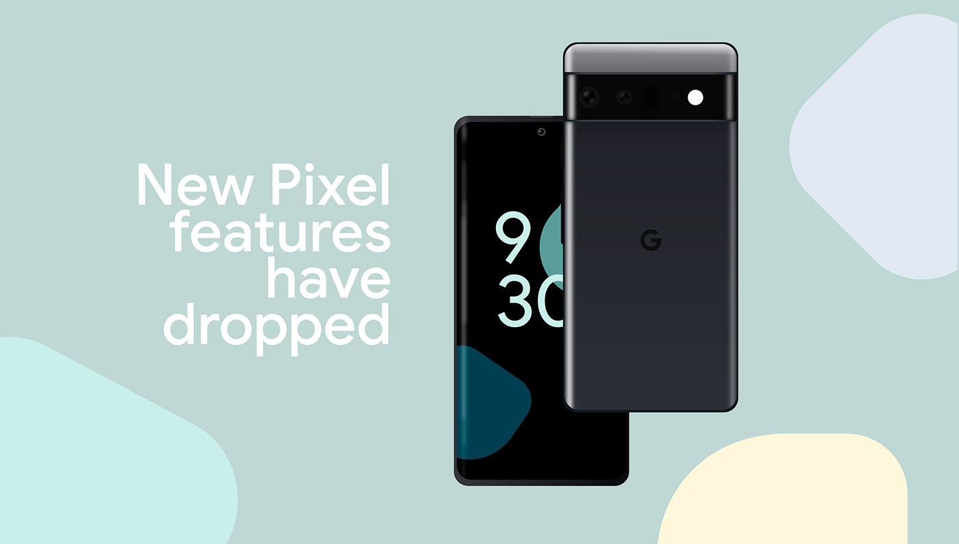
Google Pixel Feature Drop – Design project
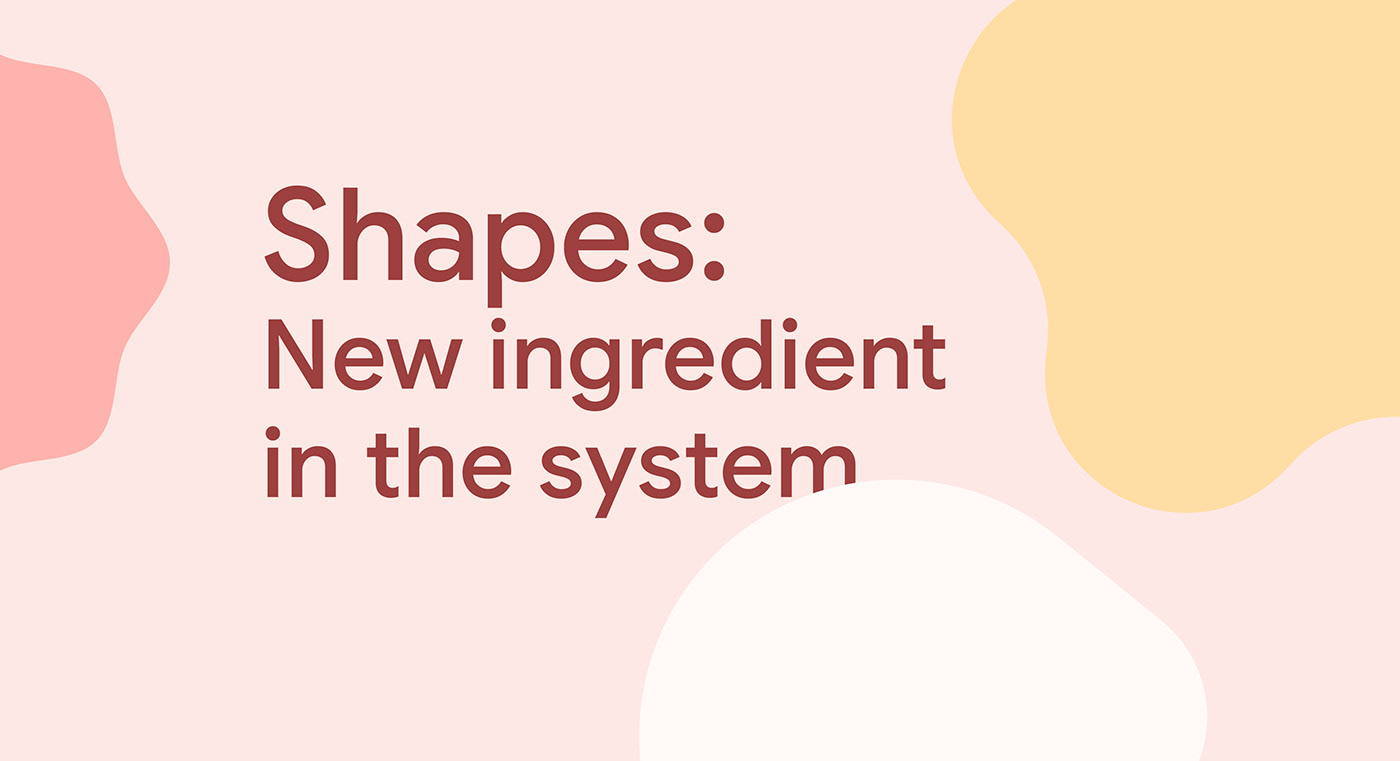
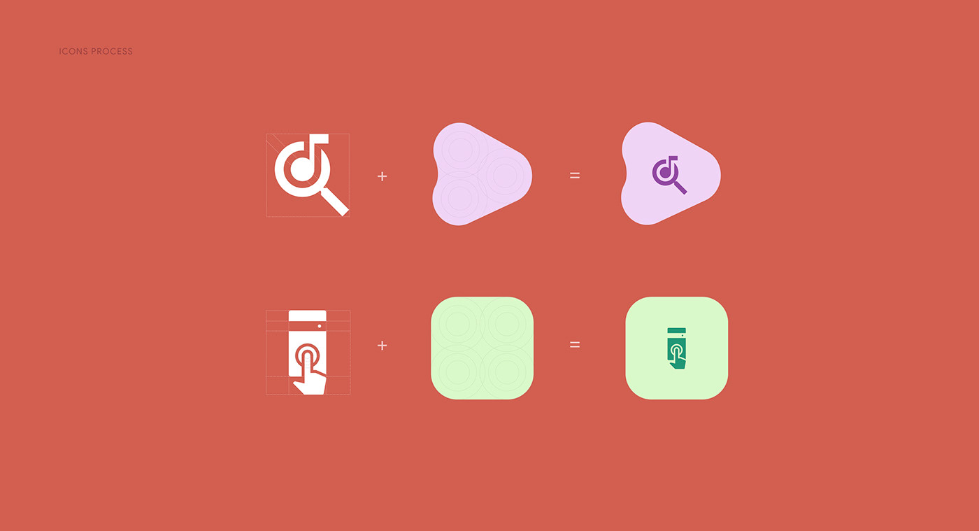
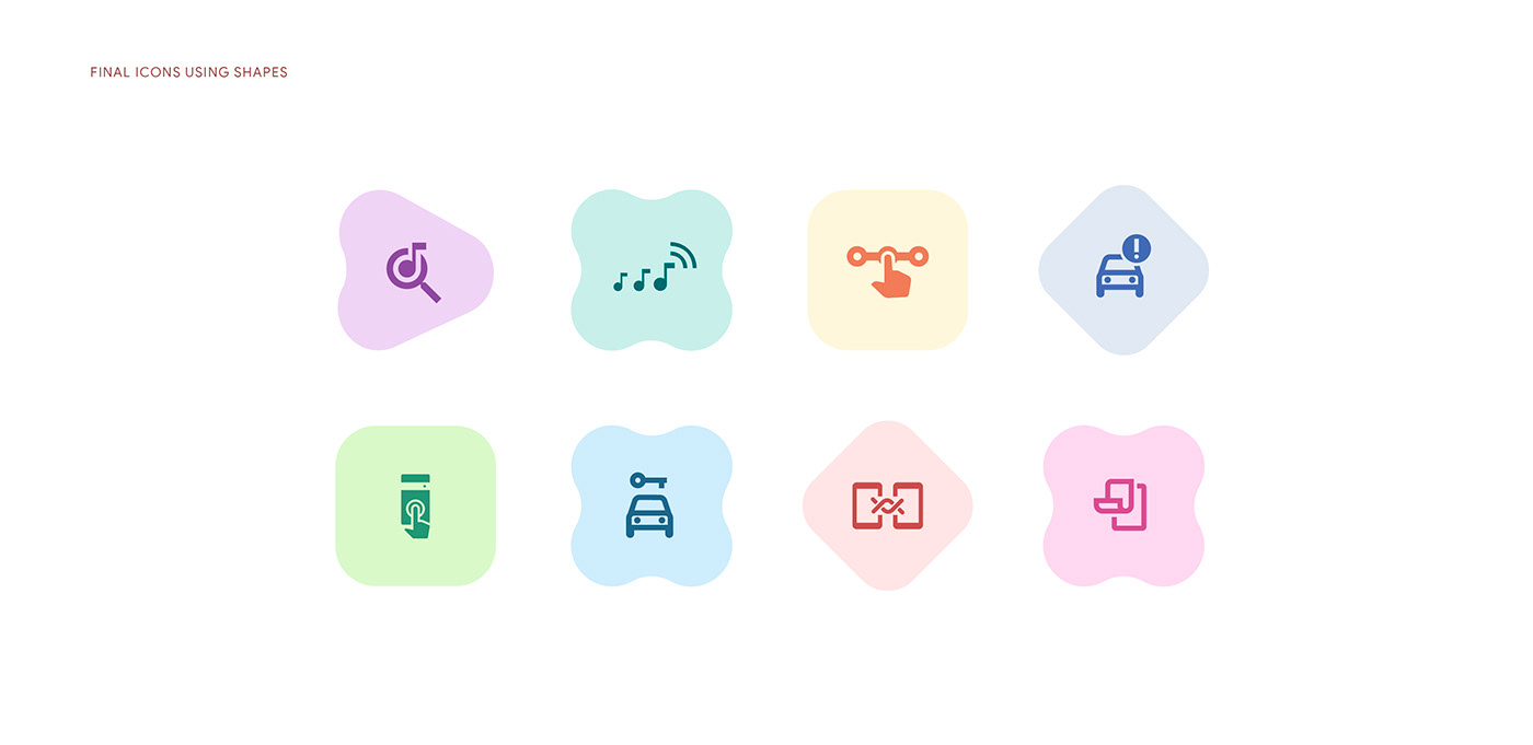
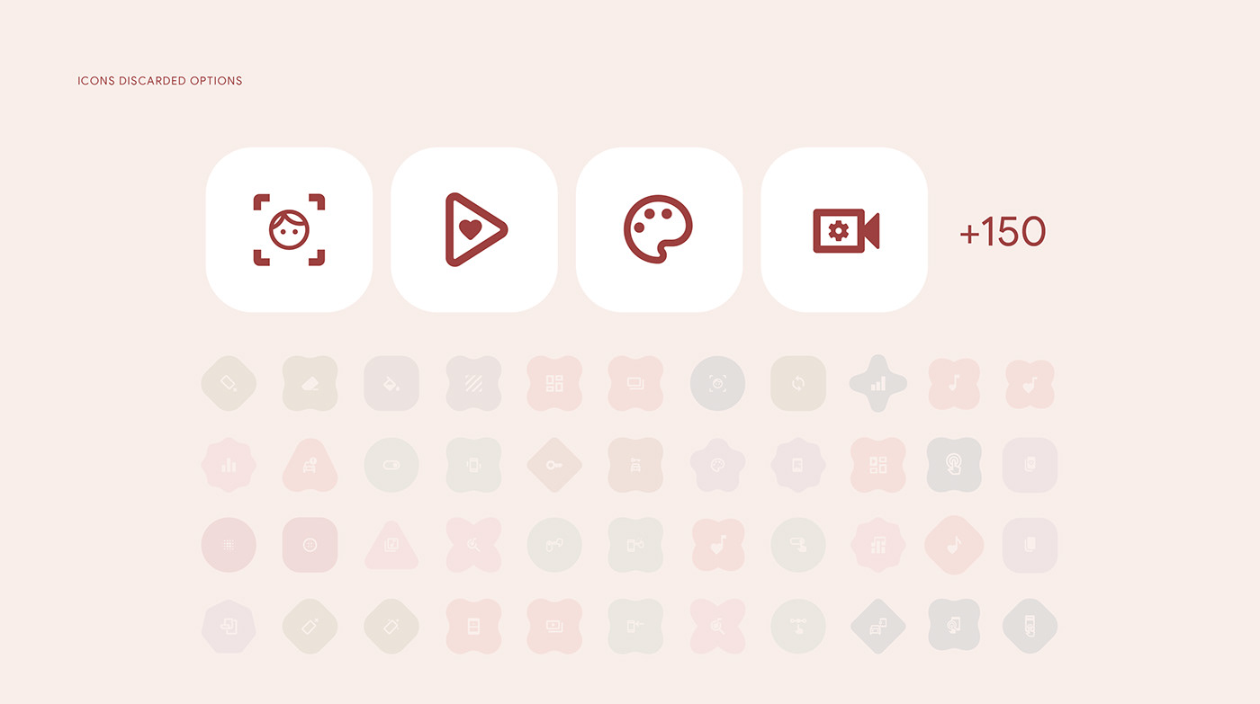
As part of the redesign of the new Google's Design system, Material You, Edelman team was appointed to create the conceptual, graphic, and animated universe of the new feature drops for the Pixel Google's phone. The design of 8 icons, visually describes the new functionalities, giving rise to the elements involved in this great project. The Google Drops December project was a big challenge for us as a studio and an opportunity to witness and be part of a new and closer version of Google and its graphic components.
As part of the graphic concept, we took many of the new ingredients from Material You. However, we also dared to propose different visual paths focused on that customizable and more flexible experience.
Concept
Life, time, we evolve every day, and we need to communicate and express ourselves. We discovered that adaptability and emotions are essential components of this visual system. That is why we created a series of forms that breathe the fluidity of our campaign and can be combined to generate new ideas and contexts through play and interaction with each other.
Life, time, we evolve every day, and we need to communicate and express ourselves. We discovered that adaptability and emotions are essential components of this visual system. That is why we created a series of forms that breathe the fluidity of our campaign and can be combined to generate new ideas and contexts through play and interaction with each other.
Keywords
Feeling, Smooth, Fluidity, Fun, Harmonious.
Feeling, Smooth, Fluidity, Fun, Harmonious.


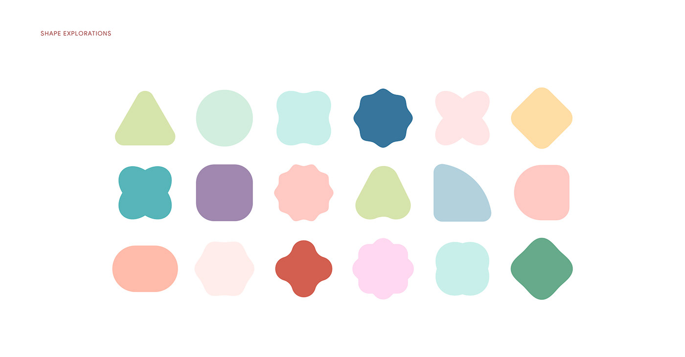


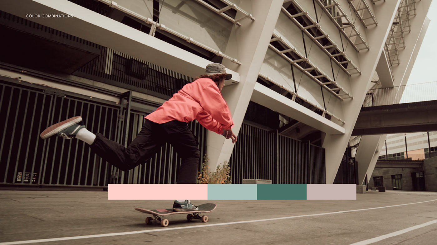
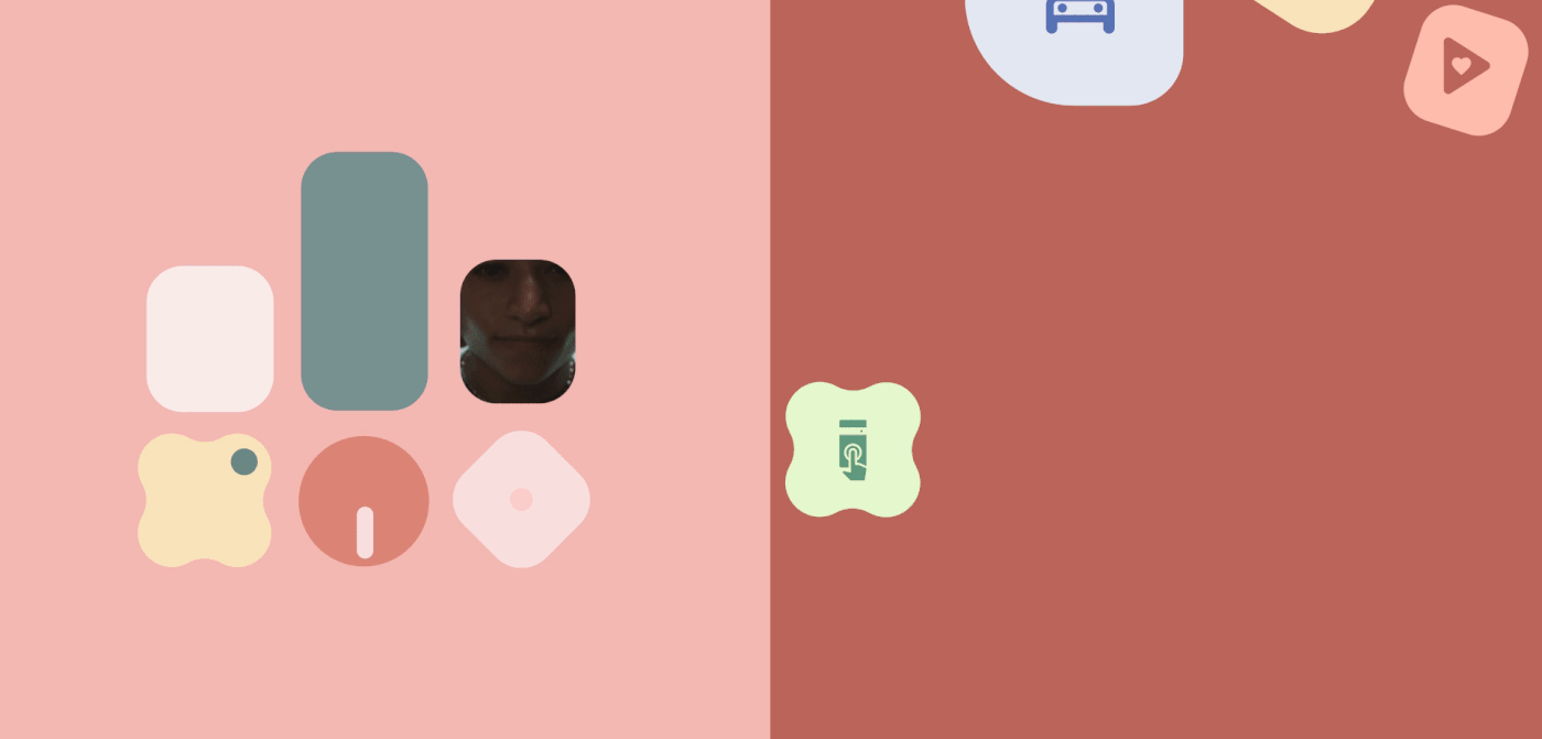
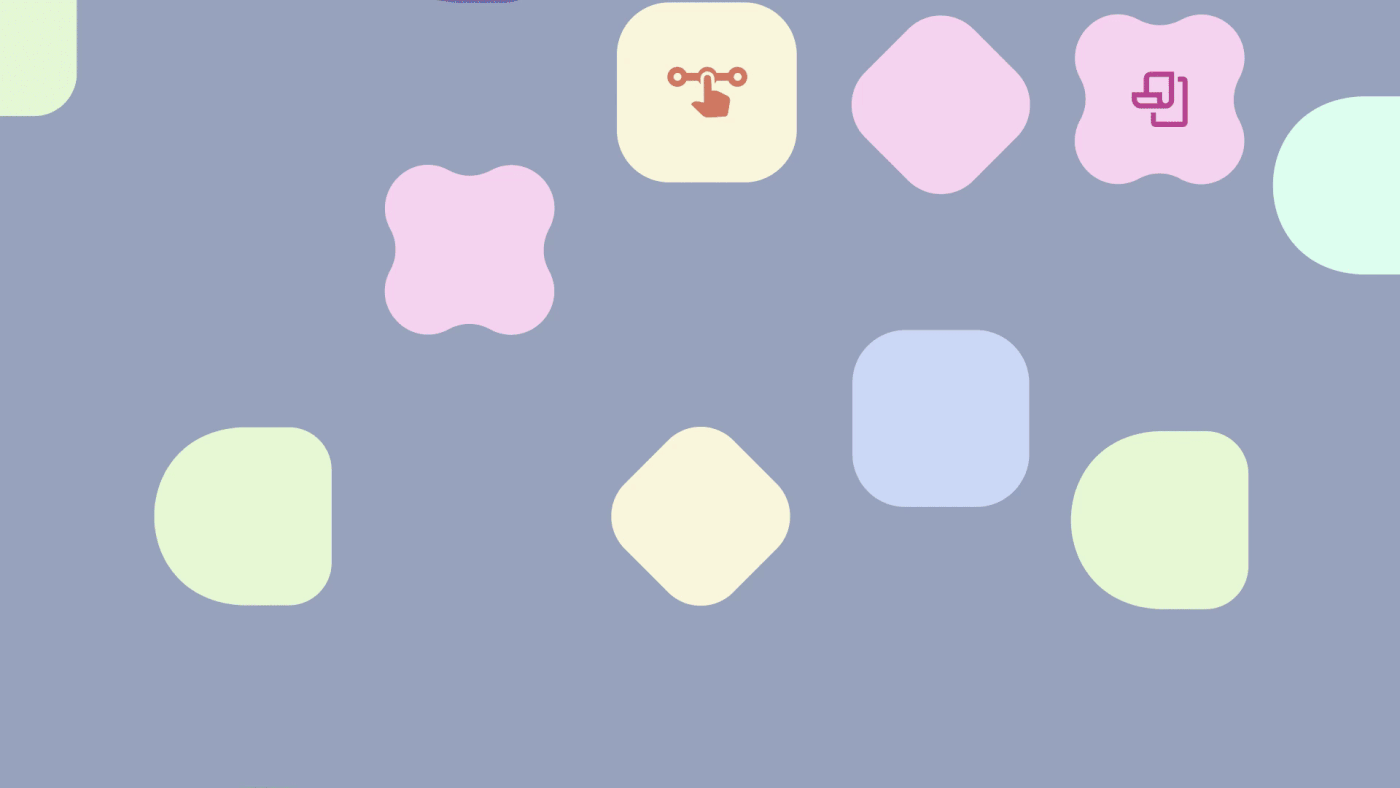
From the beginning we were clear that this would not be the usual Google palette and that the creation of color palettes would be key when it came to transmitting the message that each feature was revealing to us. Each of the improvements in the mobile phone would have its icon but also its color harmony according to the context, so that the message would be accompanied by a close, fluid and very human atmosphere.
The use of color was defined through a percentage, where there would be a predominant background color, which would be accompanied by a shape and icons in a harmonic way. On the other hand, two accent colors were designated to highlight important parts within the live action and make the color combination more attractive.


Thank you for watching!
Credits:
Guillermo Valencia – Production Studio Head Of Design
Dan Licht – Creative Director
Natalia Villegas – Production Studio Lead
Ximena Jiménez - Creative Production Director
Scott Goodfriend - Executive Producer
Byron Clear - Senior Producer
Nate Millado - Senior Producer
Chris Wernikowski – Copywriter
Esteban Diavanera - Design Lead
Camilo Ojeda - Editor & Animation Lead
Miguel De La Cruz - Senior Content Editor
Nubia Navarro - Graphic Designer
Catalina Ochoa - Graphic Designer
Andrés Rodríguez - Graphic Designer
Gino Lloreda – 2D Animator
Sebastián López – 2D Animator
Julián Cuevas (Julen Keoni) - Video Editor, VFX and 2d Motion Designer
Jorge Velandia - Video Editor Color Grading Artist
ArtClass - Live Action Production Partner


