

THE PROBLEM
The project brief was to rebrand a company that is experiencing economic downturn. I chose to focus on Canada Post, the government-owned corporation that offers postal services to the entire population.
Like many government-owned post offices around the world, Canada Post is rapidly losing profits due to a decrease in transaction mail. This has forced Canada Post to look for ways to either cut costs or increase profits. Cutting costs through community mailboxes does not work for certain audiences, such as the elderly or disabled. Increasing profits will allow Canada Post to keep their essential postal services. In order to pursure a viable, profitable stream of revenue, Canada Post will introduce banking services and mobile payment.
THE OBJECTIVES
· To create a new source of profit for Canada Post
· To create a new source of profit for Canada Post
· Not to take away Canada Post's existing, crucial services
· To elevate Canada Post's position as a trusty, reliable government-owned company
· To address the widely varying audience appropriately
THE SOLUTION
Canada Post must make a progressive, bold change. In addition to the rebrand, the company will also be renamed to Canada Postbank. The new brand will take many assets from the old, but update them to fit modern Canadians. It will also focus on the audience and have strong brand elements.

Core elements of the logo have been kept because of the strong brand equity and recognition. An important change is the tagline. At its core, Canada Postbank services every Canadian, and connects them to the rest of Canada, and the rest of the world.
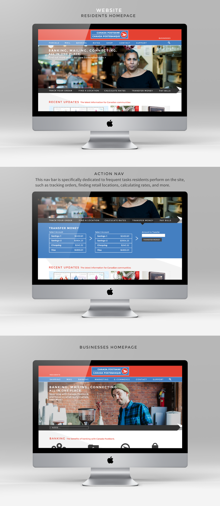
There is a residents website, as well as a businesses one. In the redesigned website, the two are quite similar in aesthetic, but perform different actions. The new website design organizes the mass amounts of information and actions into two navigations; one is based on information, and the other is based on actions users can perform.

When developing the strategy behind the B2C communications, it quickly became clear that audiences must be segmented and appropriately addressed. The two audiences that are represented here are Small Businesses and Rural Residents. These two groups are significant; rural residents are the most dependent group. Small businesses can benefit greatly from the new banking services, and also rely on Canada Post already to a certain degree. They are also a way to break through to urban audiences.

In order to approach urban communities, the target audience for urban cities is small businesses. Because the target audience has a wide variety of choices among Canada Postbank's competitors, the messaging is focussed on the benefits and convenience of mailing and banking services in one place.
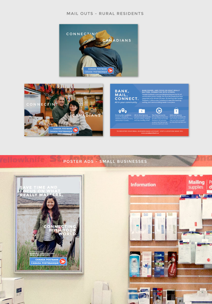
Rural residents have a higher sense of dependence on the existing Canada Post, thus the focus of the messaging is quite different from small businesses. The content still talks about convenience and saving time, but from a more personal perspective.

*Thank you to Jorge Quinteros for the awesome portrait photographs! Check out his other work on his Flickr stream: http://www.flickr.com/photos/jorgeq82/


