


WACELLO
IDENTITY DESIGN / WEB DESIGN
IDENTITY DESIGN / WEB DESIGN
WACELLO is a premium lifestyle design group with an exceptional taste who creates optical beauty based on different line proportions with emphasis on ‘sleek and sophisticated design.’ BAT developed visual brand identity including logo, key visual, color palette, typography, and art direction and designed applications as well as website to deliver consistent brand message on multiple brand touchpoints.
BAT
Directing & Project Management | Dasom Lee
Identity Strategy | Bomi Kim
Identity Directing | Youngji Choi
Identity Design | Doyeon Kim, Soyeon Kim
Web Directing | Youngjin Joo
Identity Design | Doyeon Kim, Soyeon Kim
Web Directing | Youngjin Joo
Web Design | Doyeon Kim
Web Development | Locomotion
2D Motion Design | Hyoin Jung
3D Motion Design | Hocheol Shim
2D Motion Design | Hyoin Jung
3D Motion Design | Hocheol Shim
© 2021 BAT
LOGO SYSTEM
WACELLO’s brand identity starts from its core philosophy—to create optical beauty using different line proportions. WACELLO’s logo is created based on thin (1) and thick (3) lines in the proportion 1:3.
BRAND VISUAL MOTIF 1:3
Visual motif is the most powerful brand design element that delivers WACELLO’s brand identity. The proportion 1:3 is being used as an extended visual motif on diverse touchpoints with visual consistency.

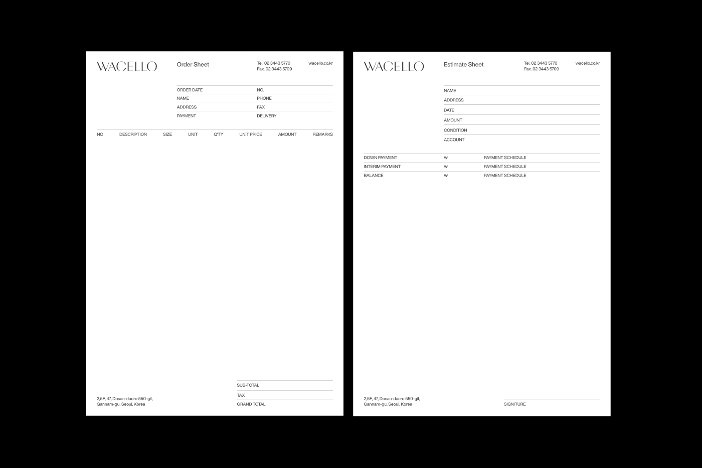
BRAND APPLICATION
By applying WACELLO’s design language that reflects brand definition to various media, the brand can maintain its consistent brand image to its customers.


d

WEB&MOBILE
WACELLO’s brand website is designed and built with its brand message and philosophy on the forefront to effectively communicate who they are and how they work. The graphic motif—the proportion 1:3—is applied to the grid that became the basis of the website.


