Client: Copan Group
This rebranding aims to visually redesign the Copan brand, a world leading company in the pre-analytics sector.
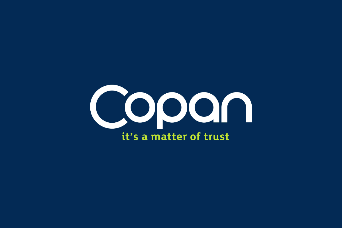
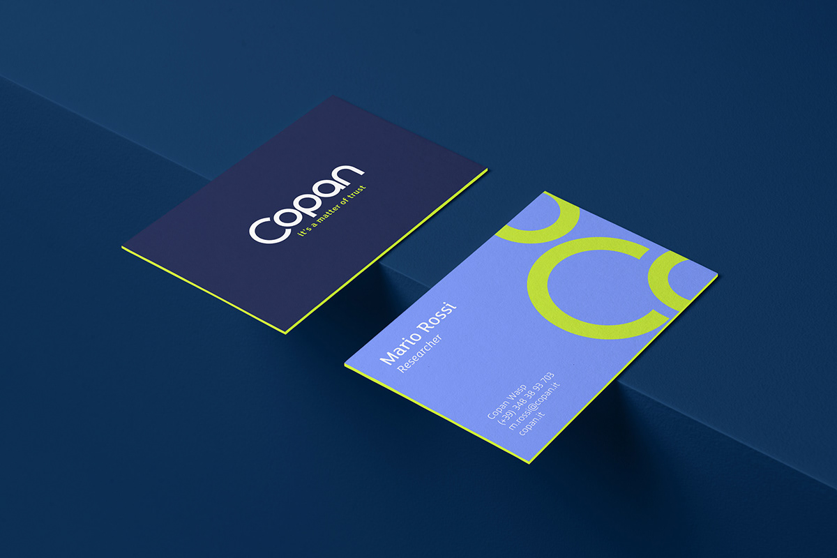
We redesigned the logo while keeping some old pictogram shapes, combining branding and typography into one sign.
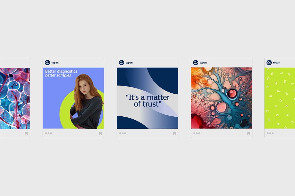
The concept behind the new claim and consequent repositioning of the brand is trust, a very important element for the type of product and service that Copan offers.
The concept behind the new claim and consequent repositioning of the brand is trust, a very important element for the type of product and service that Copan offers.
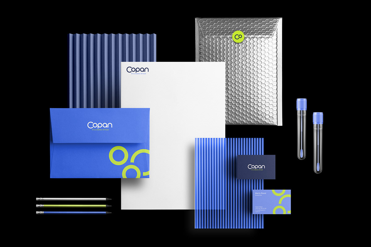
A fundamental role of the rebrand is given by the use of colour, starting from their blue, we added different tones, creating a richer chromatic scale, finally interspersing it with an acid green which creates a strong visual contrast.
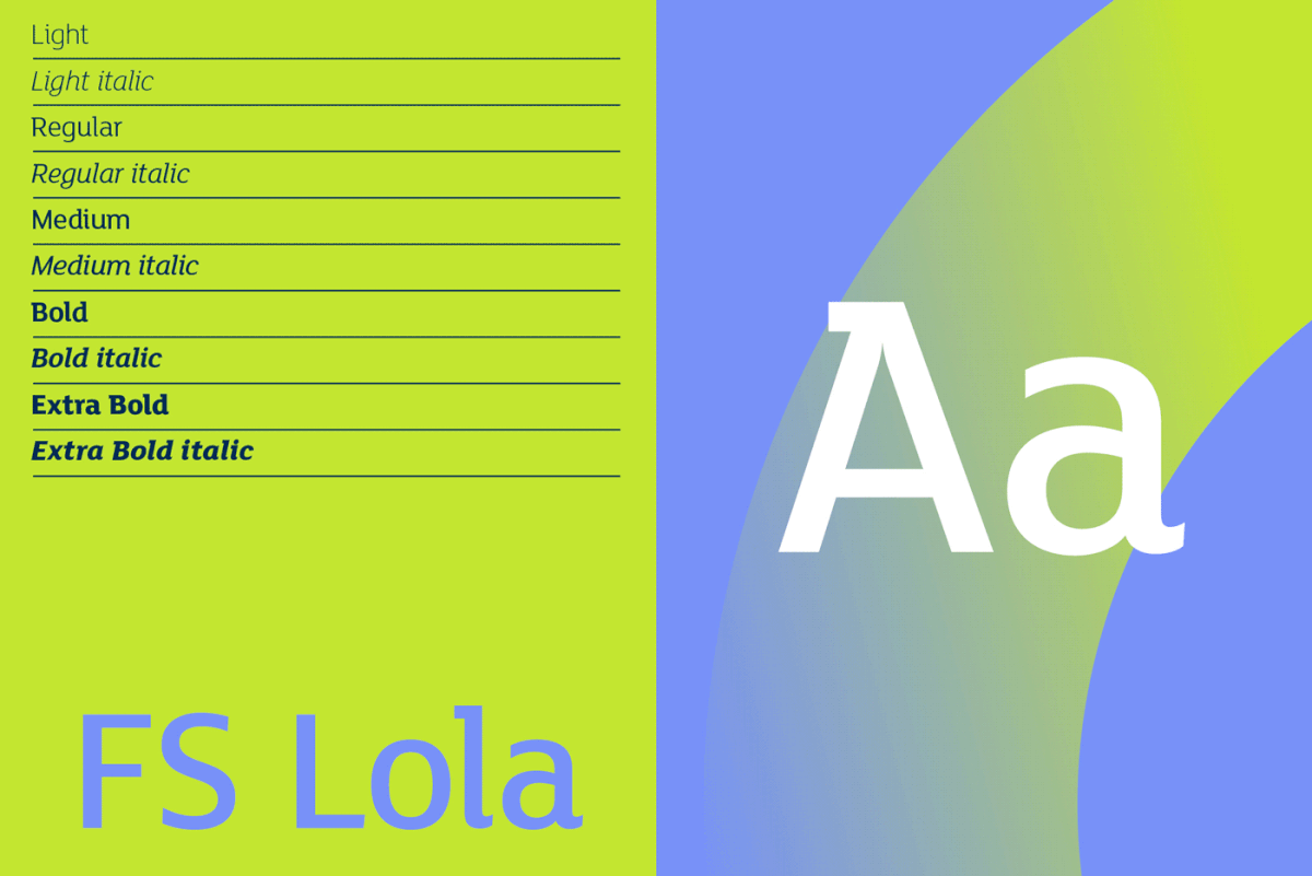
Subsequently we created a series of patterns and visual elements with the aim of dressing all the elements of the communication and brand system, in order to create a contemporary, dynamic and distinctive visual system.
Subsequently we created a series of patterns and visual elements with the aim of dressing all the elements of the communication and brand system, in order to create a contemporary, dynamic and distinctive visual system.
Questo rebranding si pone l’obiettivo di riprogettare visivamente il brand Copan, azienda leader mondiale nel settore della preanalitica.
Abbiamo riprogettando il logo mantenendo alcune vecchie forme del pittogramma, unendo marchio e tipografia in un unico segno.
Il concept dietro al nuovo claim e conseguente riposizionamento del brand è la fiducia, elemento importantissimo per il tipo di prodotto e servizio che Copan offre.
Un ruolo fondamentale del rebrand è dato dall’uso del colore, partendo dal loro blu, abbiamo aggiunto diversi toni, creando una scala cromatica più ricca, inframezzandola infine con un un verde acido che crea un forte contrasto visivo.
Successivamente abbiamo creato una serie di pattern ed elementi visivi con lo scopo di vestire tutti gli elementi della comunicazione e del brand system, al fine di creare un sistema visivo contemporaneo, dinamico e distintivo.
Agency: 45 Gradi
Art Director: Aprile Alessandro