Visual Identity of Kismaros
The municipality discovered the competative advantages of place branding and briefed us to create an easy-to-use and unique visual identity that attracts tourists and is loved by locals.
Kismaros is an idyllic village, located in a spectacular natural setting, yet still close to the Hungarian capital, Budapest.
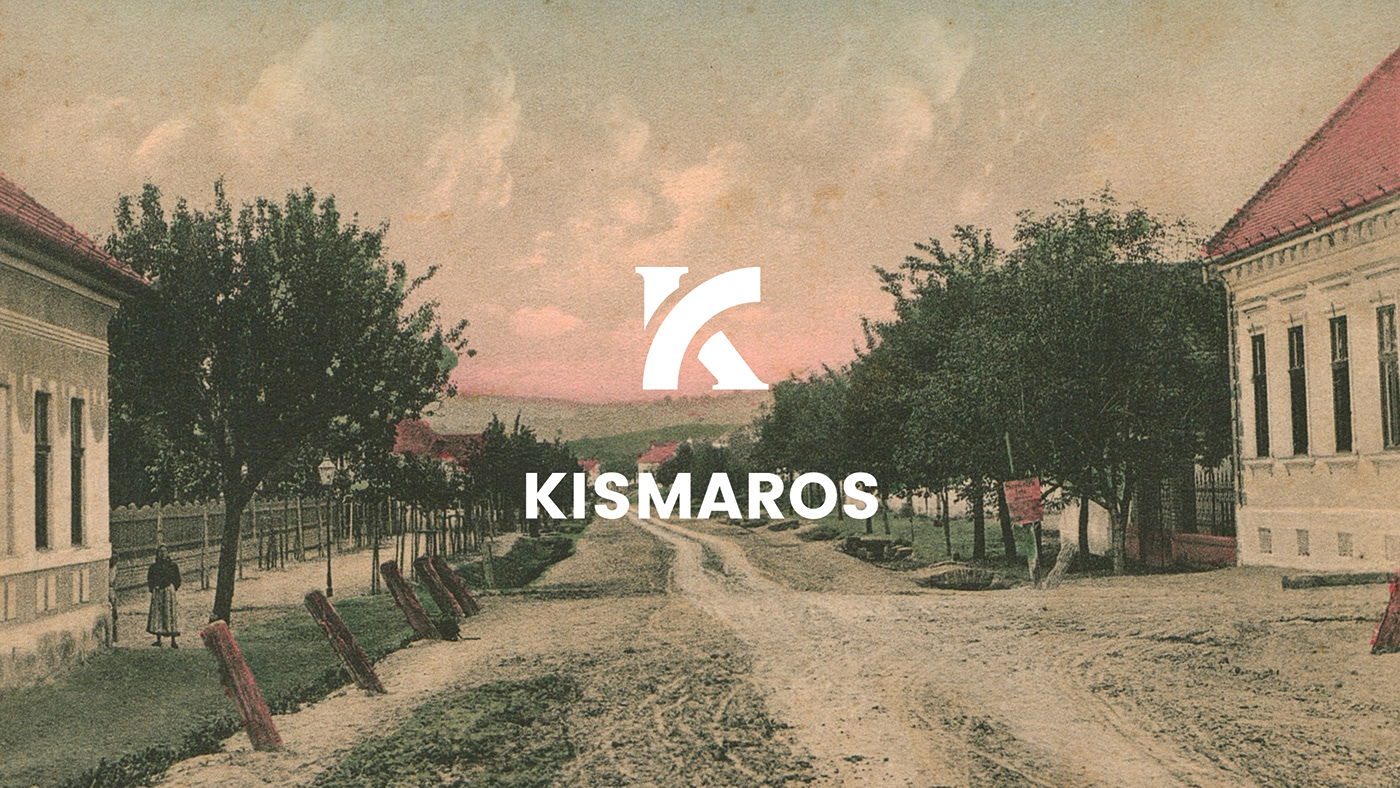
In case of city branding practices we often see the faulty process of creating identities without any input from the locals, managed and ordered exclusively from city leaders. Most of the time these brand elements are alienated from the community and often empty, meaningless, however trendy solutions. We found the curve of the Danube river (the region is literally called the Danube bend) a perfect symbol that can be easily translated into a unique and powerful emblem. The "K" logo became the center of the brand.
The modern top of the logotype is inspired by the shape of the river bend, while the bottom half is a classic, serif stem, referring to the importance of the values of the past.
Art direction: Luca Patkós
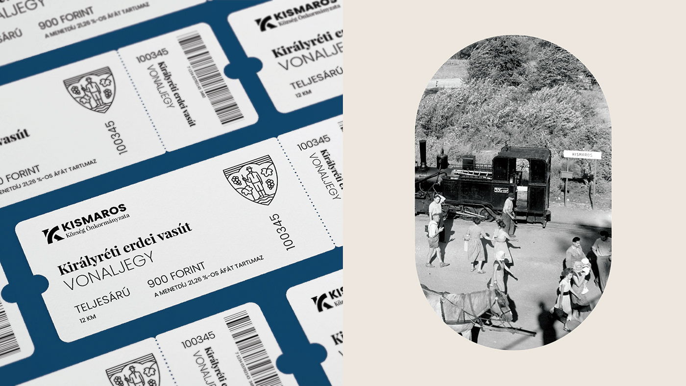
Photos: Kismarosi Sváb Muzeális Gyűjtemény, Ferenc Laufer
Client: Kismaros Önkormányzat


Coat of Arms
The coat of arms of Kismaros, alongside the logo was also updated. We consciously treated the two emblems as separate units, emphasizing the different roles they are fulfilling. The authenticity of the coat of arms was crucial for us. Prior to the renewal, we thoroughly researched it, so the final symbol came out heraldically accepted.
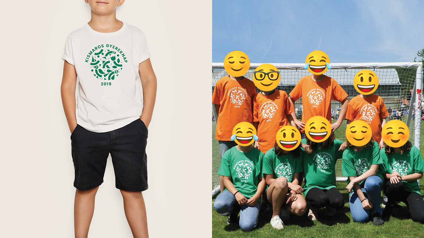
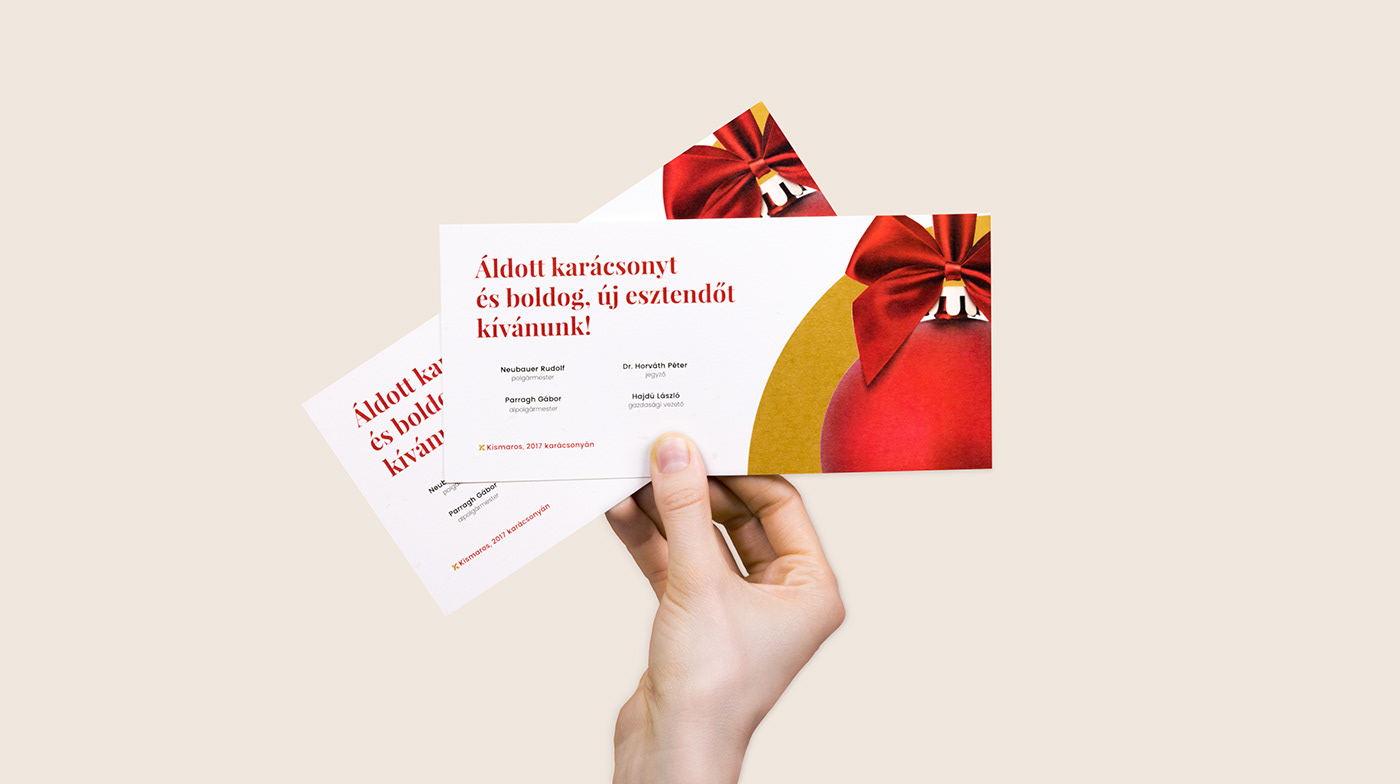
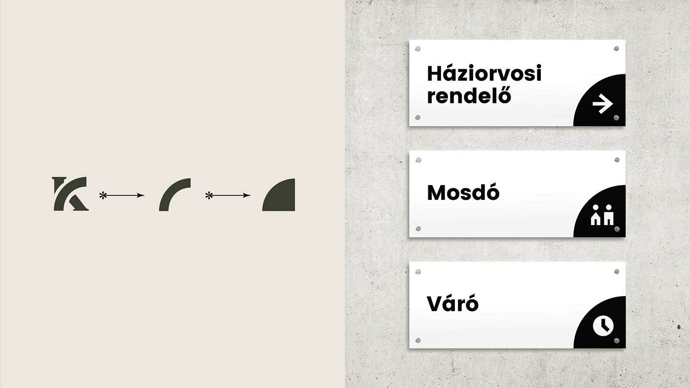
We created an easily adaptable, wide-range visual identity. Designing a consistent image is always a challenging task, especially when it's used throughout various digital and printed platforms. In this project versatile use was the center of the design process. The brand elements are displayed on souvenirs,social media accounts, doctor's office signs, as well as on the header of official documents, event posters and everything in between.


In Use
Controlling the consistency of the visual identity is almost impossible when it's used in so many ways. To prevent the disintegration of the brand, we created a simple template package that can be easily modified on any computer.
Adaptability is also amplified with the use of two free, downloadable google fonts. Throughout the years of cooperation with the town,
we delivered numerous graphic designs, yet the real advantage of the visual identity is sill the template system and its versatility.
In the case of smaller, urgent projects, it's easy to keep the aesthetic quality intact, even without the help of a graphic designer.
We are proud to create a sustainable, appealing, cohesive and engaging visual identity that is not only a passing trend, rather a timeless symbol of a community.