


FROM NAVIGATION TO MOBILITY LIFE PLATFORM
TMAP, which launched the world's first mobile navigation service, is the No. 1 mobile navigation brand in South Korea. form & function has designed TMAP's new brand with SK Telecom Brand Foundation Group that expands its service area beyond navigation services to mobility life platform such as e-hailing, public transportation, chauffeur service & more.

BRAND ISSUE
THE CHANGE of ICONINC T MARK
The T symbol mark used by TMAP was a brand mark representing SK Telecom's mobile communication brand. As the characteristics of the TMAP brand and business area change from mobile navigation to mobility life platform, we designed T-Motif, a new brand mark symbolizing TMAP.

T-Motif, the new brand mark of TMAP, represents the experience of movement optimized by various ways of transport customized to the needs of users as "T" in the form of a combination of two multi-color gradation roads. The two forms that move forward and combine into one symbolize "connecting through mobility," which is the essence of the brand experience created by TMAP, and "TMAP, a platform that connects various mobility."


DESIGN ESSENCE
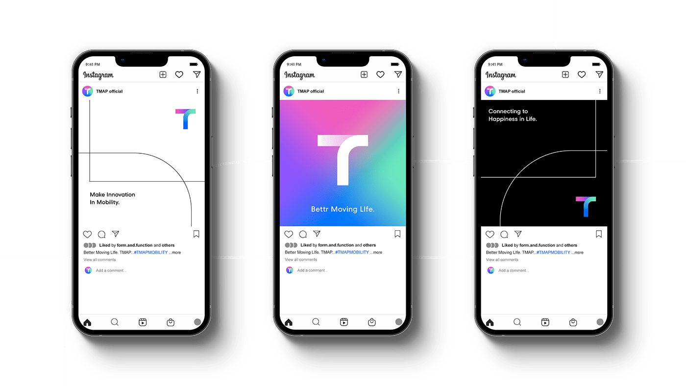
CONNECTING
People connects to each other by moving. We defined TMAP's essence as "Connecting", the core value of the experience provided by mobility platform. TMAP goes beyond the connection of places and objects and logistics to create a movement for the connection between people and people.

BRAND ELEMENTS from ROAD and PATH
Visual elements such as brand marks, logo types, brand typeface and colors that make up TMAP's brand convey the brand essence of connection using the morphological characteristics of the road and path. Through consistent and flexible brand design construction, TMAP's mobility service is designed to allow users to experience better daily life.


BRAND COLOR
DIVERSITY and SEAMLESS CONNECTING
TMAP's brand uses a multi-color gradient consisting of four colors. Each color represents the value of the environment / smart / attention / exploration pursued by TMAP. Multilayer configured color combinations represent a variety of mobility experiences as platforms provided by brands. The complementary contrast between Green and Purple, Pink and Blue is a color on the other side of the color ring, symbolizing the beginning and end of the movement, and the multi-color gradient created by connecting each color to each other expresses the value of the brand's movement and Seamless mobility service experience.


GRAPHIC MOTIF
CONNECTING and MOVEMENT for INNOVATION
TMAP's graphic motif reinterprets the morphological characteristics of T-Motif's straight lines and curves, representing an infinite number of roads and routes. The visually contrasting form of tension and dynamic images express movement for innovation in mobility services, and the sense of space created by the intersection of the two lines conveys the image of the mobility platform.


TMAP + TMAP MOBILITY
July, 2021
Brand Design
SKT
Creative Director | Cha Jonghui
Project Leader | Lee Sangeun
Identity Design | Noh Sejin, Won Jongwon
form & function
Creative Director | Chung Jinsuh, Park Juyoung
Brand Design | Hwangbo Sanghyun, Lee Dahee
3D & Motion Graphic | Hwangbo Sanghyun
Client
TMAP MOBILITY
Creative Director | Hwang Chihyeon, Park Jihye
Identity Design | Lee Seul
Project Manager | Lim Jaehyun
© form & function. all right reserved. 2022


