


Money20/20 organises the largest global annual FinTech events enabling payments and financial services innovation for connected commerce at the intersection of mobile, retail, marketing services, data and technology.


Information Architecture (IA) was used to empathise with the user product. IA focused on organising, structuring, and labelling content in a way that helps users to find information and complete tasks. The goal of the IA was to see if the user journey is customer focused, and user-centric and to see whether a user can easily, quickly and naturally navigate from point A to Z on any user journey within the product. IA is a hierarchy of information and not a sitemap of the website, so looking at the IA below, the user journey of the 2 target user groups (in pink) were intuitive with very little friction.


Heuristic Analysis of the Homepage for the Money20/20 US website & New Business subscribers e-mail


Annotated Heuristic Analysis with (Old) Homepage vs Homepage (New)


(Old) Subscriber Discount E-mail vs Subscriber Discount E-mail (New) - A/B Testing


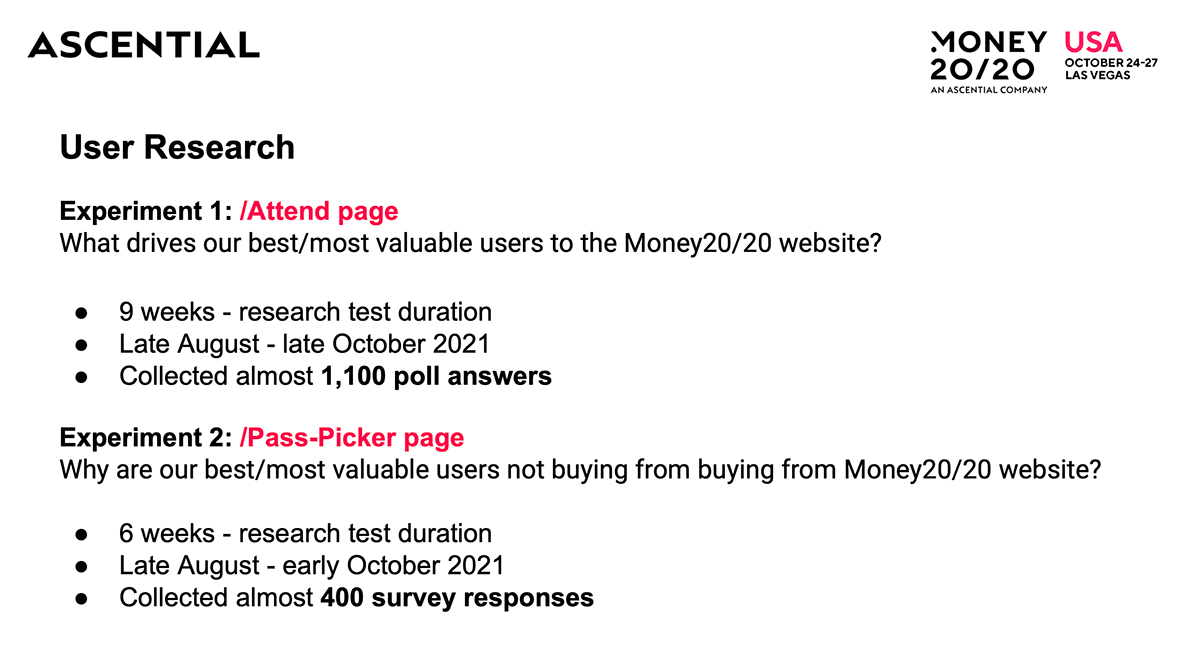
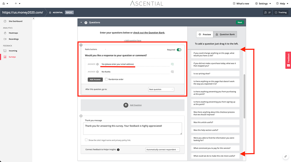
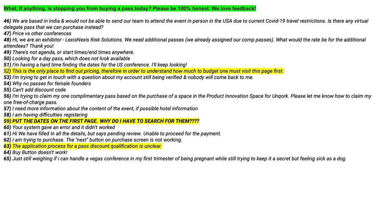
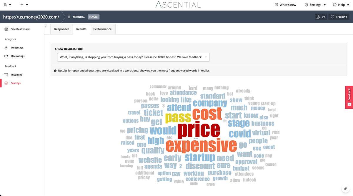
Anonymous user feedback via HotJar's on-page survey/polls.
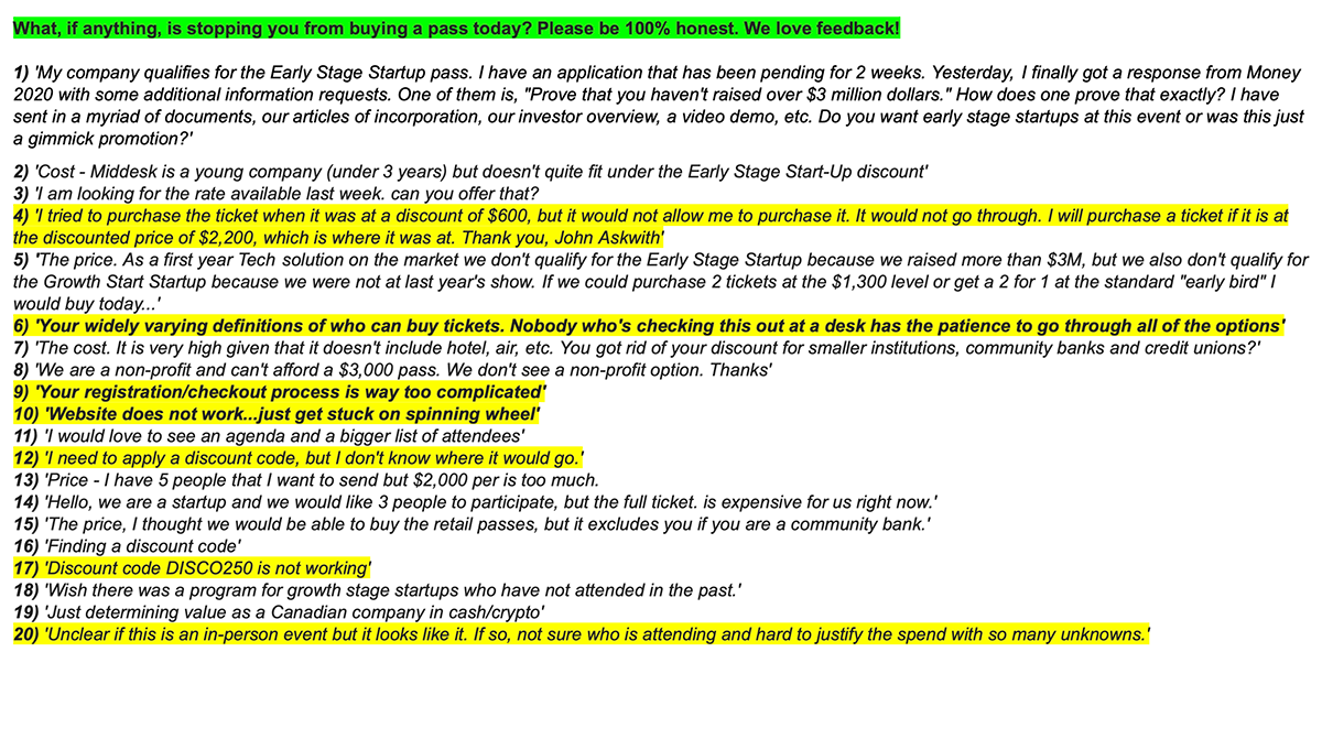
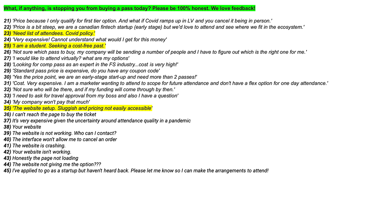
Qualitative Feedback (HotJar) Results

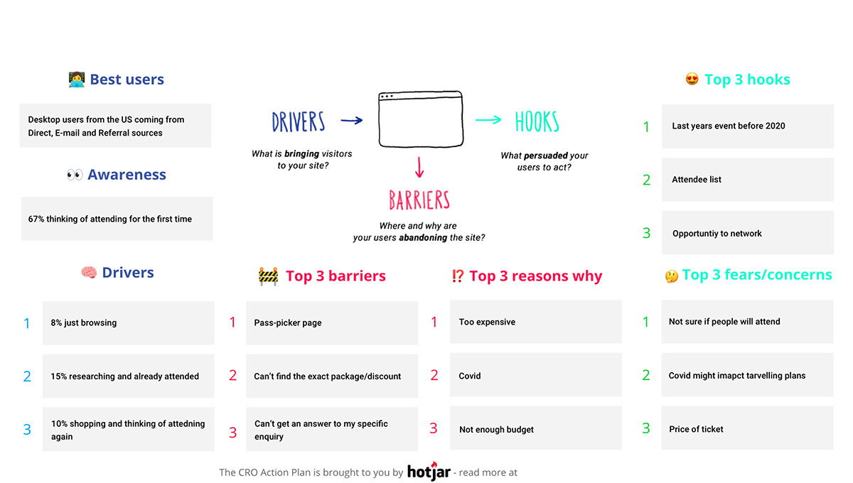
Summary of final results from Lean UX Analysis with Quantitative Data and Qualitative Research
presented to Directors and the Senior Stakeholder team in Money20/20 EU & US
(Old) Past Attendees Page vs Past Attendees Page (New)


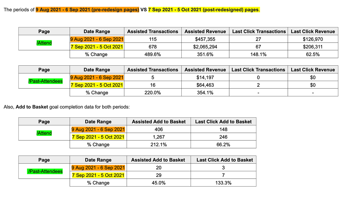
(Old) Attend Page vs Attend Page (New)


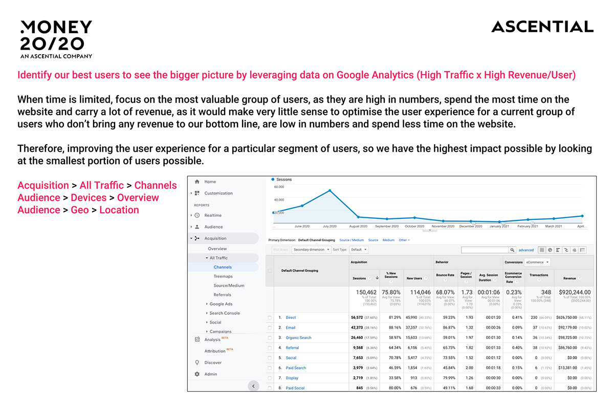
Quantitative Data (Google Analytics) - results showing increase in conversion rate.


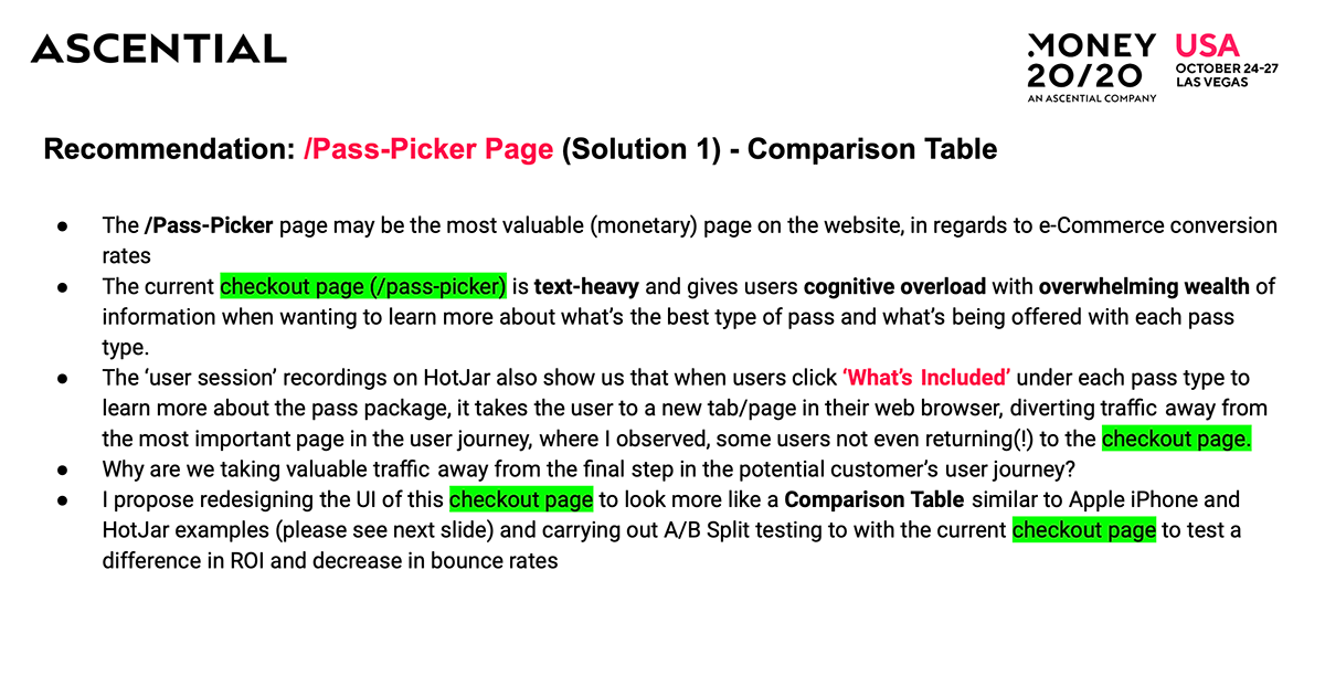
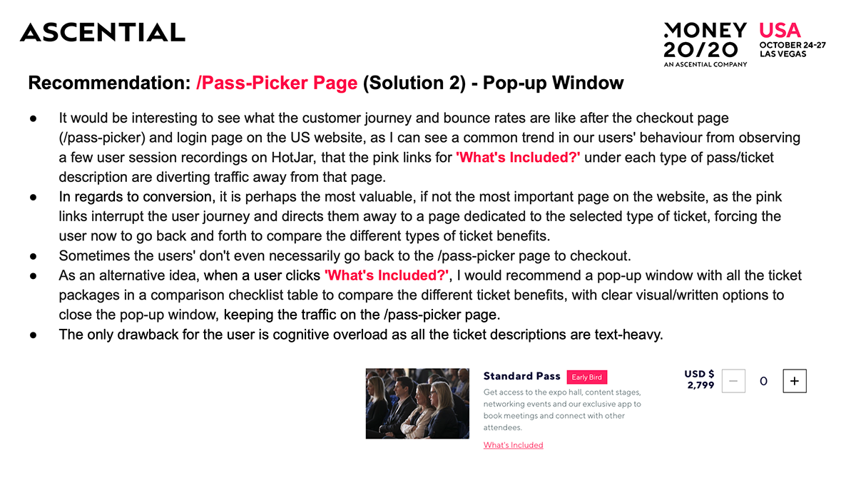
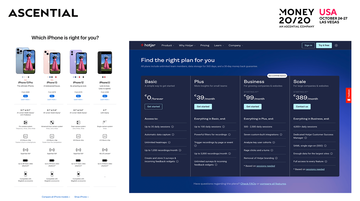
(Old) Pass Picker Checkout Page vs Pass Checkout Picker Page (New)


(Old) Why Sponsor Us? Page vs Why Sponsor Us? Page (New)


(Old) Get Involved Page vs Get Involved Page (New) - Variant A & B


(Old) PPC - Buy EU Ticket Page vs PPC - Buy EU Ticket Page (New) - Variant A & B


(Old) PPC - Global 'Buy Ticket' Page vs PPC - Global 'Buy Ticket' Page (New)


Briefed to design a prototype for a Leaderboard of Top Networks. Which is basically a landing page on the Money20/20 app and the member login dashboard for desktop users, which was also be displayed on large TV screens at the US event.
The Leaderboard is trying to solve the problem, where event attendees can become connected by scanning each other's badge/QR Code using a scanner in the mobile app. This was be masked as a 'game' and as an alternative way to 'exchanging business cards', encouraging attendees to make more connections, which resulted in more meetings.
Although Money20/20 had data on all the connections made, they didn't have a way to display this in the form of a Leaderboard page for a list of the most popular attendees with the most connections.
Prototypes of the Leaderboard of Top Networkers page for the Money20/20 App and public LCD screens for the US FinTech event in Las Vegas, Nevada (October 2021).


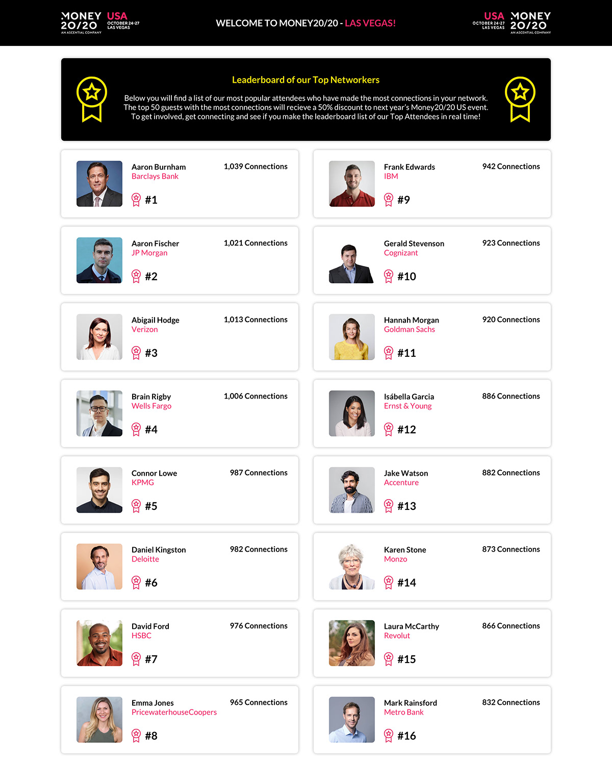

The Leaderboard page on a large LCD screen in Las Vegas, Nevada for the Money20/20 FinTech event (October 2021).


