Redesign of SMEKALKA brand packaging
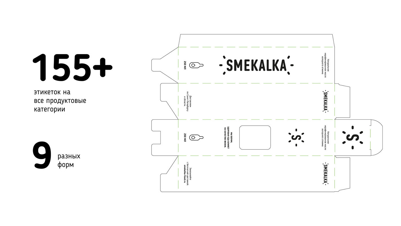
SMEKALKA is a brand of semi-finished products. It was first launched as a small production on the outskirts of St. Petersburg, later it increased sales by more than 700% and introduced more than 150 items in just 1.5 years. The growth in the number
of positions and the high quality of products required modernization of the packaging,
as it no longer corresponded to the level of the company.
of positions and the high quality of products required modernization of the packaging,
as it no longer corresponded to the level of the company.
Packaging upgrade
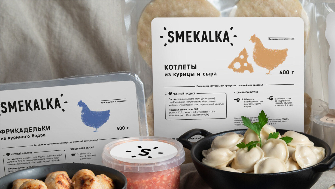
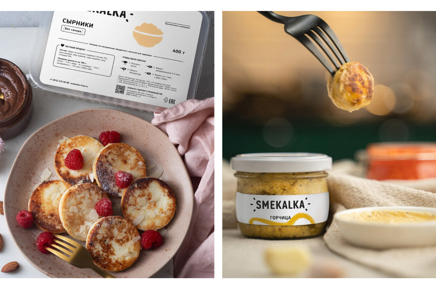
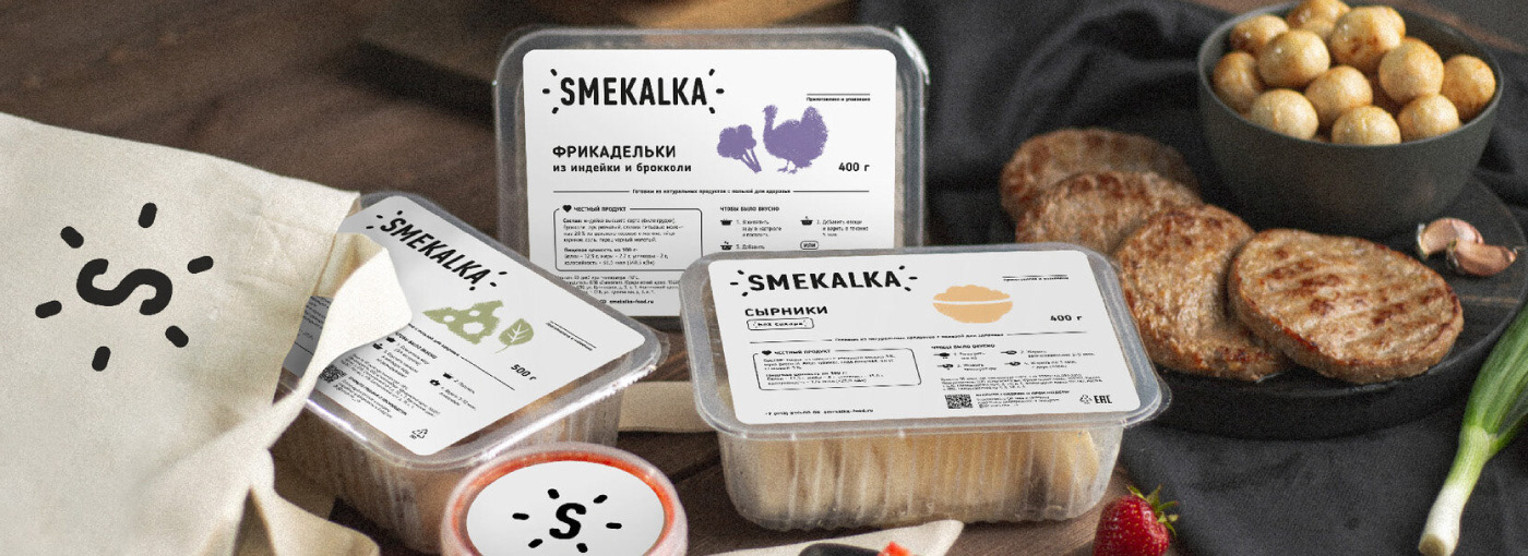
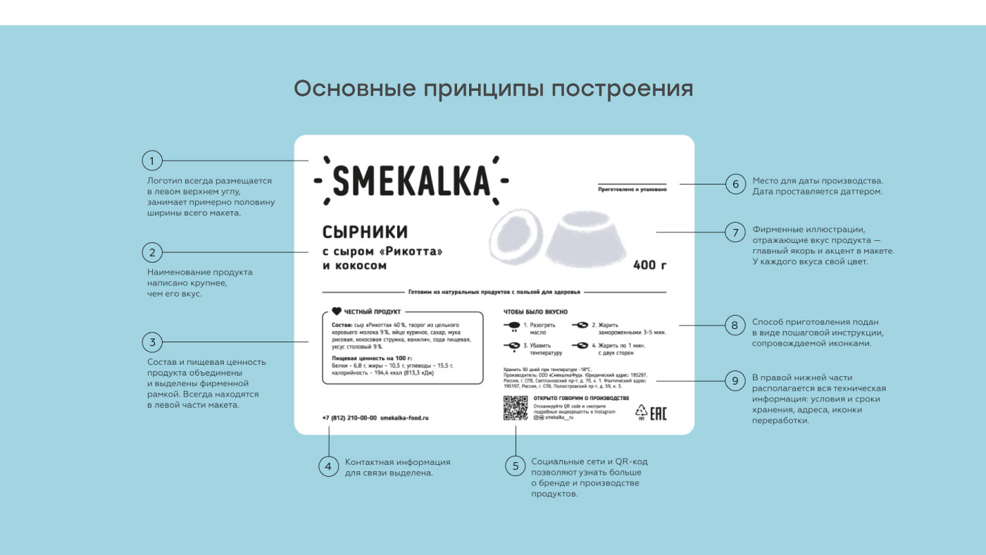
When we started cooperating the company was a startup and the packaging clearly showed it. The printing was grainy, there was a lot of technical information, the product design was scattered and lacked a graphic system.
As the company was growing and expanding the product range, we urgently needed
a unified corporate identity. We decided to completely revise the approach to packaging.
a unified corporate identity. We decided to completely revise the approach to packaging.
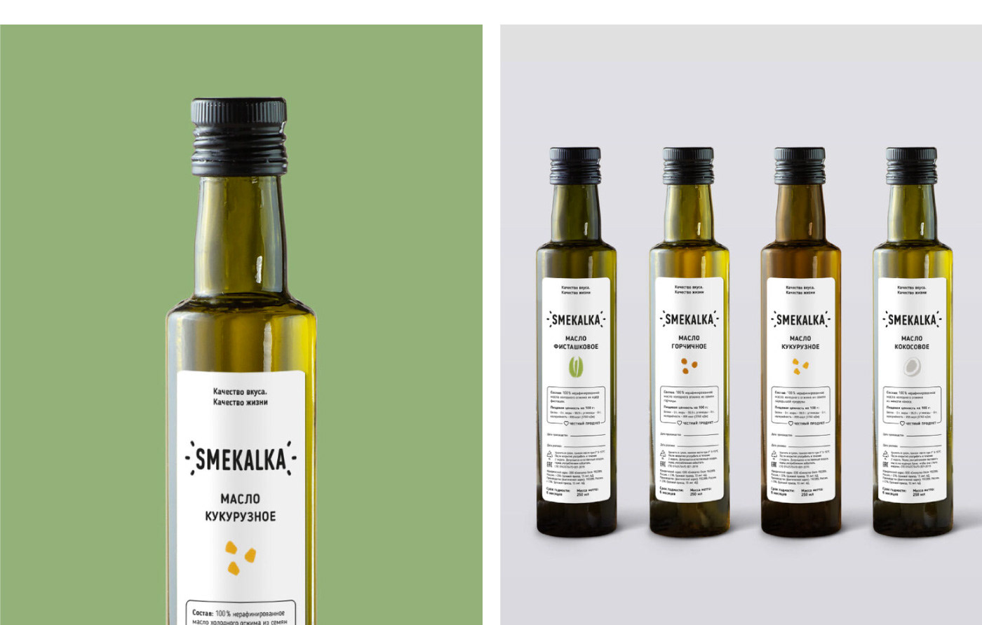
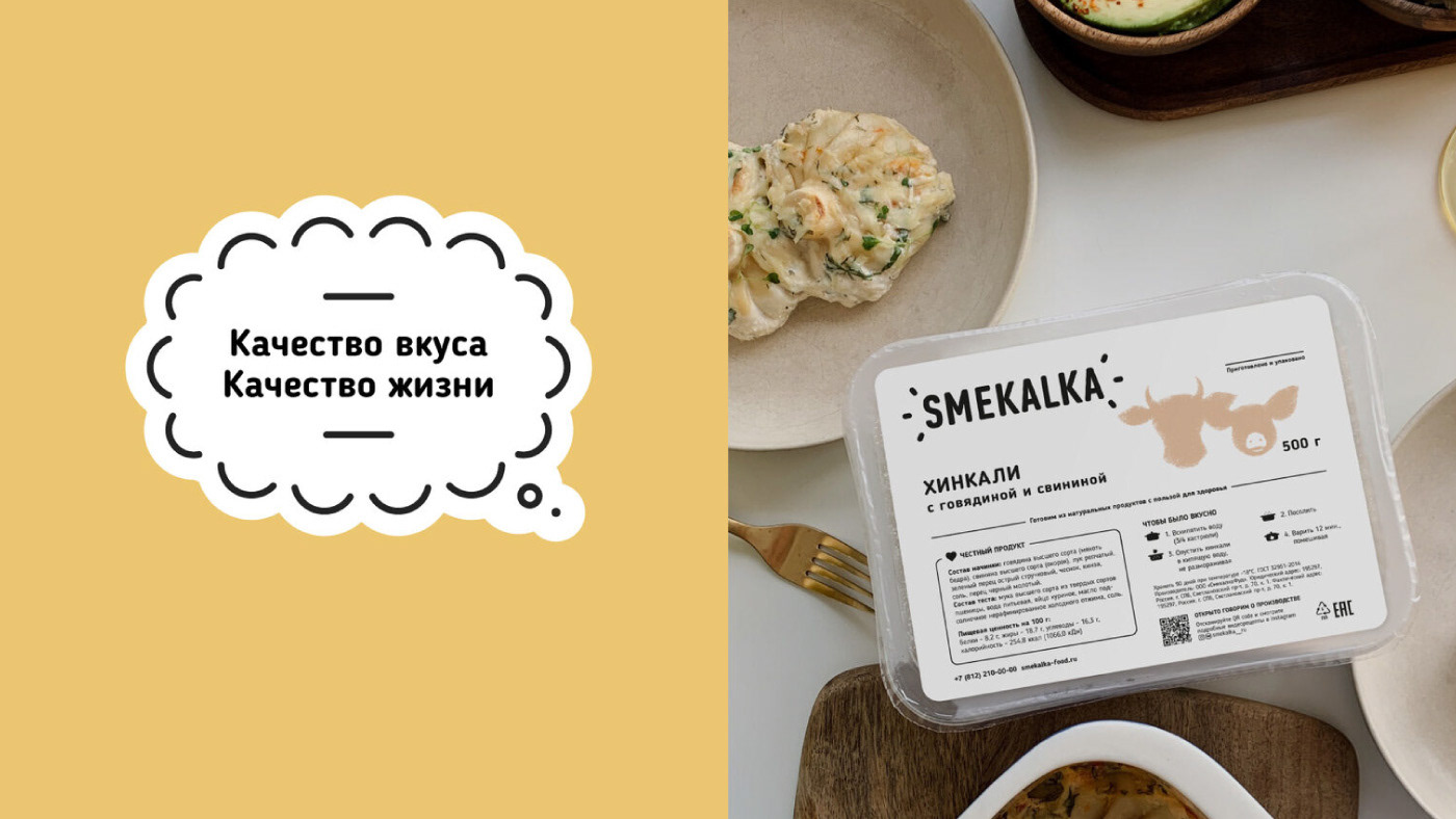
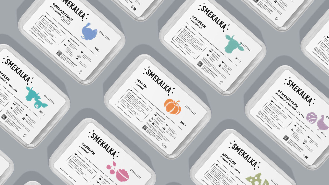
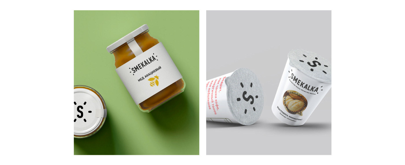
We switched from “craft” shades to white colour. It represents the product, emphasizes
the quality and sterility of production as an important part of the brand identity. The color distinguishes the product from widely popular “craft” competitors.
the quality and sterility of production as an important part of the brand identity. The color distinguishes the product from widely popular “craft” competitors.
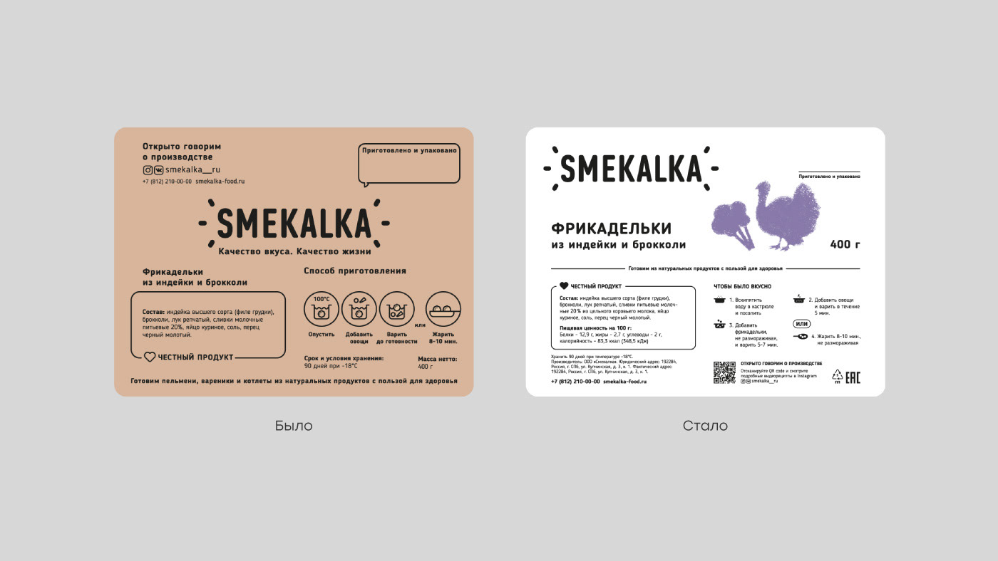
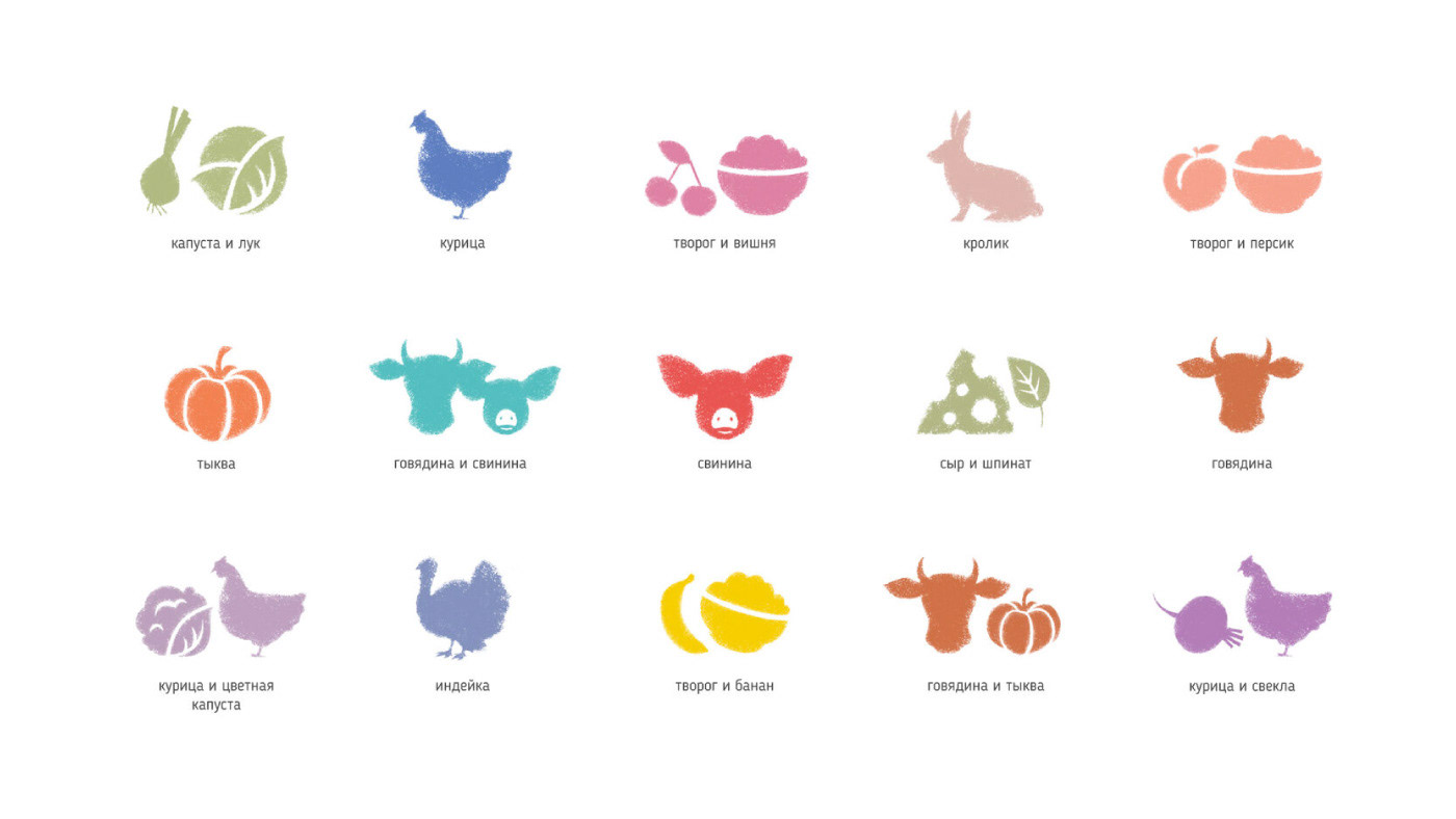
We created a corporate style for the icons. It resembles flour and ice at the same
time as the products are usually frozen. We also introduced the color scheme
for various products.
time as the products are usually frozen. We also introduced the color scheme
for various products.


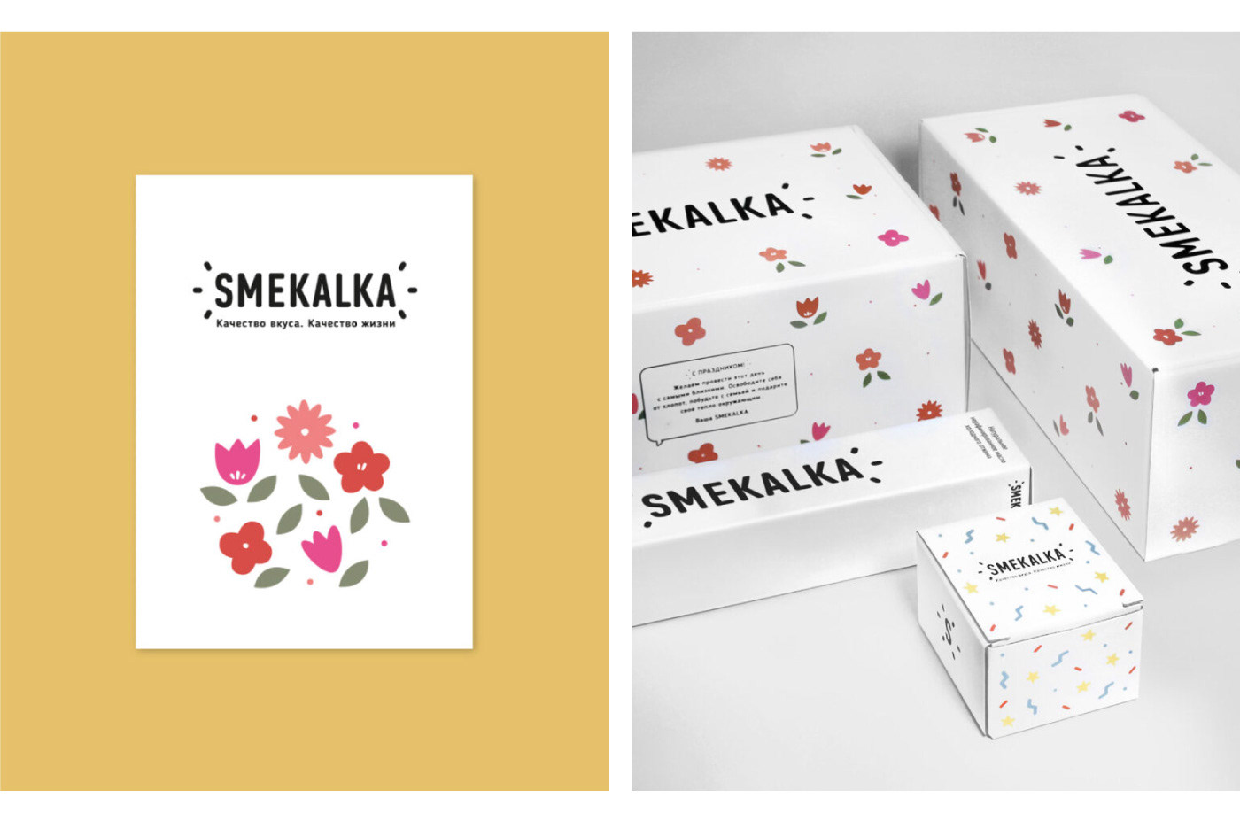
Festive corporate identity
SMEKALKA is a warm and welcoming company. It is always happy to celebrate significant events and congratulate its customers and partners. We have developed an additional graphic system specifically for such occasions. The packaging looks festive but still remains in the design code. In addition, the system can be used for generating patterns for a variety of holidays such as March 8 (International Women’s Day) and New Year.