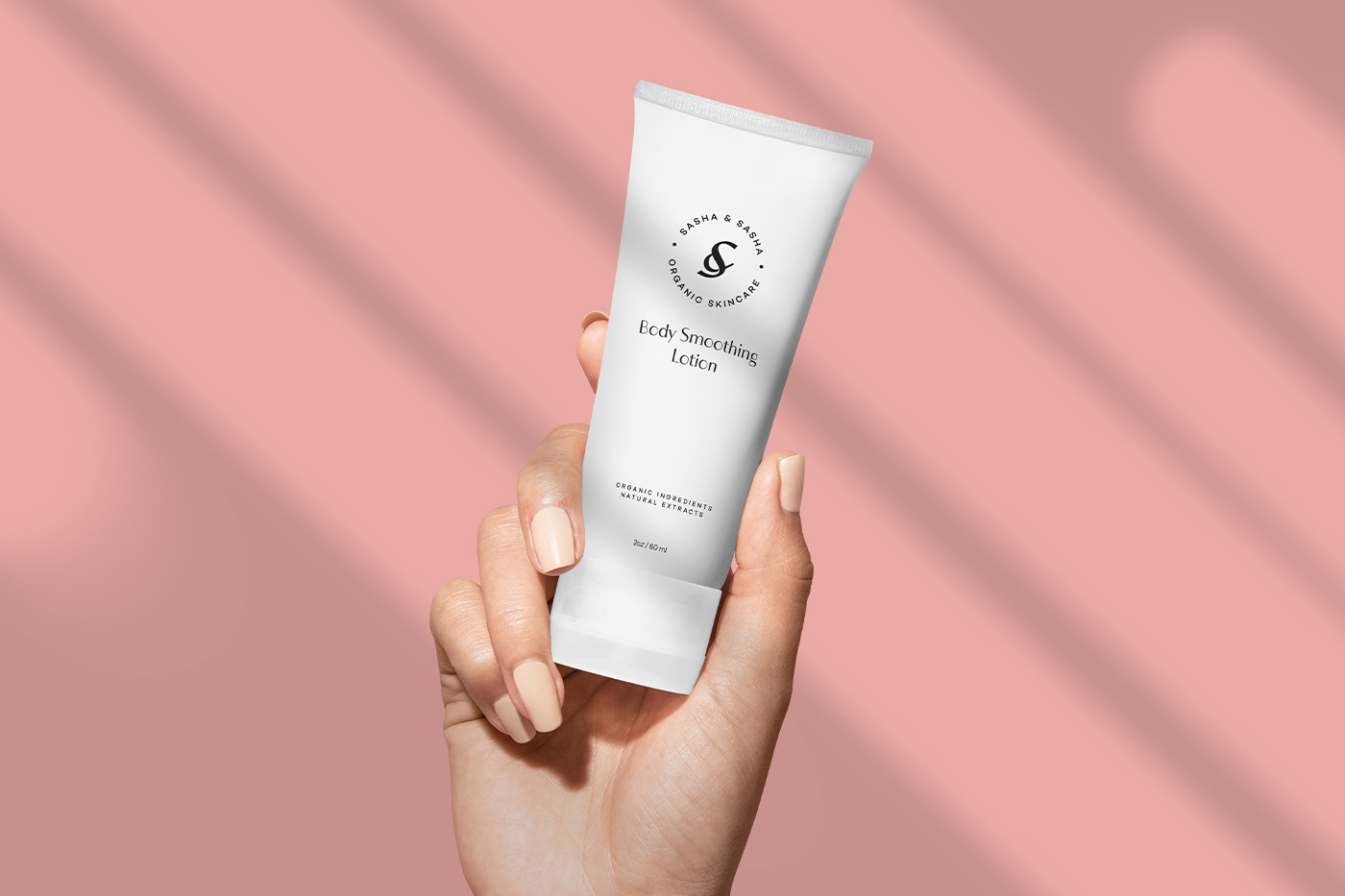
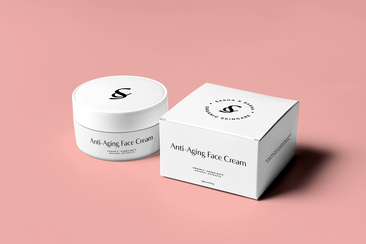
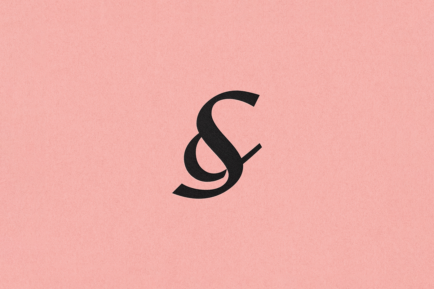
My challenge was to make a brand design identity that speaks sophistication but still making it premium looking. We started by working with ampersand because Sasha is a big fan of ampersand so we decided to incorporate the alphabet “S” into the ampersand to give a more premium luxury cosmetic brand feel to the brand identity. The main task was to create a whole brand identity and packaging design. Their main goal was to show their main values in branding and create a premium look of the product to help them worthwhile compete with their premium competitors’ brands.
The brand color palette consists of 2 colors which are pink pastel color as an emphasis on any skin tone, with the main color accent – black, which perfectly associates with the luxury theme.