Speed is the most obvious benefit of delivery. Though, Londoners prefer to go out for groceries themselves. That’s why the initial swirl icon turned out to be the poor symbol for Jiffy — the London based local digital grocery store with ultrafast delivery. Thankfully, Jiffy isn’t just about rushing.
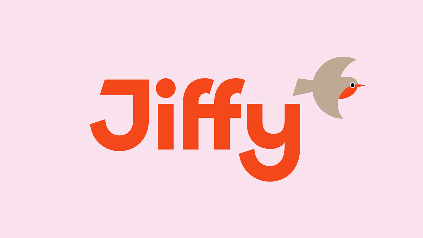
The brand’s new visual identity is built on the conclusion that Jiffy isn’t only hurries to customers, but also takes care of them. That’s when the robin came around — the most beloved bird of Great Britain. Therefore, the crescent of wings on the Jiffy are pointed right. It's like the bird tends to hug and protect you.
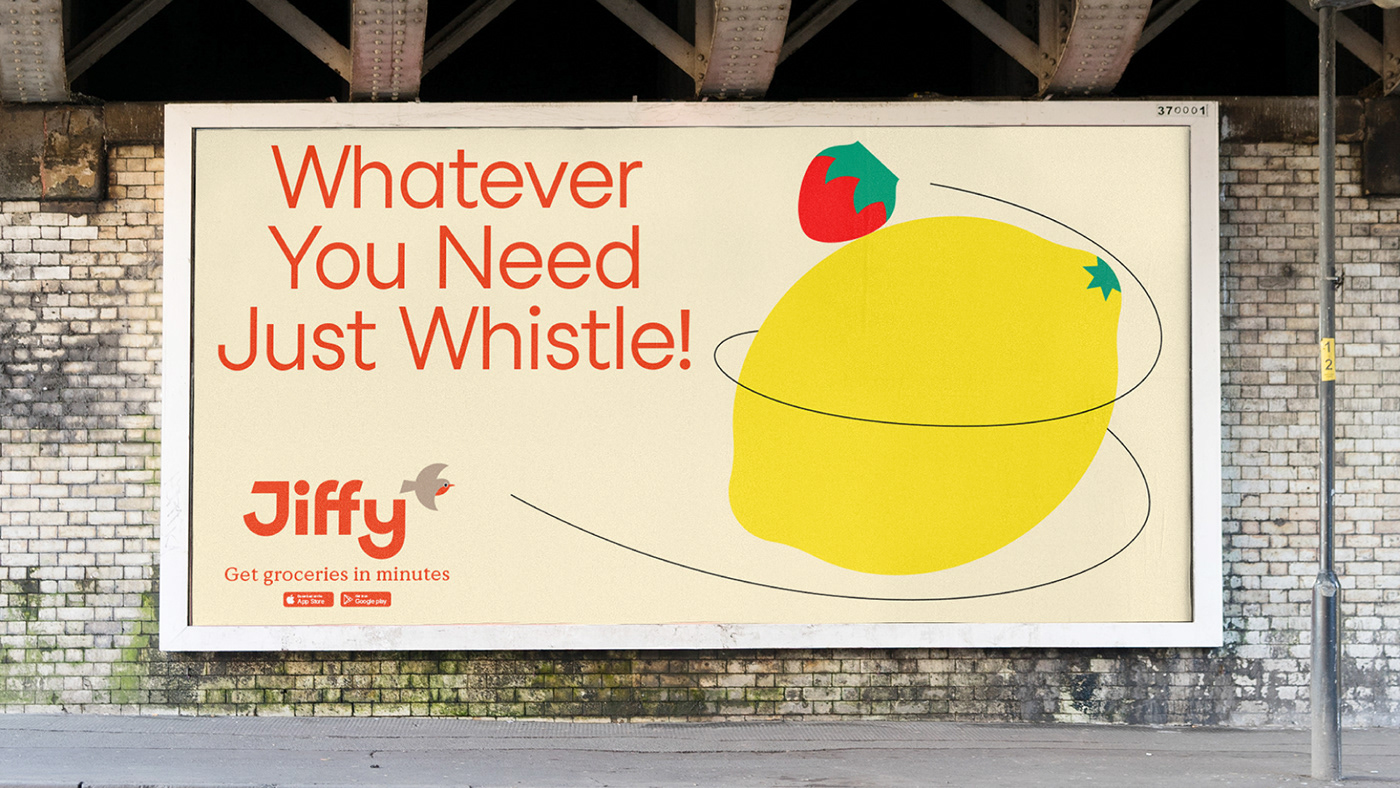
Simple shapes are the base of the visual language. The cuts and curvatures of the wordmark rhyme with the same in the sign. Robin red is the brand’s main colour. It’s accented at the urban touchpoints with potential clients in and muted, when it comes to those, who’s already made an order.
#shukadesign 2022


SHUKA
creative strategy director → anastasia butrym
brand strategist → jack wimmer
creative directors → ivan vasin, ivan velichko
art director → alexander koltsov
lead designer → konstantin frolov
lead motion designer → dmitry kozlyaev
lead digital designer → yanina sharipova
designer → dina isaeva
motion designer → daniil svetlov
project manager → anna eremina
JIFFY
brand lead → liliya kamaletdinova
art director → alexander lafaki
photo → michail fedoseev
designed by shuka ®
© all rights reserved
© all rights reserved


