

I am an artist, but I have an interest and desire for sports.
Because I have enjoyed soccer and basketball with my friends since I was young.
All sports inspire me and give me the energy to express in works. For me, sports provide constant charm and imagination and provide explosive emotions.
Therefore, I like to express the energy that sports convey in artworks.
Sports are a genre that I love so much because I can enjoy it and have the happiness of expressing it in artworks.
Sports are a genre that I love so much because I can enjoy it and have the happiness of expressing it in artworks.

One day, "Foot Locker" contacted me. I was surprised and very happy.
This is because working with the "Foot Locker" brand is a new experience for me and another opportunity to create amazing artworks.
I love these opportunities.
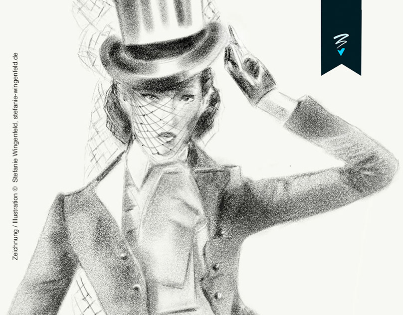
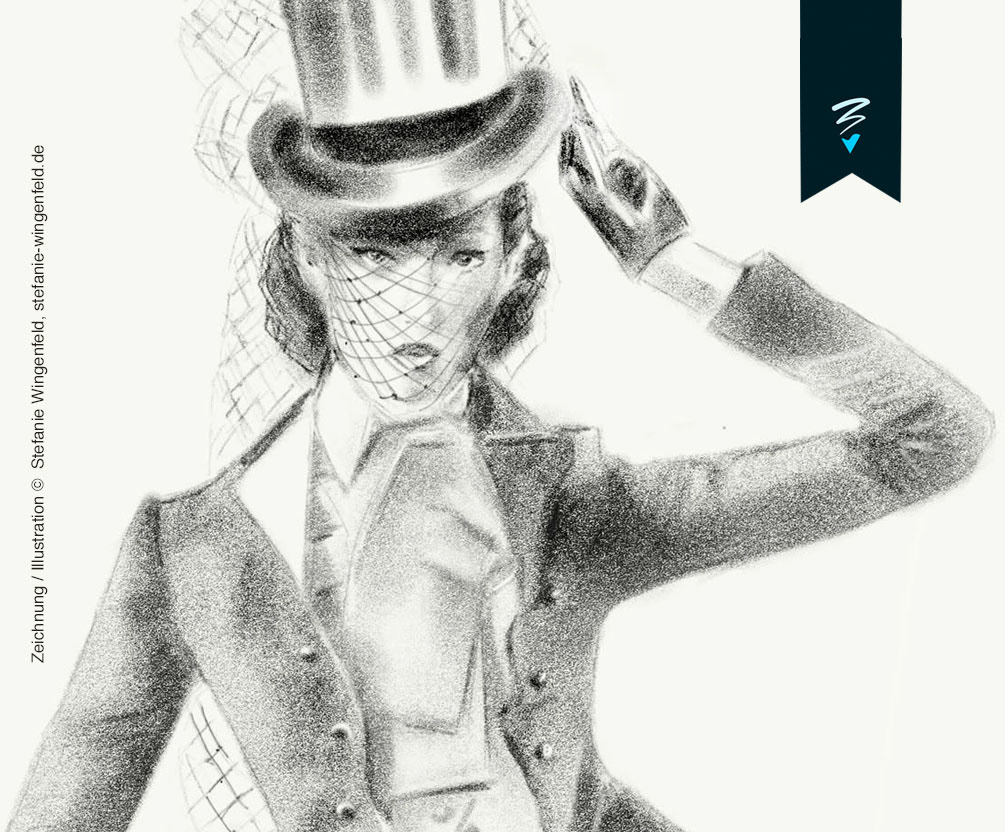
I express the imagination that has emerged through various methods. One of them is a method of painting together through line drawing. And the other is a free expression method through painting.
In this artwork, it was primarily expressed through line drawing, and more vitality was given to the artwork through brush touch.
The images below are "Prespective Design Part 1" for the first time.

The design was planned and organized in two directions.
In order to understand the overall volume, the coloring was carried out in a single color.
In order to understand the overall volume, the coloring was carried out in a single color.

The most important thing in the project is "What story should I make?"
I like to develop my own story in the artwork and appear as a connected work. And I think that's one of the characteristics of my artwork.
I like to develop my own story in the artwork and appear as a connected work. And I think that's one of the characteristics of my artwork.
The concept of this artwork was set as the title of "String of Relationship."
"Foot Locker," a brand that sells shoe products.
The people who visit the store are people of various genres. The concept is that the relationship of many people visiting the store is connected like a "shoe string" and is constantly connected to the charm of "foot rocker."
The people who visit the store are people of various genres. The concept is that the relationship of many people visiting the store is connected like a "shoe string" and is constantly connected to the charm of "foot rocker."

Since the work has to be cut into a total of three images according to the actual environment of the space in which it will be installed, I have been thinking about this since the work was first created.
We took care not to overlap objects such as characters and shoes on the boundary so that each part does not feel awkward.
And I thought it was successfully edited in the final result.
We took care not to overlap objects such as characters and shoes on the boundary so that each part does not feel awkward.
And I thought it was successfully edited in the final result.
The black pattern is an important point of the "Foot Locker" brand. I hid images of black stripes everywhere in the artwork.

I should have made another vertical artwork.
The horizontal work was edited so that it could feel like another vertical new artwork.
The horizontal work was edited so that it could feel like another vertical new artwork.
The image below is a simple example of the order of conception and detail work for the artwork.

The order in which the work was carried out was prepared as an image.


Foot Locker artwork - 02

Foot Locker (Common Ground) Store . Republic of Korea


Indoor artworks


And I would like to express my gratitude to a friend who conceived and helped me with the work together. My friend "1000day" is a wonderful artist, and through him, I receive various inspiration energies. He collaborated on the first store of Korea's Foot Locker.

Thank you so much! 1000day :D