
Company: Electrum Payments
Client: BankServ Africa
Bank participants/users: Absa, Nedbank, FNB, Standard Bank, Standard Chartered, Tyme, Capitec, Discovery, Investec, Sasfin and Ubank.
Client: BankServ Africa
Bank participants/users: Absa, Nedbank, FNB, Standard Bank, Standard Chartered, Tyme, Capitec, Discovery, Investec, Sasfin and Ubank.
Summary: The RPP Testing Platform allows RPP participants to test their implementations in a simulated RPP environment. Participants will use this platform as a pre-certification step before proceeding to formal acceptance testing with BankservAfrica. This approach would allow participants to take the RPP solution live quickest, without unnecessary delays due to dependencies.
Background: The Rapid Payments Program (RPP) is a national initiative to bring easy, modernised instant payments to South Africa. It aims to introduce instant payments, usage of proxy resolution, and the ability to initiate payments using a request-to-pay.

PROBLEM STATEMENT
Integration testing involving relatively unfamiliar asynchronous message flows can be complex, time-consuming and resource-intensive. RPP participants (developers/testers as users) need to have quick insight into what went wrong and why during certification integration testing, because they need to gain their certification on final testing.
Since the RPP system involves payer and payee participants, RPP participants also need a way to test their system and carry out integration testing (as either a payer or payee) independently.
ROLE
- Gather requirements
- Facilitate user research/workshops in order to build and inform user persons
- Create and maintain user stories, together with the team
- Research existing similar interfaces and design patterns
- Create low-mid fidelity wireframes
- Create interactive prototypes
- Conduct usability testing and record feedback
- Reviews with the team/stakeholders (technical leads, Product Owner, Product Manager)
- Refine wireframes based on user and internal/stakeholder feedback
- Create UI mockups
- QA testing of UX & UI post-build
- Suggest UX/UI enhancements for implementation post-build
CHALLENGES
- Access to external users
- Functionality limited to what has been pre-defined by client, and technical/development engineers. Mainly surfacing built API's
- Lack of time allocated to UX discovery/research before design and development phases
- Functionality limited to what has been pre-defined by client, and technical/development engineers. Mainly surfacing built API's
- Lack of time allocated to UX discovery/research before design and development phases
USER-CENTERED ANALYSIS - WORKSHOP & PERSONA CREATION

Persona workshop to understand the user, task and environmental profile


In order to create the user personas, I facilitated a collaborative online workshop between Electrum and BankservAfrica. We worked on user profiles, environmental profiles and general task profiles, that I used to create the final personas.
REQUIREMENTS GATHERING + WRITING USER STORIES


We created user stories as a team, to describe the user needs that the designed solution needs to satisfy.
USER TASK FLOWS

RESEARCH - EXISTING PATTERNS


I looked at existing design patterns: login patterns, other testing software interfaces, and patterns that allow the user to edit and submit information within a table view.
WIREFRAMES

We collaborated on low-fi wireframes to discuss initial concepts and thoughts during briefing-in and user-story meetings.


Wireframing iterations - Health Checks screen

Wireframing Iterations - Test results

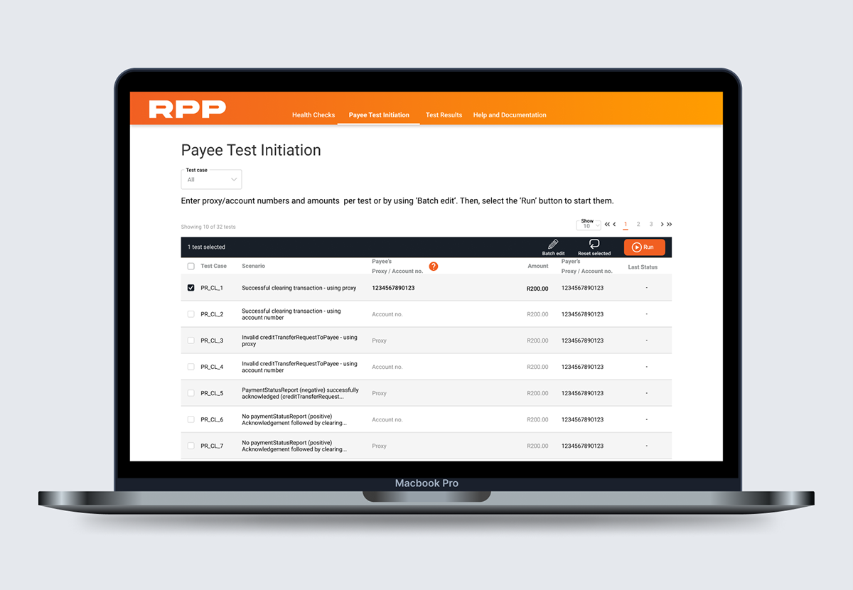
Wireframing iterations - test initiation
PROTOTYPES


Prototype - view all test results and details of a specific test

Test Initiation - flow A. Users click 'Edit' to add amount and proxy information, then the tick/cross icons to save or cancel.

Test Initiation - flow B. Edit is visible immediately on hover, information is saved automatically by clicking out of the input field.
USABILITY TESTING


The login + health checks, test results and test initiation flows were tested individually, then iterated on. Each round of testing consisted of 3-5 users, mostly developers as well employees with a technical background . They were asked to complete certain tasks, and to think out loud while doing so. I tabulated the results.
Two different patterns within the test initiation section were tested with AB testing, as shown in the prototypes above.
USABILITY TESTS - OUTCOMES
Login and Health check screens: Users understood what the Testing Platform can do by reading the copy on the Login Screen. They would find a Help screen beneficial. They did not understand the different test types (Clearing, Proxy and Request to Pay), so tooltips were included to explain them.
Test Results: Users felt the inclusion of the code block would be helpful to troubleshoot. Some users found the JWS failure icon (?) confusing, so this was updated to a (!) symbol. They felt it would be good to access the test pack from this interface, however that was out of scope for this version.
Test Results: Users felt the inclusion of the code block would be helpful to troubleshoot. Some users found the JWS failure icon (?) confusing, so this was updated to a (!) symbol. They felt it would be good to access the test pack from this interface, however that was out of scope for this version.
Test initiation: Users preferred flow B, which allowed immediate editing after clicking within the table row. They also said that selecting and editing should be independent actions. And would prefer to be able to batch edit if they have to input the same information per test. Copy had to be adjusted as they thought 'Clear selected' meant unselect vs clear input, and they wanted 'Initiate tests' changed to the more familiar 'Run tests'. Some users at first didn't know that entering in amounts and proxy/account numbers for the test(s) to run is needed, so instructional copy was included at the top of the section.
USER INTERFACE DESIGN


One of the requirements was to use BankservAfrica's existing RPP brand colours. I also used colours symbolically to indicate test statuses, however, icons were also included to aid in the accessibility of reading the test status tags, especially for colour-impaired users. I tried two variations of the action bar for the test initiation screen, and went the standard approach of labels below icons. The interface scored 95% on accessibility, however, the areas where it failed were due to the contrast of the brand colours. I would have used different colours, if I had done this project and branding from the start (image bottom-right as an example).
FINAL PROTOTYPE
The prototype above shows a user checking the health of the connections, running a test and then viewing the latest test results. The Help and Documentation section is also shown.
The prototype above shows a user searching for a test using the filters
QUALITY ANALYSIS - UX/UI
Once in pre-prod, I assisted the developers with testing the interface from a UX/UI perspective. I logged bugs and enhancements in Github.
ENHANCEMENTS


As more requirements and tests were added, the current 'Test Case' dropdown had 68 tests for the user to scroll through, which wasn't an ideal experience as it is overwhelming for the user (see image 1). To solve & enhance the design, I added a 'Test Type' filter, which acts as a broader category and reduces the items in the 'Test Case' dropdown accordingly. The additional dropdown was suggested for both the Test Results and Test Initiation pages.


Another improvement, was that in pre-prod, the background of the tests changed to grey on hover. However, it was confusing as it was the same grey used to indicate alternating rows in the default state. The enhancement was to make the colour change to blue on hover.
METRICS
The graphs below the the cumulative tests passed/failed and in-flight per bank. By using Bank A as an example, the % of passed tests increased by 39.85%. The interface has provided sufficient feedback in the case of failed tests, to allow developers to fix their tests and re-run them until they pass.

THANK YOU


