EVISION REBRAND
E-vision started as the content arm for Etisalat’s Elife service and is now evolving its business. As such, E-vision is revamping its brand to become the leading one-stop-shop, content & digital aggregator.


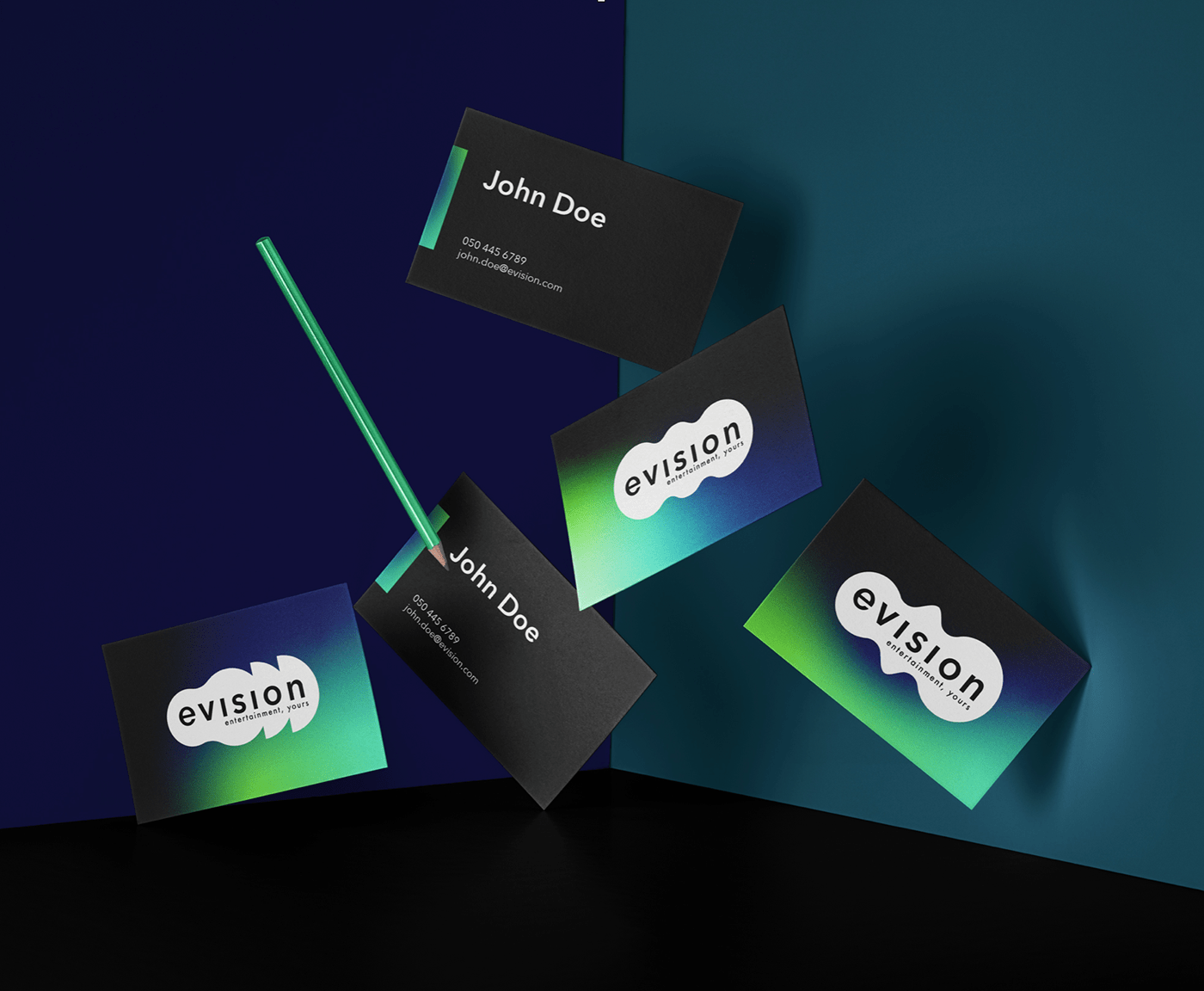
The logo word mark is a simple geometric font that is enclosed in a moving organic shape. The organic shapes give a feeling of the word mark wanting to break out, and be unleashed, representing how the entertainment wants to as well.
The different shapes show all the different categories and genres, always evolving, changing and staying fresh.