


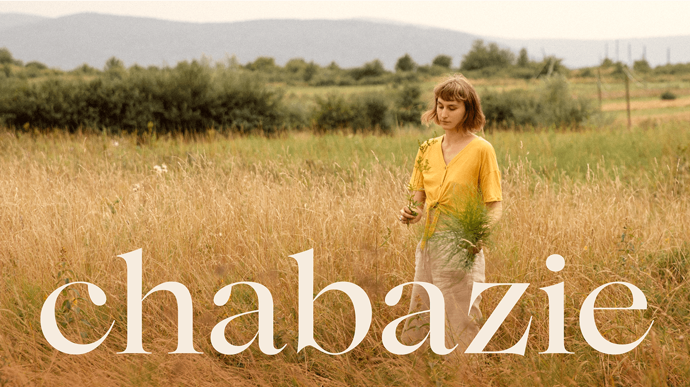
Discovery
Karolina and Krzysiek, a couple behind Chabazie brand, are passionate about growing and combining fruits and vegetables with herbs. They create health-promoting food and beverages of deliciously intriguing tastes. Having a background as herbal engineers, their mission is to constantly extend their knowledge to support the wellbeing of their community — family, friends and customers, especially those living in cities but seeking a way to nurture their bodies with sustainably-sourced organic products. They own and develop a small organic family farm that has a multi-generational tradition of growing herbs... or weed, one could say. That's actually where the brand name came from, as Karolina explains:
Chabaź is, colloquially, some undefined plant resembling a weed, sometimes like a bush. Personally, I also associate the word with people of such a lively, extraordinary character, a bit strange, intriguing and direct in what they say, but staying associated in a positive way.
They decided it might be fun to play with the word, and use it as a name for their brand.


Brand Identity Design
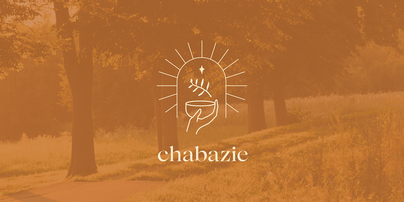
The land Karolina and Krzysiek cultivate has belonged to their family for 7 generations. Seeking to reflect the tradition in the brand identity, the aim was to avoid an old-fashioned, conservative image of a Polish family business, but using it as a unique value in a modern way. To differentiate the brand from competitors, we agreed to stay away from a typical aesthetics of rural food produce and stick to minimalistic, modern look based on a warm color palette. In the design process, we came up with an illustrative symbol that communicates the nurturing nature of the brand on a mission to invite you to a sunny sanctuary of handcrafted, plant-based goods.


Packaging Design
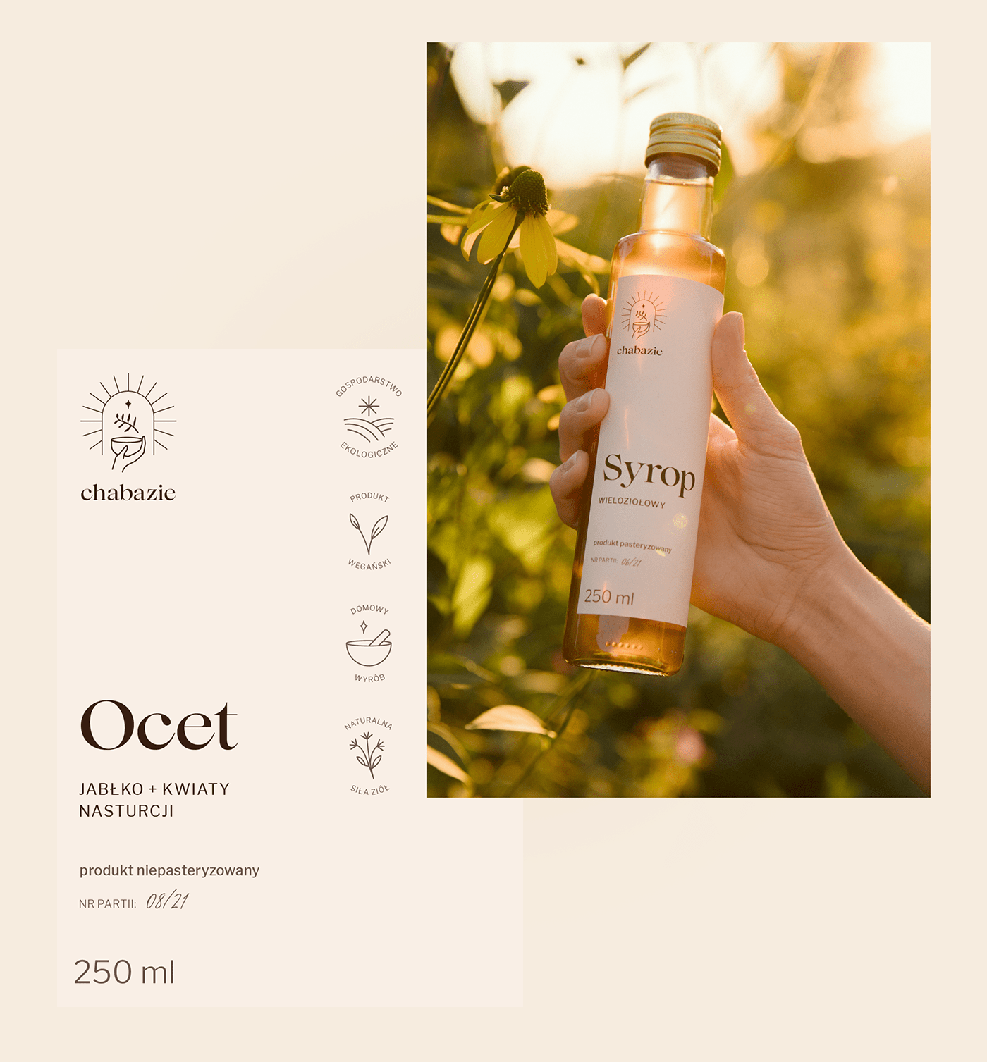
Our task was to design a tangible packaging design system for products ranging from jams in a small jars to vinegar and syrups in tall glass bottles. We deprecated any outer packaging to minimize the paper waste, and agreed on sourcing or reusing paper-made fillers for a safe shipping only.
Chabazie imagined the labels to be clean, straight to the point, extremely consistent and easy to scale as they add new products to the range. Having the products made by hand in small batches, the challenge was to also design labels to be printed in a relatively low-cost manner. We suggested a solution that enabled them to be smoothly produced straight on the office printer. The label sizes were thought to generate as little paper waste as possible, using up to entire paper-sheet, while still communicating the brand’s identity through the packaging.
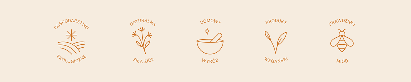
The final design puts a product name in a center, making it easy to differentiate types of products that may end up in the same size of a bottle, like syrups and vinegar. To add a human touch, we proposed each batch number to be signed by hand. The system also features a custom-designed set of icons for the following brand features: an organic farm, the natural power of herbs, homemade, vegan produce, and real honey.

UX/UI Design
Chabazie needed a really uncomplicated, easy to navigate website to reach direct consumers and potential retailers, as well as wholesale clients. The main message was to say:
We are authentic, honest, and we know what we do. Our products are organic, and they come from our crops, simply they are made by us.
They also wanted to build an image as experts who have extensive knowledge of herbal medicine, sharing it through articles on the blog and social media.
The website aesthetic was to be minimalistic but in a warm way. It was supposed to arouse emotions as when entering a modern herbal shop — a welcoming, safe and clean space where you can talk with a professional and gain valuable knowledge.
Having this vision in mind, we started from the ground up, creating a site map and discussing all the sections required. Continued with wireframing session and smooth UI design process, the website has been implemented on Webflow, and handed off to the client to put live into it with their unique products and content.


Art Direction
Joanna Statucka
Joanna Statucka
Brand + Packaging + UX/UI Design
Anna Trzcińska, Joanna Statucka
Anna Trzcińska, Joanna Statucka
Photography
Anna Trzcińska
Motion Design
Jakub Trybus


Looking for a partner to create a brand identity, packaging or a website?
Drop a message at hello@joannast.com


