


The challenge
stc, a telco leader and one of the most valuable brands in MENA, is going through a meaningful cultural change. The economic and social transformation of the region has driven new business strategy, moving from Telco to become a Regional Digital Powerhouse.
This was not a cosmetic change, but a cultural change. stc purpose is to become a catalyst for change and a tool for the people's future.
The new strategy, both business and brand, is condensed in "Everything's going forward!", which expresses the inherent desire of people for change, empowering all to take steps forward in what they believe in.
The solution
A new full brand expression emerges from "The Slider", a visual metaphor that is always on the move and determined to bring the future closer, representing a digital and human movement, that transforms, discovers, activates, opens and facilitates.
The slider puts people at the core of change. It can't be activated by itself. With this new brand, "you make everything go forward."

The superpowers
We condensed all the slider actions into three superpowers. The slider superpowers can be used both in static and in motion and will always reflect the brand's purpose.


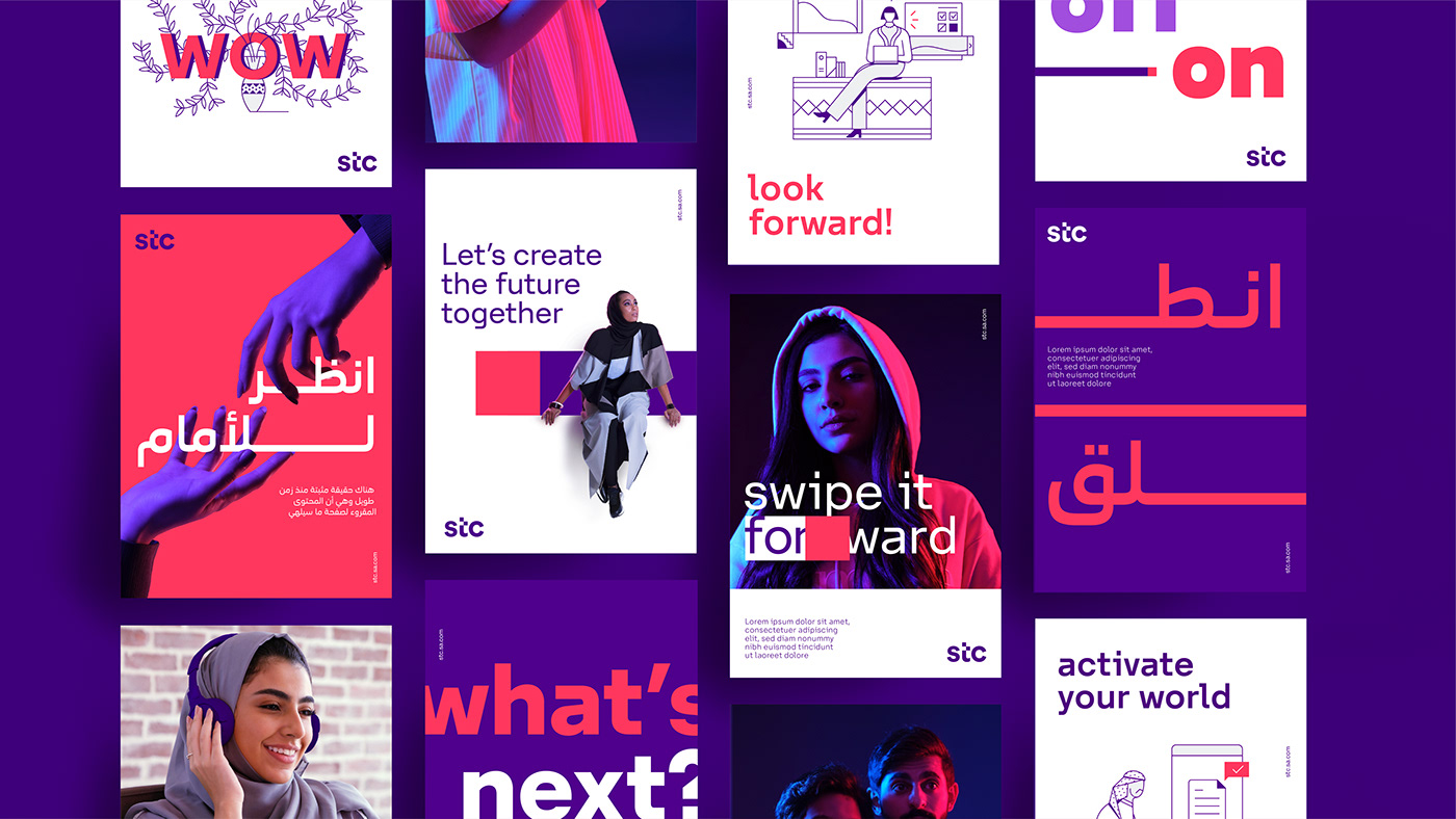
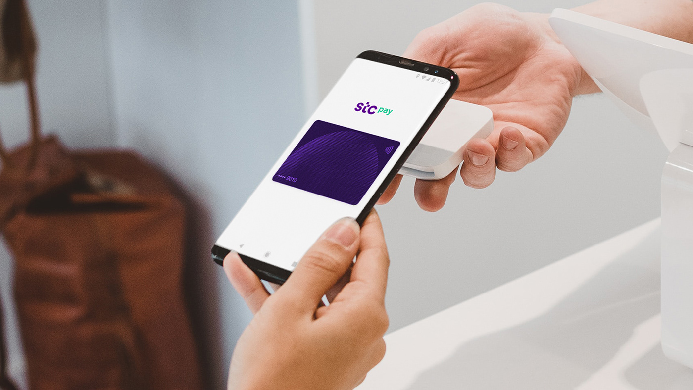
A new brandworld
A new complete set of visual assets, color palette, font family, illustrations, an unique photography style, digital language and retal expression.
All created by the hand of a large number of creatives from all disciplines, orchestrated from Interbrand Madrid.

A new logo that subtly encapsulates the brand essence.
That gesture towards the future at our fingertips.
That gesture towards the future at our fingertips.

A new, highly personal, differentiating color palette
that is flexible enough to be used across
all of the company's brands and sub-brands.
that is flexible enough to be used across
all of the company's brands and sub-brands.


One typography, two languages, two type designers.
Developed by Blackletra (Daniel Sabino) and
TPTQ Arabic type foundry (Kristyan Sarkis)
under the creative direction of Interbrand Madrid.
Developed by Blackletra (Daniel Sabino) and
TPTQ Arabic type foundry (Kristyan Sarkis)
under the creative direction of Interbrand Madrid.


The photographic style as the brand's way of looking.
stc has a unique and special way of seeing things,
with those characteristic touches of light.
Challenging attitudes and actions, focused on the future.
stc has a unique and special way of seeing things,
with those characteristic touches of light.
Challenging attitudes and actions, focused on the future.


Based on the typography, the whole brand icons system is created.
A responsive approach consisting of both web icons and pictograms.
A responsive approach consisting of both web icons and pictograms.


The Illustration style developed by Laura Alejo is a flexible,
functional and easy to combine.
All Illustrations have been animated by Maaambo.
functional and easy to combine.
All Illustrations have been animated by Maaambo.


Credits
Creative Direction and Brand Development - Interbrand Madrid
In collaboration with:
/ Typographic Design - Daniel Sabino Blackletra & Kristyan Sarkis TPTQ Arabic
In collaboration with:
/ Typographic Design - Daniel Sabino Blackletra & Kristyan Sarkis TPTQ Arabic
/ Illustration Style - Laura Alejo
/ Video and animation - Maaambo
Other links
> Underconsideration - New logo and Identity by Interbrand Madrid


