Ekilu
Feed your life
Technology has been trying for years to provide solutions to make our lives easier. But at the same time, day-to-day life causes us to impose frenetic rhythms and pressures on ourselves that make everything seem unattainable, causing us to pursue ideals of life that only generate frustration. This project is proof of how technology can help us break out of this loop and enter a world in which finding ourselves and our surroundings is much easier than we have so often been led to believe.
Challenge
To transform the Nooddle brand, an app for "eating healthy with what you have at hand", for a future in which food will continue to play a key role in the experience, but in which new variables such as physical exercise and mindfulness will also play a part. To create a new brand that preserves the best of the past, that sets a before and after, and that serves as a guide to build a future beyond the universe of recipe apps.

Solution
We dug deeper into the essence of Nooddle, we tried to understand what was really appealing about their proposal, and we concluded that the essence of offering healthy eating solutions with what you have at hand, is empathy. And empathy to achieve what? Nooddle's ultimate goal was clear: a healthy recipe app is for healthy eating. But what happens when we say that Nooddle will also help you exercise, and help you connect with yourself through mindfulness?
We needed a unifying promise, a common purpose for all that was to be Nooddle from now on. So, what can healthy eating, exercising, and taking care of yourself mentally have in common? Well, they are all solutions to simply being well. To feel good about ourselves, and about our environment. And that "being well" was based on balance, on a balance between these 3 verticals.
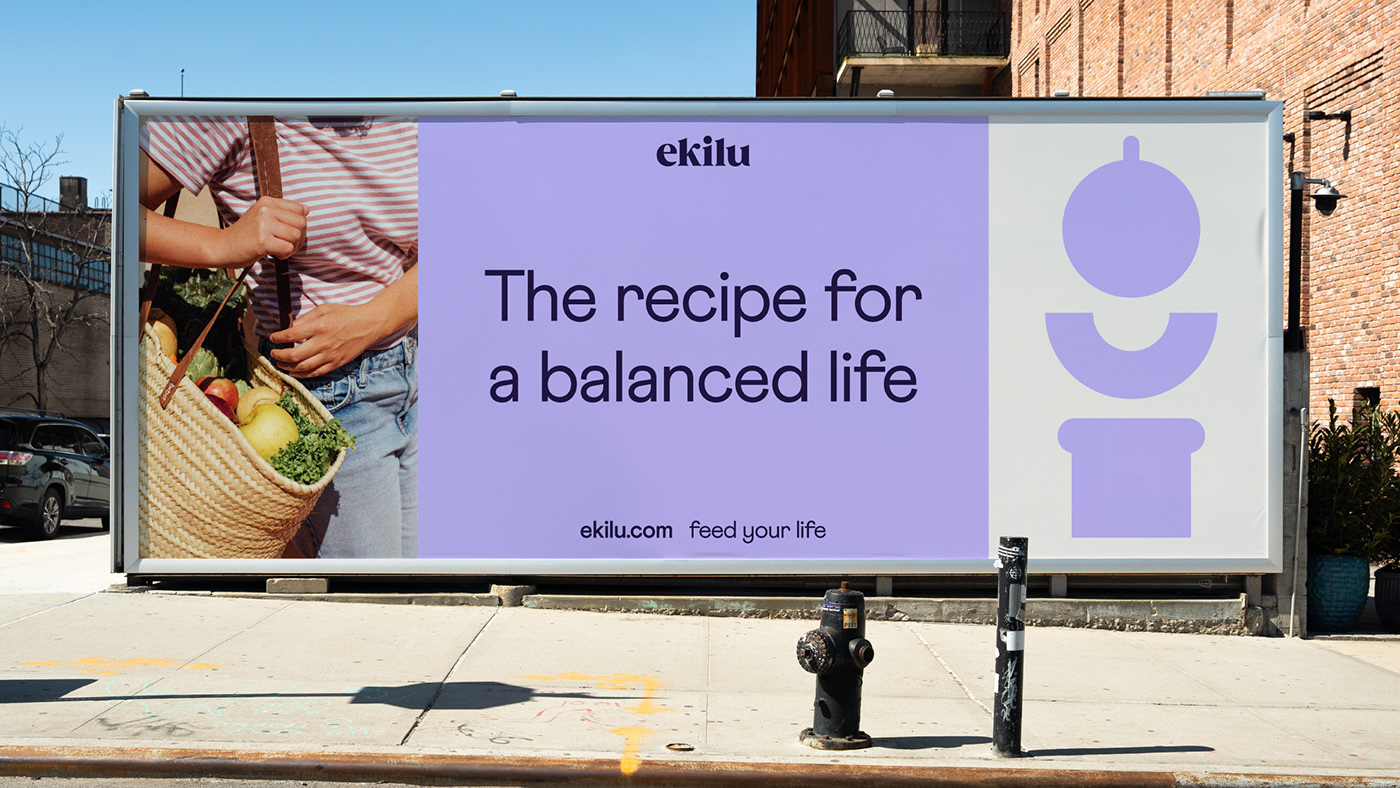
Empathy, being well, balance... With all these ingredients on the table, and with a territory based on the idea of taking care of oneself without guilt or restrictions (a key part of Nooddle's DNA), we defined the new brand platform, with the new tagline "Feed your life", and with a new activity descriptor, "The recipe for a balanced life" as symbols of the ambition and attitude thanks to which Nooddle moves from being a recipe app to become a wellness platform.
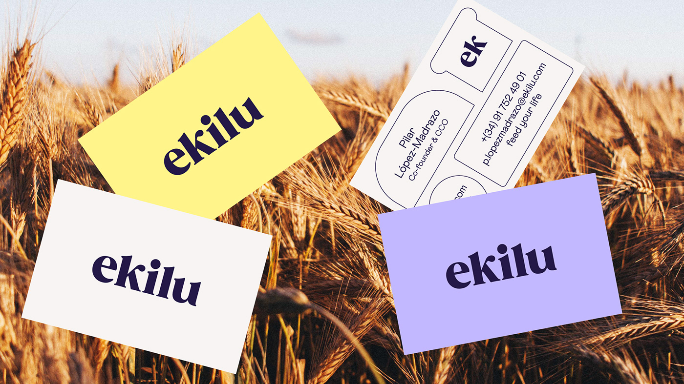
After the transformation at a strategic level, the first big change in the identity arrived: Nooddle is no longer called Nooddle, but ekilu. A name that feeds the idea of balance and equilibrium, a fundamental part of the new strategy, and which, together with the tone of voice and the messages, gives the brand a personality that invites you to achieve "being well" without guilt, in a simple way, and with the intention of wanting to nourish your life and fill it with flavour with much more than just delicious recipes. A life of wellness, with balance as the way forward.


Visual Identity
Balance is a feature that can be found in every layer of the project. It was already intuited in Nooddle when it invited us to cook with the ingredients we had at hand, but it is in ekilu where this idea assumes all the prominence to be approached from a much broader perspective.
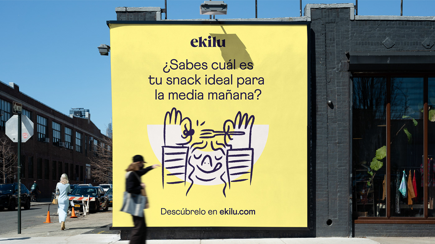
Taking the concept of balance as the backbone, we translated it into visual language to connect all the brand's assets. Thus, we defined a chromatic range formed mainly by two complementary tones; we justified the texts and other elements that accompany each communication in the centre; and we designed geometric structures that metaphorically express ekilu's promise: To help people lead a balanced life in a simple and guilt-free way.