
C H I M A E R A logo and corporate identity development
CHIMAERA is a Norwegian company and their business is based on accounting and other services that can be attached to accounting services. They focus is on giving the costumer flexible services based on their need, by using skilled personel and want to stand out in the marked by being more available then others.
They do services like: accounting, salaries, invoicing, consulting, financial analasys, and
does also help with other services like making contracts, follow up on employees, etc.
does also help with other services like making contracts, follow up on employees, etc.
They want to be a preferred service provider when it comes to accounting services
and related issues focused hard on online solutions.
and related issues focused hard on online solutions.
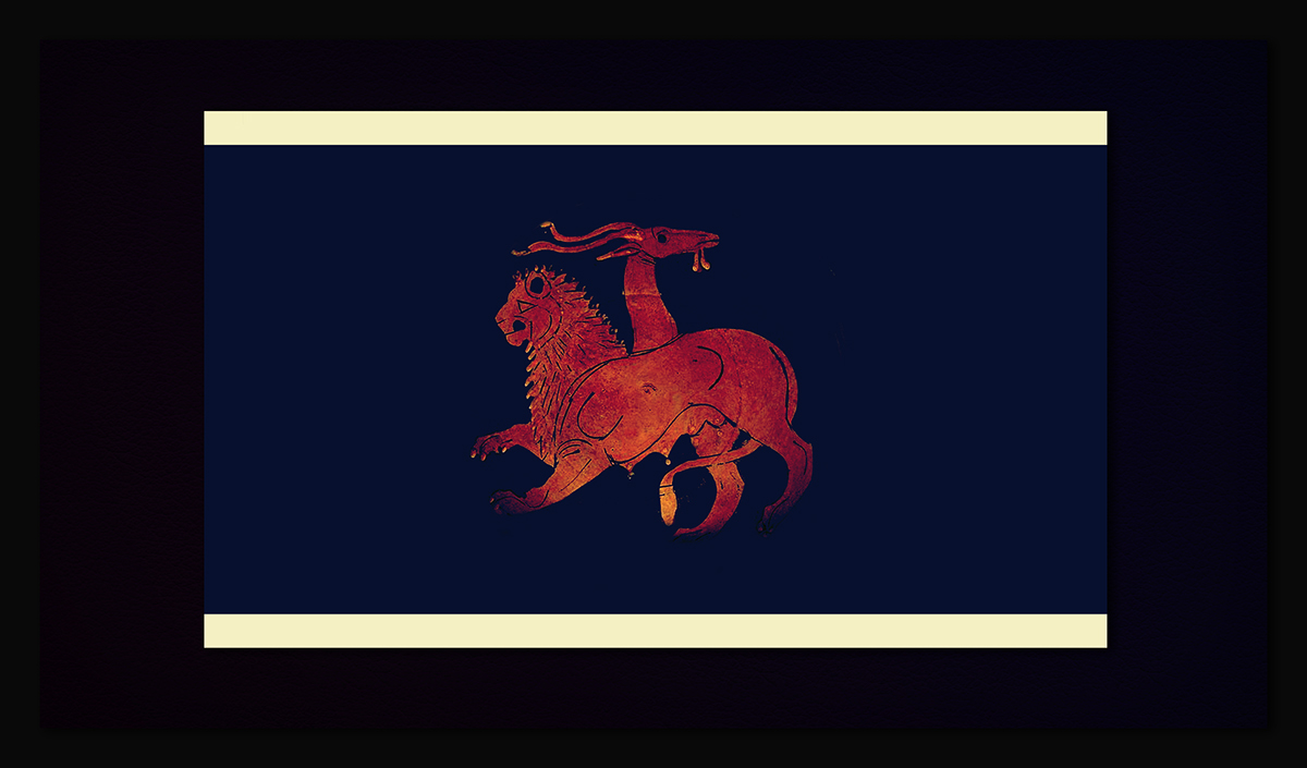
The Chimera (/kɨˈmɪərə/ or /kaɪˈmɪərə/, also Chimaera, Chimæra; Greek: Χίμαιρα Chímaira) was, according to Greek mythology, a monstrous fire-breathing creature ofLycia in Asia Minor, composed of the parts of three animals — a lion, a snake and a goat. Usually depicted as a lion, with the head of a goat arising from its back, and a tail that ended in a snake's head,[1] the Chimera was one of the offspring of Typhon and Echidna and a sibling of such monsters as Cerberus and the Lernaean Hydra.
*The term chimera has come to describe any mythical or fictional animal with parts taken from various animals, or to describe anything perceived as wildly imaginative or implausible.
*The term chimera has come to describe any mythical or fictional animal with parts taken from various animals, or to describe anything perceived as wildly imaginative or implausible.
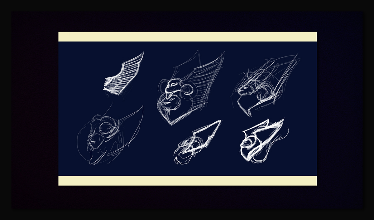
So I've started sketching, trying not the make a Chimaera, but a composition with the Chimaera animals but in a way that I could show it very simple and still recognizable. Wings are additional, to make it more interesting visually and also cause conceptually it was very well accepted by (all) client.

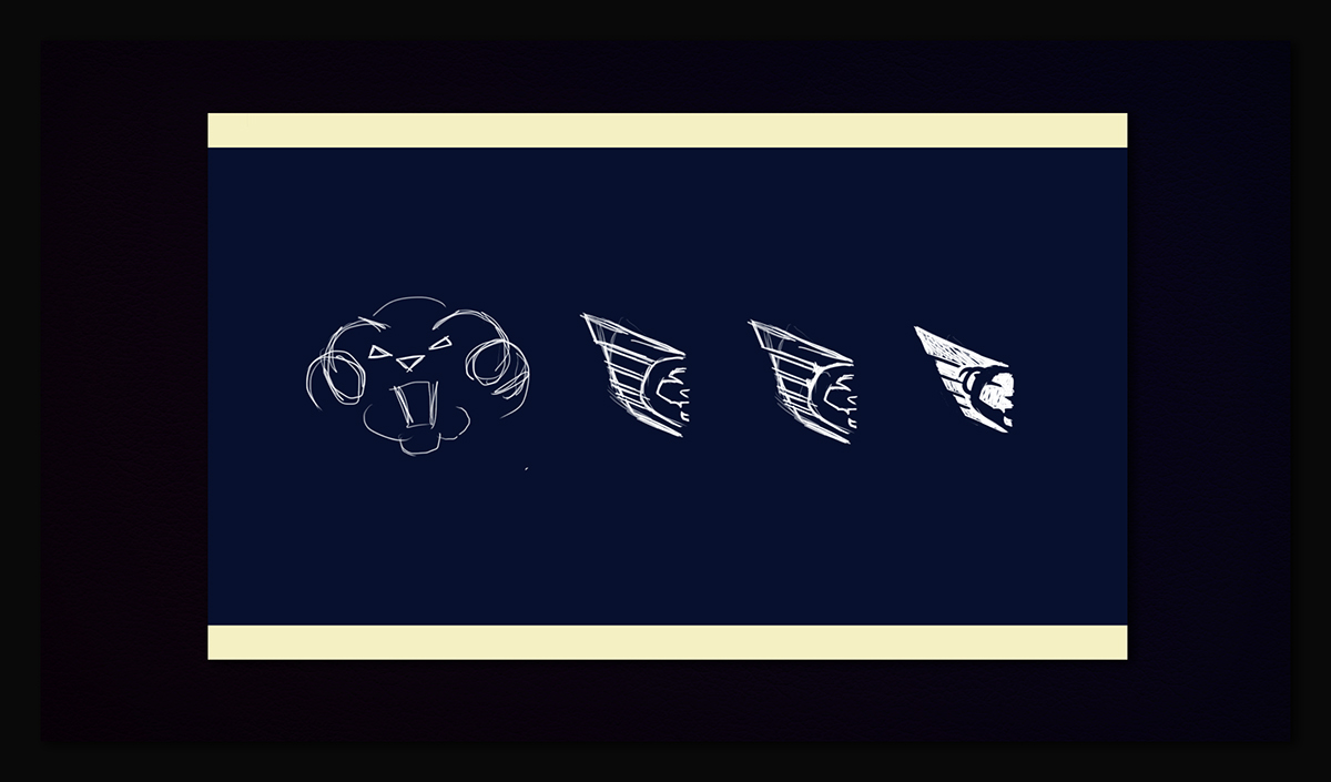
In this stage I was almost consolidating the overall shape and composition, the elements was settle and I was just about managing them to make it good looking: Goat horns, Skake tail, Lion mane and client Wings
So as the development goes on, I noticed that the Snake doens't fits well with other elements, it was very ambiguous and not show a dinamic position (on the contrary, makes it very static)
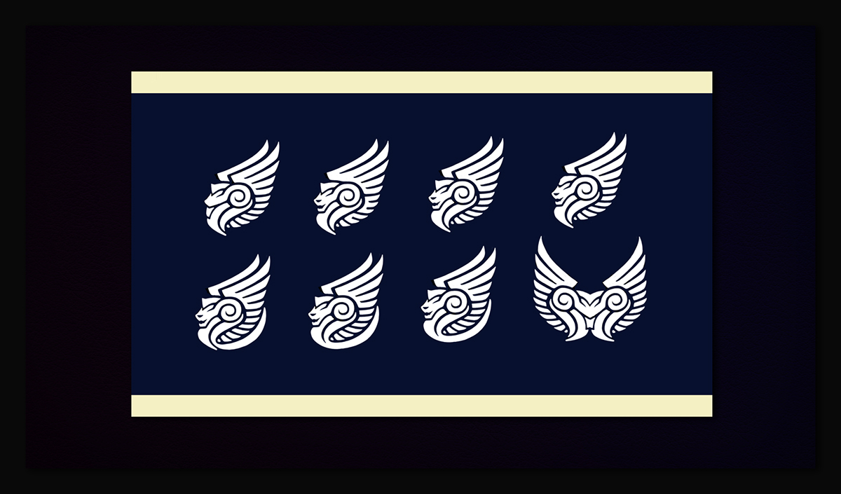
So I keep playing with those elements, and see that the symmetry could be a nice add the the wings composition, also to make the Lion as the main element, some hierarchy about Lion > Goat > Snake (and of course the wings above it all)
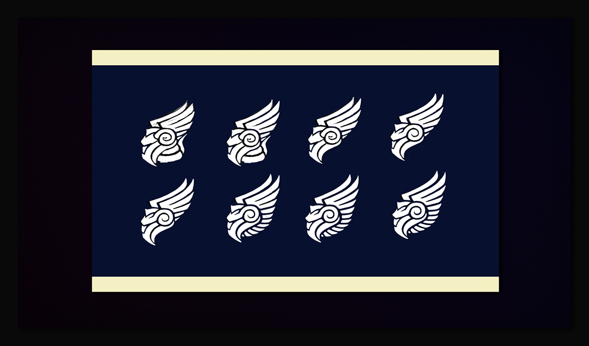
At this point I decided to focus in the elements that was working and drop all the rest for now. Put Lion mane and Goat horn on negative space to make it more stylish and less visual elements, I mean less traces.
Here I concluded some things: first the wings are way wider than I liked, and despites horns are a very nice conceptual add, I makes the overall shape very busy, and I don't know how to solve this issue. Also, courve wings makes is way more dinamic, something that was a good point of balance between it and the symmetric overall shape.

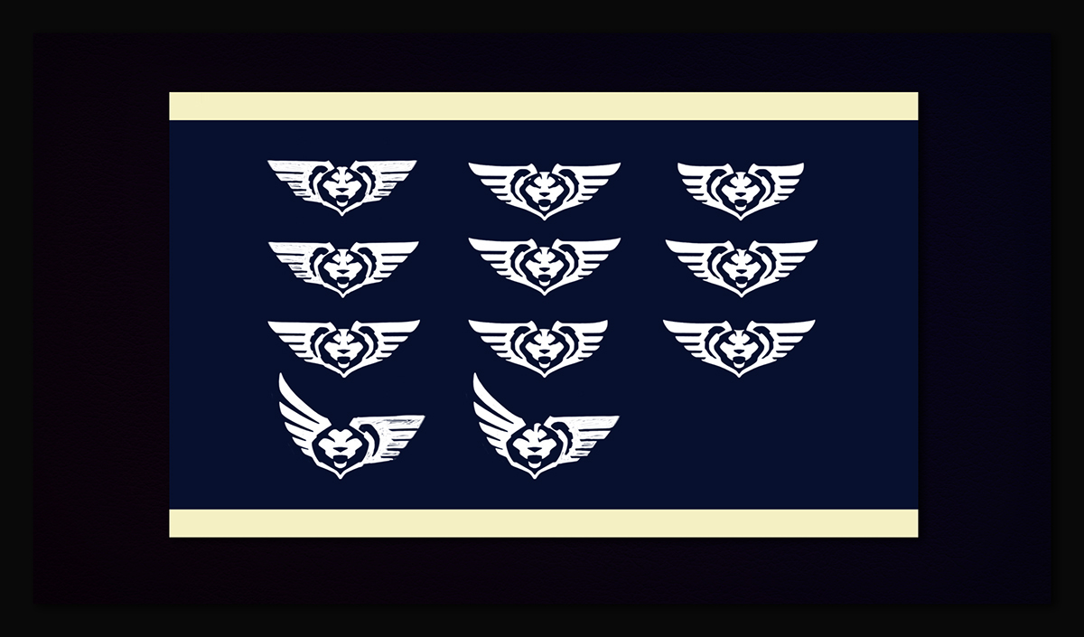
With these composition tests I could see clearly that courved wings are way better in this case and also that horns aren't fitting good what I consider a good mark, confusing everything and not adding nicely the conceptual meaning that is suposed to do. ( I have Goats, I really hate it)
Wings courvature and shapes spacings was widely tested, this logo works way better in negative space due the actual construction of the Chimaera, the Lion mane looks more evident and and the balance is almost perfect in this type of usage. I tried a lot to make it as a 'single shape logo', no success.
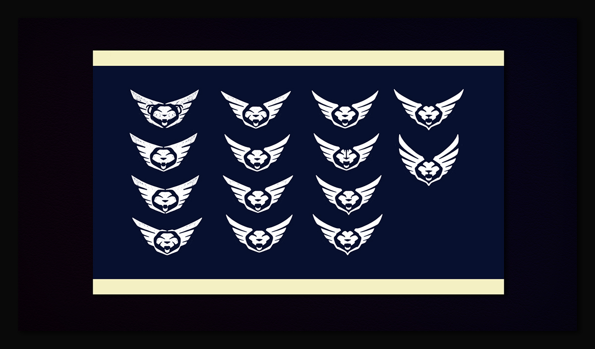
Here I already had the base of the logo done, so I tried to step back and add also the Snake, and fortunately I could do it in a subtle way on the negative spane into the Lion mane, It's not a very evident thing, but to me works good. Just a smart detail. :)

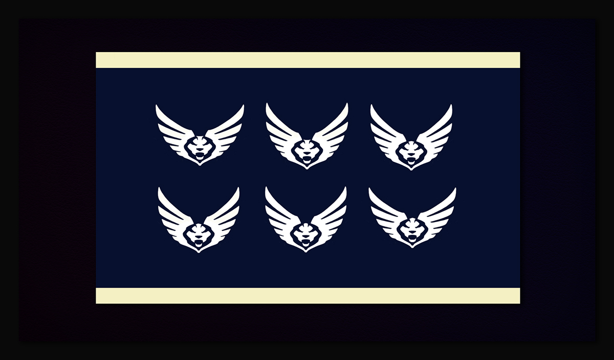
This is the CHIMAERA final main logo, hope I had the right decision.
Now I'll show you all material and logo usage guidelines!
Now I'll show you all material and logo usage guidelines!
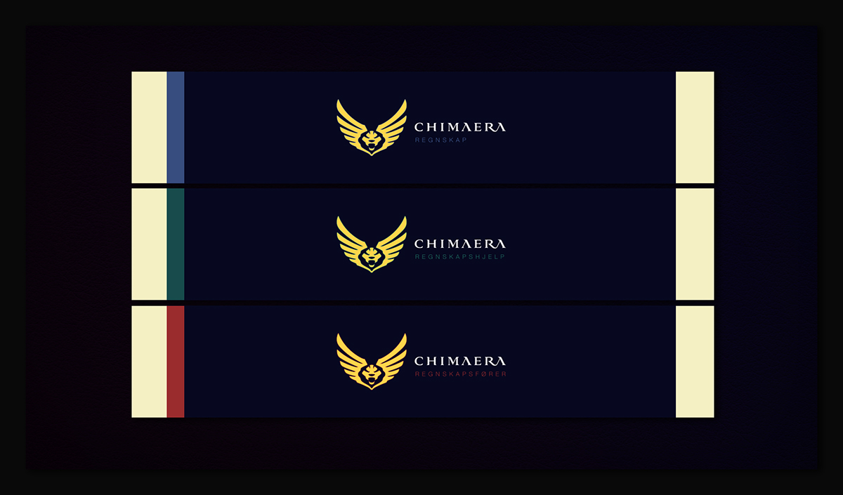
CHIMAERA is a global organization, and is segmented into specific areas of action.
Here are the primary applications, three main taglines: Regnskap, Regnskapshjelp and Regnskapsfører.
Here are the primary applications, three main taglines: Regnskap, Regnskapshjelp and Regnskapsfører.
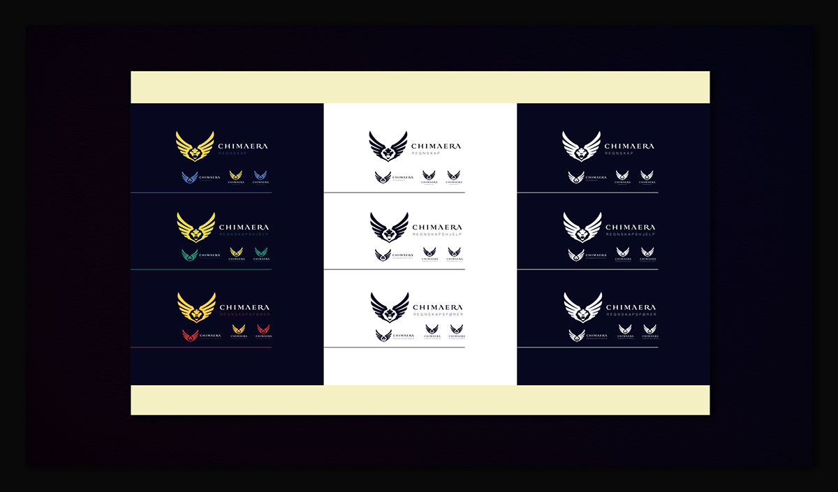
These are restricted versions of the collateral logos. Be careful to use them properly. ;)
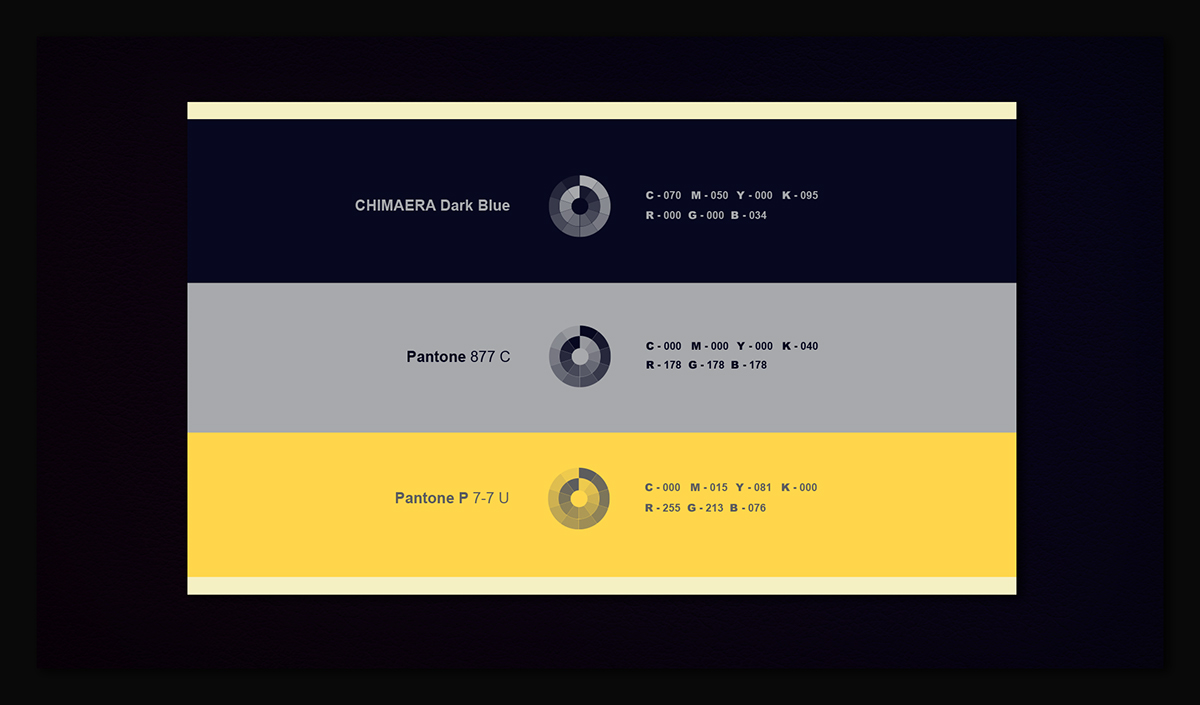
CHIMAERA color palette is composed of three colors in perfect harmony. Since they have
different weights for different uses. Check out three colors with the translation for the main color standards.
different weights for different uses. Check out three colors with the translation for the main color standards.
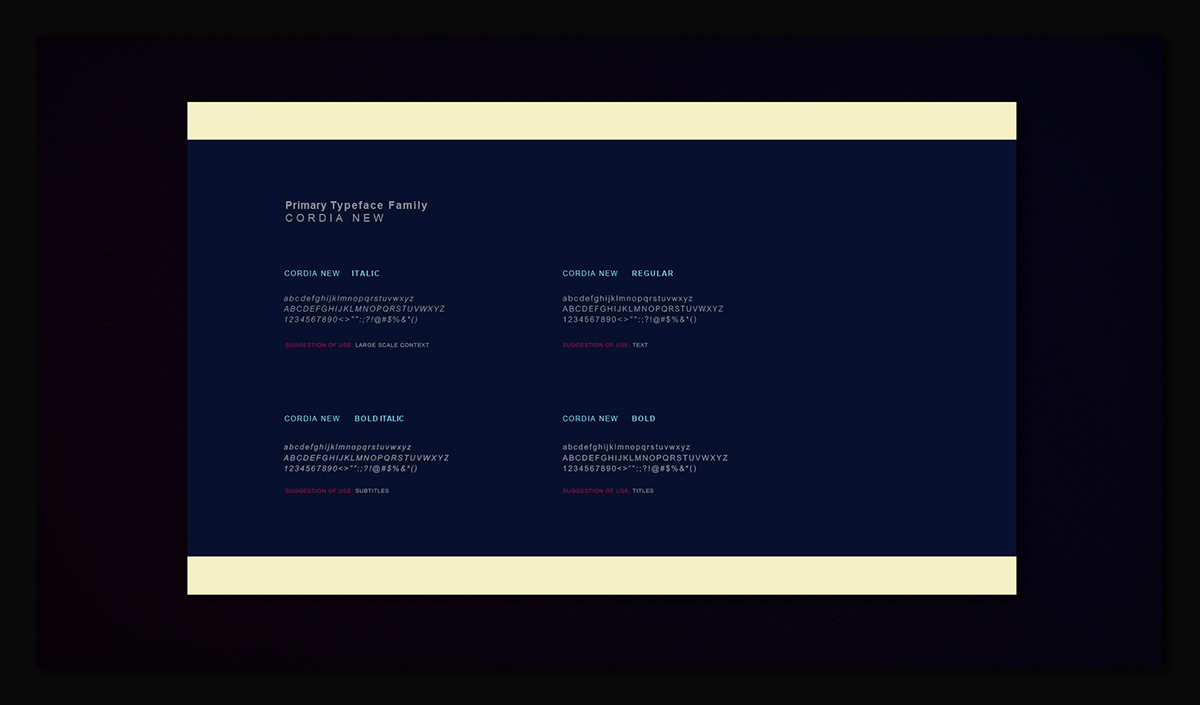
CHIMAERA corporative typography is Cordia New, it is part of its visual identity and is as important as the
use of all other elements. Stay tuned for its application in various types of documents and situations.
use of all other elements. Stay tuned for its application in various types of documents and situations.
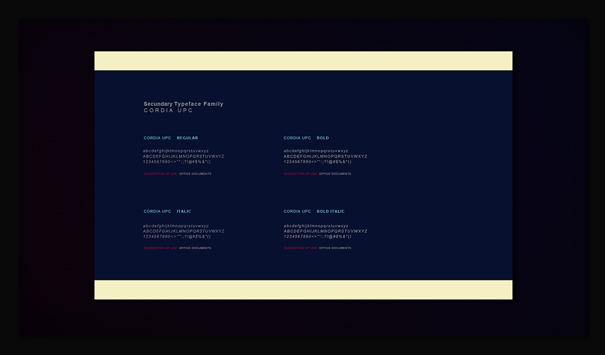
CHIMAERA visual identity has too a secondary type, used for common office jobs.
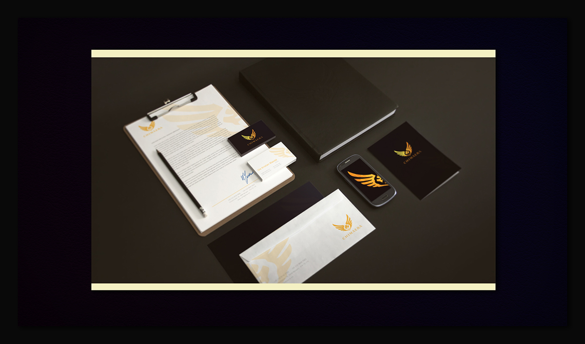
CHIMAERA stationery presentation render

CHIMAERA business card has two option of color and contrast, a dark and white one.
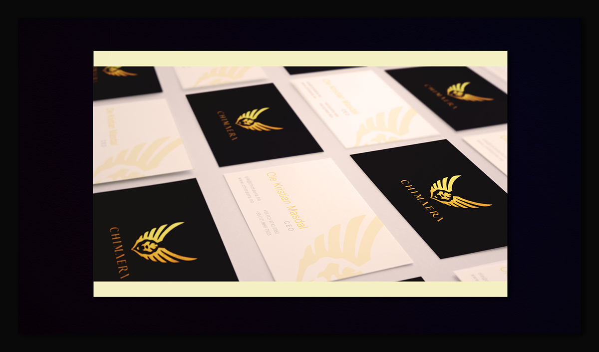
CHIMAERA business card render with neutral colors
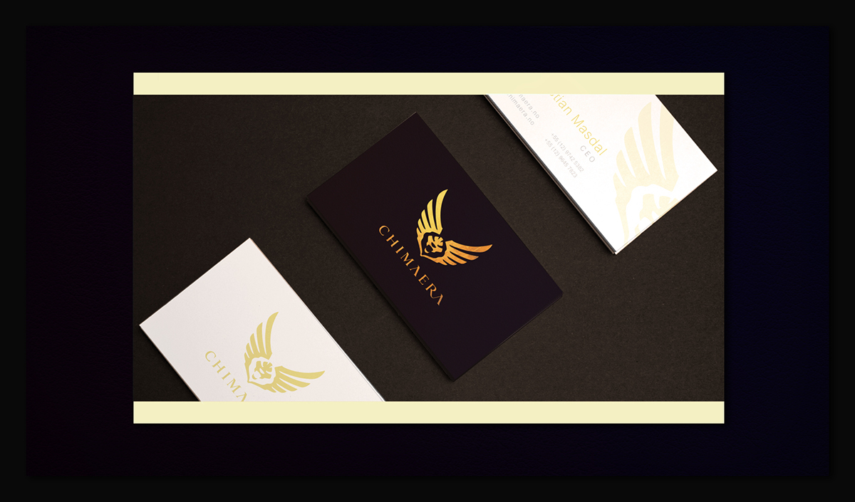
CHIMAERA business card render with special colors and print technics, gold and purple feel.
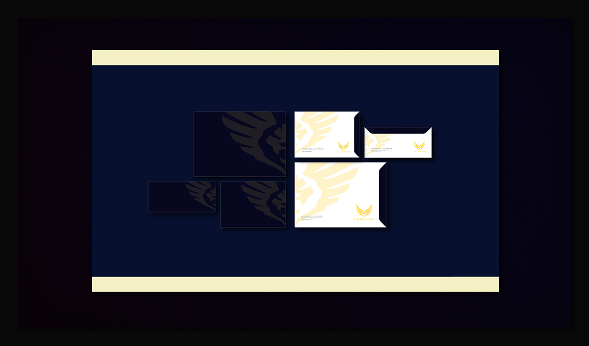
Basic set of envelopes for CHIMAERA office use

Render of a printed CHIMAERA envelope
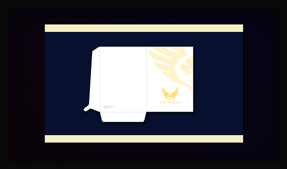
Folder model for CHIMAERA office use, golden version

Letterpaper for document and other related uses in colors and neutral versions

Spacement specification for text body, title and margin for letterpaper use
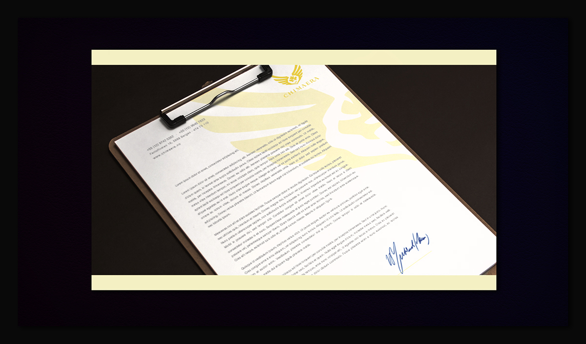
Printed letterhead render
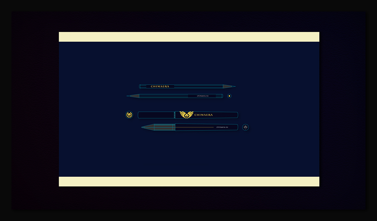
Pens and pencils CHIMAERA logo use indications
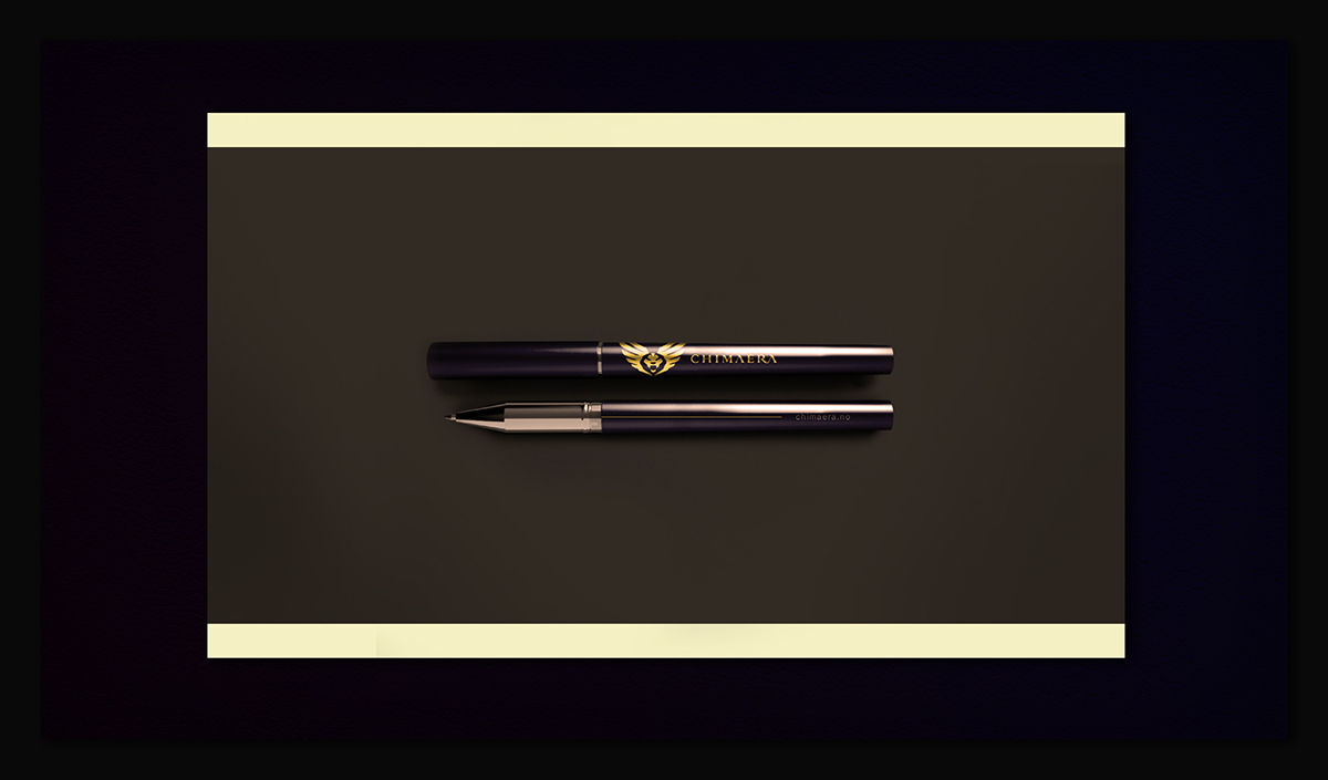
CHIMAERA logo usage pen render
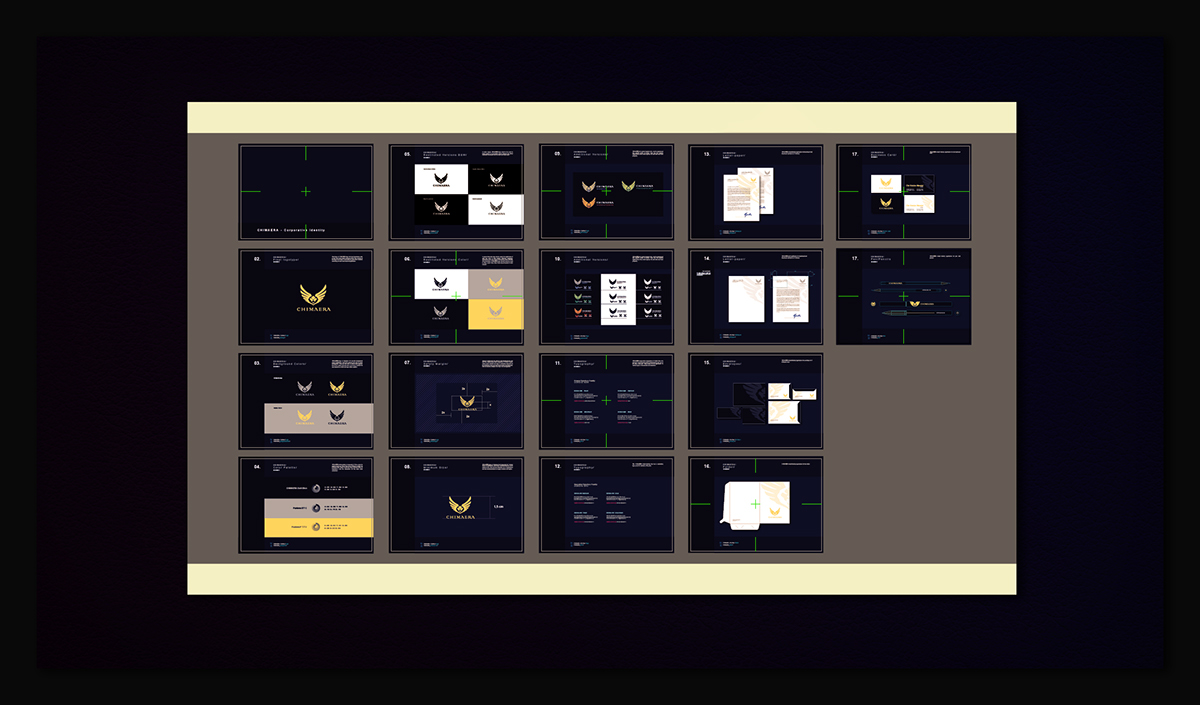
CHIMAERA guideline / Brandbook slides
Thanks for watching!


