P R O J E C T
Khozaku
Y E A R
2021
Khozaku
Y E A R
2021
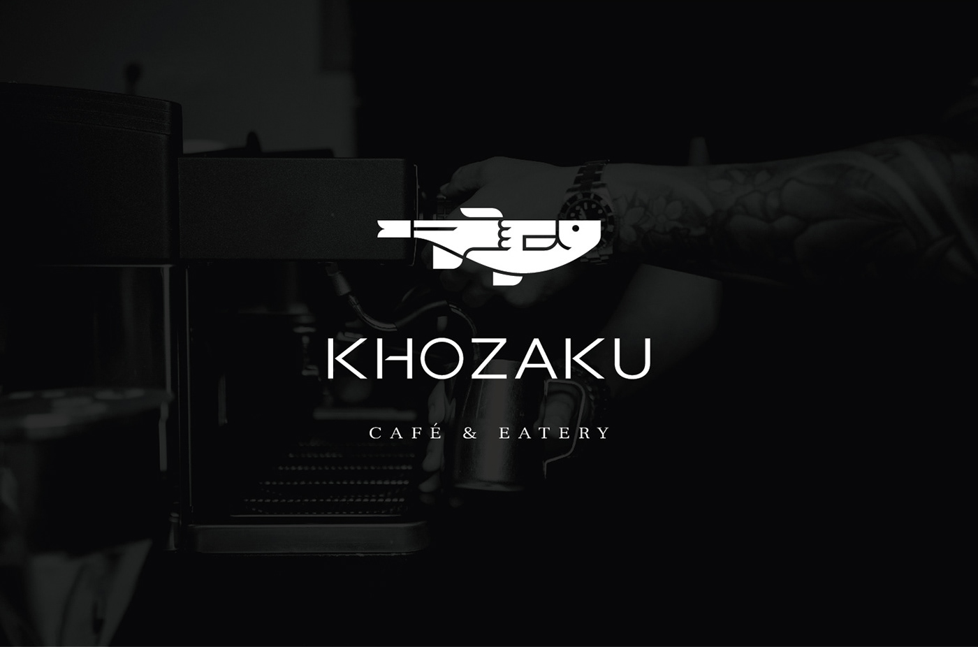
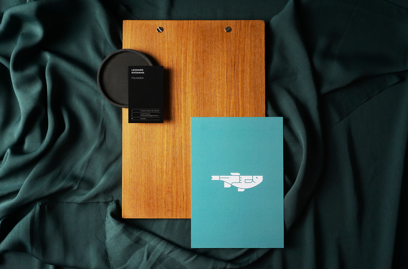
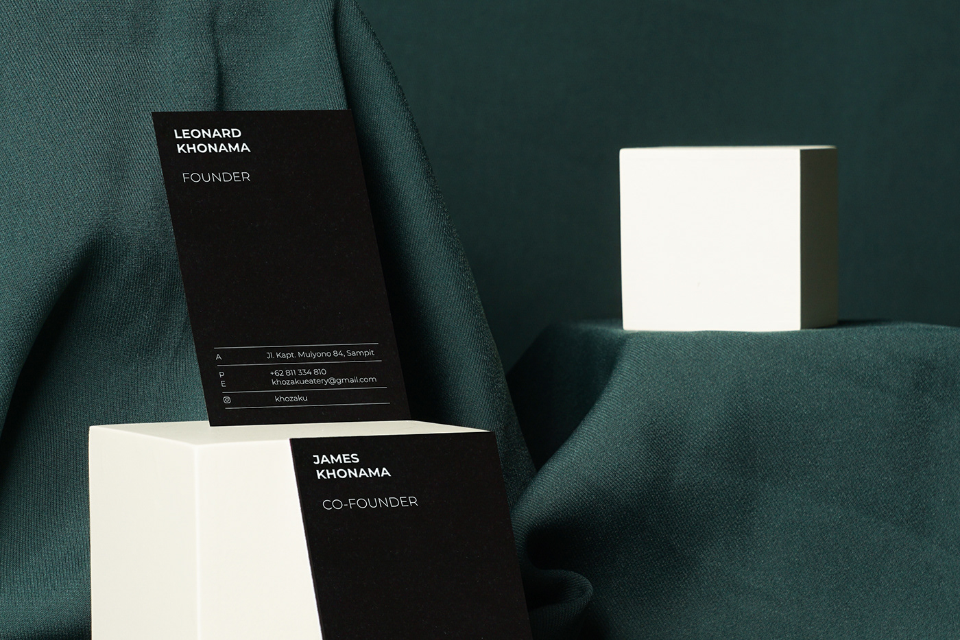
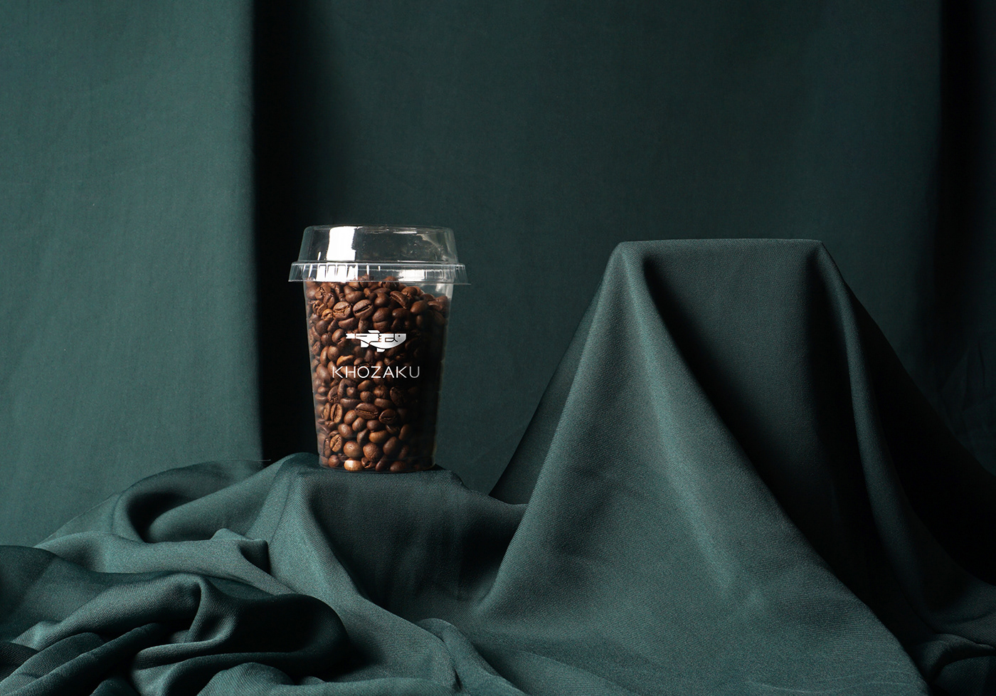
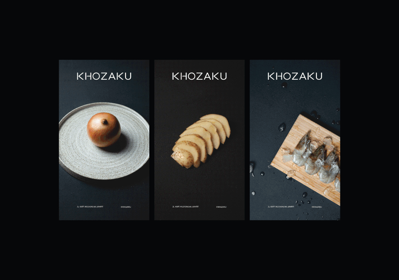
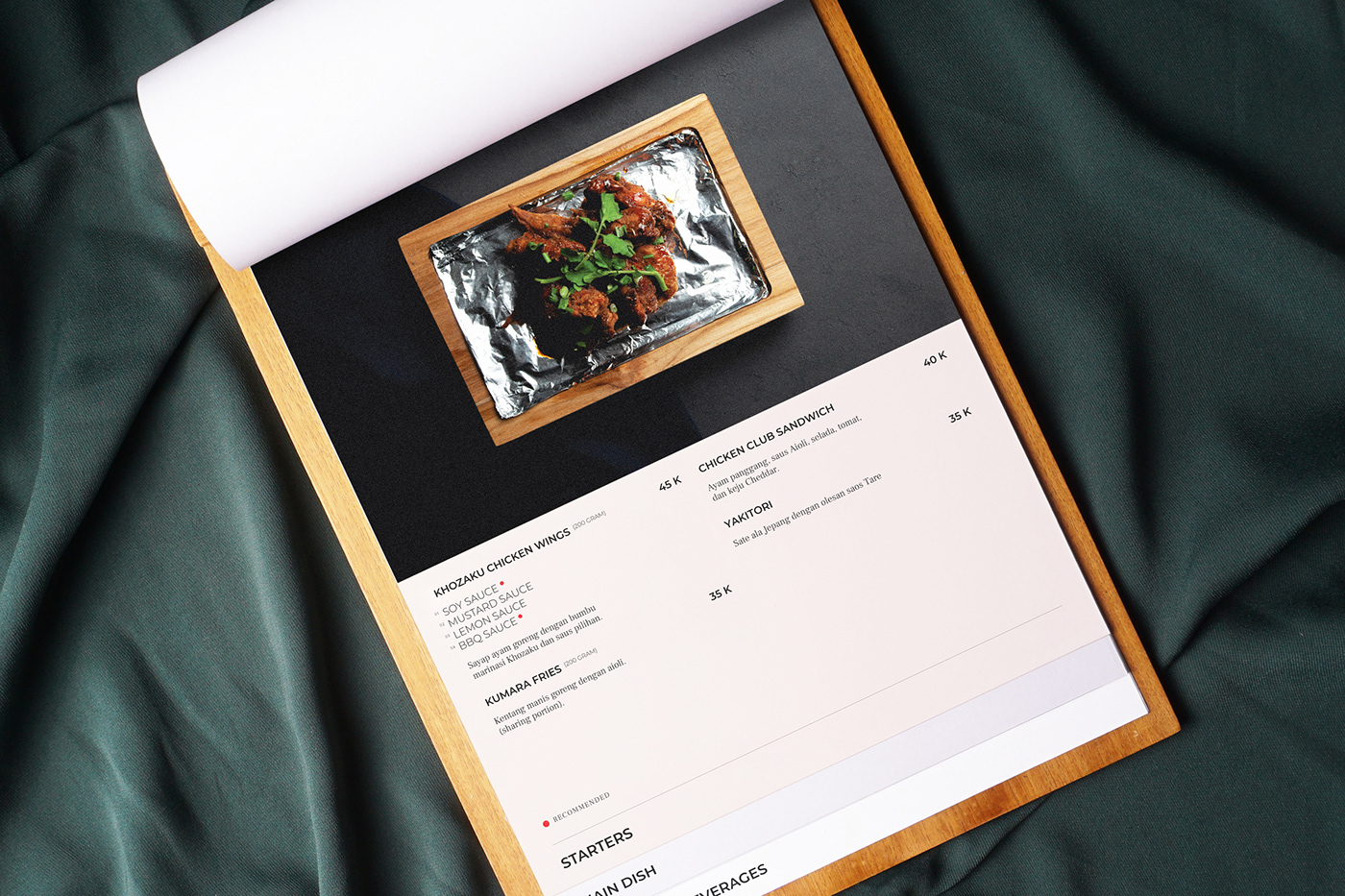
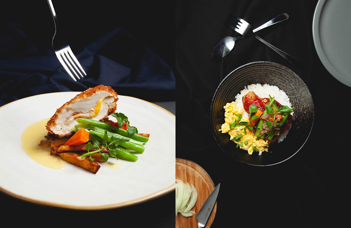
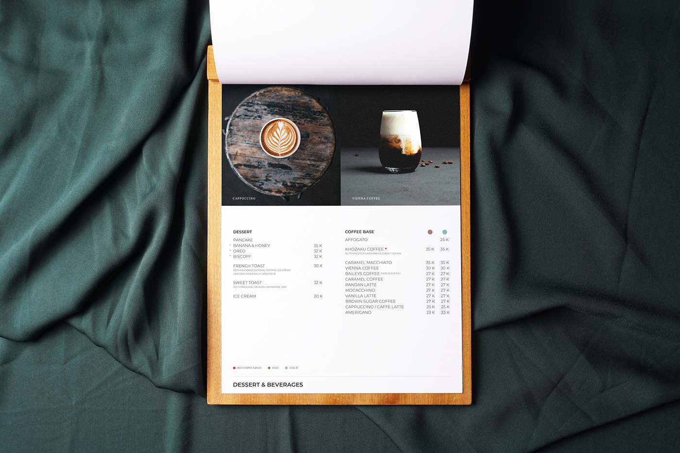
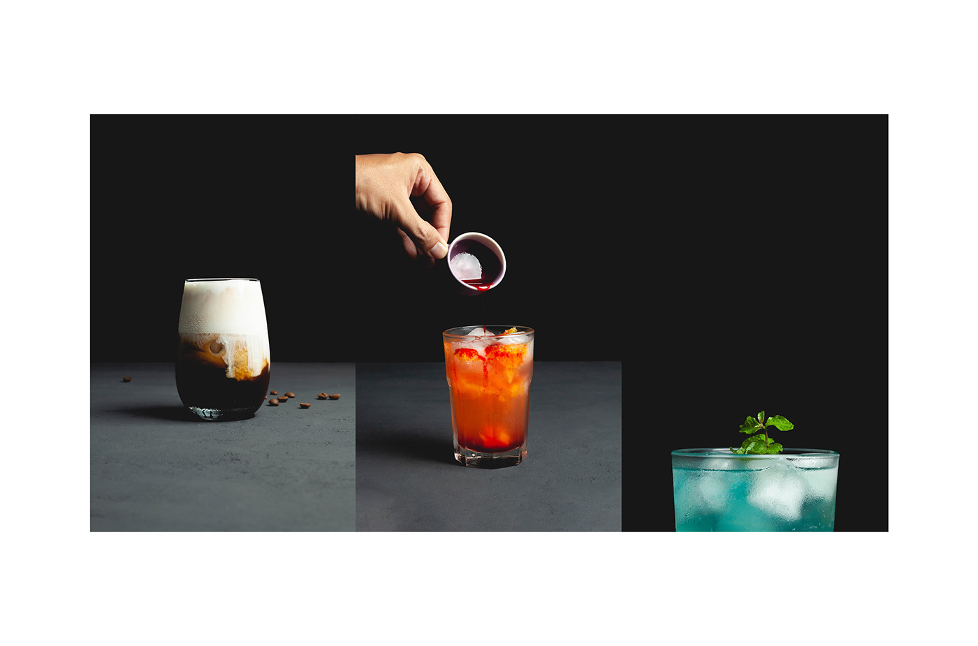
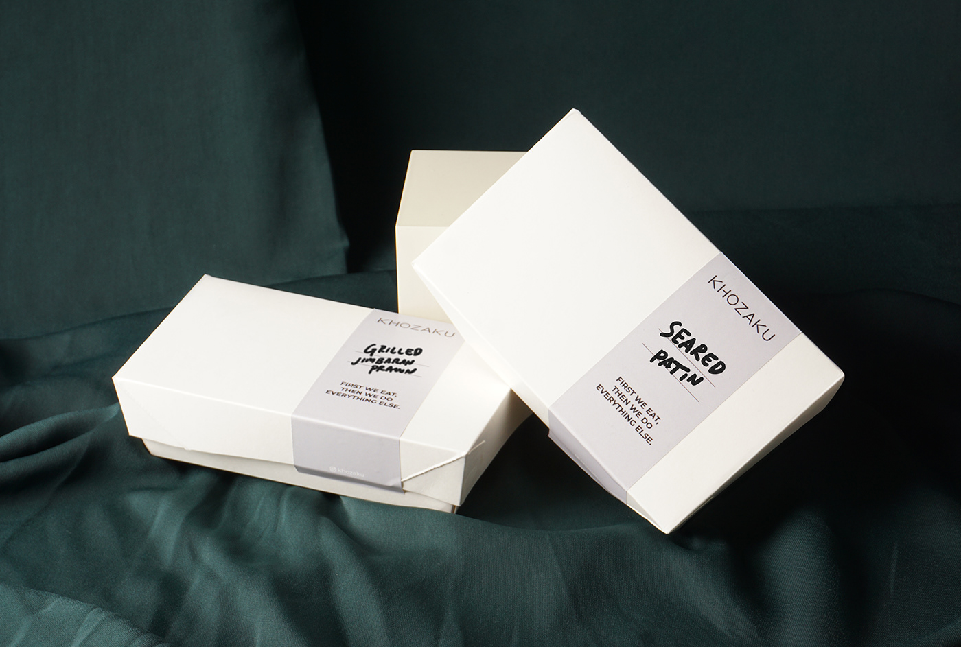
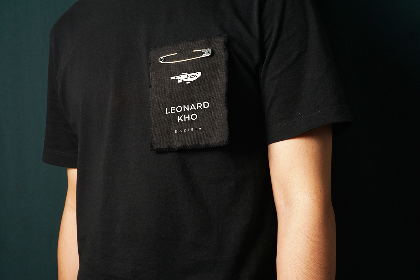
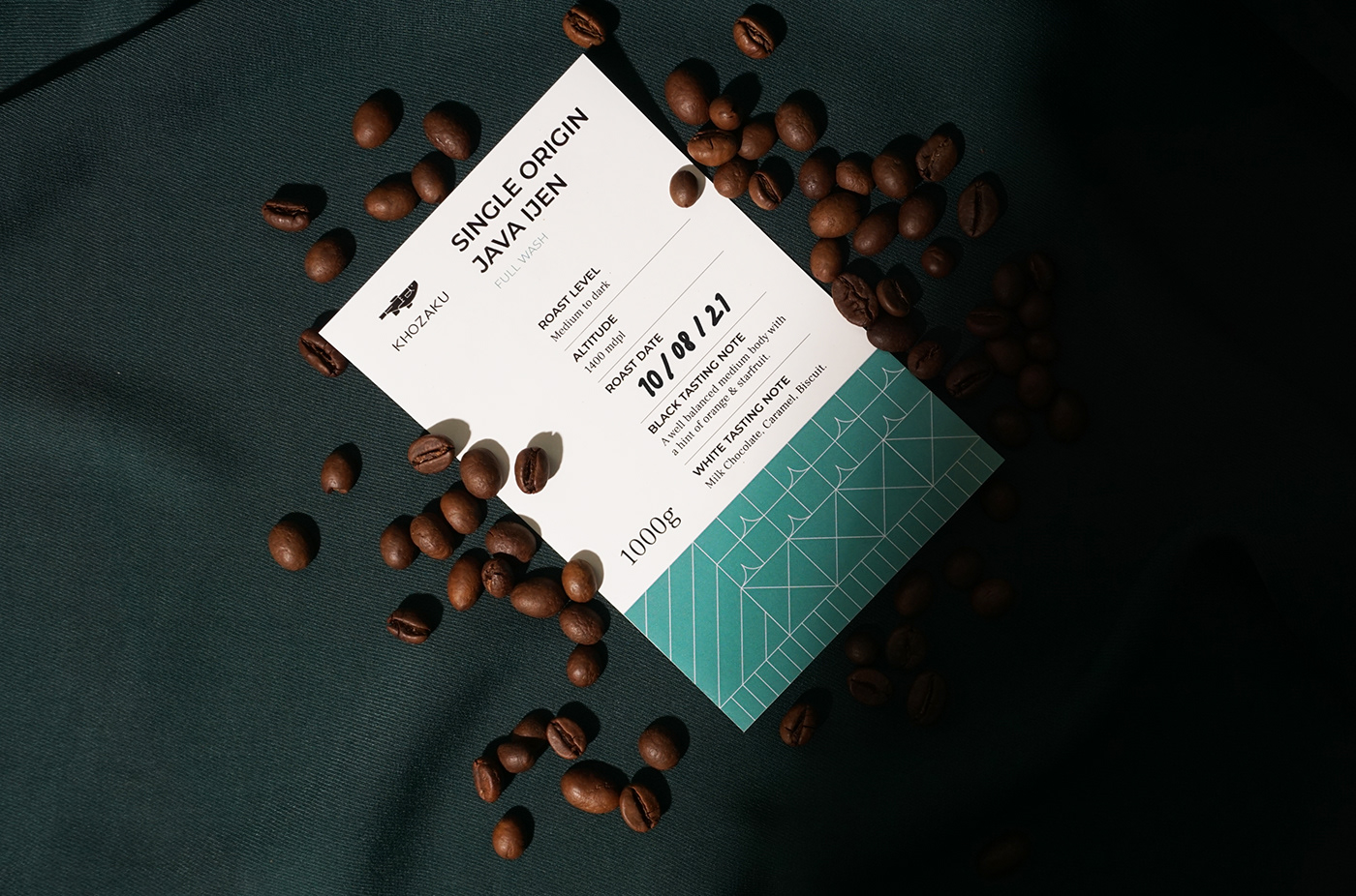
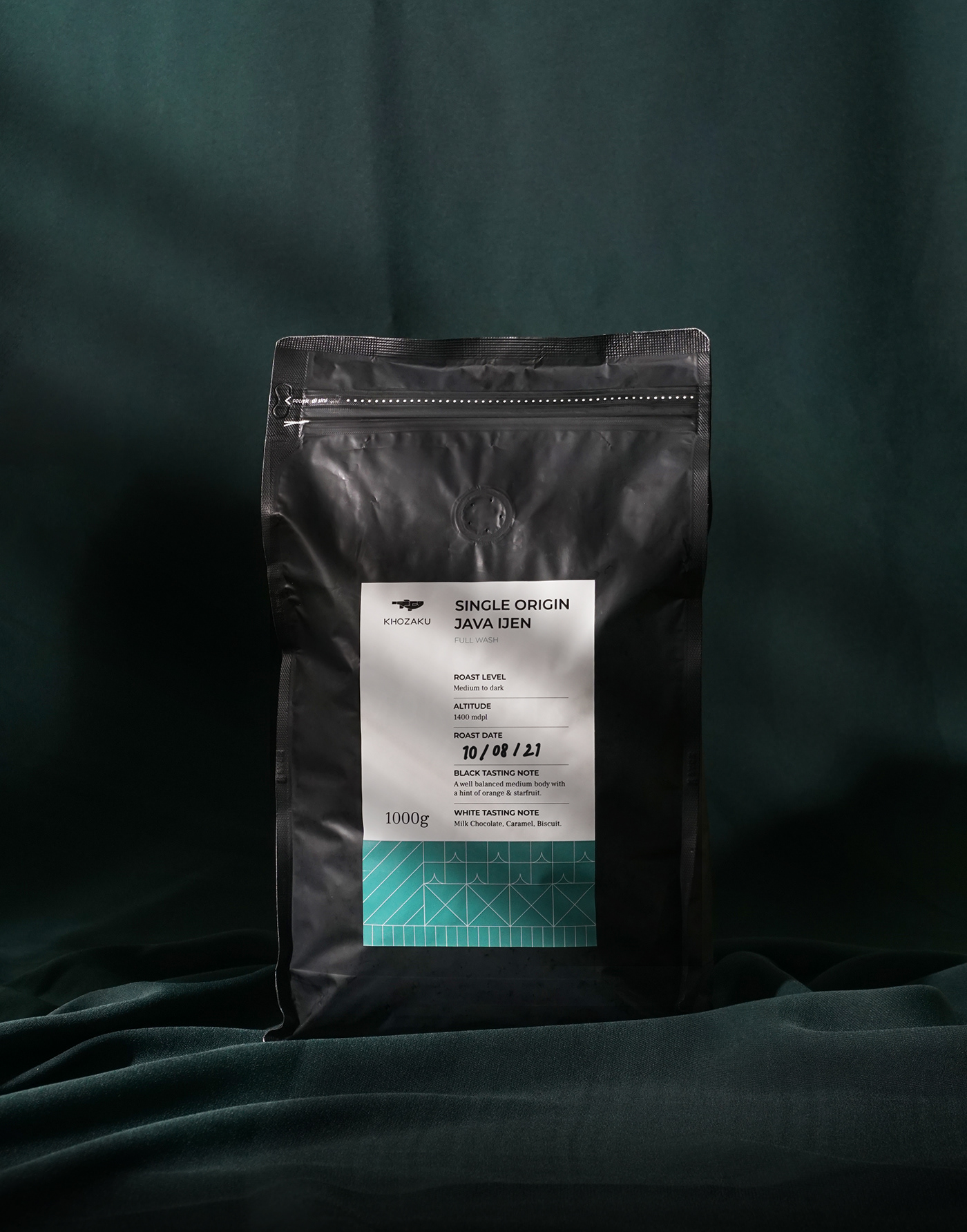
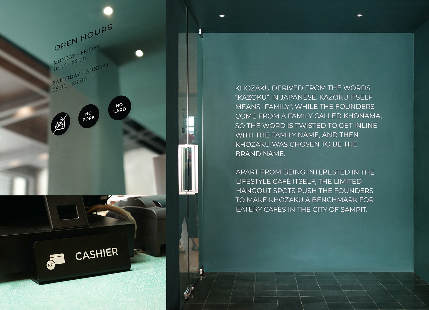
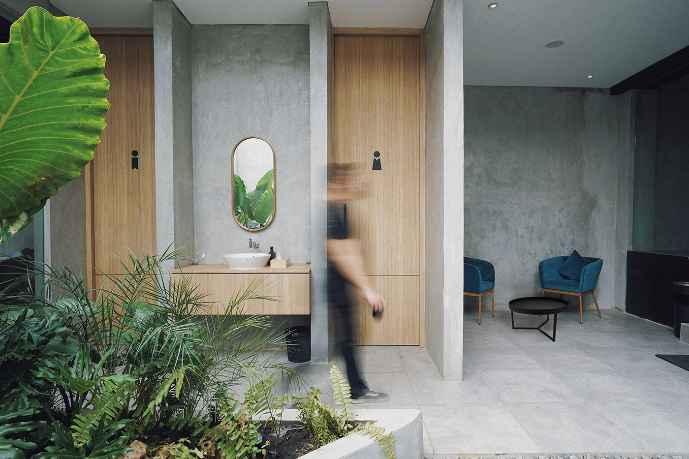
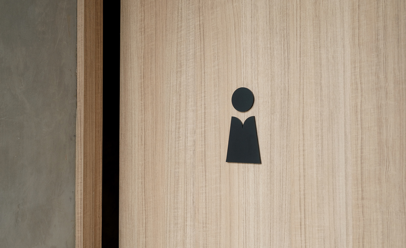
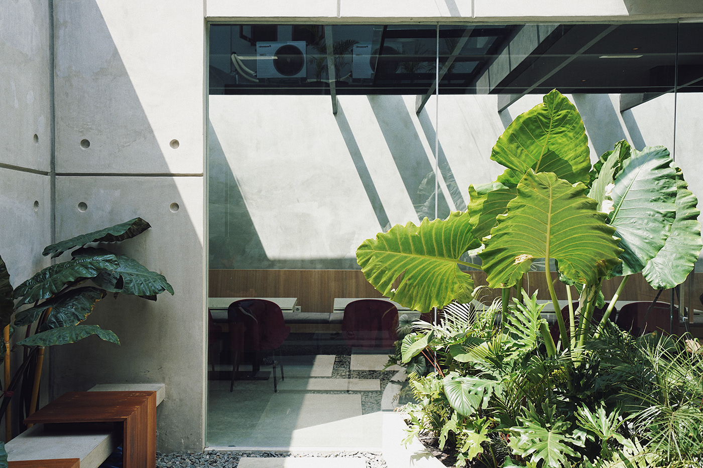
Visual Identity for a dining place in Sampit, Khozaku - Cafe and Eatery. Khozaku derived from the words “Kazoku” in Japanese. Kazoku itself means "family", while the founders come from a family called Khonama, so the word are twisted to get inline with the family name, and then Khozaku was chosen to be the brand name.
Apart from being interested in the lifestyle café itself, the limited hangout spots in Sampit push the founders to make Khozaku as a benchmark for eatery cafés in the city of Sampit.
Apart from being interested in the lifestyle café itself, the limited hangout spots in Sampit push the founders to make Khozaku as a benchmark for eatery cafés in the city of Sampit.
"Brings Togetherness in Families & Communities"
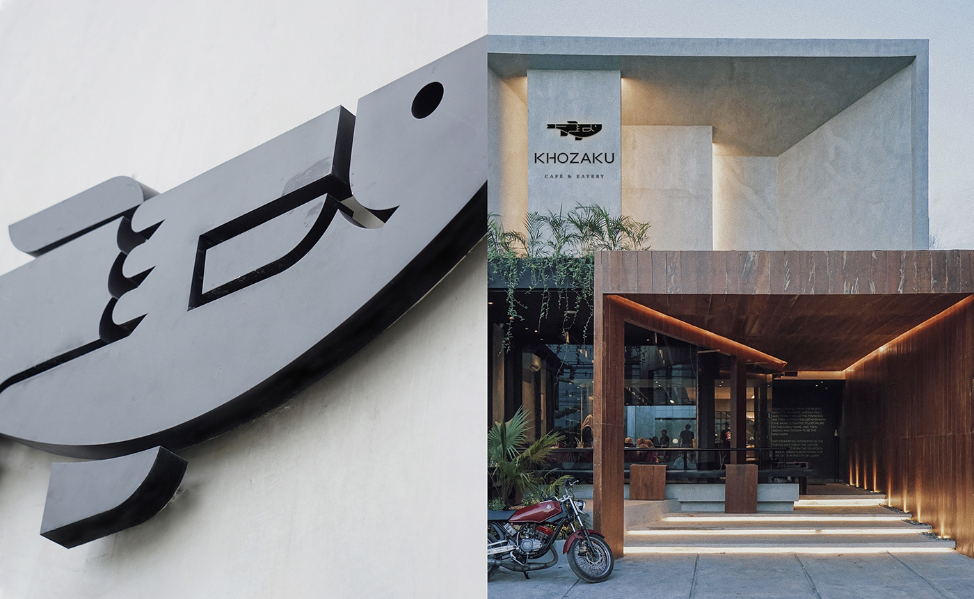
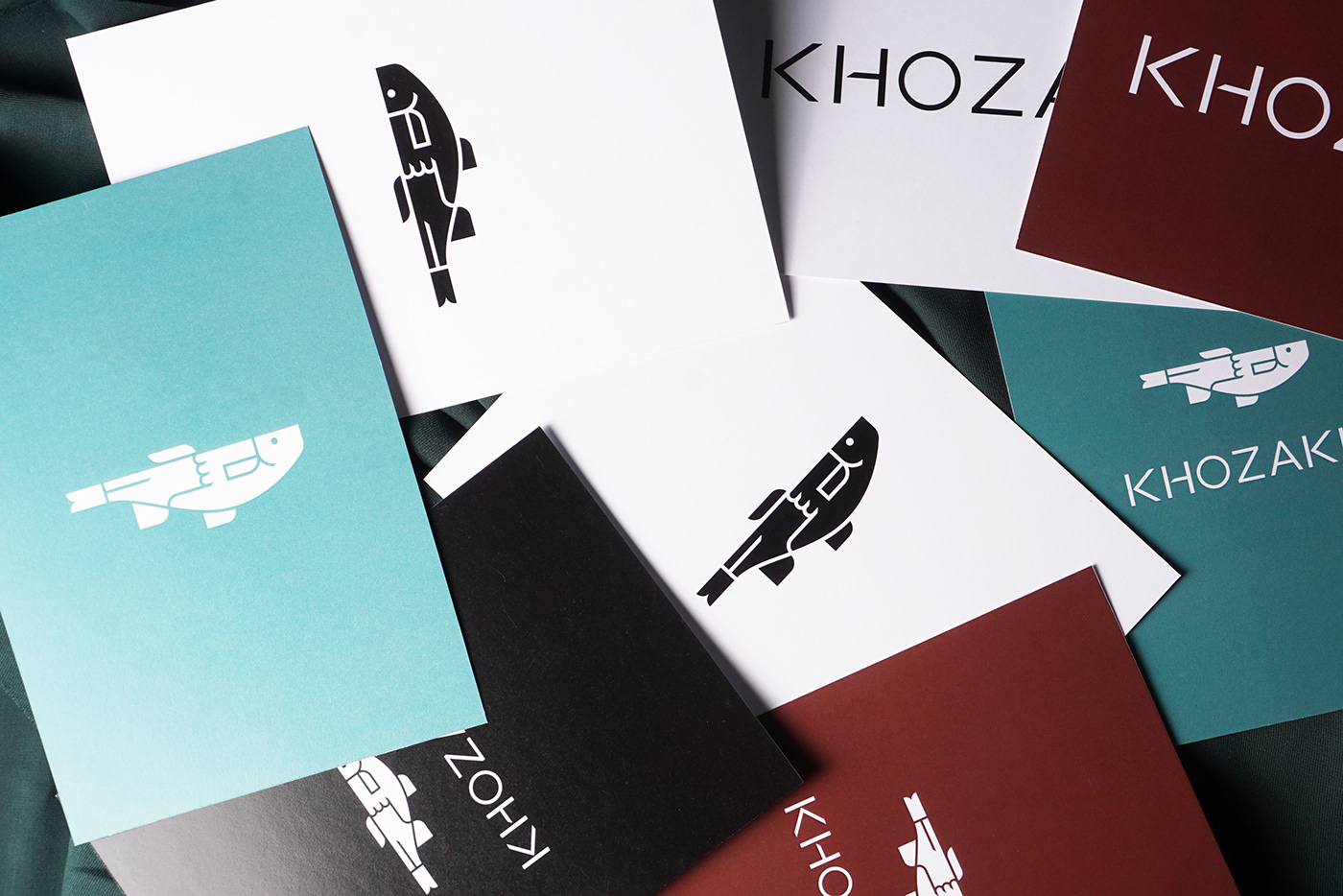
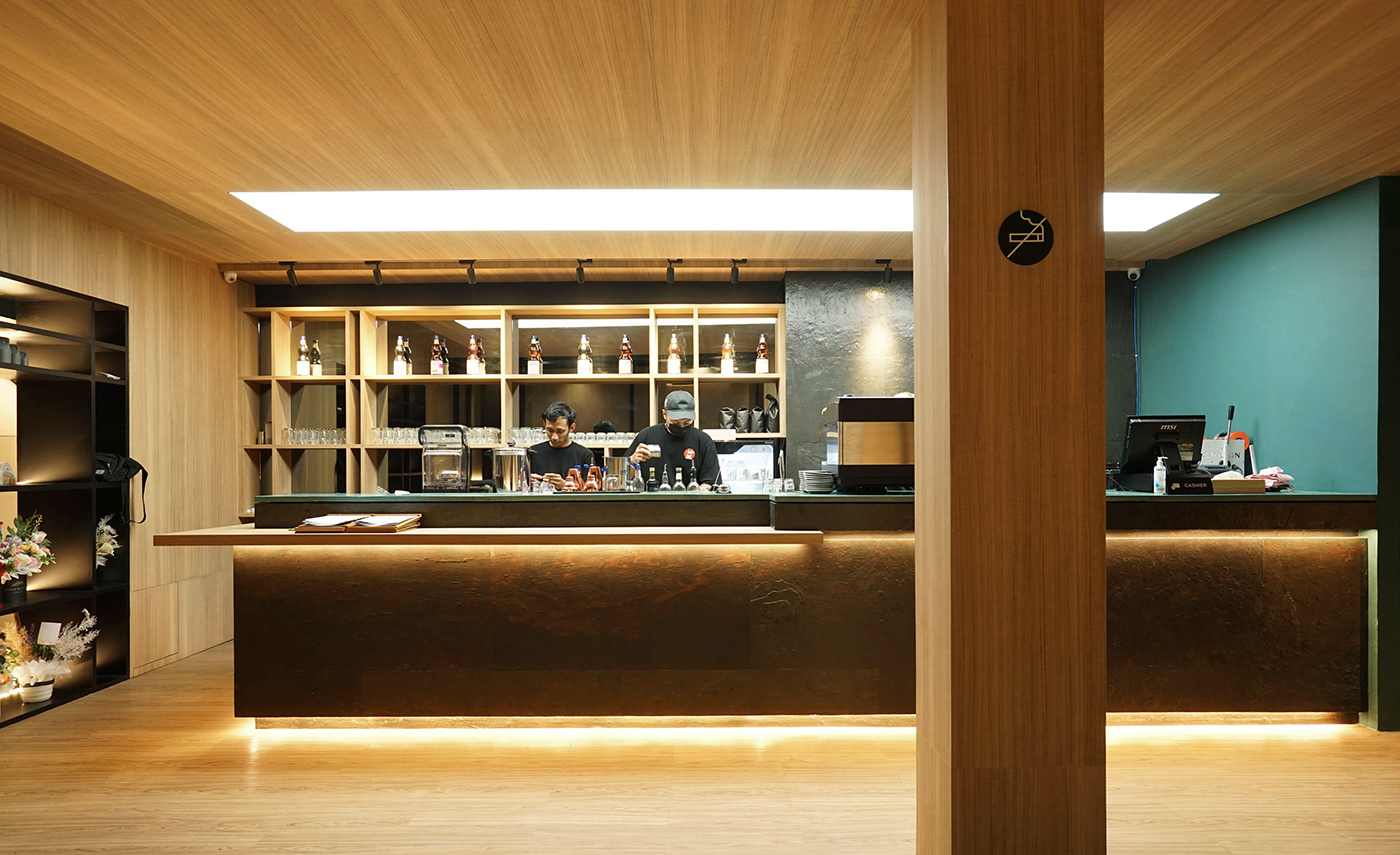
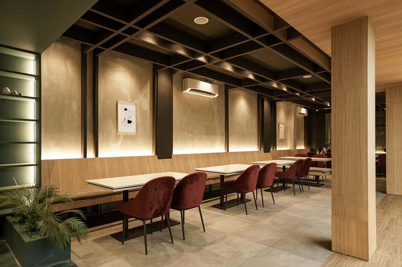
Base on the roots as a family business, we want to show the identity of Khozaku refers to the Sampit icon, Jelawat fish. This symbol brings the identity where the family comes and it’s already attached to the audience in Sampit. Hopefully the identity will create a warm and humble feel image for the brand as a home where we can feel togetherness.


B R A N D I N G T E A M - A K R O N I M
Project Manager /
Anas Kautsar
Photography /
Fraktal
Ryo Dinata
Interior Build /
Hucraft
Plantscape /
Plantovert
Architecture & Interior Photography /
Courtesy of DVAL Studio & Hucraft
Art & Design Direction /
Adji Herdanto
Adji Herdanto
Graphic Designer /
Septia Dwi P
Septia Dwi P
Project Manager /
Anas Kautsar
Photography /
Fraktal
Ryo Dinata
Interior Build /
Hucraft
Plantscape /
Plantovert
Architecture & Interior Photography /
Courtesy of DVAL Studio & Hucraft
S O C I A L M E D I A
Facebook
Instagram
C O N T A C T
halo@studioakronim.com
C O N T A C T
halo@studioakronim.com
W E B S I T E
www.studioakronim.com
www.studioakronim.com


