The brand
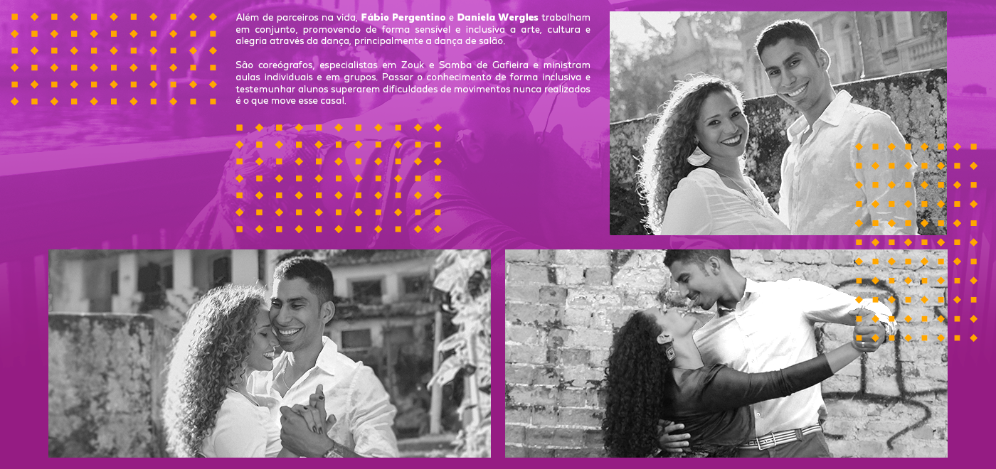
In addition to being partners in life, Fábio and Dani work together, sensitively and inclusively promoting art, culture and joy through dance, especially ballroom dancing. They are choreographers, specialists in Zouk and Samba de Gafieira and teach individual and group classes. Passing knowledge in an inclusive way and witnessing students overcome difficulties in movements they had never done before is what moves this couple.
In addition to being partners in life, Fábio and Dani work together, sensitively and inclusively promoting art, culture and joy through dance, especially ballroom dancing. They are choreographers, specialists in Zouk and Samba de Gafieira and teach individual and group classes. Passing knowledge in an inclusive way and witnessing students overcome difficulties in movements they had never done before is what moves this couple.
Project's goal
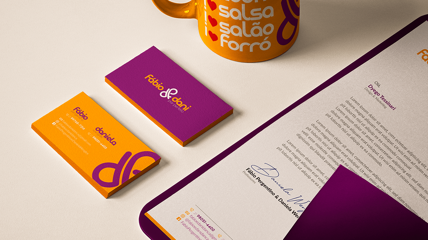
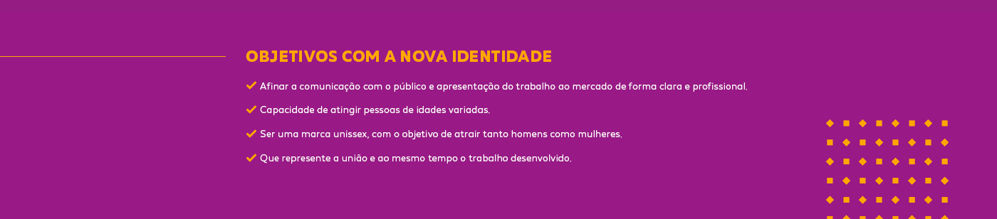
The main objective of the project was to improve communication with the public and present the work to the market in a clear and professional manner. Furthermore, the brand should represent the union and at the same time the work developed. Creating an identity capable of reaching people of different ages and being a unisex brand, aiming to attract both men and women was one of the main challenges.
The main objective of the project was to improve communication with the public and present the work to the market in a clear and professional manner. Furthermore, the brand should represent the union and at the same time the work developed. Creating an identity capable of reaching people of different ages and being a unisex brand, aiming to attract both men and women was one of the main challenges.

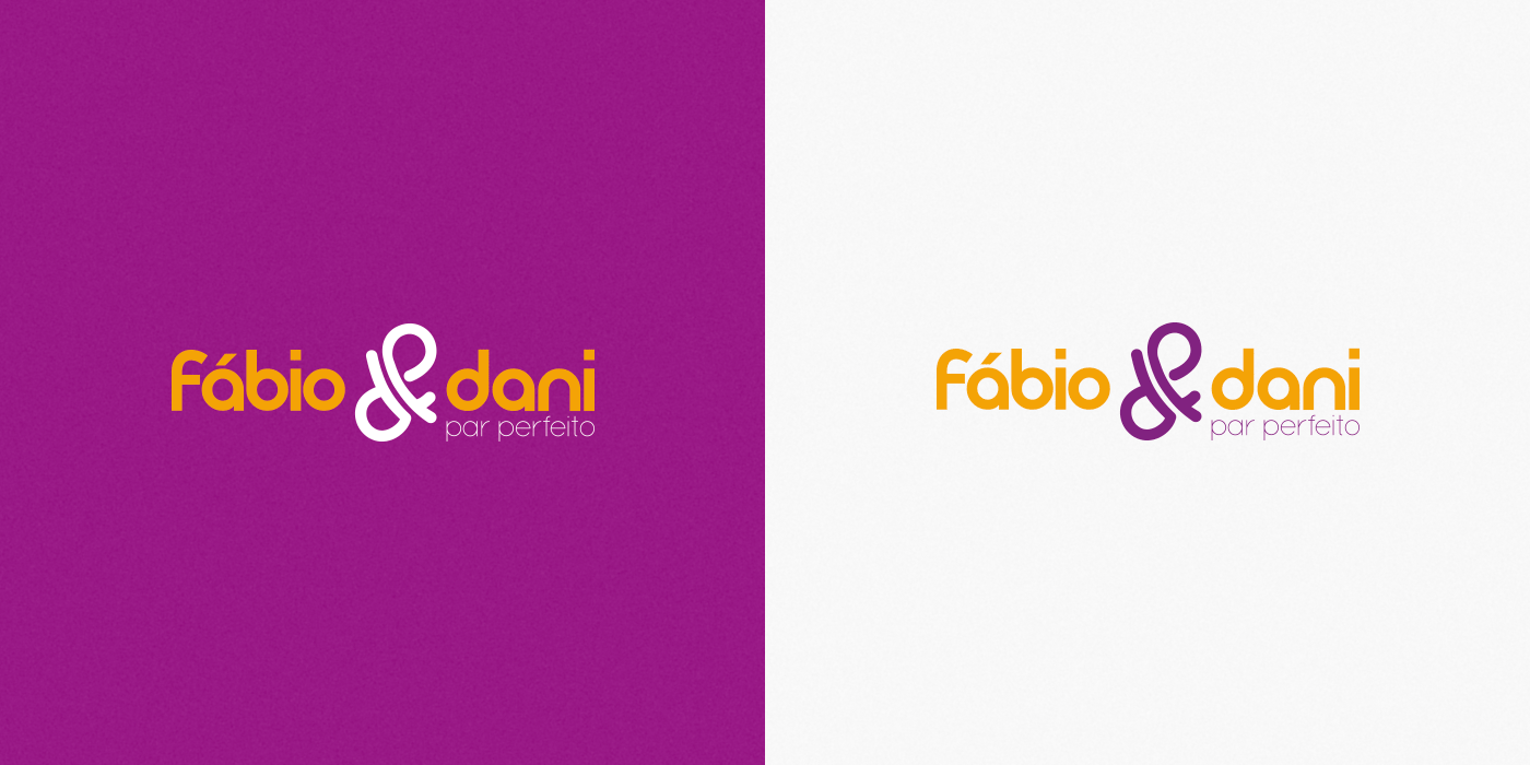
Symbol Construction
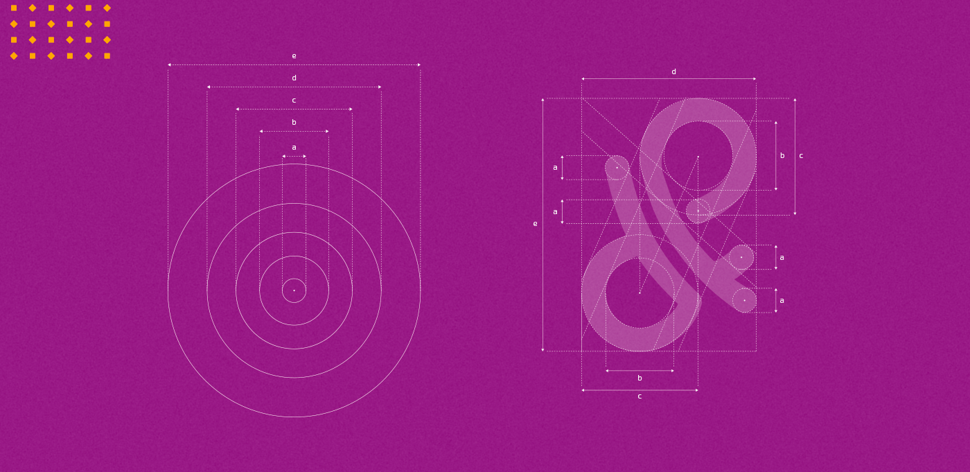
During the creation process, the most diverse solutions were tested before defining which would suit the project. The brand symbol has as its concept the fusion of three elements: 1) The initials "F" and "D" ; 2) Infinity symbol (∞); 3) The sign “&” (ampersand or popularly known as commercial ‘e’). With this triad, we personalize the brand, transmit a sense of movement and represent the couple's union.
During the creation process, the most diverse solutions were tested before defining which would suit the project. The brand symbol has as its concept the fusion of three elements: 1) The initials "F" and "D" ; 2) Infinity symbol (∞); 3) The sign “&” (ampersand or popularly known as commercial ‘e’). With this triad, we personalize the brand, transmit a sense of movement and represent the couple's union.

Colors
Yellow, among the warm colors, is the lightest. It is also the one that most resembles the color of the Sun. Therefore, it is usually associated with luminosity, joy, brightness and joviality. The chosen tone, closer to golden yellow, can convey an idea of optimism, since it is considered a welcoming color. And in many cases, it helps in the concentration of those who are inside a certain environment with that color, in addition to stimulating the intellectual and suggesting animation.
Yellow, among the warm colors, is the lightest. It is also the one that most resembles the color of the Sun. Therefore, it is usually associated with luminosity, joy, brightness and joviality. The chosen tone, closer to golden yellow, can convey an idea of optimism, since it is considered a welcoming color. And in many cases, it helps in the concentration of those who are inside a certain environment with that color, in addition to stimulating the intellectual and suggesting animation.
Violet, historically known as the color of royalty and nobility, can also be associated with calm, respect and wisdom. It is a mixture between blue and red, that is, it is neither a feminine nor a masculine color. Like yellow, violet is a color capable of stimulating imagination and creativity. Many people even use violet as a way to mention spirituality.

Typography
The typographic family chosen as the main one was Meltix. In the name signature, we put all characters in lower case (lowercase) to bring the brand closer and make it more human. To accompany the brand's visual identity, Quicksand was used as a source of support. Both sans serif fonts, modern and contemporary in style. The fonts fit perfectly with the brand's proposal: fluid (easy interpretation), good continuity (continuous reading) and legibility (good reading regardless of the reduction).
The typographic family chosen as the main one was Meltix. In the name signature, we put all characters in lower case (lowercase) to bring the brand closer and make it more human. To accompany the brand's visual identity, Quicksand was used as a source of support. Both sans serif fonts, modern and contemporary in style. The fonts fit perfectly with the brand's proposal: fluid (easy interpretation), good continuity (continuous reading) and legibility (good reading regardless of the reduction).